Crowdfunding Campaign Professional Website Template
Fund is a transparent crowdfunding landing page template built for social impact platforms that need to prove every dollar's journey. It features a live global map, a real-time donation ticker, a side-by-side comparison grid, and interactive project dashboard cards, all wrapped in a dark Tech Glass visual identity that turns financial data into compelling, trust-building evidence.
by Rocket studio
Quick summary
Fund is a single-page crowdfunding landing page template designed for radical financial transparency. It opens with a live donation map, moves into a hard-hitting comparison grid, and resolves with a full project dashboard. The layout is built to convert skeptical donors and campaign organizers by showing proof before asking for trust.
Who this template is for
This template is built for people who need to demonstrate exactly where donated money goes. It works best for impact-driven platforms and the communities they serve.
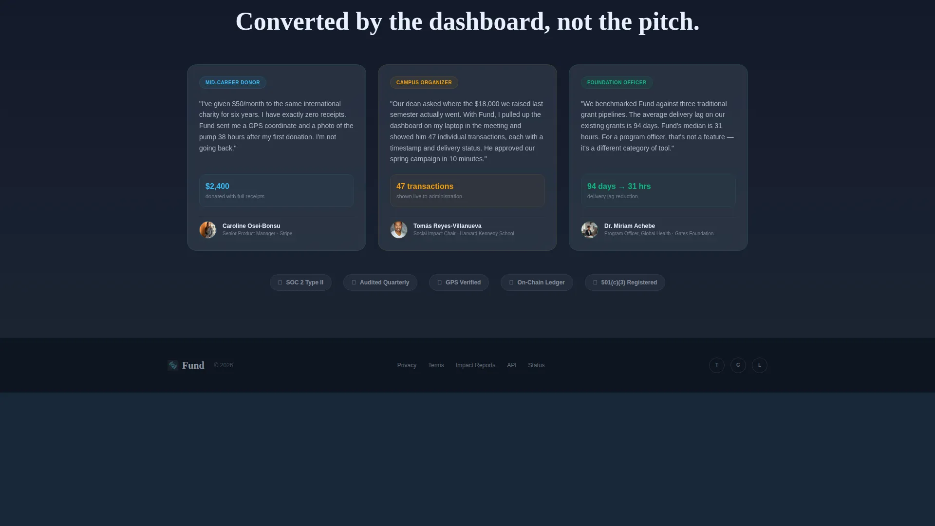
- Mid-career professionals who give monthly but want verified proof that funds reach real projects
- College and university organizers running semester-length fundraising drives who must report transparently to institutional stakeholders
- Foundation program officers who need to benchmark donation efficiency against traditional grant pipelines
What problem this template solves
Most crowdfunding pages ask visitors to trust a cause before showing any evidence. Donors who have been burned by overhead-heavy organizations need more than a mission statement. This template reverses that sequence entirely.
- Donors cannot see where their money goes in real time, which erodes trust and reduces repeat giving
- Campaign organizers lack a visual dashboard to show institutional stakeholders meaningful progress data
- Traditional giving pages bury transparency metrics instead of leading with them
What you get with this template
This template delivers a full single-page layout structured around data visibility and conversion. Every section earns the next click by layering evidence first.
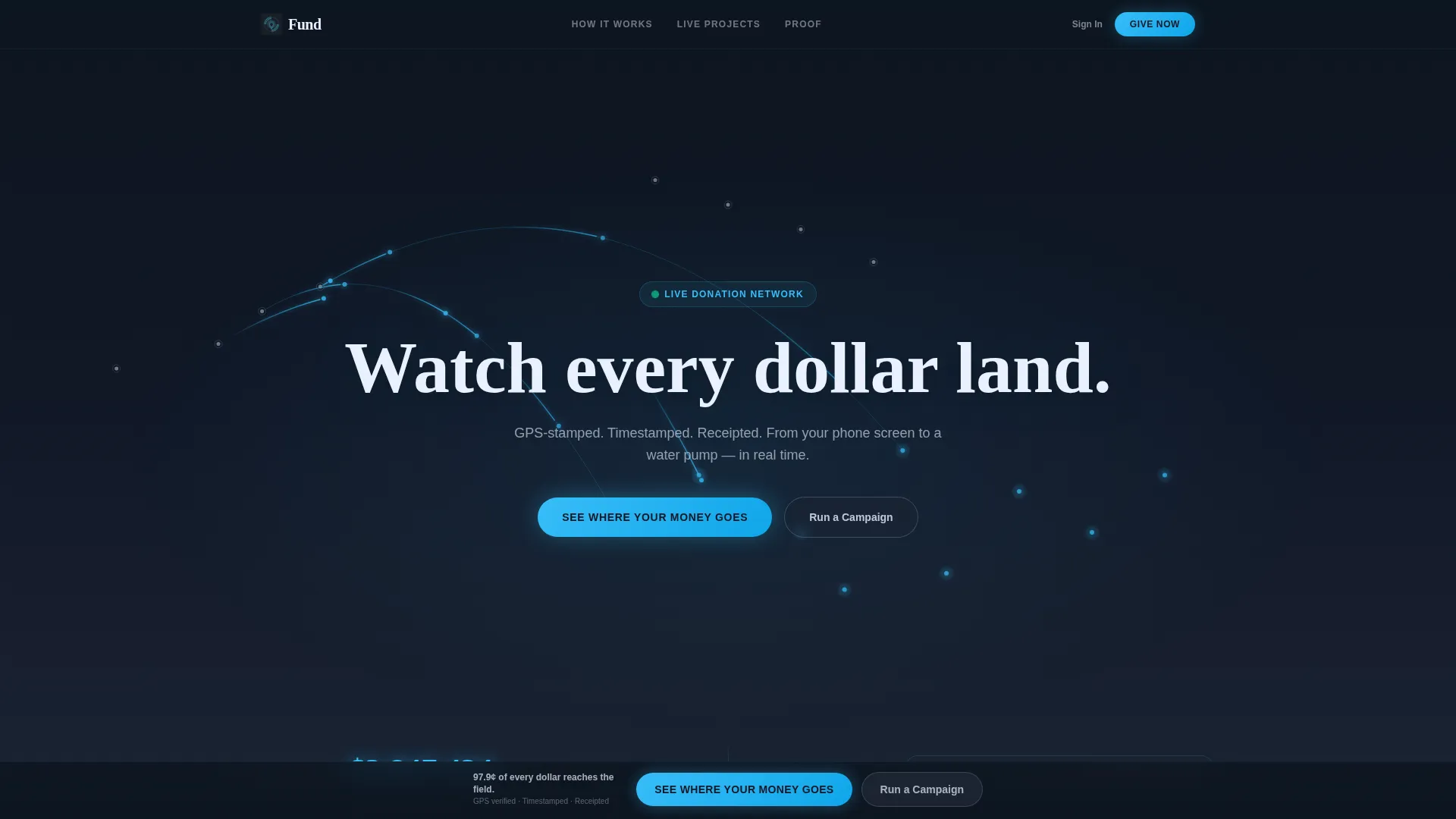
- A dark full-bleed header with an animated global donation map and a live ticker counting contributions in real time
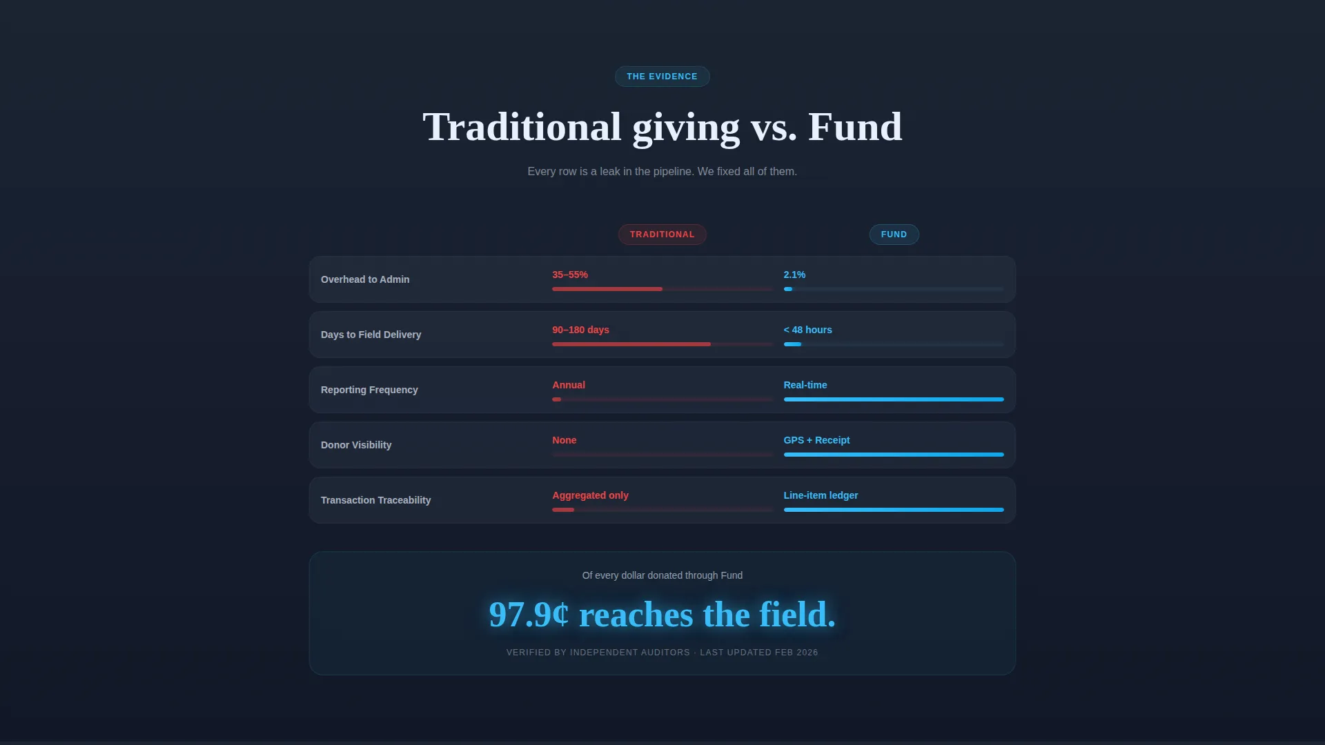
- A side-by-side comparison grid contrasting traditional giving against the platform on overhead, delivery speed, reporting frequency, and donor visibility
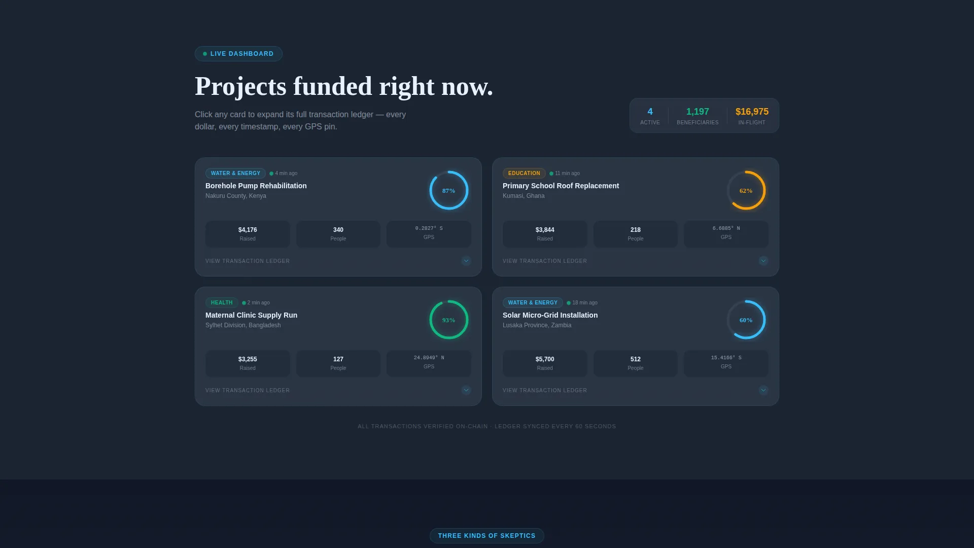
- A live project dashboard with gunmetal cards showing funding arcs, beneficiary counts, and completion percentages linked to a transaction ledger lightbox
- Two distinct conversion paths: a donor lightbox with email capture and a monthly amount slider, plus a separate organizer intake form
Feature list
This template includes purpose-built components that turn financial data into a compelling, trust-first experience for every visitor type.
Live Global Donation Map
The header renders donation pathways as luminous arcs across a dark full-bleed canvas. Each arc travels from a donor city to a project coordinate and brightens on arrival, creating a visceral, real-time proof of fund delivery.
Real-Time Donation Ticker
A live counter sits in the lower third of the header, ticking upward with each new contribution. It is synced visually to the map's glow pulse, reinforcing the sense that money is actively moving right now.
Comparison versus. Grid
A two-column grid places traditional giving side by side with the platform. It covers overhead percentage, days-to-delivery, reporting frequency, and donor visibility. Each row's data bar animates as it enters the viewport, making the contrast impossible to ignore.
Interactive Project Dashboard
Gunmetal panel cards display individual projects with funding arc progress, beneficiary counts, and completion percentages. Clicking any card opens a transaction ledger so visitors can trace every contribution to its destination.
Dual Conversion Lightboxes
A sticky bottom bar activates after the visitor passes the comparison section. It drives two distinct flows: a donor path with email and a monthly amount slider starting at ten dollars, and an organizer path collecting organization name, goal amount, and cause category.
Sticky Conversion Bar
The primary call to action, "See Where Your Money Goes," anchors to the bottom of the viewport once the visitor scrolls past the comparison grid. It stays visible throughout the rest of the page, reducing friction at the moment of highest intent.
Page sections overview
| Section | Purpose |
|---|---|
| Full-Bleed Header | Anchors attention with a live donation map and real-time ticker |
| Comparison Grid | Contrasts traditional giving with the platform row by row |
| Project Dashboard | Shows live funding cards with ledger detail on click |
| Sticky call to action Bar | Keeps the primary conversion action visible after comparison |
| Donor Lightbox | Captures email and monthly donation amount from individual givers |
| Organizer Intake Form | Collects campaign details from organizations starting a drive |
Design & branding system
The visual identity follows a Tech Glass theme built on a Slate and Sky color system. Every color choice has a functional role, so the palette communicates meaning rather than just aesthetic preference.
- Background layers stay within the slate family: deep graphite (#1B2432) for the page base and mid-tone gunmetal (#3A4556) for card surfaces, keeping the interface grounded and readable
- Sky blue (#38BDF8) appears exclusively where data is active, on donation tickers, progress arcs, and hover states, so every glow on screen signals money in motion
- Cirrus white (#E8F0FE) handles all body typography and chart lines, maintaining contrast and legibility against the dark background at every scroll depth
Mobile & speed optimization
The template is laid out with small-screen readability in mind. The dashboard grid and comparison table both reflow cleanly so data stays legible on phone screens, which is where many micro-donors will first encounter the platform.
- Dashboard cards stack vertically on narrow viewports, preserving funding arc visibility and card tap targets
- The sticky conversion bar remains anchored at the bottom of the screen on mobile, keeping the primary call to action within thumb reach throughout the scroll
How this template helps you convert
The entire page is sequenced as an evidence stack. Each section adds another layer of proof so that by the time visitors reach the call to action, skepticism has already been addressed.
- The global map and live ticker in the header create immediate credibility before a single word is read, because visitors can see donations arriving at real project coordinates in real time
- The comparison grid makes the platform's advantage concrete and measurable, giving analytical visitors the specific data points they need to justify a decision
- The sticky call to action bar activates at peak persuasion, right after the comparison grid, and stays visible so the conversion moment is never more than one tap away
Other information about this template
This template sits within the Startup and Launch category under the Crowdfunding Campaign subcategory, specifically tailored for the social impact crowdfunding niche. It is a strong fit for platforms that route micro-donations to field-level projects such as water infrastructure, school facilities, and maternal health clinics.
- The template style is a Dashboard and Data Grid layout, making it well suited for any platform where financial transparency is the core product promise
- The header concept is Dark Full-Bleed with a radial glow effect, a distinctive choice that sets the page apart from standard charity landing pages that rely on photography
- The creative direction is Stats-First Impact, meaning the data grid and live metrics appear before any narrative copy, which aligns with how analytically minded donors and program officers evaluate new platforms
- The landing page direction is Comparison and Versus conversion, a proven structure for platforms positioning against a legacy alternative
Theme
Tech Glass
Creative direction
Stats-First Impact
Color system
Slate & Sky
Style
Dashboard/Data Grid
Direction
Comparison/Versus
Page Sections
Live Global Donation Map
Real-time Donation Ticker
Comparison Versus. Grid
Interactive Project Dashboard
Dual Conversion Lightboxes
Sticky Conversion Bar
Related questions
Can I customize the project cards and dashboard data?
Does the template include both donor and organizer conversion flows?
Is this template suitable for a single campaign or an ongoing platform?
What makes the comparison grid effective for skeptical donors?
Can the sticky call to action bar be adjusted or repositioned?



