Agriculture Blog & Media Reviews Website Template
Furrow is a cinematic agriculture editorial landing page built for independent review publications and agronomy-focused blogs. The asymmetric 60/40 grid pairs a letterboxed short-form video reel with a founder manifesto, scoring rubric cards, a top-reviews grid, and a sticky email capture rail, all dressed in a deep, dark atelier palette that treats fieldwork like fine film.
by Rocket studio
Quick summary
Furrow is a single-page editorial template for an agriculture review blog. It opens with a letterboxed cinematic reel, then walks readers through a founder manifesto, a transparent review framework, a curated reviews grid, and a seasonal editorial calendar. The 60/40 asymmetric layout creates a magazine-like tension between long-form content and dense data callouts.
Who this template is for
This template is built for independent agriculture publishers, agronomy writers, and editorial teams who want their content to carry real credibility. It suits anyone who reviews crops, soil amendments, or farming inputs with field-tested data and wants a design that matches that seriousness.
- Mid-scale row crop farmers who publish cultivar comparisons and yield trial results
- Agronomists advising cooperatives who need a professional editorial home for nutrient program guidance
- Hobby homesteaders and specialty growers who want a data-backed platform for heirloom variety reviews
What problem this template solves
Most agriculture blogs look like generic content sites. They fail to communicate methodological rigor, and readers have no way to assess whether a review is paid placement or honest fieldwork. Furrow solves the trust gap by making the review process visible from the first scroll.
- Readers cannot tell if reviews are sponsored or independent, eroding credibility before they even read
- There is no clear editorial identity to anchor the brand and keep readers returning
- Email capture and content gating often feel intrusive, pushing away the exact audience a niche publication needs
What you get with this template
You get a fully structured editorial landing page that earns reader trust before it asks for anything. Every section serves a specific role in a deliberate trust arc, from the cinematic opening reel to the friction-free framework download.
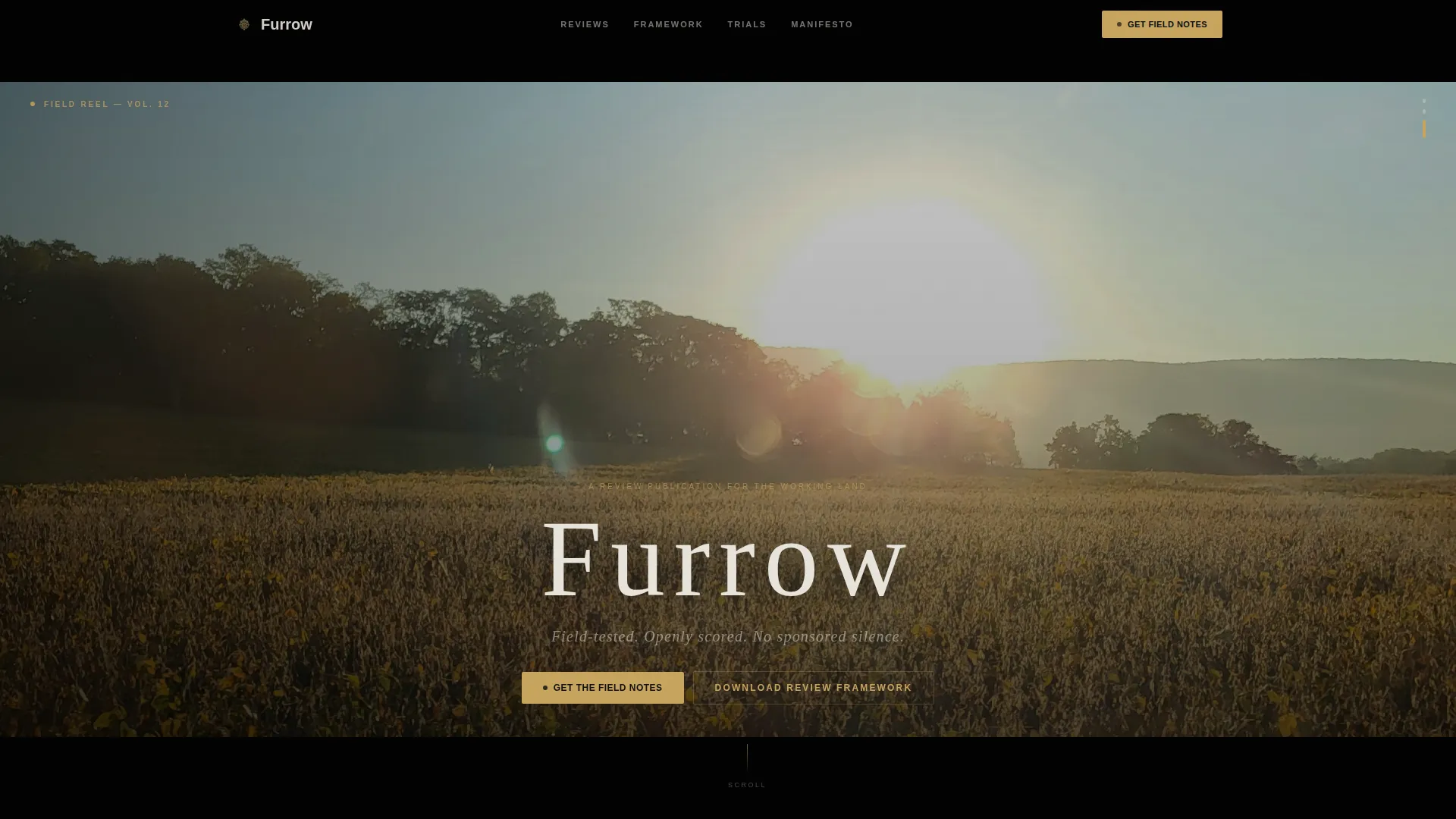
- A letterboxed short-form video hero with ambient field audio design and film-title-card headline typography
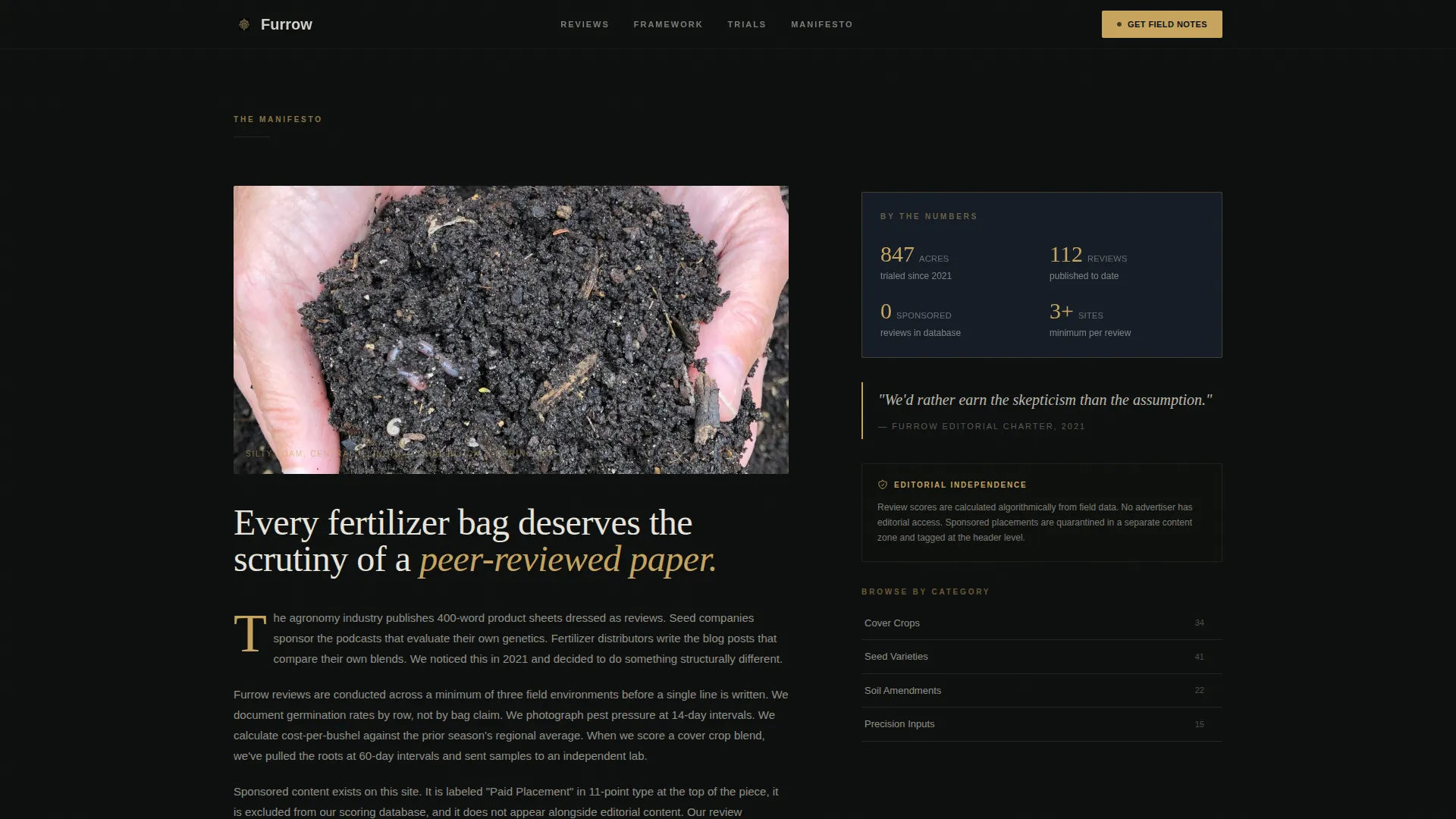
- A 60/40 asymmetric grid with a 60-column editorial rail and a 40-column sticky sidebar for pull quotes, data callouts, and email capture
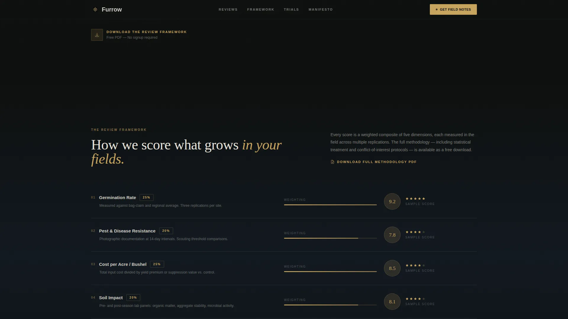
- Scoring rubric cards covering germination rate, pest resistance, and cost-per-acre, plus a top-reviews bento grid with field photography and star ratings
Feature list
This template includes purpose-built sections and interactive components drawn directly from the source brief.
Cinematic Letterboxed Video Hero
The header features a short-form reel shown in a vertical-ratio clip letterboxed into the viewport. The sequence runs eight seconds: a hand pulling a root mass from dark earth, slow-motion soil crumbling, then a combine header cutting through amber wheat at dusk. The blog title appears in thin tracked-out serif type over the final frame, styled as a film title card.
Asymmetric 60/40 Editorial Grid
The layout divides each scroll section into a wide 60-column content rail and a compact 40-column sidebar. The 60-column side carries editorial copy and generous field photography. The 40-column side holds pull quotes, data callouts, and the sticky email capture rail, creating the visual tension of a magazine spread.
Transparent Review Framework Section
Scoring rubric cards display the methodology openly: germination rate, pest resistance, and cost-per-acre are each presented as a distinct card. A secondary call to action offers a free PDF download of the full review framework, requiring no email signup, to reduce friction and demonstrate value first.
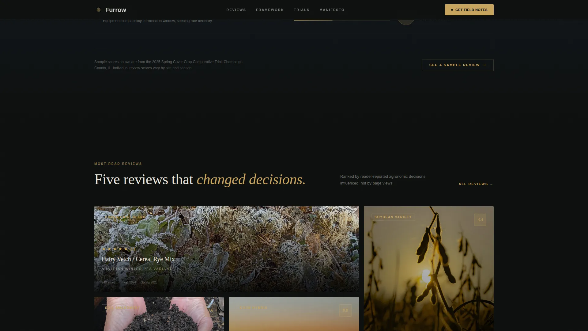
Top Reviews Bento Grid
An asymmetric bento layout presents the five most-read reviews with cropped field photography, star ratings, and crop category tags. Hover states on the review cards surface additional context, making the grid interactive and encouraging deeper exploration.
Sticky Email Capture Rail
A single-field email input is fixed to the bottom of the 40-column sidebar rail. It becomes visible from the second scroll onward and persists as readers move through the page. The primary call to action reads "Get the Field Notes," gating a weekly email digest.
GSAP ScrollTrigger Animations
The template is built with high-animation intent using GSAP ScrollTrigger. Parallax layers, stagger reveal effects, and counter animations bring editorial sections to life as the reader scrolls, reinforcing the cinematic pacing of the overall experience.
Page sections overview
| Section | Purpose |
|---|---|
| Cinematic Video Hero | Opens with a letterboxed 8-second field reel and film-title-card headline |
| Founder Manifesto | Delivers the editorial mission, sponsorship transparency statement, and methodology promise |
| Review Framework Cards | Shows scoring rubrics for germination, pest resistance, and cost-per-acre |
| Top Reviews Grid | Presents five featured reviews with field photography, star ratings, and crop tags |
| Editorial Calendar | Lists current season trial lineup and anchors the sticky email capture rail |
| Page Footer | Closes with a horizontal flow footer pattern |
Design & branding system
The visual identity follows an Atelier Studio theme built on a Cinematic Dark color system. The palette evokes a single lamp illuminating a wooden desk covered in soil samples and contact sheets, everything recedes into darkness except the content that matters.
- Colors: deep loam black (#0D0F0E) as the base, twilight field blue (#1B2838) as the secondary surface, warm grain gold (#C8A45E) as the accent, and chalky soil white (#E8E4DC) for body text
- Typography: Fraunces serif for editorial headlines and pull quotes, DM Sans for body copy and interface elements
- Layout language: deliberate asymmetry, generous whitespace in the wide column, dense typographic blocks in the narrow column, cinematic dark negative space throughout
Mobile & speed optimization
The template is designed desktop-first to honor the 60/40 asymmetric editorial layout at full fidelity. On smaller screens, the two-column structure collapses into a responsive mobile stack so the content hierarchy is preserved.
- Static editorial sections are built with server components to keep initial load fast
- Animation-heavy client components handle GSAP ScrollTrigger, parallax layers, and stagger reveals separately from the static content
- The sticky 40-column email rail adapts to a bottom-anchored bar on mobile, maintaining visibility without obstructing the reading flow
How this template helps you convert
The conversion architecture is built on a principle of earning trust before asking for anything. Every section delivers value first, making the reader feel they have already received something worth coming back for.
- The free PDF framework download appears before any email gate, removing the barrier of commitment and letting readers experience the publication's rigor immediately
- The sticky email rail stays visible from the second scroll onward, so the "Get the Field Notes" prompt is always present without interrupting the editorial reading experience
- The review framework cards, star ratings, and acreage-tested social proof signals build enough credibility that subscribing feels like a logical next step rather than a cold ask
Other information about this template
Furrow is suited for editorial teams who want a template that reflects the same care they put into their fieldwork. A few additional details worth knowing before you build with it.
- The template is categorized under Blog and Editorial, specifically Agriculture Blog and Media, making it a strong fit for independent agronomy publishers
- Animation complexity is high, using GSAP ScrollTrigger for parallax, stagger, and counter effects, customizing or reducing animations is possible by editing the client component layer
- The editorial calendar section is designed to show seasonal trial lineups and can be updated each growing season to keep returning readers engaged
- Copy tone is calibrated for a Midwest and Great Plains agricultural context with English language, United States dollar pricing references, and United States date formatting
- The template style is Asymmetric Grid (60/40) under the Atelier Studio theme with the Cinematic Dark color system, making it visually distinct from standard blog templates
Theme
Atelier Studio
Creative direction
Vision & Mission
Color system
Cinematic Dark
Style
Asymmetric Grid (60/40)
Direction
Content/Resource
Page Sections
Cinematic Letterboxed Video Hero
Asymmetric 60/40 Editorial Grid
Transparent Review Framework Section
Top Reviews Bento Grid
Sticky Email Capture Rail
GSAP Scrolltrigger Animation System
Related questions
Who is this landing page template built for?
Does this template include an email capture feature?
What is the free PDF download section for?
Can the video hero section be customized with my own footage?
Is this template suitable for a mobile audience?



