Restaurant Blog & Media Blog Website Template
Gather is a warm, editorial landing page template built for restaurant industry community forums. It uses an asymmetric 60/40 grid, a Parchment and Rust color system, and an Origin Story creative direction to turn a simple sign-up page into a compelling narrative. The primary call to action, "Pull Up a Chair," drives email capture through a low-friction three-field form.
by Rocket studio
Quick summary
Gather is a single-page, lead generation landing page template designed for restaurant professional communities. It pairs a heavy serif headline with a scroll-driven origin story, asymmetric grid layouts, and a cast-iron dark form panel. Every section builds trust before asking for anything, making sign-ups feel natural rather than transactional.
Who this template is for
This template is built for anyone launching or growing a community platform aimed at restaurant industry professionals. It suits founders who want their landing page to feel lived-in and credible from the very first scroll.
- Community founders building a private forum for cooks, owners, servers, bartenders, or food service suppliers
- Restaurant industry operators who need email capture without a cold, corporate sign-up flow
- Creators and media brands building niche editorial platforms around food service culture
What problem this template solves
Generic community sign-up pages ask for trust before they've earned it. Restaurant workers are skeptical audiences. They need proof of life before they commit their inbox to anything.
- A blank form with no context loses sign-ups from high-intent visitors who just need one more reason to join
- Stock-photo aesthetics signal inauthenticity to industry insiders who can spot a fake community from a mile away
- Long or high-friction forms (asking for last name, restaurant name, and more) push away busy professionals checking a page on their phone mid-shift
What you get with this template
You get a fully structured, single-page lead generation layout built around a six-section narrative flow. Each section is designed to deepen trust before the form appears for the second time.
- A hero section with a giant centered serif headline, a live member counter display, and a primary call-to-action button
- Four proof-building content sections covering the founder origin story, early community thread screenshots, member testimonials, and a live discussion category preview
- A closing form panel in cast-iron dark with a three-field join form and social proof elements, plus a linear single-row footer
Feature list
This template includes a tightly considered set of components, each serving the lead generation goal without adding unnecessary complexity.
Giant Headline Hero Section
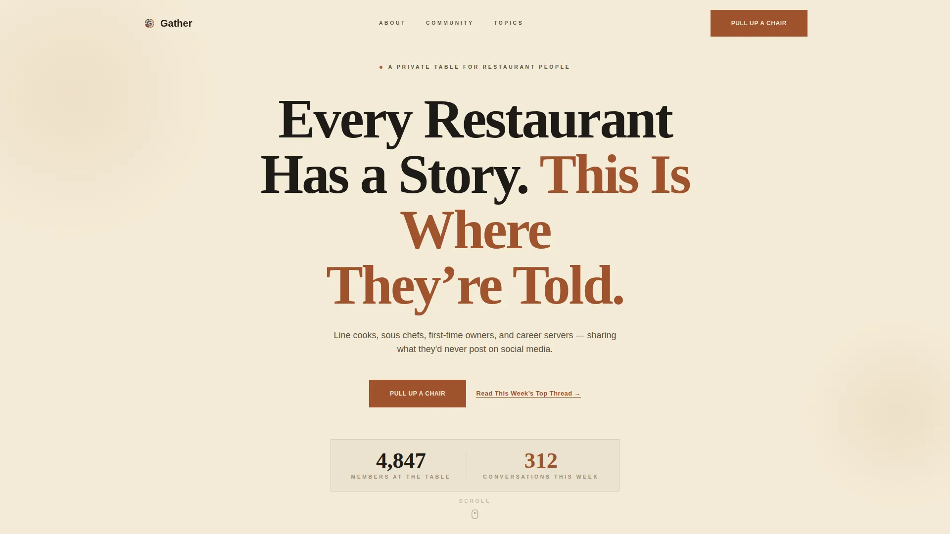
The hero opens with a single, massive centered headline set in a heavy serif typeface styled to look hand-pressed on butcher paper. A live member count and weekly conversation counter sit beneath it as animated living numbers, giving first-time visitors immediate social proof before they read another word.
Asymmetric 60/40 Grid Layout
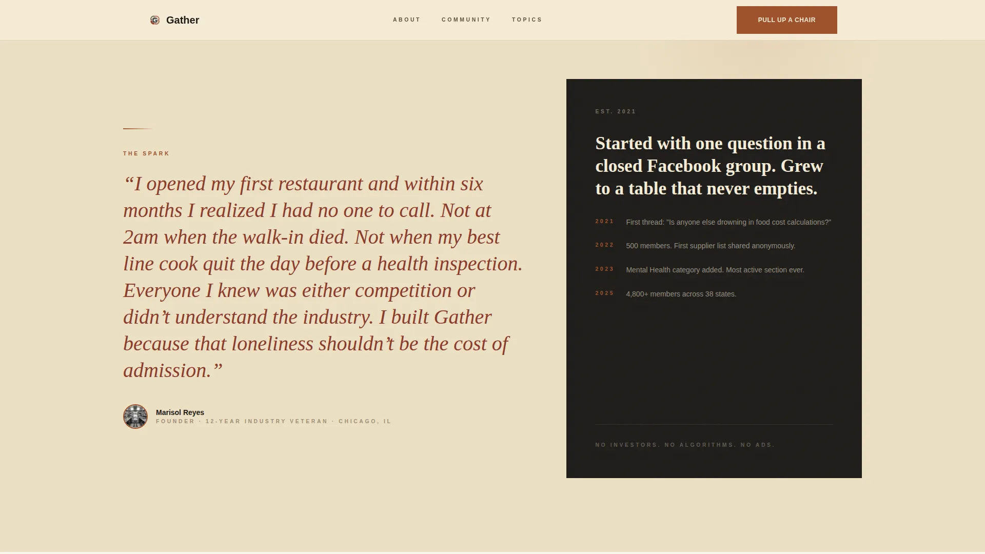
The page uses a deliberate 60/40 column split throughout its middle sections. The wider 60-column side breathes in aged parchment cream, while the 40-column side anchors content in deep cast-iron black with reversed cream type. This contrast makes the layout feel editorial and intentional rather than templated.
Origin Story Scroll Sequence
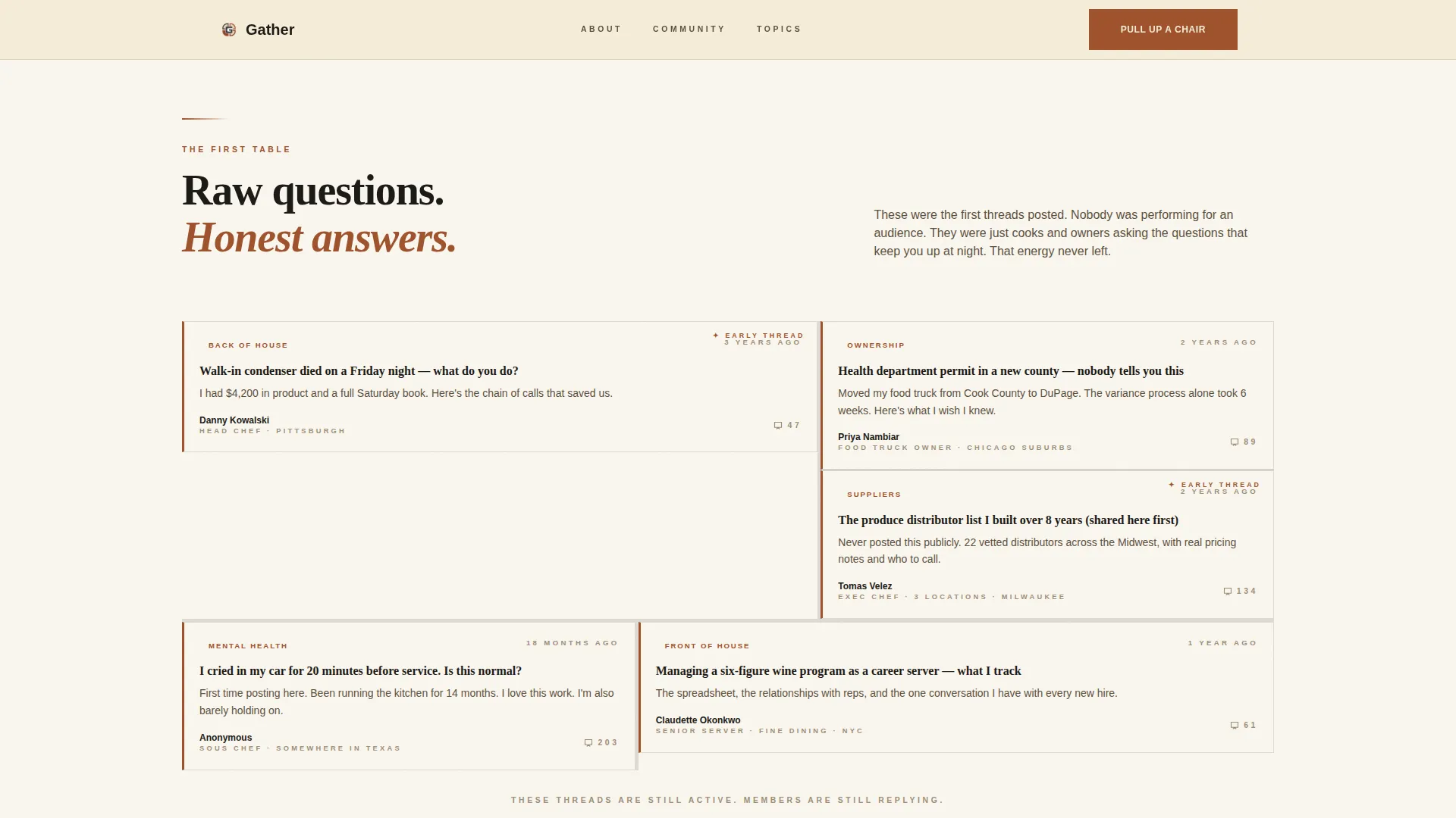
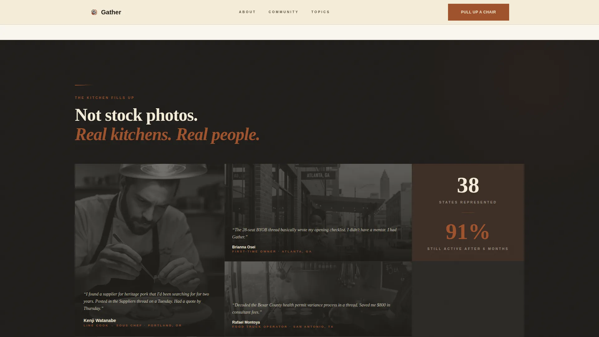
Four named content sections, The Spark, The First Table, The Kitchen Fills Up, and The Menu Today, unfold as visitors scroll. Each section adds a new layer of community proof, moving from a founder quote to raw thread screenshots to member testimonials to live discussion categories.
Low-Friction Three-Field Join Form
The "Pull Up a Chair" form asks only for industry role (via dropdown), first name, and email. No last name, no restaurant name. The form appears twice: once beneath the hero and once anchored at the bottom of the page inside a cast-iron dark panel, giving hesitant visitors a second chance to commit.
Gated Thread Preview Path
A secondary conversion path offers a "Read This Week's Top Thread" link. It opens a gated preview that captures email on exit, giving visitors who are not ready to fully join a softer on-ramp into the community.
Discussion Category Bento Grid
The "Menu Today" section displays current forum categories, including Back of House, Front of House, Ownership, Suppliers, and Mental Health, inside a bento-style grid with post counts. This makes the community feel active and specific rather than hypothetical.
Page sections overview
| Section | Purpose |
|---|---|
| Hero Headline Panel | Introduce the community with a bold centered headline and animated member counter |
| The Spark | Share the founder origin story through a pull-quote and atmospheric narrative copy |
| The First Table | Display early thread screenshots in a 60/40 asymmetric layout as raw community proof |
| The Kitchen Fills Up | Present member testimonials and real member photos in an asymmetric dark panel |
| The Menu Today | Preview active discussion categories in a bento grid with a secondary call to action |
| Pull Up a Chair | Collect sign-ups via a three-field form inside a cast-iron dark closing panel |
| Single-Row Footer | Provide essential links in a clean linear single-row footer layout |
Design & branding system
The visual identity draws from a Warm Artisan editorial approach, combining the tactile warmth of a working kitchen with the intentional weight of hand-set type. Every color and font choice is calibrated to signal authenticity to an industry audience.
- Color system uses four values: aged parchment cream (#F5ECD7) for primary backgrounds, deep cast-iron black (#1C1A17) for body text, oxidized rust (#A0522D) for buttons and accent borders, and smoked paprika (#8B3A2A) for hover states and pull-quotes
- Typography pairs Fraunces as the heavy display serif for headlines with DM Sans as the clean, readable body font
- A faint linen grain texture overlays the hero background, and a worn-booth aesthetic carries through the overall visual tone
Mobile & speed optimization
The template is built desktop-first but adapts strongly to smaller screens. Restaurant workers often check community platforms on a phone during breaks, so the mobile experience is treated as a genuine priority, not an afterthought.
- Scroll reveal animations with stagger effects are set to medium intensity, keeping motion present without overwhelming mobile performance
- The three-field form is touch-friendly by design, with minimal fields that reduce typing friction on a small screen
- Server Components handle static content sections while Client Components manage the animated counter and form, keeping the interactive layer lean
How this template helps you convert
Every design and copy decision in this template is aimed at lowering the barrier to sign-up while raising trust at each scroll step.
- The living member counter in the hero delivers immediate social proof before a visitor reads a single sentence of body copy, answering the unspoken question of whether the community is real and active
- The origin story scroll sequence, moving through the founder quote, early thread screenshots, real member testimonials, and active category previews, builds credibility section by section so the form at the bottom feels earned rather than pushy
- The secondary gated thread preview path catches visitors who are curious but not yet ready to commit, giving them a taste of the content and capturing their email in the process
Other information about this template
This template sits at the intersection of Blog and Editorial design with a Restaurant Blog and Media subcategory focus. It is purpose-built for the Restaurant Community Forum niche.
- The creative direction is Origin Story, meaning the page structure mirrors the narrative arc of a community coming to life rather than presenting a static feature list
- The header concept is Giant Headline Centered, a single bold statement that sets tone before any other content competes for attention
- The template style is Asymmetric Grid (60/40), which is unusual in the community forum space and signals editorial confidence
- The theme is Warm Artisan, drawing visual cues from exposed brick, butcher paper, and cast-iron cookware rather than tech startup aesthetics
- Form validation is included for the three-field join form, and the FAQ-style accordion component supports thread preview interactivity within the page
Theme
Warm Artisan
Creative direction
Origin Story
Color system
Parchment & Rust
Style
Asymmetric Grid (60/40)
Direction
Lead Generation
Page Sections
Giant Headline Hero with Live Counter
Asymmetric 60/40 Grid Layout
Origin Story Scroll Sequence
Low-friction Three-field Join Form
Gated Thread Preview Path
Discussion Category Bento Grid
Related questions
What kind of community is this template designed for?
Does this template work for a community that is just getting started?
How does the two-form layout help with sign-ups?
What is the gated thread preview and how does it work?
Is the template usable on mobile devices?



