Beauty & Salon Blog & Media Specialist Blog Website Template
Gloss is a cinematic dark landing page template for beauty and salon industry publishers. Built on a 60/40 asymmetric grid, it delivers editorial-magazine authority through a full-bleed hero, department-style scroll sections, and a gold-accented interactive system. It is designed to earn reader trust and drive clicks through to full reports.
by Rocket studio
Quick summary
Gloss is a single-page editorial template for beauty industry intelligence publications. It combines a cinematic dark color palette with an asymmetric grid layout to create the visual weight of a premium print magazine. Department sections, pull quote breaks, and a slim subscription banner guide readers from first impression to click-through.
Who this template is for
This template is built for publishers who treat beauty as a serious business discipline. It speaks directly to people who need their platform to carry editorial credibility before asking for any commitment.
- Salon owners who scan for pricing strategy and revenue benchmarks between client appointments
- Indie brand founders tracking ingredient trends ahead of formulation decisions
- Beauty school graduates and emerging professionals mapping where money moves in the industry
What problem this template solves
Most beauty blog templates feel like lifestyle mood boards. They look aspirational but offer no sense of analytical depth or business authority. Gloss solves the gap between visual beauty and editorial substance.
- Generic blog layouts bury high-value industry data inside templates that feel too casual for professional readers
- Click-through rates suffer when readers cannot gauge content depth from the landing page alone
- Building subscription trust requires showing enough insight to prove the publication earns attention
What you get with this template
You get a complete, production-ready landing page that functions as both a curated editorial front page and a click-through engine. Every layout decision reinforces the sense that the content behind each card is worth reading in full.
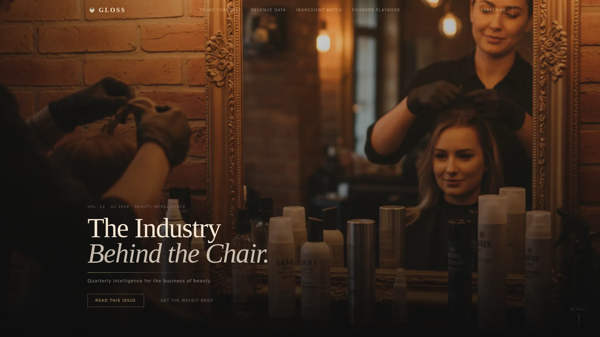
- A full-bleed cinematic hero with a low-left serif headline and a gold rule underline
- A 60/40 asymmetric grid that flips weight between departments, mimicking the rhythm of turning magazine pages
- Department sections covering Trend Forecast, Revenue Data, Ingredient Watch, and Founder Playbook
- Report cards with first-two-paragraph previews and data visualization glimpses to prove content depth
- A slim email capture banner placed between departments for readers already convinced by the content
Feature list
This section describes the core built-in capabilities delivered by the Gloss template.
Asymmetric Editorial Grid
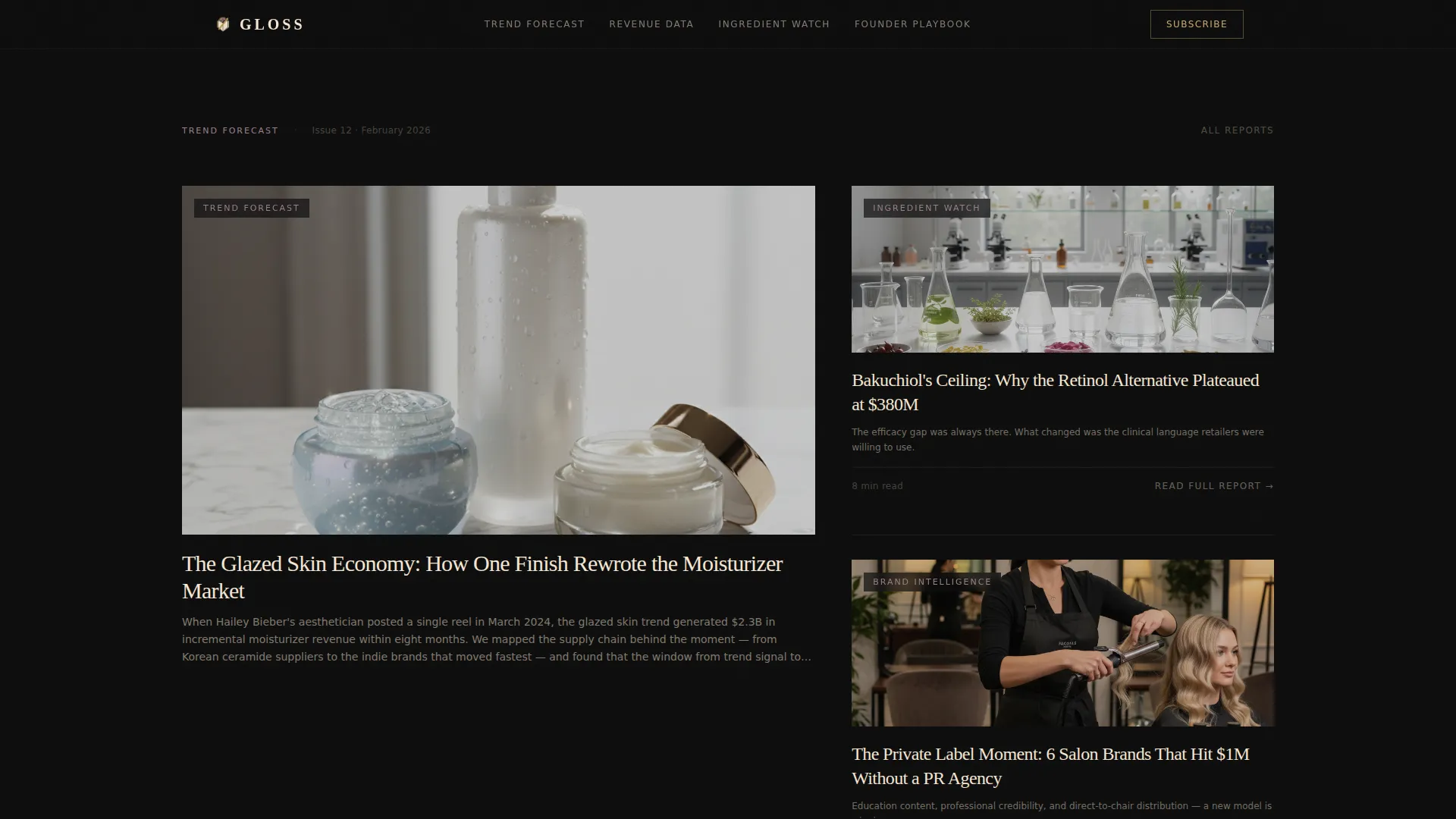
The 60/40 column grid alternates dominance section by section. The left-heavy then right-heavy rhythm gives each department its own visual weight, preventing the page from feeling like a uniform blog roll.
Full-Bleed Cinematic Hero
The hero image bleeds edge to edge with no visible margin. A shallow-depth-of-field salon scene carries a cream serif headline low-left in the frame, with a thin gold rule anchoring the subheadline beneath it.
Department-Style Scroll Sections
Four editorial departments structure the scroll: Trend Forecast, Revenue Data, Ingredient Watch, and Founder Playbook. Each department is a self-contained visual unit with its own grid weight, imagery, and editorial lede.
Gold Interactive System
Gold is reserved exclusively for interactive elements. Hover states on report cards reveal a gold underline that slides in from the left. Every clickable element feels distinguished from the static layout around it.
Pull Quote and Subscribe Banner
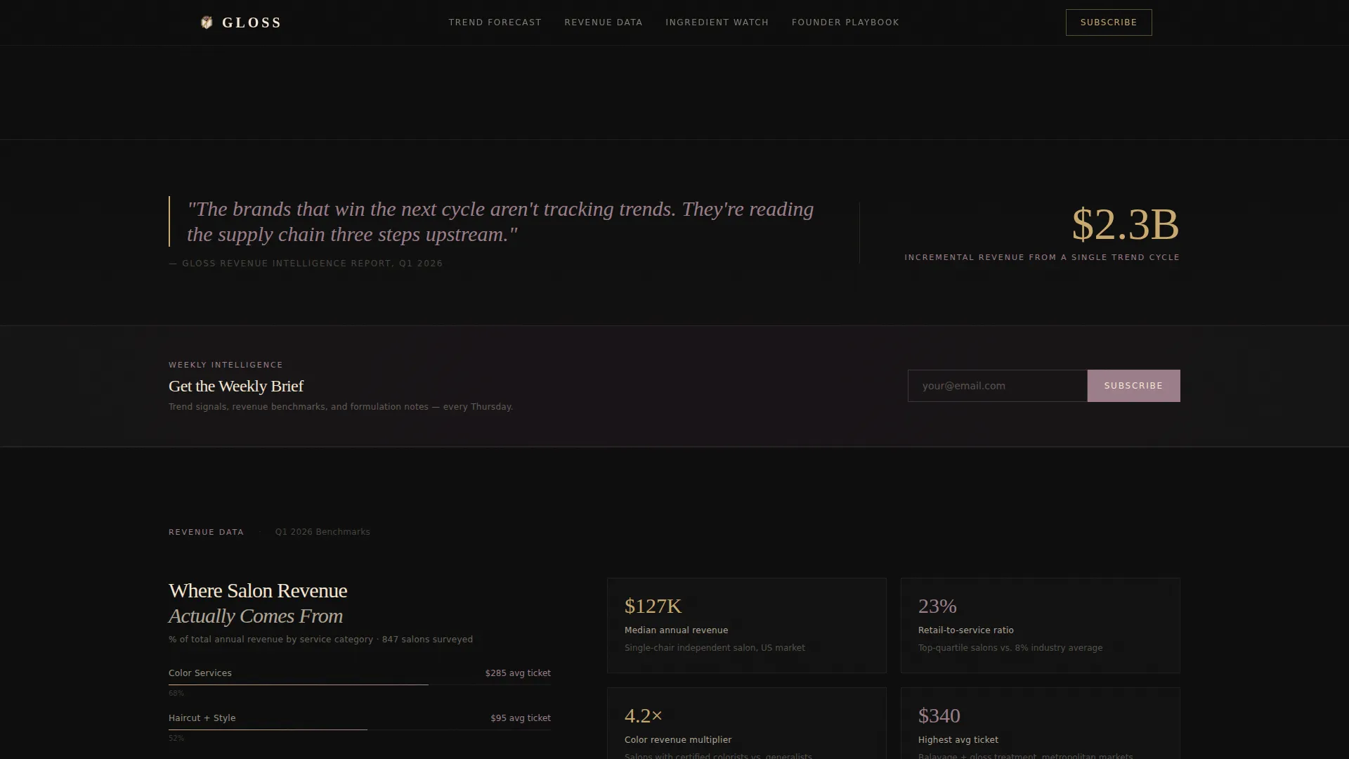
Mauve italic pull quotes break between departments as editorial marginalia. A slim banner between the second and third departments holds a single email field and a subscribe button, capturing readers mid-scroll without interrupting the editorial flow.
High-Fidelity Animation Layer
The template includes parallax scrolling on the hero, stagger reveal animations on cards, scroll-linked marquee elements, and gold rule animations. These interactions reinforce the cinematic, high-production feel throughout the page.
Page sections overview
| Section | Purpose |
|---|---|
| Full-Bleed Hero | Establishes cinematic editorial authority with headline and gold rule |
| Trend Forecast Department | Features oversized report image with three-line editorial lede |
| Stacked Report Cards | Two smaller reports with cropped thumbnails and single-sentence hooks |
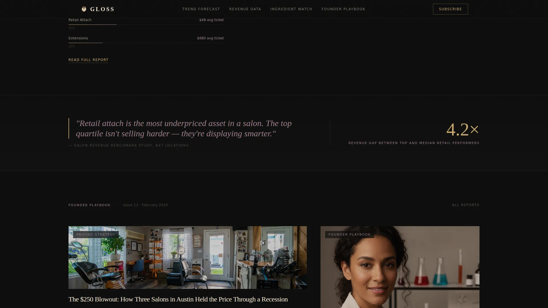
| Pull Quote Break | Mauve italic marginalia separating editorial departments |
| Subscribe Banner | Slim email capture between second and third departments |
| Revenue Data Department | Flipped 40/60 grid with data visualization preview |
| Ingredient Watch Section | 60/40 bento layout with cropped thumbnails |
| Founder Playbook Section | Bento-style cards with editorial hooks and gold hover states |
| Page Footer | Horizontal footer pattern closing the editorial experience |
Design & branding system
The visual identity follows an editorial magazine aesthetic built on a cinematic dark color system. Every color in the palette carries a specific role, and that discipline is what gives the design its authority.
- Deep editorial black (#0D0D0D) dominates the canvas; warm cream (#F5E6D3) carries all body text and headlines; muted mauve (#9B7E8A) tags categories and metadata
- Liquid gold (#C9A96E) is reserved for hover states, pull quotes, and call-to-action borders, so every interactive moment feels like jewelry against the dark canvas
- Typography uses Fraunces for serif headlines and DM Sans for body copy and interface elements, creating a clear hierarchy between editorial voice and functional text
Mobile & speed optimization
The template is built desktop-first, reflecting how the target audience reads between appointments on larger screens. Mobile experience is supported through a dedicated floating interaction layer.
- A floating bottom bar on mobile surfaces the primary "Read the Full Report" call to action persistently, so readers never lose the click path as they scroll
- Server Components handle static editorial content while Client Components manage scroll-driven animations, keeping the interactive layer from slowing down content delivery
- Stagger reveal and parallax effects are structured to run without blocking the initial page render
How this template helps you convert
Gloss earns trust before it asks for anything. The layout is engineered so readers feel the depth of the content before they decide whether to click or subscribe.
- Each report card surfaces the first two paragraphs and one data visualization, giving readers just enough to confirm the full article is worth their time without satisfying their curiosity completely.
- The "Read the Full Report" call to action appears at the base of every card and again in the mobile floating bar, keeping the primary conversion path visible at every scroll position.
- The subscribe banner appears only after readers have passed two departments, placing the email ask at the moment of highest earned trust rather than at the top of the page.
Other information about this template
This template sits at the intersection of editorial design and beauty industry publishing. It is a strong fit for quarterly intelligence publications, industry report blogs, and premium beauty media brands looking to launch or refresh their digital presence.
- The template is categorized under Blog & Editorial with a Beauty & Salon Industry Report Blog niche alignment
- Layout style is Asymmetric Grid (60/40) under an Editorial Magazine theme with a Cinematic Dark color system
- The creative direction follows a Curated Collection approach, and the landing-page direction is optimized for Click-Through
- The header concept is Full-Bleed Photo, consistent with high-production editorial photography standards
- Localization is set to English (US) with USD currency formatting and MM/DD/YYYY date display
Theme
Editorial Magazine
Creative direction
Curated Collection
Color system
Cinematic Dark
Style
Asymmetric Grid (60/40)
Direction
Click-Through
Page Sections
Asymmetric 60/40 Editorial Grid
Full-bleed Cinematic Hero Section
Department-style Scroll Architecture
Gold-only Interactive Layer
Report Preview with Data Glimpse
Inline Subscribe Banner
Related questions
Is this template suitable for a publication covering multiple beauty topics?
Does this template include a subscription form?
Do I need custom photography to use this template effectively?
Who is the floating mobile call-to-action bar designed for?
Can I adapt the editorial department names to fit my publication?



