Funko Pop Podcast Landing Page Template
Grail is a coming-soon landing page template built for a Funko Pop collecting podcast. It uses an asymmetric 60/40 grid, a zine-editorial visual identity, and a chapter-by-chapter scroll flow to tell the show's story before it launches. A waitlist form with audience segmentation and a community grail submission field help build an engaged list from day one.
by Rocket studio
Quick summary
Grail is a single-page waitlist template for a Funko Pop collecting podcast. It opens like a graphic novel and scrolls like a manifesto. The 60/40 asymmetric grid alternates illustration and text across every chapter section. A bookmark-ribbon form captures emails and segments collectors from curious newcomers before the first episode drops.
Who this template is for
This template is built for podcast creators in the collector and enthusiast space who want to build an audience before they go live. It works especially well for hosts who want their launch page to feel as considered as the show itself.
- Funko Pop collectors launching a podcast or collector-focused show
- Podcast creators who want a pre-launch waitlist page with community hooks
- Designers and developers building editorial-style landing pages for niche content brands
What problem this template solves
Most podcast launch pages are generic. They show a logo, a short description, and a subscribe button. That approach does nothing to communicate the personality of the show or give potential listeners a reason to care before episode one.
- There is no way to signal the show's voice, values, or community stance through a standard template
- A plain form page wastes the opportunity to collect meaningful audience data, like whether someone is a seasoned collector or a curious newcomer
- Coming-soon pages rarely create conversation; this one opens with a field asking visitors to share their rarest find
What you get with this template
You get a fully structured, design-ready landing page that reads like a printed publication. Every section has a defined purpose, a layout direction, and a visual role in the overall story. Nothing is generic filler.
- A five-section chapter-by-chapter page layout covering hero, host intro, mission manifesto, episode format previews, and waitlist capture
- An asymmetric 60/40 grid that alternates illustration and copy sides across sections, creating a graphic-novel reading rhythm
- A bookmark-ribbon waitlist form fixed to the screen edge, with a "Collector or Curious?" audience toggle and a "What's your grail?" community submission field
Feature list
This template includes the following built-in features drawn directly from the design brief.
Chapter-Style Hero Section
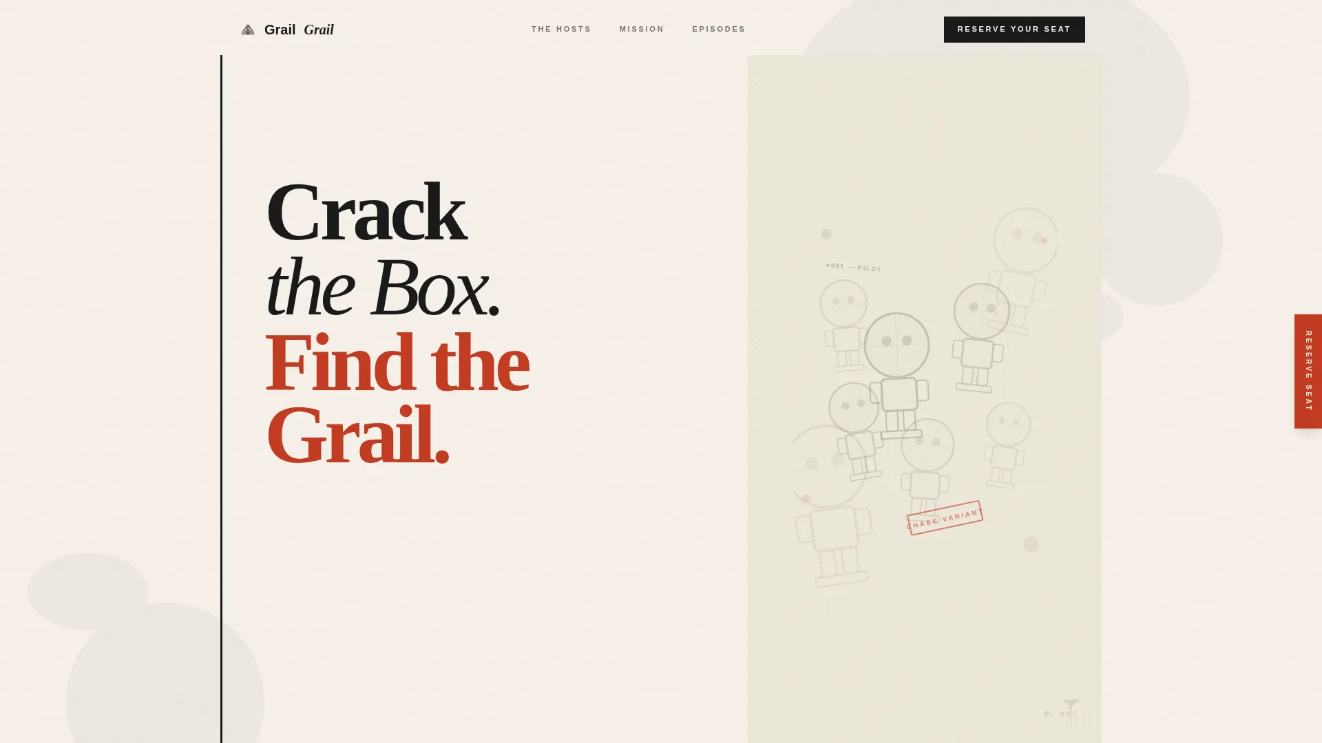
The hero is designed as a physical book spread. The left 60% displays a hand-illustrated chapter title page reading "Chapter One: The Hunt Begins" in a display serif typeface with ink-splatter flourishes. The right 40% shows a stack of crosshatch-style Funko silhouettes. A page-curl animation in the corner invites the first scroll.
Alternating 60/40 Grid Layout
Each chapter section flips which side carries the illustration and which carries the text. This creates a natural reading rhythm that feels closer to turning pages in a graphic novel than scrolling a standard webpage.
Bookmark Ribbon Waitlist Form
A thin bookmark ribbon is fixed to the right edge of the screen. On click, it expands to reveal a single email input, an audience toggle labeled "Collector or Curious?", and a text field asking "What's your grail?" This segments your list and seeds future episode content from launch day.
Manifesto Chapter Sections
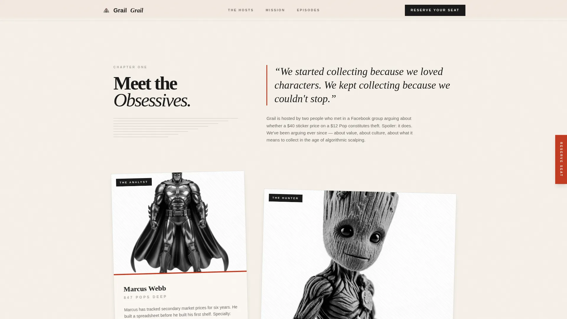
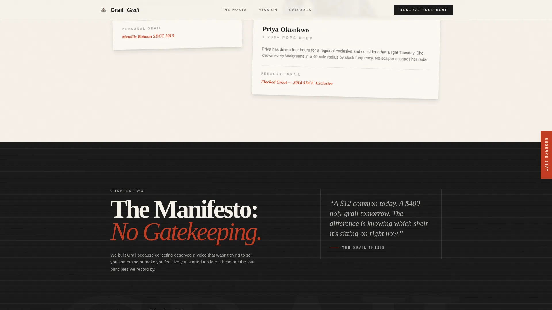
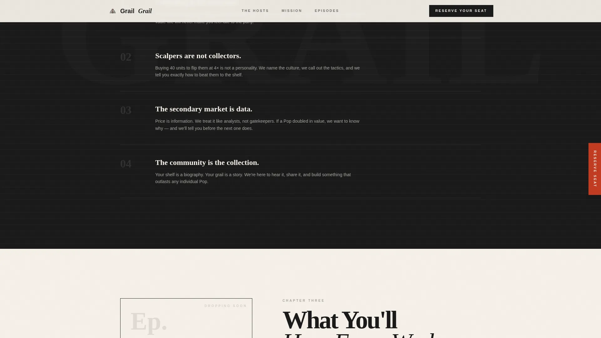
Three distinct content chapters carry the editorial voice of the show. Chapter One introduces the hosts. Chapter Two delivers the mission: accessible collecting, anti-gatekeeping, and honest market commentary. Chapter Three previews episode formats including unboxings, market analysis, and guest interviews.
Ink and Paper Visual System
The entire page uses a warm, tactile color palette. Ink bleed textures appear on section dividers. A paper-grain overlay sits across every background. The result feels like a hand-lettered zine, not a generic web template.
GSAP Scroll and Animation Layer
The template includes high-interactivity animation built with GSAP ScrollTrigger. Scroll reveals, a marquee element, the page-curl effect, and the bookmark ribbon expansion are all part of the interaction layer described in the brief.
Page sections overview
| Section | Purpose |
|---|---|
| Hero Book Spread | Opens the page as a chapter title page with crosshatch Funko silhouettes and a page-curl scroll invite |
| Chapter One: Hosts | Introduces the podcast hosts using alternating 40/60 layout with rotated portrait cards |
| Chapter Two: Mission | Delivers the show's manifesto with full-width editorial styling and pull quotes |
| Chapter Three: Episodes | Previews episode formats using bento-style asymmetric cards |
| Waitlist Capture | Email form with audience toggle and community grail submission field |
| Footer | Horizontal flow footer pattern closing the page |
Design & branding system
The visual identity follows an Ink and Paper theme. Every design choice reinforces the feeling of a photocopied zine, warm and deliberately imperfect rather than polished and corporate.
- Color palette: unbleached page cream (#F5F0E8) as the base, India ink black (#1A1A1A) for primary text, pencil-sketch gray (#A8A4A0) for secondary elements, and editorial red (#C23B22) reserved for alerts, drop countdowns, and hover states
- Typography: Fraunces as the display serif for headings and chapter titles, paired with DM Sans for all body text
- Texture details: ink bleed textures on section dividers and a paper-grain overlay across every background surface
Mobile & speed optimization
The template is built desktop-first with a strong mobile adaptation in mind. The asymmetric grid and animation layer are designed to reflow cleanly across screen sizes without losing the editorial character of the layout.
- CSS animations and GSAP ScrollTrigger are used together to keep the animation layer performant across devices
- The bookmark ribbon and form toggle are built to function on both desktop and mobile interaction patterns
- The 60/40 grid alternates intentionally on desktop and stacks with maintained visual hierarchy on smaller screens
How this template helps you convert
The page is structured to move a visitor from curiosity to commitment across a short, engaging scroll. Every section earns the next one.
- The hero section opens with strong visual identity and an unmistakable chapter metaphor, which immediately communicates that this show has a point of view worth paying attention to.
- The mission chapter gives potential listeners a reason to care, making it clear what the show stands for before asking anything of them.
- The waitlist form asks for two things beyond an email: an audience type and a personal grail submission, turning sign-up into a two-way conversation that makes the visitor feel like a founding community member.
Other information about this template
This template is part of the Blog and Editorial category and sits within the Funko Pop collecting content subcategory. It is a strong fit for any niche entertainment or collector-culture podcast that wants to launch with presence.
- The template style is classified as Asymmetric Grid (60/40), making it suitable for editorial brands that want layout variety without a fully custom build
- The creative direction follows a Vision and Mission flow, meaning the page reads as a statement of intent rather than a product pitch
- The header concept is Chapter/Book, placing the show's identity inside a narrative frame from the very first screen
- The landing page direction is Waitlist and Coming Soon, so the primary goal is list-building and community seeding before launch
- This template sits at the intersection of Blog and Editorial design and collector-community content, giving it a focused niche identity that generic podcast templates do not offer
Theme
Ink & Paper
Creative direction
Vision & Mission
Color system
Ink & Paper
Style
Asymmetric Grid (60/40)
Direction
Waitlist/Coming Soon
Page Sections
Chapter-style Hero Section
Alternating 60/40 Grid Layout
Bookmark Ribbon Waitlist Form
Three Manifesto Chapter Sections
Ink and Paper Visual System
GSAP Scroll and Animation Layer
Related questions
Can I use this template without any podcast episodes recorded yet?
How does the "Collector or Curious?" toggle work?
What is the "What's your grail?" field for?
Does the asymmetric grid still work on mobile screens?
Can the editorial red be used for a countdown or drop alert?



