Music History Blog Editorial Landing Page Template
Groove is an editorial music history landing page template built for blogs that dig deeper than the surface. It pairs a broadsheet-style masthead with themed issue blocks, pull quotes, and a quiet inline subscription prompt. The result feels like a carefully curated print magazine, warm, analog, and impossible to skim past without reading.
by Rocket studio
Quick summary
Groove is a single-page editorial template designed for music history blogs. It opens with a newspaper masthead, moves through curated "issue" blocks with featured stories and article clusters, and closes with a searchable archive call to action. The palette, typography, and layout all evoke the feeling of a well-thumbed music biography.
Who this template is for
Groove is built for writers and publishers who treat music history as serious journalism. If your readers return at 2 a.m. to chase a half-remembered session detail, this template speaks their language.
- Crate-diggers and music theory students who expect depth and credibility from the publications they follow
- Podcast hosts and culture writers who need a searchable story archive and well-sourced reference material
- Independent editorial teams running niche music history blogs that deserve a publication-grade presence
What problem this template solves
Most blog templates are built for news feeds and listicle formats. They push content out in reverse-chronological order and give every story the same visual weight. That format works against long-form editorial work about uncredited session musicians, studio accidents, and overlooked B-sides.
- Generic blog layouts flatten every story to the same visual importance, making deep research feel throwaway
- Standard templates offer no editorial rhythm, readers scroll without a sense of discovery or pace
- Conversion prompts interrupt the reading experience with modals and gates, breaking trust before it builds
What you get with this template
Groove delivers a complete single-page layout that reads like a front-page broadsheet and moves like a curated magazine. Every section is designed to hold attention and reward the kind of reader who finishes the article before clicking anything.
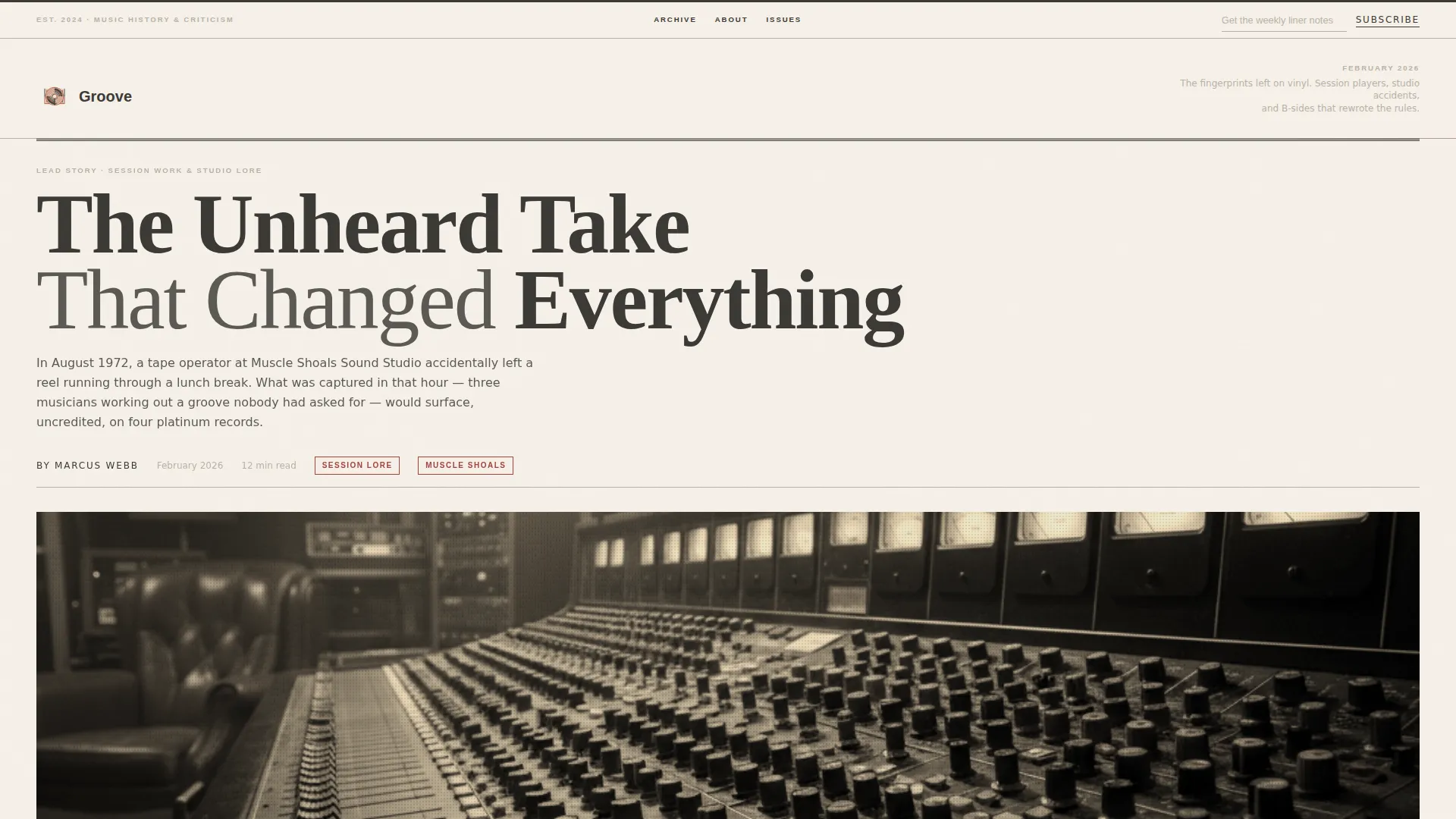
- A broadsheet masthead hero with a four-column headline, halftone console photograph, studio caption, and small-caps dateline
- Three themed editorial issue blocks, each with a featured story, article cluster grid, and pull quote interstitial
- A persistent masthead subscription field and a mid-page archive call to action placed after the reader is already engaged
Feature list
Groove ships with a tightly considered set of layout and interaction features drawn directly from its editorial brief.
Broadsheet Masthead Hero
The hero opens with a hand-set serif title, an enormous four-column lead headline, and a halftone-grain recording console photograph. A small-caps dateline anchors the current month. The composition is designed to look like a front page worth framing.
Themed Issue Blocks
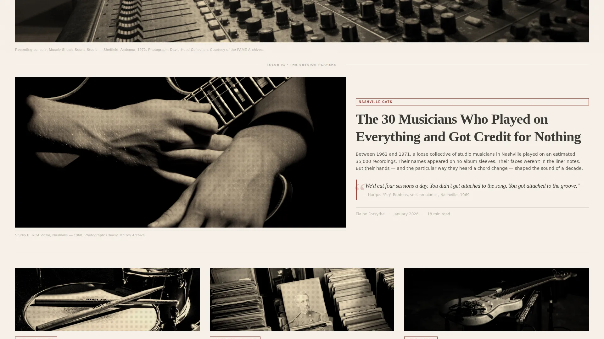
The page is organized into self-contained editorial "issues," each with its own featured image, pull quote, and three-article cluster. Background warmth shifts subtly between cream and parchment as you move between issues, giving the impression of turning through chapters of the same book.
Alternating Grid Rhythm
Layout alternates between full-width hero stories and tight two-column article grids. Interstitial dividers use thin ruled lines and small ornamental glyphs. The rhythm prevents the eye from settling, keeping readers browsing the way they flip through a print magazine.
Inline Subscription Prompt
A single email field sits quietly in the masthead gutter with the prompt "Get the weekly liner notes" and a submit button reading "Subscribe." There is no modal and no content gate. The writing earns the signup.
Archive Call to Action
"Open the Archive" appears after the third editorial block, once the reader is already invested. It links to a searchable story index. Placement is deliberate, it arrives at the moment curiosity peaks, not before.
Scroll-Triggered Animations
Sections enter with a fade and slide on scroll. Article card hover states, hover-activated pull quotes, and beam-style ruled line transitions add tactile responsiveness without distracting from the content.
Page sections overview
| Section | Purpose |
|---|---|
| Masthead Hero | Broadsheet front page with four-column headline, halftone console photo, and dateline |
| Issue 01 Block | Full-width featured story plus three-article asymmetric cluster grid |
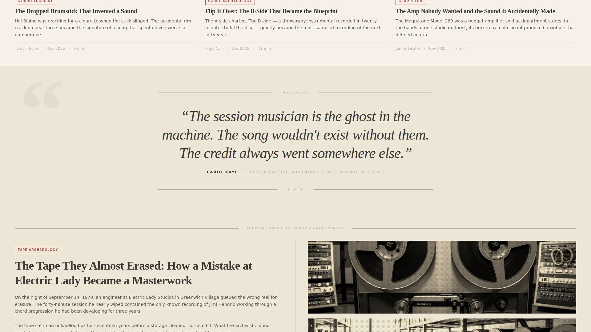
| Pull Quote Interstitial | Parchment-toned divider with editorial red pull quote and ruled ornamental line |
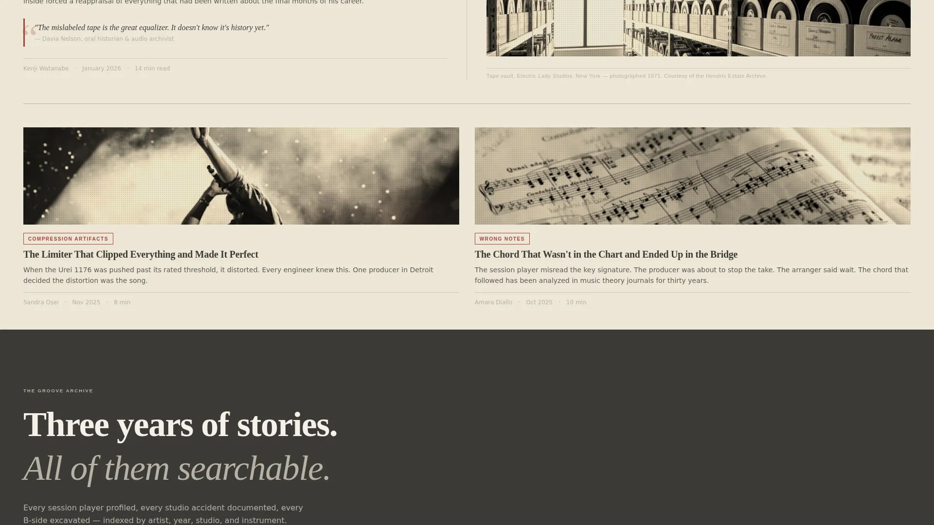
| Issue 02 Block | Two-column editorial grid with featured image and article cluster |
| Archive Call to Action | "Open the Archive" prompt linking to the searchable story index |
| Issue 03 Block | Tight article grid with inline email subscription field |
| Editorial Footer | Minimal horizontal footer in the editorial broadsheet style |
Design & branding system
Groove uses a Soft Mist color palette drawn from the textures of aged print media. Typography pairs a historical serif for headlines with a clean sans-serif for body copy and interface elements, keeping reading comfortable across long editorial passages.
- Color system: aged newsprint cream (#F5F0E8), faded ink charcoal (#3B3A36), pencil-margin gray (#B8B2A6), and muted editorial red (#A4443B) reserved for pull quotes and hover states
- Typography: Fraunces serif for all display headlines and section titles, DM Sans for body copy and user interface text
- Visual details: halftone grain photography treatment, thin ruled dividers, small ornamental glyphs, and background warmth that shifts gradually from cream to parchment across issue sections
Mobile & speed optimization
Groove is designed desktop-first to honor the long-form reading experience, but the layout is fully responsive and adapts cleanly to smaller screens.
- Multi-column broadsheet grids reflow into single-column stacks on mobile without losing editorial hierarchy
- Server Components handle static editorial content, keeping the initial page load lean for text-heavy sections
- Animations use scroll-triggered fade and slide rather than autoplay, so they do not affect perceived load time on slower connections
How this template helps you convert
Groove is built around the idea that trust precedes action. Conversion prompts are placed where reader investment is highest, not where attention is most fragile.
- The masthead subscription field is always visible but never intrusive, it sits in the gutter without competing with the headline, so readers who arrive ready to subscribe can act immediately without being pushed
- "Open the Archive" appears after the third editorial block, timed to the moment a reader has moved through enough content to feel the breadth of what Groove covers and wants to go deeper
- The writing-first structure means every element earns the next, readers who finish an issue block are already in a state of engagement when the conversion prompt arrives, making the ask feel natural rather than transactional
Other information about this template
Groove is categorized under Blog and Editorial templates, sitting at the intersection of History and Culture blogs and music history publishing. It is well-suited for independent publishers who want a template that communicates editorial seriousness without requiring a custom build.
- Template style: Editorial and Magazine, built on a Heritage and Story theme
- Creative direction: Curated Collection, organizing content into discrete issues rather than a continuous feed
- Header concept: Newspaper and Publication masthead, using broadsheet typographic conventions
- Social proof elements in the template include byline slots, studio credits, session year references, and a reader count display ("12,000 liner notes delivered weekly")
- The footer follows a minimal horizontal editorial pattern consistent with the broadsheet aesthetic throughout
- Localization is set to English (US) with an editorial date format of Month and Year, no currency symbols
Theme
Heritage & Story
Creative direction
Curated Collection
Color system
Soft Mist
Style
Editorial/Magazine
Direction
Content/Resource
Page Sections
Broadsheet Masthead Hero
Themed Editorial Issue Blocks
Alternating Grid Layout
Persistent Inline Subscription Field
Deliberate Archive Call to Action
Scroll-triggered Hover Interactions
Related questions
Who is the ideal reader this template is designed to attract?
Does the template include a way for readers to subscribe without a popup?
How does the archive call to action work within the layout?
Can the color palette and typography be adjusted to match a different brand?
Is this template suitable for a blog that publishes new content regularly?



