Editorial Agriculture Podcast Landing Page Template
Harvest is a horizontal-scroll landing page template for an agricultural podcast and editorial media brand. Built around a broadsheet newspaper aesthetic, it presents weekly episodes as curated magazine features with inline audio players, thematic panel groupings, and a gentle email capture prompt. The design is desktop-first with a warm, restrained palette that feels like quality print journalism.
by Rocket studio
Quick summary
Harvest is a single-page editorial template designed for an agriculture podcast brand. It combines a newspaper-style masthead, a smooth horizontal scroll experience, and inline episode players to create a content destination that feels unhurried and authoritative. The palette, typography, and layout work together to treat every episode like a feature story worth reading slowly.
Who this template is for
This template is built for creators and brands at the intersection of agriculture and editorial storytelling. If your audience respects depth over noise, this layout earns their attention.
- Agriculture podcast hosts and independent media producers who want a premium content home
- Agricultural extension professionals, ag-tech founders, and farming communities who publish long-form audio
- Farm media brands and rural journalism outlets looking for a visually distinctive landing page
What problem this template solves
Most podcast landing pages look like generic link lists. They move too fast, offer no editorial context, and give no reason to linger. For an agriculture audience that values substance, that approach fails.
- Visitors leave quickly when there is no clear hierarchy or editorial framing around episodes
- A fragmented layout forces listeners to hunt for content instead of flowing naturally through it
- The email subscription ask often feels abrupt because nothing has earned trust first
What you get with this template
You get a complete, publication-quality landing page that presents your podcast archive as a curated editorial experience. Every section is purposefully designed to slow the visitor down and draw them deeper into the content.
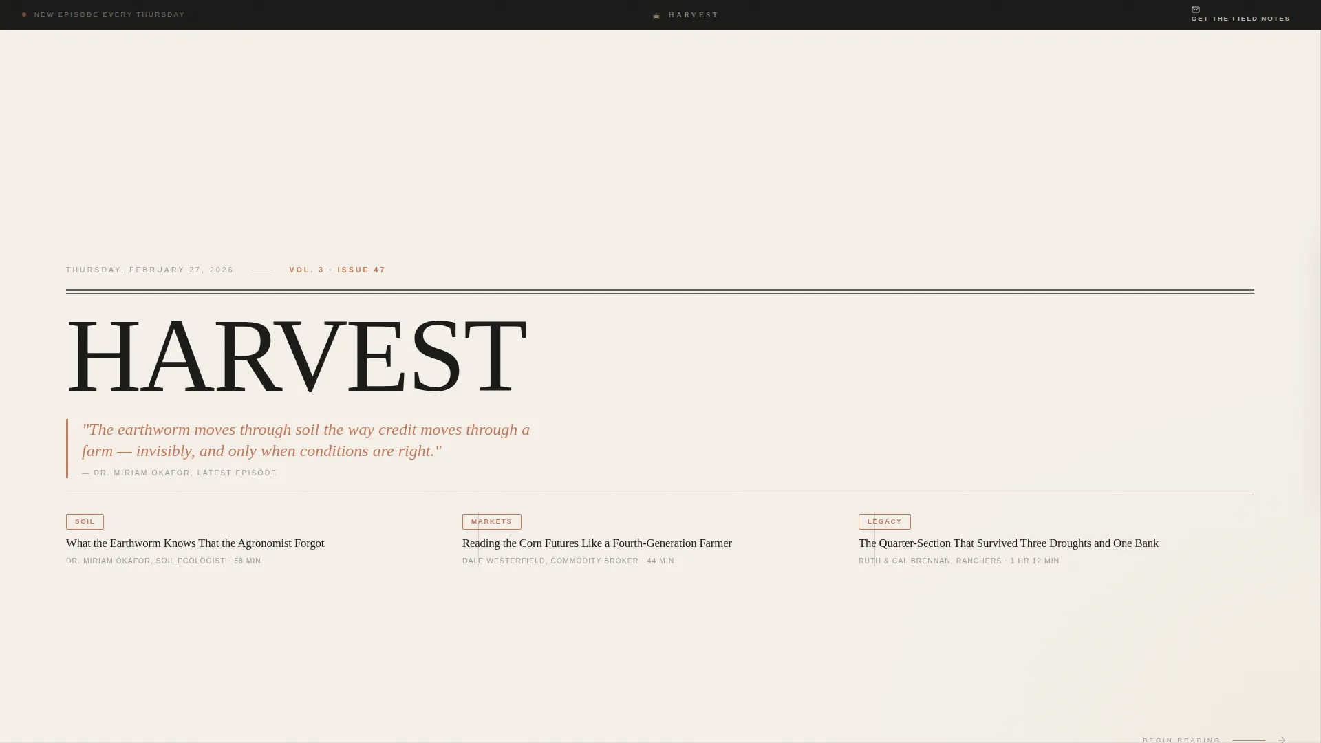
- A newspaper masthead hero with a large display serif, dateline, lead pull quote, and a three-column episode deck
- A horizontal-scroll episode archive grouped by theme, with guest portraits, pull quotes, synopses, and inline audio players
- A slide-in email capture panel that appears after three episodes, offering the "Get the Field Notes" weekly digest
Feature list
Every built-in component serves the editorial experience directly. Nothing is decorative without also being functional.
Newspaper Masthead Hero
The header opens like the front page of a broadsheet. A large Fraunces display serif carries the brand name, a dateline shows the latest episode release date, and a lead headline pulls the most striking quote from the newest guest. Three episode titles sit below in a columnar typographic deck.
Horizontal Scroll Episode Archive
Episodes scroll left to right in individual full-panel feature cards. Each panel includes a black-and-white guest portrait, a terracotta pull quote, a three-line synopsis, and an inline audio player with a "Listen to This Episode" call to action. The experience feels like flipping through a carefully edited magazine.
Thematic Episode Collections
Panels are grouped into four named collections: Soil, Markets, Legacy, and Machines. Typographic dividers separate each collection so the archive feels organized rather than endless. Visitors can navigate by theme without losing their place.
Inline Audio Players
Every episode panel carries its own embedded audio player. The primary call to action, "Listen to This Episode," appears beside each player on every panel. Friction between discovery and listening is reduced to a single click.
Slide-In Email Capture
After three episode panels, a "Get the Field Notes" prompt slides in gently from the right margin. It asks only for an email address and is framed as a curated weekly reading list, not a gate. The page earns the subscription before making the ask.
Editorial Pull Quote System
Terracotta-colored pull quotes appear on every episode panel and in the hero section. They act as both visual anchors and persuasive entry points, drawing the eye and communicating episode value before the visitor commits to listening.
Page sections overview
| Section | Purpose |
|---|---|
| Masthead Hero | Establishes brand identity with broadsheet editorial layout and latest episode details |
| Episode Deck | Presents three episode titles in columnar layout beneath the lead headline |
| Horizontal Scroll Archive | Displays full episode panels grouped by theme for lateral browsing |
| Soil Collection | Groups soil-focused episodes with typographic divider |
| Markets Collection | Groups commodity and market-focused episodes with typographic divider |
| Legacy Collection | Groups generational farming story episodes with typographic divider |
| Machines Collection | Groups agricultural technology and equipment episodes with typographic divider |
| Email Capture Panel | Slides in from the right margin after three panels with the Field Notes prompt |
| Footer | Horizontal flow footer on parchment background with brand and navigation elements |
Design & branding system
The visual identity is built around a Luxe Minimal editorial aesthetic, drawing from a Cloud Canvas color system that feels like warm, tactile print media rather than a digital product.
- Colors: warm parchment white (#F5F0E8) and pale wheat (#E8DCC8) alternate as section backgrounds, soft graphite (#3D3D3D) carries all body and headline text, and muted terracotta (#C4775A) is reserved for play buttons, pull quotes, and hover states
- Typography: Fraunces serves as the display serif for all headline and masthead treatments, while DM Sans handles body text and interface elements with clean, open spacing
- Whitespace and restraint define the layout; no imagery competes with the type in the hero, and guest portraits are rendered in muted black-and-white to keep the palette cohesive
Mobile & speed optimization
The template is desktop-first by design, built around a horizontal scroll experience that rewards a wide viewport. A vertical fallback ensures the content remains accessible on smaller screens.
- The horizontal scroll interaction is powered by GSAP ScrollTrigger, with image reveals and magnetic button states adding editorial-grade animation on desktop
- On mobile, the layout transitions to a vertical stack so every episode panel, audio player, and email capture prompt remain fully usable
- Static content sections use server components for fast initial load, while scroll and animation logic is handled by client components to keep interactivity contained
How this template helps you convert
The conversion strategy is built into the layout itself. Every design decision reduces friction toward listening and subscribing without ever feeling like a sales page.
- The masthead earns immediate attention with a provocative lead quote, giving visitors a reason to slow down and read before they scroll anywhere
- The inline "Listen to This Episode" call to action appears on every episode panel, so the path from discovery to listening is always one click away regardless of where the visitor is in the archive
- The email capture slides in only after three full episode panels have passed, meaning the subscription ask arrives after the page has already demonstrated real value
Other information about this template
This template is part of the Blog & Editorial category, under the Agriculture Blog & Media subcategory. It is purpose-built for the agriculture podcast and media niche.
- The template style is Horizontal Scroll, with the Curated Collection creative direction driving the panel-by-panel episode browsing experience
- The header concept follows a Newspaper and Publication pattern, giving the brand the visual authority of a long-established editorial outlet
- The landing page direction is Content and Resource focused, prioritizing episode discovery and audience retention over hard conversion pressure
- The footer uses a Vercel Horizontal Flow pattern on a parchment background, keeping the bottom of the page consistent with the overall editorial tone
- Social proof elements include guest pull quotes, episode count displays, and listener statistics integrated into the layout



Theme
Luxe Minimal
Creative direction
Curated Collection
Color system
Cloud Canvas
Style
Horizontal Scroll
Direction
Content/Resource
Page Sections
Newspaper Masthead Hero Section
Horizontal Scroll Episode Panels
Thematic Collection Groupings
Zero-friction Inline Audio Players
Slide-in Email Capture Prompt
Editorial Pull Quote System
Related questions
Is this template suited for a podcast that is just starting out?
Can I rename the thematic collection sections like Soil, Markets, Legacy, and Machines?
Does the horizontal scroll experience work on mobile devices?
What does the Get the Field Notes email capture look like in practice?
Can this template support an agriculture media brand that publishes more than just podcast episodes?



