Smart Agtech Landing Page Template
Yield is a precision agtech comparison landing page built for Series A startups competing in the row-crop intelligence space. It fuses a mission-control visual identity with a data-forward layout, putting hard numbers front and center. The template drives conversions through a sticky field audit call to action, a twelve-row competitor comparison table, and a two-step lead capture form.
by Rocket studio
Quick summary
Yield is a single-page comparison landing page template for precision agriculture startups. It opens with a stat-first hero, runs through a detailed competitor table, and closes with a sticky conversion bar. Every section is built around hard data and fast decisions, designed to convince row-crop operators, agronomists, and investors before their first cup of coffee cools.
Who this template is for
This template is built for founders and marketing teams at precision agtech companies preparing for or just after a Series A raise. It speaks directly to technically demanding audiences who expect data before they trust a platform.
- Midwest corn-and-soybean operations managing 2,000 or more acres who want field-level decision support
- Agronomists managing multiple field-scouting tools who need a single, faster command layer
- Venture partners running due diligence on precision agriculture deal flow who want benchmark proof fast
What problem this template solves
Agtech buyers are skeptical. They've seen dashboards before. They will not respond to generic benefit statements or stock photography of green fields. They need to see specific, comparable numbers before they click anything.
- Competing platforms are hard to evaluate side by side, so the template leads with a twelve-row comparison table to make the decision obvious
- Farmers and agronomists distrust marketing copy, so the template anchors every claim in a hard metric, a real crop, and a measurable outcome
- Series A agtech teams often lack a conversion-ready page that speaks both to operators on the ground and investors on the cap table
What you get with this template
You get a complete, ready-to-customize single-page layout that moves visitors from credibility to comparison to conversion in one scroll. Every section has a clear job, and no section wastes pixels.
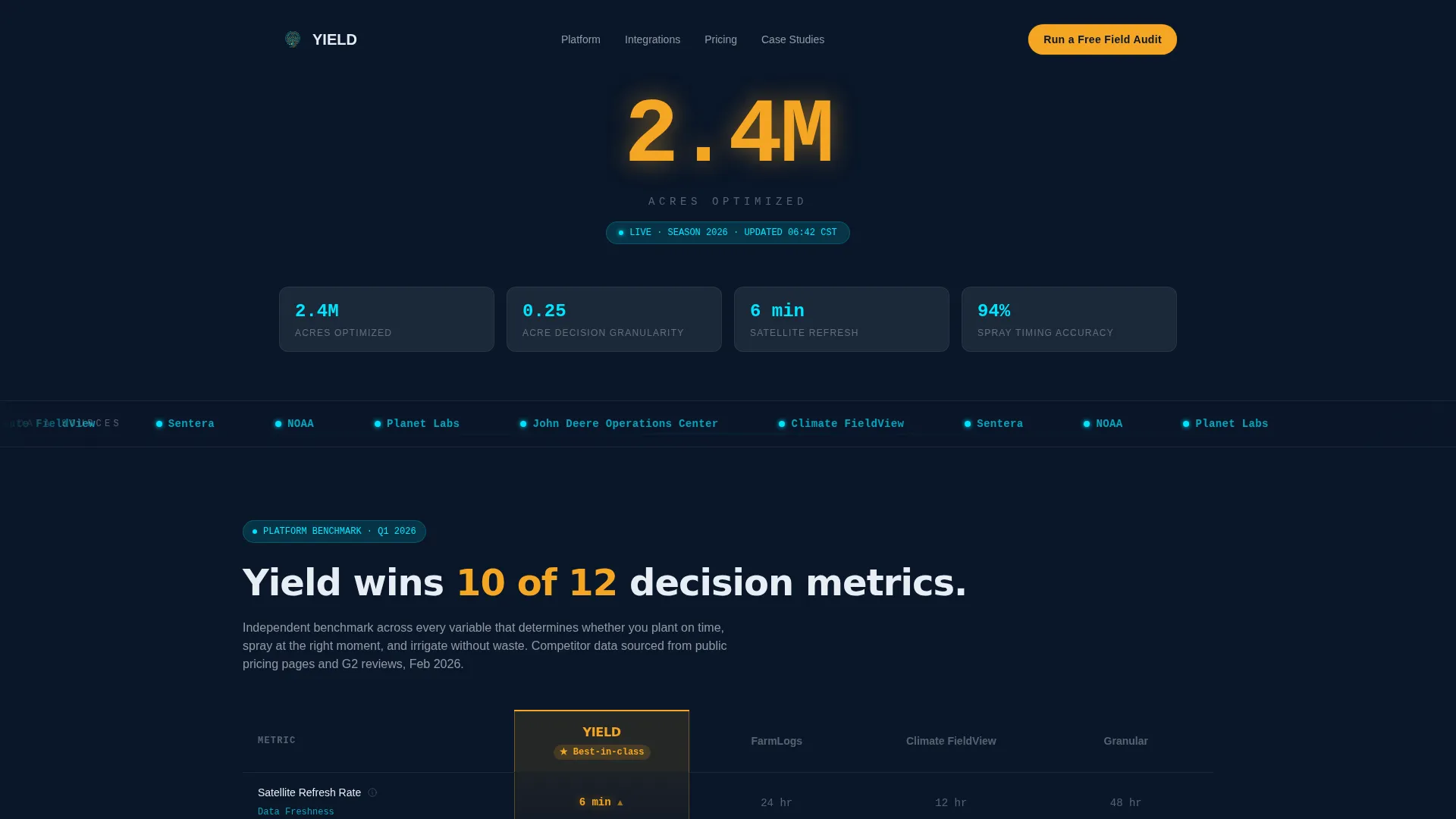
- A stat-first logo bar header showing 2.4 million acres optimized, with scrolling integration partner logos in monochrome cyan
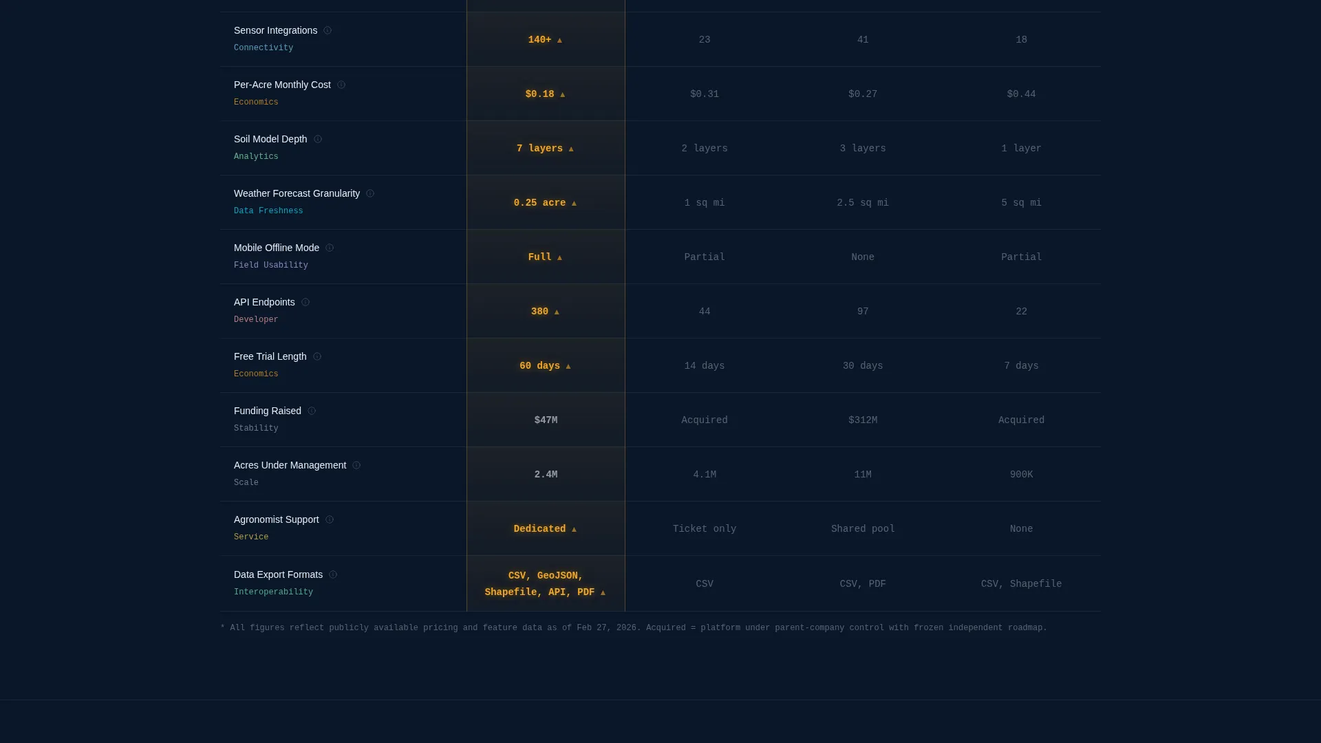
- A dominant mid-page comparison table covering twelve decision-critical rows across four columns, with your column highlighted in harvest gold
- A sticky bottom conversion bar with a two-step field audit form and a secondary PDF download link for early-stage leads
Feature list
This template is built around a tightly defined set of components, each earning its place in the layout.
Stat-First Hero Header
The header opens with a single 96-pixel harvest-gold stat: "2.4M acres optimized." Below it sits a proof ribbon. No hero image, no subhead. The number does the talking, and authority is established before any copy appears.
Scrolling Integration Partner Logo Bar
A horizontal strip of data-source and integration partner logos scrolls slowly across a terminal-navy background. Each logo renders in monochrome cyan, reinforcing the data-command visual identity without visual clutter.
Twelve-Row Competitor Comparison Table
The table benchmarks your platform against three named competitors across twelve decision-critical rows. These rows cover satellite refresh rate, sensor integrations, per-acre cost, soil-model depth, weather-forecast granularity, mobile offline mode, API endpoints, trial length, funding raised, acres under management, agronomist support, and data-export formats. Your column glows in harvest gold while competitor columns stay in soil-dark charcoal.
Micro-Case Proof Blocks
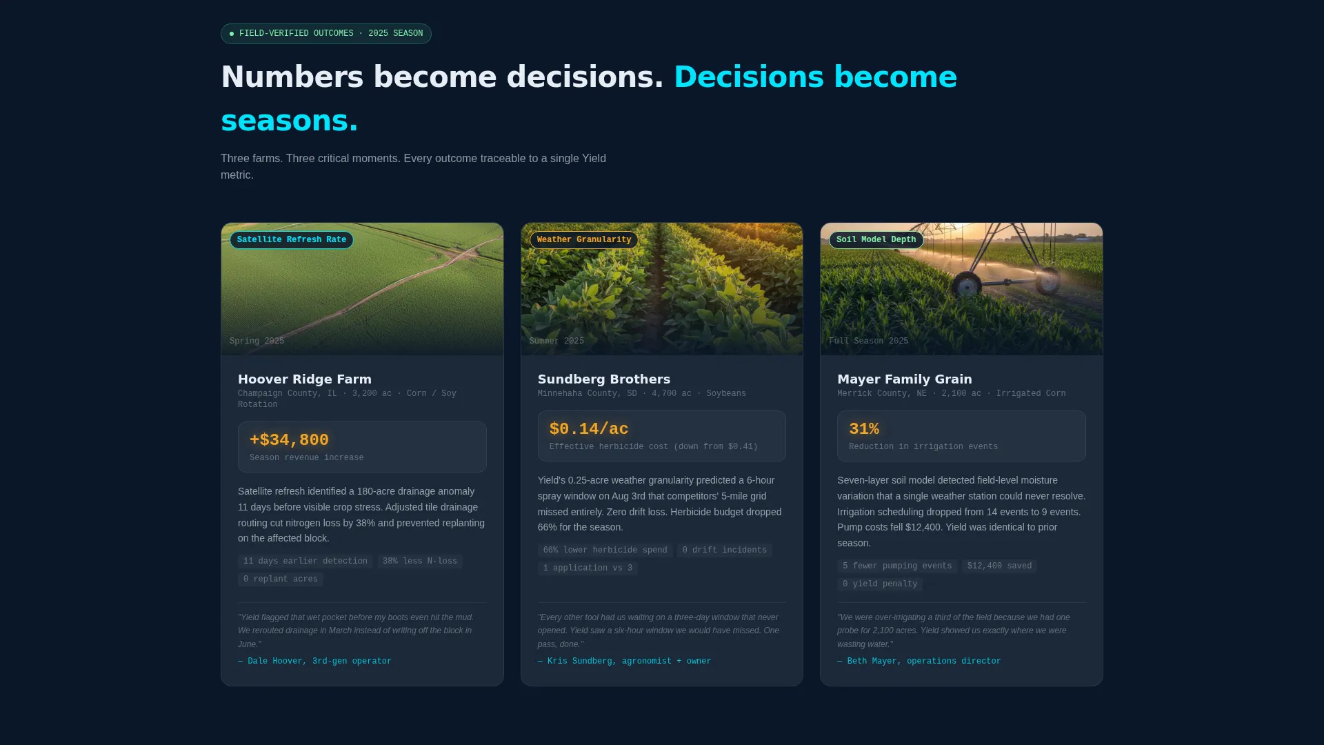
Each winning metric in the comparison table expands below into a micro-case story. One farm, one season, one measurable outcome. These blocks convert data rows into human proof without losing the data-forward cadence.
Sticky Conversion Bar with Two-Step Form
Once a visitor scrolls past the logo strip, a sticky bottom bar appears. The primary call to action reads "Run a Free Field Audit" in harvest gold. Clicking opens a two-step form: step one collects total acreage and primary crop; step two collects the competitor being compared and a work email.
Secondary PDF Lead Capture
Below the primary call to action sits a text link: "Download the Full Benchmark PDF." This captures top-of-funnel leads who want the data before committing to an audit. The download is gated behind email only, keeping the form friction low.
Page sections overview
| Section | Purpose |
|---|---|
| Hero Stat Bar | Establish authority with a single large number before any copy |
| Partner Logo Strip | Signal data-source credibility through recognizable integration logos |
| Comparison Table | Show platform superiority across twelve side-by-side decision rows |
| Micro-Case Blocks | Turn each winning metric into a one-farm, one-season proof story |
| Sticky Audit Bar | Capture conversion-ready leads with a pinned two-step form |
| PDF Download Link | Collect early-stage leads with a low-friction email gate |
Design & branding system
The visual identity follows a Data Command theme. Every color choice reinforces the feeling of a mission-control room running under a grain elevator at pre-dawn, cold and precise, with nothing decorative.
- Deep terminal navy (#0A1628) covers all full-bleed backgrounds; soil-dark charcoal (#1B2838) surfaces cards and table rows to create depth without distraction
- Sensor-glow cyan (#00E5FF) lights up live data points, logo renders, and hover states across interactive elements
- Harvest gold (#F5A623) is reserved strictly for calls to action and the winning-column highlight in the comparison table, making conversion paths impossible to miss
Mobile & speed optimization
The layout is structured for fast visual scanning on any screen size. Operators checking the page from a cab or a field office need the same clarity they'd get on a desktop display.
- The comparison table is designed to scroll horizontally on smaller screens, keeping all twelve rows readable without collapsing data
- The sticky conversion bar stays pinned and accessible on mobile without blocking critical table content
- Typography scales cleanly from desktop to mobile, preserving the large-number impact of the hero stat even on smaller viewports
How this template helps you convert
Every design and copy decision in this template is built to reduce friction and increase confidence at the moment of decision.
- The stat-first structure earns trust before asking for anything, so visitors arrive at the comparison table already primed to believe the numbers
- The twelve-row table removes the need for a prospect to research competitors separately, keeping them on your page and inside your frame of reference
- The two-step form qualifies leads by acreage and crop before collecting contact details, so your team receives context-rich inquiries instead of cold email addresses
Other information about this template
This template is designed specifically for the agtech Series A startup context, where both operator credibility and investor-grade data presentation matter equally. It can support a range of go-to-market moments from initial product launch through competitive re-positioning.
- The competitor dropdown in the two-step form comes pre-populated with the three platforms featured in the comparison table, making the form feel native to the visitor's decision process
- The micro-case proof block format can be updated each season with new farm outcomes, keeping the page fresh without a full redesign
- The template is built for the Comparison/Versus conversion intent, making it a strong fit for paid search campaigns targeting "precision ag platform comparison" or similar competitive queries
- The Stats-First Impact creative direction and Logo Bar header concept are matched intersection context choices that align the layout with high-trust, data-forward startup positioning

Theme
Data Command
Creative direction
Stats-First Impact
Color system
Midnight Blue
Style
Comparison Table
Direction
Comparison/Versus
Page Sections
Stat-first Hero with Proof Ribbon
Scrolling Partner Logo Bar
Twelve-row Comparison Table
Micro-case Proof Blocks
Sticky Two-step Conversion Bar
Secondary PDF Lead Gate
Related questions
Can I update the comparison table rows for my specific platform?
Is the two-step form connected to a specific CRM or email tool?
Can I replace the micro-case proof blocks with my own farm data?
What if I have more or fewer than three competitors in my market?
Who handles the benchmark PDF that the download link points to?



