Performancedriven Data Landing Page Template
Pulse is a masonry-style landing page template built for healthtech newsletters. It uses a Cinematic Dark color system, a Gallery Walk scroll experience, and a curated issue-card layout to convert healthtech founders, hospital innovation officers, and biotech investors into subscribers before a single signup field appears.
by Rocket studio
Quick summary
Pulse is a performance-driven landing page template for healthtech data and trends newsletters. It pairs a cinematic dark visual identity with a Pinterest-style masonry gallery to turn past issue cards into live proof of value. The page earns every click before it asks for an email.
Who this template is for
This template is built for publishers and operators running intelligence-grade newsletters in the health technology space. If your audience makes high-stakes decisions and expects depth over noise, this layout speaks their language.
- Healthtech founders who scan competitive signals each morning before the rest of the market moves
- Hospital innovation officers who use weekly briefings to build and pressure-test vendor shortlists
- Biotech investors who need faster pattern recognition than a full analyst cycle can provide
What problem this template solves
Most newsletter landing pages ask for trust before they offer proof. They lead with a subscribe button and a vague value promise, then expect visitors to convert on faith alone. Healthtech readers are skeptical by training. They need evidence first.
- Generic templates bury the content quality and force visitors to imagine what a subscription looks like
- Flat single-column layouts cannot communicate the editorial range and analytical depth of a multi-topic intelligence newsletter
- Standard email capture pages give expert audiences no reason to pause, read, or feel the value before they decide
What you get with this template
You get a fully structured, single-page layout that shows the work before it makes the ask. Every section is purpose-built for a subscription-conversion flow that respects a sophisticated reader's time and judgment.
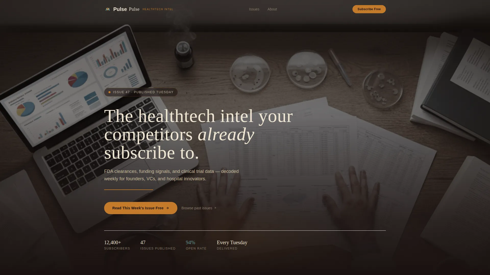
- A full-viewport hero with a cinematic overhead photograph, a Fraunces serif headline in parchment cream, and an animated amber underline beneath the subhead
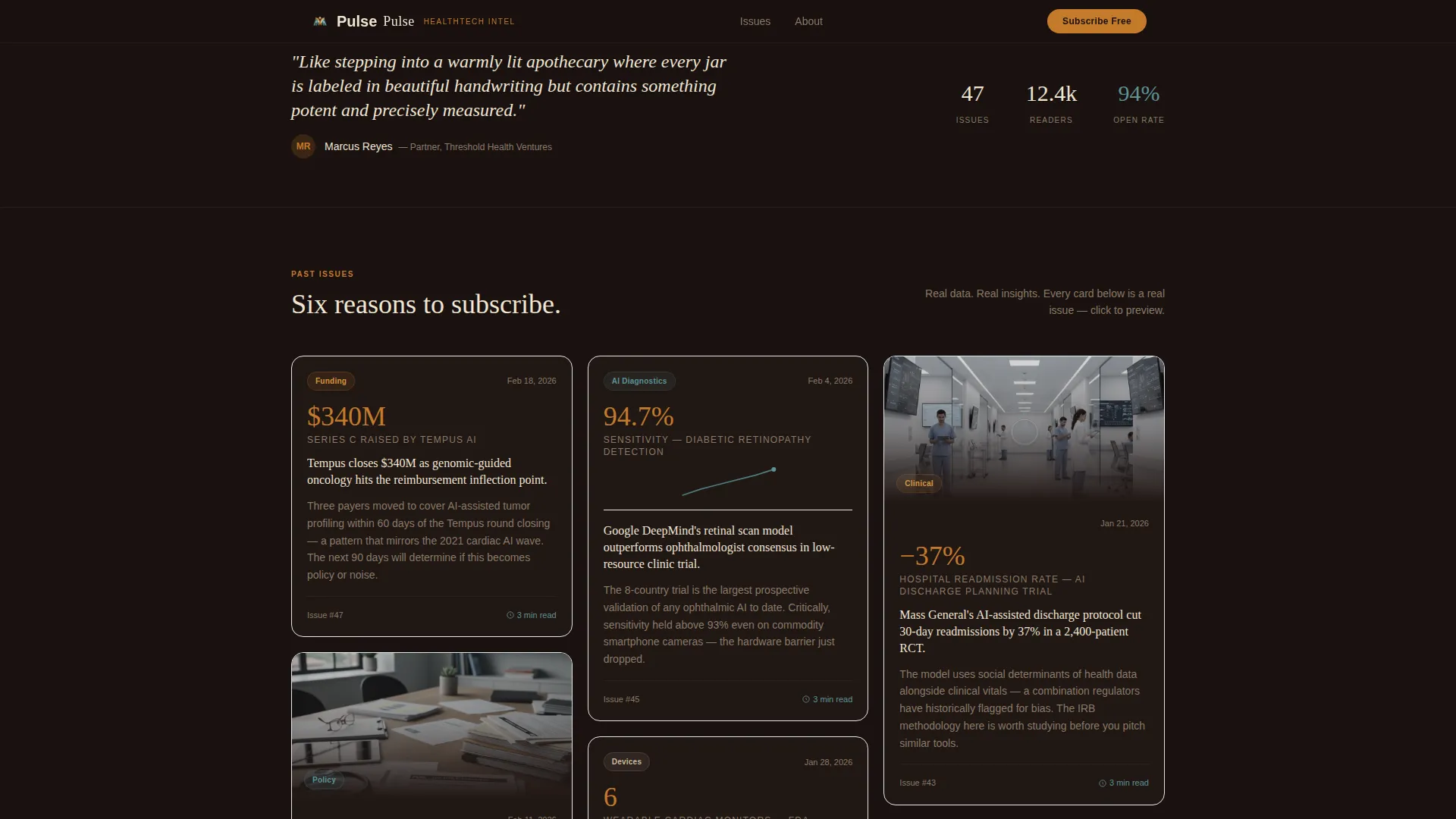
- A two-stage masonry gallery with ten issue cards across two depth zones, each carrying a bold datum, a one-sentence insight, and a category tag
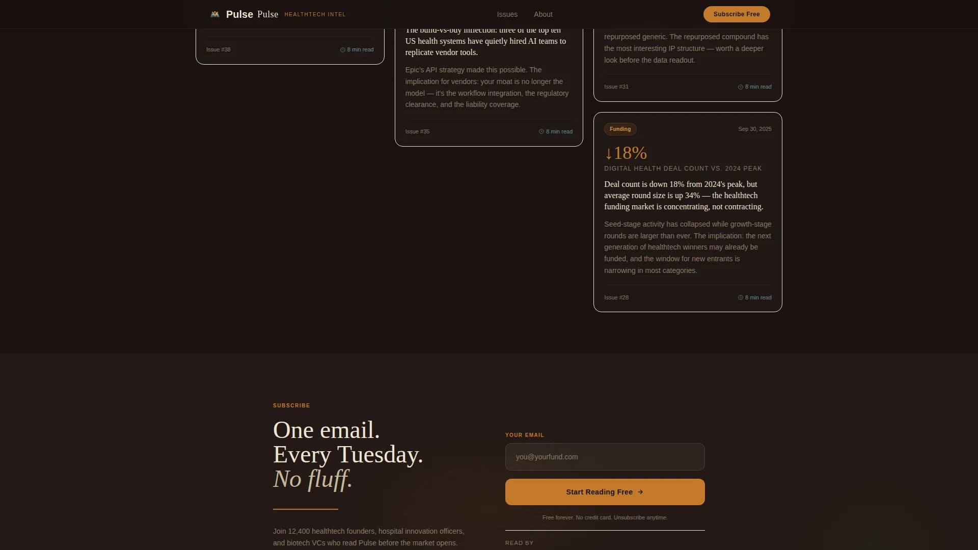
- A floating amber call-to-action button and a bottom signup panel with a single email field and the line "One email. Every Tuesday. No fluff."
Feature list
This template packs a focused set of capabilities directly drawn from the Pulse brief.
Cinematic Dark Hero Section
The header fills the full viewport with a softly desaturated overhead photograph showing a desk, stethoscope, and a funding dashboard on a laptop. A large Fraunces serif headline in parchment cream sits over the image with generous letter spacing. A single amber underline pulses beneath the subhead using a CSS animation.
Two-Stage Masonry Gallery
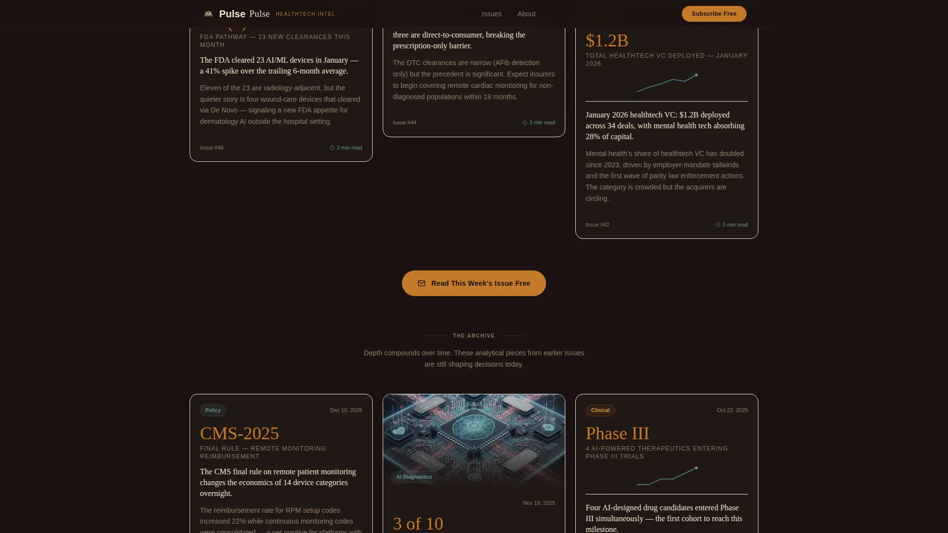
The page is organized into a top gallery of six issue cards and a deeper gallery of four analytical pieces. Cards vary in height and density, alternating between image-heavy and purely typographic treatments. This rhythm builds the implicit argument that analytical depth compounds the longer a reader stays subscribed.
Issue Card Architecture
Each masonry card presents a past newsletter edition as a visual artifact. It carries a bold data point, a one-sentence insight, and one of four category tags: Policy, Funding, Devices, or AI Diagnostics. Cards act as standalone proof of value without requiring a visitor to read a full issue.
Soft-Gate Card Preview
Any card in the gallery can be tapped to reveal a redacted issue preview. A soft gate prompts the visitor with the line "Unlock the full brief." This secondary conversion path captures intent from readers who are not yet ready to subscribe from the main call to action.
Floating Amber Call-to-Action
After the third row of masonry cards, a floating amber button fades in with the label "Read This Week's Issue Free." The button reappears anchored at the page bottom beside the email field. Both placements are timed to appear after the visitor has already seen real issue content.
Minimal Superhuman Footer
The footer follows a Superhuman-style extreme minimal pattern with centered social links and copyright text on an espresso black background. It keeps the post-scroll experience clean and avoids visual clutter after the signup panel.
Page sections overview
| Section | Purpose |
|---|---|
| Full-Viewport Hero | Establishes editorial authority with a cinematic photo and serif headline |
| Masonry Gallery Top | Displays six issue cards as proof of value before any signup ask |
| Floating Amber call to action | Introduces the primary call to action after the visitor has seen content |
| Masonry Gallery Deep | Presents four analytical pieces that deepen the depth-compounds argument |
| Bottom Signup Panel | Captures email with a single field and a direct, no-fluff value statement |
| Minimal Footer | Closes the page with centered social links and copyright on dark background |
Design & branding system
The visual identity blends Warm Artisan warmth with Cinematic Dark gravity. The palette feels like a leather-bound medical journal opened under a single desk lamp: candlelight warmth meeting the precision of a clinical environment.
- Four-color palette: espresso black (#1A1210) for backgrounds, aged parchment cream (#F0E6D3) for body text and card surfaces, arterial amber (#C47A2B) for headlines and interactive elements, and muted clinical teal (#4A7C7E) reserved for data highlights and hover states
- Typography pairing: Fraunces serif for all display headlines, giving the page an unhurried, hand-typeset quality; DM Sans for body copy and interface elements, keeping functional text clean and readable
- Amber is the action color throughout: it marks headlines, buttons, underlines, and interactive affordances, while teal appears sparingly on chart details and linked references
Mobile & speed optimization
The template is designed desktop-first, reflecting the primary audience of founders reading over morning coffee on a laptop. The layout is built to remain responsive on smaller screens without rebuilding the core experience.
- The masonry layout uses CSS columns rather than a JavaScript library, keeping the gallery render lightweight and scroll behavior smooth
- Scroll reveal animations for cards use the Intersection Observer application programming interface (API), triggering only as elements enter the viewport rather than running on load
- The floating call-to-action uses a CSS fade-in timed to appear after the visitor has scrolled past the initial gallery rows
How this template helps you convert
The page is structured as a conversion sequence, not a static brochure. Every design and content decision is ordered to reduce friction and build evidence before the ask arrives.
- The hero establishes credibility instantly with a cinematic editorial aesthetic and a provocative headline. Visitors who recognize themselves in the implied audience read on rather than bouncing.
- The masonry gallery lets ten real issue cards do the persuading. Bold datums, sharp one-sentence insights, and category tags communicate analytical range without requiring the visitor to read anything in full.
- The soft gate on card previews and the timed floating call-to-action create two distinct conversion moments. Visitors who want quick access click the floating button; more deliberate readers explore the card preview path, each leading to the same signup destination.
Other information about this template
This template sits in the Blog & Editorial category under the HealthTech Newsletter subcategory. It is purpose-built for the healthtech data and trends niche and carries an intersection match score of 13, reflecting a high alignment between the template's design system and its intended editorial audience.
- The page includes a social proof band that can display a subscriber count metric, total issues published, and reader role tags to reinforce newsletter credibility
- The category filter tags (Policy, Funding, Devices, AI Diagnostics) built into the masonry cards allow visitors to mentally map the newsletter's editorial scope in a single scroll
- The template is designed to link out to a Substack page or a standalone signup confirmation page, making it a practical front door for any newsletter hosted on a third-party publishing platform
- Animation intensity is set to medium-high: the amber underline pulses, cards lift on hover, masonry cards reveal on scroll, and the floating call-to-action fades in at a precise scroll depth
Theme
Warm Artisan
Creative direction
Gallery Walk
Color system
Cinematic Dark
Style
Masonry/Pinterest
Direction
Click-Through
Page Sections
Cinematic Dark Hero with Pulse Animation
Two-stage Masonry Issue Gallery
Issue Card Proof-of-value System
Soft-gate Redacted Issue Preview
Timed Floating Amber Call-to-action
Bottom Signup Panel with Minimal Footer
Related questions
What kind of newsletter is this template designed for?
Can I use this template if I am just launching my newsletter?
How does the soft-gate card preview work?
Is the masonry layout built with a JavaScript library?
Who is this landing page built to convert?



