Lifestyle Blog Pre-Launch Website Template
Hearth is a hub-and-spoke landing page template built for a coming-soon artisan home journal. It uses a manifesto-style scroll narrative, a cinematic dark color palette, and a waitlist form to turn design-curious readers into early subscribers. The layout moves from conviction to invitation, building emotional resonance before asking for anything.
by Rocket studio
Quick summary
Hearth is a single-page waitlist landing page for a home and decor blog with a slow-living editorial voice. It opens on a bold manifesto headline, unfolds through four thematic spoke sections anchored by sticky navigation, and closes with a waitlist form that feels like an invitation rather than a transaction.
Who this template is for
This template suits creators and writers who lead with a point of view before they lead with content. It is designed for people launching an editorial project in the home and decor space who want to build an audience before the first post goes live.
- Home and decor bloggers preparing a coming-soon editorial journal
- Lifestyle writers who want waitlist signups before launch day
- Design-focused creators who need a visually considered, long-form landing page
What problem this template solves
Most coming-soon pages are placeholder pages. They say "coming soon" and ask for an email with nothing in between. Hearth solves the gap between announcement and belief. It gives the reader a reason to care before the journal even exists.
- Generic waitlist pages fail to build emotional connection or audience trust
- Design-curious readers need to feel the voice of a publication before committing their email
- A single headline and a form cannot carry the weight of a slow-living, artisan-editorial brand
What you get with this template
You get a fully structured, single-page layout with a clear narrative arc from manifesto to signup. Every section has a defined role, and the design system is ready to carry a strong editorial identity from the first scroll.
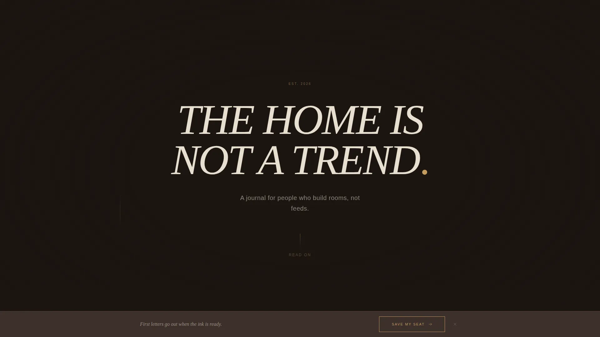
- A hero section with a large centered headline and a single supporting line
- Four spoke sections (Craft, Patina, Ritual, Origin) anchored in a sticky navigation bar
- A waitlist call-to-action form with a fixed bottom bar that appears after the third spoke
Feature list
Manifesto-Style Hero Section
The page opens on a pure kiln-black void with one massive serif headline centered on screen. Below it sits a single line of linen cream body text. There is no image, no animation on load, and no navigation visible at this point. The statement carries the full weight of the brand.
Sticky Hub-and-Spoke Navigation
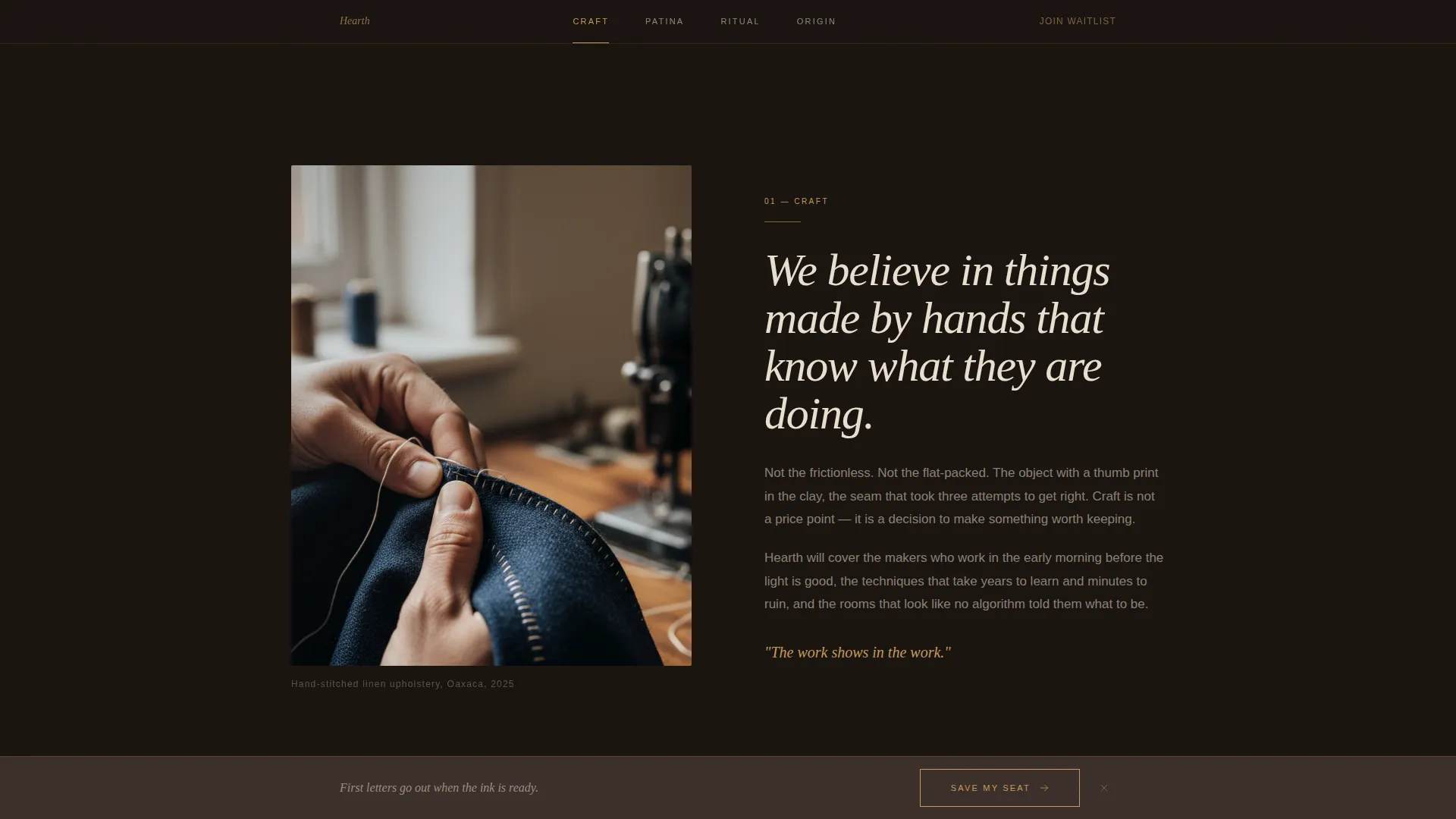
A sticky navigation bar anchors four spoke sections: Craft, Patina, Ritual, and Origin. Readers can scroll through the full narrative or jump to any section directly. Anchor links use tarnished brass on hover to stay consistent with the broader color system.
Four Themed Spoke Sections
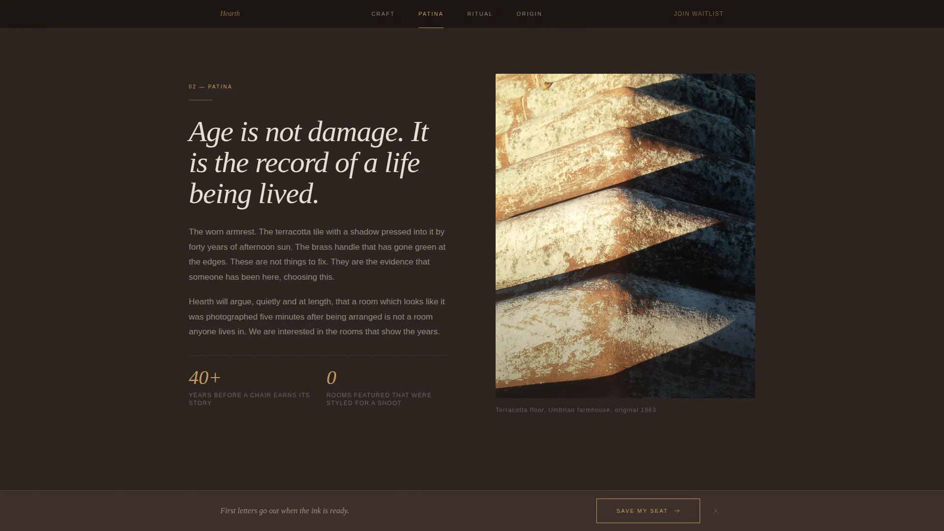
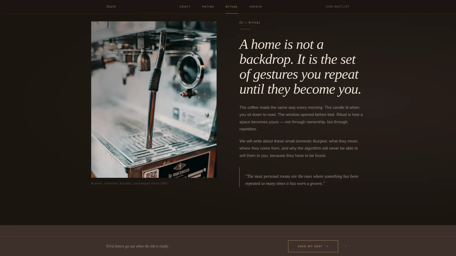
Each spoke section pairs a declarative belief paragraph with moody, grain-heavy photography. The scroll sequence moves from philosophy to promise, building a coherent editorial worldview across all four sections before the reader reaches the waitlist.
Dual-Placement Waitlist Form
The primary call-to-action button labeled "Save My Seat at the Table" appears at the manifesto's emotional peak and again as a fixed bottom bar after the third spoke. The form collects an email address and includes one optional question asking what room in the home matters most to the reader.
Fixed Bottom Bar on Scroll
After the visitor scrolls past the third spoke section, a fixed bottom bar appears at the base of the viewport. It keeps the waitlist call to action visible without interrupting the reading flow, reinforcing the invitation at the right moment.
Cinematic Dark Visual System
The color palette draws from kiln black, smoked walnut, raw linen cream, and tarnished brass. Typography uses a refined serif for headlines and a clean sans-serif for body text. The overall visual register reads like a candlelit still life rather than a polished editorial spread.
Page sections overview
| Section | Purpose |
|---|---|
| Hero Headline | Opens on manifesto statement in large centered serif |
| Sticky Anchor Nav | Lets readers jump to any of the four spoke sections |
| Craft Spoke | Explores the belief around handmade materials and process |
| Patina Spoke | Covers the value of age, wear, and accumulated character |
| Ritual Spoke | Frames daily home routines as meaningful, considered acts |
| Origin Spoke | Traces the provenance and story behind objects and spaces |
| Waitlist Form | Collects email with an optional reflective question |
| Fixed Bottom Bar | Persistent signup prompt after the third spoke scroll |
| Minimal Footer | Closes the page with a horizontal ultra-minimal layout |
Design & branding system
The visual identity follows a Warm Artisan theme expressed through a Cinematic Dark color system. Every color decision reinforces depth and warmth rather than brightness or contrast for its own sake. The palette feels considered and restrained, with brass used sparingly as a signal rather than a decoration.
- Four-color palette: kiln black (#1A1410), smoked walnut (#3B2F2A), raw linen cream (#E8DFD0), and tarnished brass (#C49A5C) reserved for hover states, anchor links, and the waitlist button
- Typography pairing: Fraunces serif for headlines at display scale, DM Sans for body text and form elements
- Grain overlay and spotlight card treatments give photography a textured, film-like quality that reinforces the slow-living editorial tone
Mobile & speed optimization
The template is built desktop-first with a reading experience that holds up on smaller screens. Long-form editorial content requires careful spacing and type scaling, and both are handled across viewport sizes.
- Scroll-linked reveals and blur entrance animations are driven by IntersectionObserver without heavy third-party libraries
- CSS scroll-behavior handles anchor navigation to keep the sticky nav responsive and lightweight
- The fixed bottom bar and waitlist form adapt to mobile viewports so the call to action remains accessible at all screen sizes
How this template helps you convert
The page is structured as an escalating emotional argument. Every section builds on the last, and the waitlist form arrives only after the reader has already invested in the voice and worldview of the journal. The conversion path feels earned rather than pushed.
- The hero headline creates immediate brand gravity. Readers either recognize themselves in it or they do not. Those who do are already primed to scroll further and eventually sign up.
- The four spoke sections build narrative debt across Craft, Patina, Ritual, and Origin. By the time the waitlist form appears, the reader has read a complete editorial manifesto and trusts the voice behind it.
- The dual-placement waitlist button and fixed bottom bar ensure the call to action is always within reach, whether the reader is at the emotional peak or still scrolling through the final sections.
Other information about this template
Hearth is a pre-launch editorial template, which means it does not require existing content to function. The page is designed to build an audience before the first piece of writing is published. The waitlist copy deliberately avoids promising a launch date, using the line "First letters go out when the ink is ready" to frame patience as part of the brand's identity.
- The optional form question ("What room in your home matters most to you?") turns the signup step into a small act of self-reflection, which can also inform early editorial decisions
- The footer follows a horizontal flow pattern and is intentionally minimal, keeping visual focus on the manifesto narrative rather than secondary links
- The template suits creators working in the slow-living, home and decor space who want their landing page to feel as considered as the content they plan to publish
Theme
Warm Artisan
Creative direction
Manifesto
Color system
Cinematic Dark
Style
Hub & Spoke (Anchor Nav)
Direction
Waitlist/Coming Soon
Page Sections
Manifesto Hero with Giant Centered Headline
Sticky Hub-and-spoke Anchor Navigation
Four Thematic Spoke Sections
Dual-placement Waitlist Call to Action
Fixed Bottom Bar on Scroll Trigger
Cinematic Dark Color and Typography System
Related questions
Do I need existing blog content to use this template?
Can I change the four spoke section topics?
How does the waitlist form collect reader information?
Is this template suitable for a lifestyle blog outside of home and decor?
Can I use my own photography in the spoke sections?



