Helix - Powerful Biotech Landing Page Template
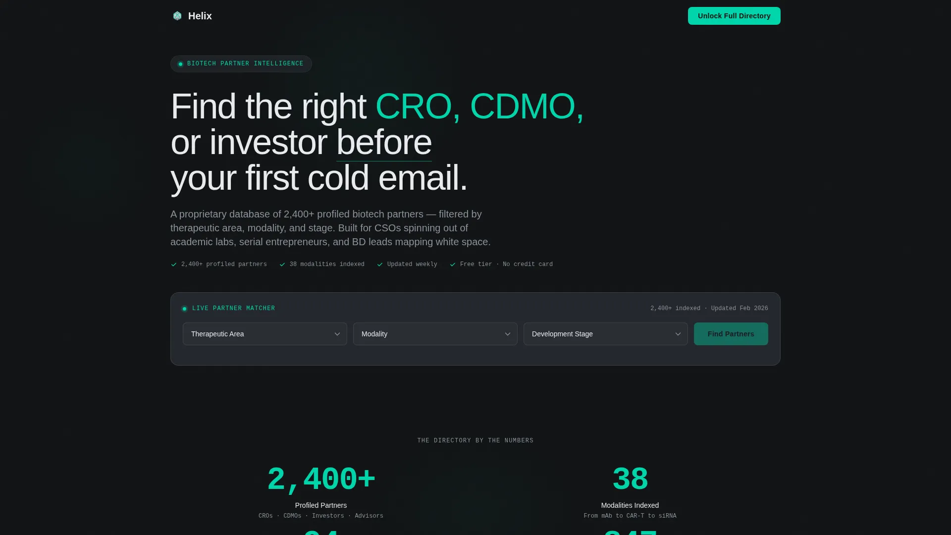
Helix is a hub-and-spoke landing page built for biotech founders who need to find contract research organizations (CROs), contract development and manufacturing organizations (CDMOs), and Series A-ready investors fast. An interactive partner-matching dashboard sits above the fold, letting visitors filter by therapeutic area, modality, and development stage before they ever scroll past the header.
by Rocket studio
Quick summary
Helix is a single-page biotech partner directory landing page with a live matching dashboard at the top. Visitors filter by therapeutic area, modality, and development stage to see partner results before they read a word of copy. An anchor navigation locks to the top as they scroll, revealing five spoke sections: CROs, CDMOs, Investors, Advisors, and Licensing.
Who this template is for
This template is built for founders and business development professionals who are deep in the early-stage biotech process and need to move quickly. It speaks directly to the people who are sourcing partners, not reading about them.
- First-time chief scientific officers spinning out of academic research labs and entering industry for the first time
- Serial biotech entrepreneurs scouting contract manufacturers for novel biologics across multiple programs
- Business development leads at platform companies mapping competitive white space and evaluating partnership fit
What problem this template solves
Finding the right contract research organization, contract manufacturer, or investor in biotech is slow and opaque. Most founders spend weeks on cold outreach before they have even a rough shortlist. Helix eliminates that friction by surfacing filtered, relevant partners the moment a visitor lands on the page.
- There is no single discoverable resource that filters CRO and CDMO partners by modality and stage simultaneously
- Investors in biotech are rarely profiled alongside the capability partners that a founding team needs at the same time
- Early-stage teams waste time on mismatched outreach because they have no way to pre-qualify fit before a first email
What you get with this template
You get a fully structured, interactive landing page designed around a partner-discovery experience. The tool is the hook, and every section is built to reinforce the value of what is behind the signup.
- A live partner-matching calculator in the header with three dropdown selectors and an animated results panel showing six partner cards
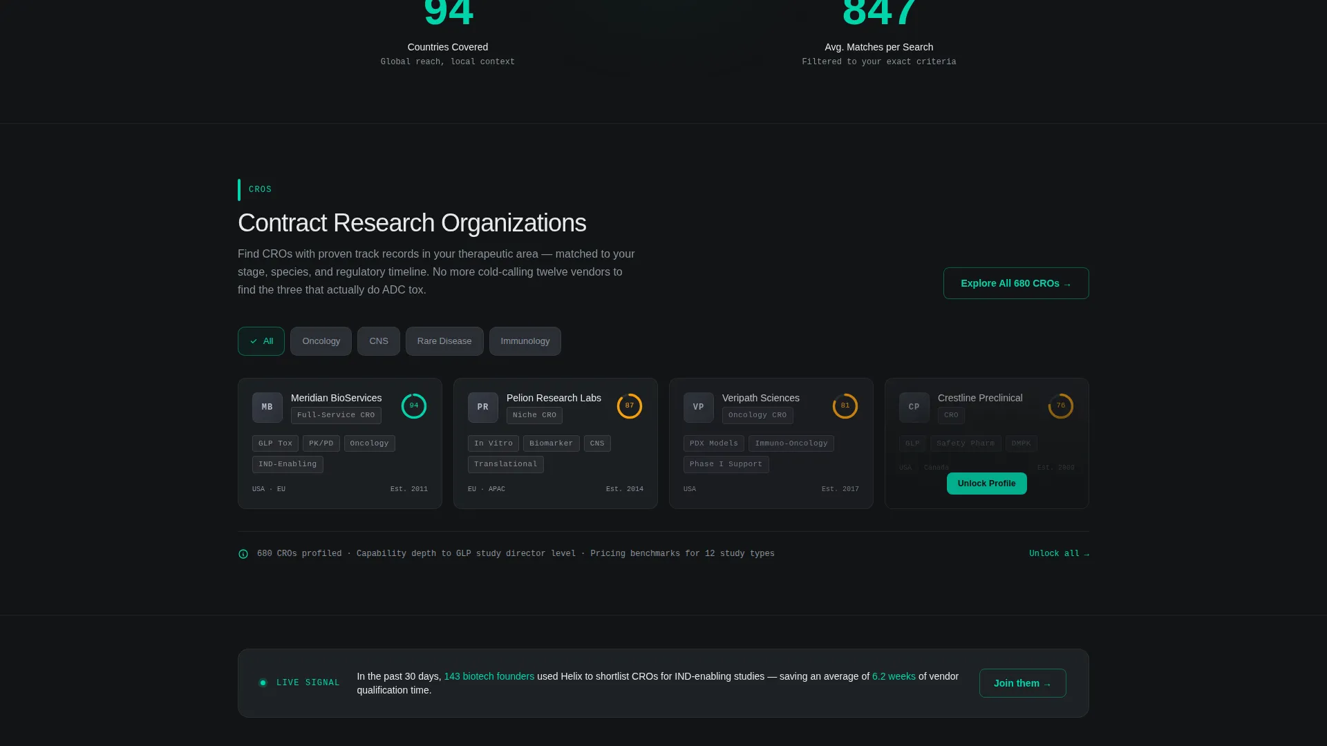
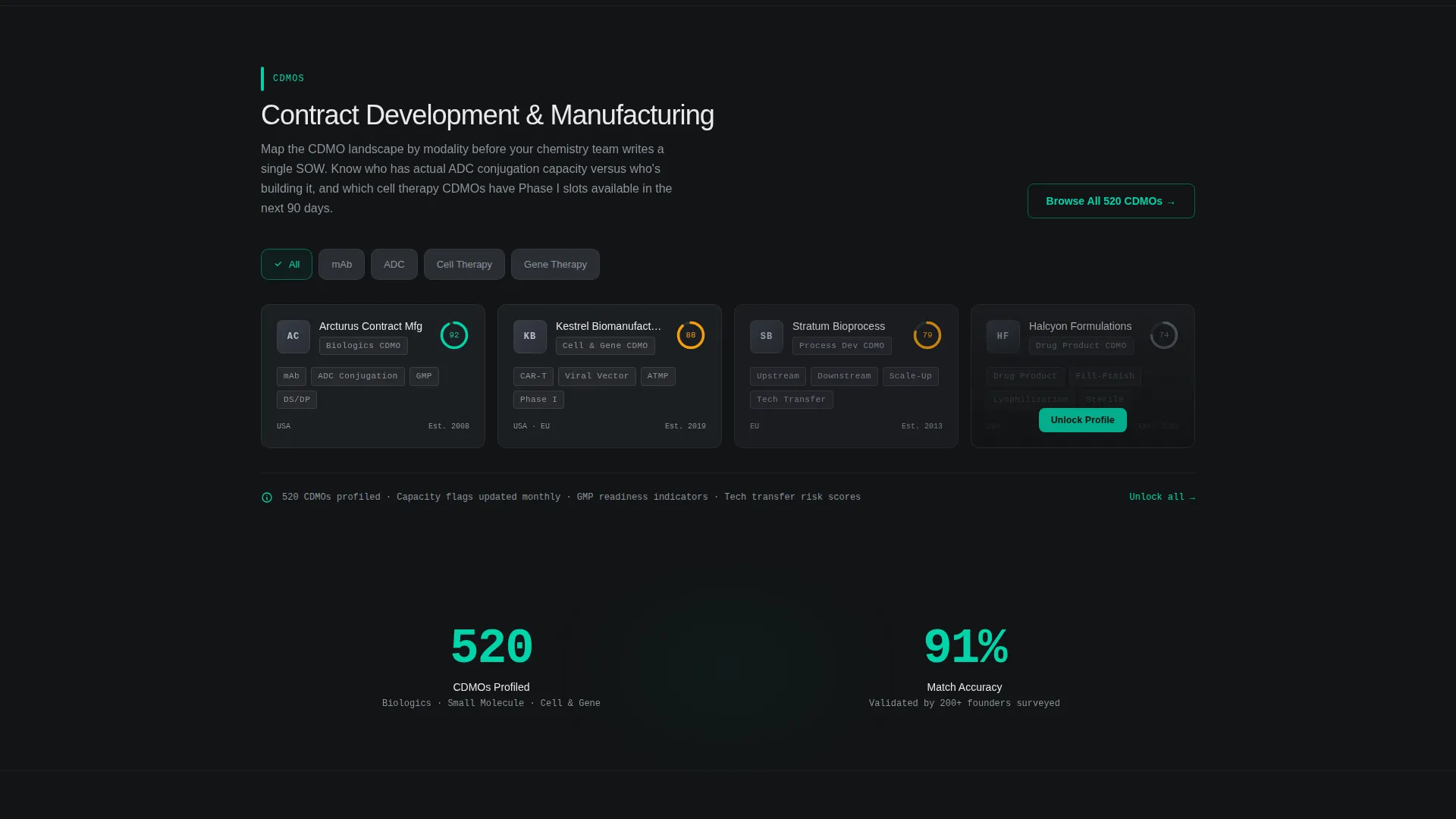
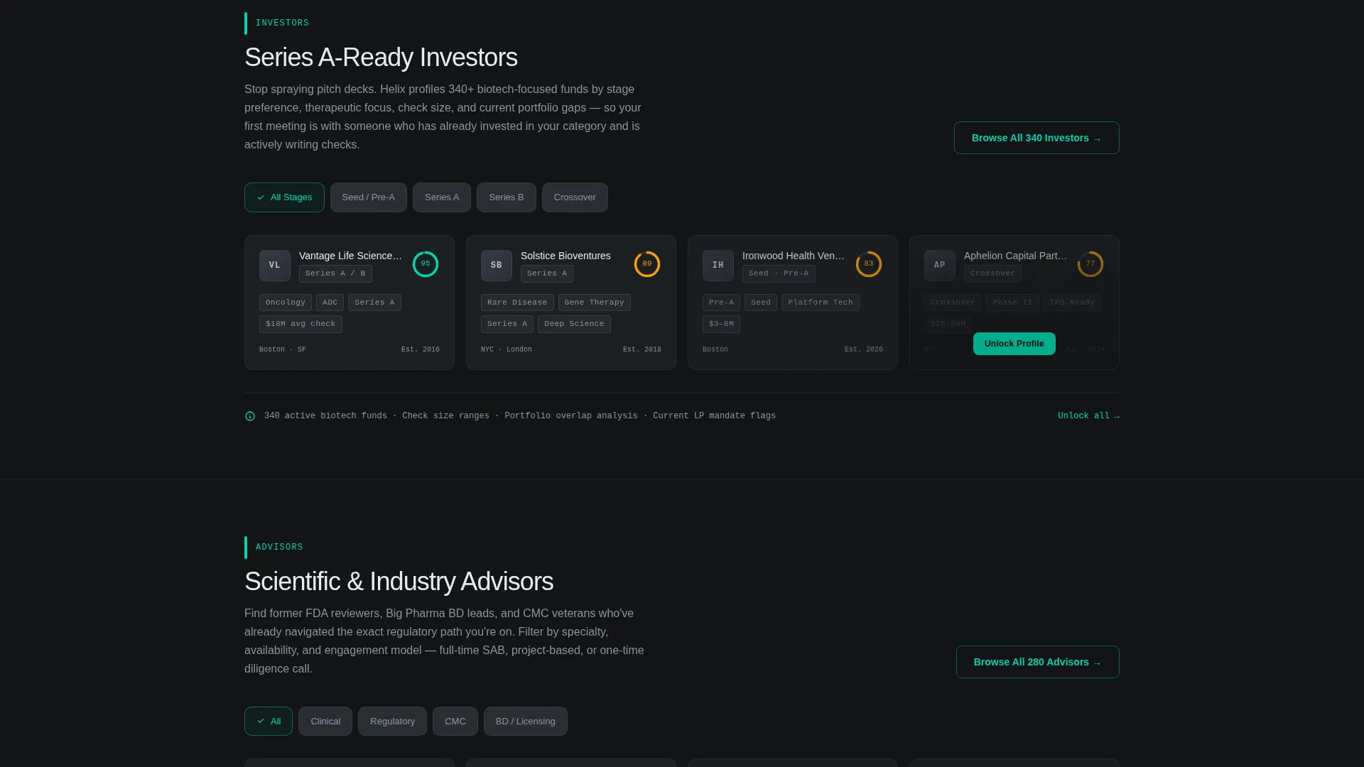
- A sticky anchor navigation bar with five spoke sections, each containing a category-specific mini-filter and a four-card sample grid
- Progressive disclosure on every card: logo and name first, capability summary on hover, then a gated full-profile click-through
Feature list
This section covers the core functional and design features built into the Helix template as defined in the source brief.
Interactive Partner-Matching Dashboard
Three dropdown selectors sit in a horizontal row above the fold: Therapeutic Area, Modality, and Development Stage. Pressing "Find Partners" triggers an animated result panel that slides up with six partner cards. Each card includes a company logo placeholder, capability tags, a geography badge, and a compatibility score shown as a radial progress ring.
Hub-and-Spoke Anchor Navigation
After the first scroll, an anchor navigation bar locks to the top of the page. It exposes five spoke sections: CROs, CDMOs, Investors, Advisors, and Licensing. This architecture lets visitors jump directly to the category most relevant to them without losing their place.
Progressive-Disclosure Partner Cards
Each spoke section opens with a category-specific mini-filter followed by a grid of four sample cards. Cards reveal information in layers: the logo and name are visible immediately, a hover state surfaces a capability summary, and a click attempts to open a gated full profile. This layered reveal creates felt utility before any signup.
Single-Stat Breather Rows
Between dense data grids, the page inserts single-stat validation rows. An example reads "2,400+ profiled partners across 38 modalities." These rows break visual density and reinforce the scale of the directory without requiring the visitor to process a table.
Click-Through Conversion Flow
There is no form on the page. The primary call to action, "Unlock Full Directory," appears first below the dashboard results and then stays fixed in the anchor navigation bar after the initial scroll. Every secondary call to action on each spoke section routes to the same free-tier signup, which asks only for a work email and company name.
Carbon Fiber Visual System
The entire page uses a four-color carbon fiber palette. Deep carbon black (#121416) and graphene mid-gray (#2A2D34) cover all backgrounds. Titanium (#8B939C) handles body text on dark surfaces. Reactive teal (#00D4AA) is reserved exclusively for interactive states, compatibility scores, and call-to-action elements, so every teal element signals something clickable or live.
Page sections overview
| Section | Purpose |
|---|---|
| Dashboard Header | Partner-matching calculator with dropdown filters and animated result cards |
| Anchor Navigation Bar | Sticky hub that links to each spoke section after the first scroll |
| CROs Spoke | Mini-filter and four-card sample grid for contract research organizations |
| CDMOs Spoke | Mini-filter and four-card sample grid for contract manufacturers |
| Investors Spoke | Mini-filter and four-card sample grid for Series A-ready investors |
| Advisors Spoke | Mini-filter and four-card sample grid for scientific and operational advisors |
| Licensing Spoke | Mini-filter and four-card sample grid for licensing opportunities |
| Breather Stat Rows | Single-stat validation breaks between data-dense grid sections |
| Unlock call to action Block | Primary click-through button routing to free-tier signup |
Design & branding system
The visual system is built around a carbon fiber palette that communicates precision and technical credibility. Every color has a specific role, and nothing decorative competes with the data.
- Backgrounds stay within the carbon black to graphene gray range, creating a cleanroom-instrument feel across all sections
- Titanium renders body text on dark cards while carbon renders text on lighter card surfaces, maintaining clear contrast
- Reactive teal is reserved for interactive states, radial score rings, live data indicators, and every call-to-action element, so visitors instinctively know what is clickable
Mobile & speed optimization
The template is designed to translate its dashboard-first experience cleanly across screen sizes. The interaction model stays functional without sacrificing the visual density that makes the directory feel real.
- Dropdown selectors and the animated results panel are structured to reflow into a single-column layout on smaller screens
- Card grids in each spoke section reduce column count on mobile so capability tags and score rings remain readable
- The sticky anchor navigation condenses gracefully so spoke links stay accessible without consuming excessive vertical space
How this template helps you convert
Helix converts by letting visitors feel the product before they see a paywall. The conversion sequence is engineered around earned trust rather than front-loaded friction.
- Visitors interact with the matching dashboard immediately on arrival, filtering real-feeling results and seeing truncated partner profiles, which creates a genuine desire to see the full data
- As visitors scroll through spoke sections, progressive card disclosure and single-stat rows continuously validate the directory's depth, so the "Unlock Full Directory" call to action feels like removing a barrier rather than starting a transaction
Other information about this template
This template fits naturally within the biotech enterprise startup category, where the audience is technically sophisticated and deeply skeptical of marketing-first landing pages. The Directory and Discovery theme is intentional: the page is built to feel like a proprietary internal tool, not a promotional brochure.
- The template style is hub and spoke with anchor navigation, making it a strong fit for multi-category directories that need both scannable depth and fast category access
- The Calculator or Tool First creative direction means the header calculator is the primary hook, not headline copy or hero imagery
- The header concept is a Dashboard Preview, meaning the tool above the fold is interactive and produces visible output before any scroll
- The landing page direction is click-through, routing all conversions to a separate signup page rather than capturing leads inline
- The carbon fiber color system is purpose-built for technical and life sciences audiences who associate dark, minimal interfaces with high-signal data tools
Theme
Directory & Discovery
Creative direction
Calculator/Tool First
Color system
Carbon Fiber
Style
Hub & Spoke (Anchor Nav)
Direction
Click-Through
Page Sections
Interactive Partner-matching Dashboard
Sticky Hub-and-spoke Navigation
Progressive-disclosure Partner Cards
Single-stat Validation Rows
Click-through Conversion Architecture
Carbon Fiber Visual Identity
Related questions
Does this template include a real working database or live partner data?
Can I change the dropdown options in the matching calculator?
Is there a lead capture form built into this template?
How many spoke sections does the template include?
Who is the right person to customize this template?



