Vivid Regional Heritage Landing Page Template
Chronicle is an asymmetric 60/40 landing page template built for local history blogs and cultural archives. It combines a progressive ink-sketch hero illustration, draggable then-and-now photo sliders, and a bento-grid archive sampler to pull visitors deep into neighborhood stories. The warm parchment and graphite color system makes every page feel like a conservator's worktable brought online.
by Rocket studio
Quick summary
Chronicle is a single-page, section-led landing page template designed for local history blogs and urban cultural archives. It uses an asymmetric 60/40 grid, a hand-drawn progressive illustration hero, and a carefully layered scroll experience to invite visitors into decades of forgotten city life. The design evokes archival research without sacrificing modern usability, making it an immediately trustworthy space for readers who care about where they live and what came before.
Who this template is for
Chronicle is built for editors, researchers, and passionate amateurs who want to present local history with the weight it deserves. The template suits anyone running a neighborhood archive, a city memory project, or a long-form editorial blog focused on place and the past.
- Retired educators and urban planners who want to share research and recovered records with a wider community
- Newcomers exploring the history of their block, their city, and the layers of life buried beneath the present day
- Independent historians and university department contributors who need a polished online home for their archive collections
What problem this template solves
Most history blogs look like generic news sites. They bury the best materials under menus, present documents without context, and give visitors no reason to stay past the first paragraph. Chronicle solves each of these problems by structuring the page like a research dossier, where every scroll reveals a new artifact and every section earns the reader's trust before asking for anything in return.
- Readers arrive with curiosity and leave with a sense of ownership, because the page surfaces stories that feel personally relevant rather than academically distant
- Archive collections are hard to navigate without clear visual hierarchy; Chronicle's asymmetric layout separates long-form content from sidebar artifacts so users always know where they are
- Email sign-up forms feel intrusive when placed too early; Chronicle positions its newsletter capture mid-scroll, after three complete micro-histories have already delivered real value
What you get with this template
Chronicle ships as a fully designed, section-ordered landing page ready to populate with your own archive collections, contributor portraits, and neighborhood records. Every section is purposefully sequenced so that visitors consume content before they encounter any conversion ask.
- A hero section with a progressive SVG ink-sketch illustration, scroll-triggered reveals, and a letterpress-style blog title that loads as if being set by hand
- A featured essay section with a draggable then-and-now date slider for cinematic before-and-after photograph pairs
- A bento-grid archive sampler displaying three micro-history cards, a mid-scroll newsletter banner with a neighborhood dropdown, and a contributor voices section with blockquote testimonials and pencil-sketch portrait styling
Feature list
Chronicle includes the following built-in design and interaction features, all grounded in the brief and ready for your content.
Progressive SVG Illustration Hero
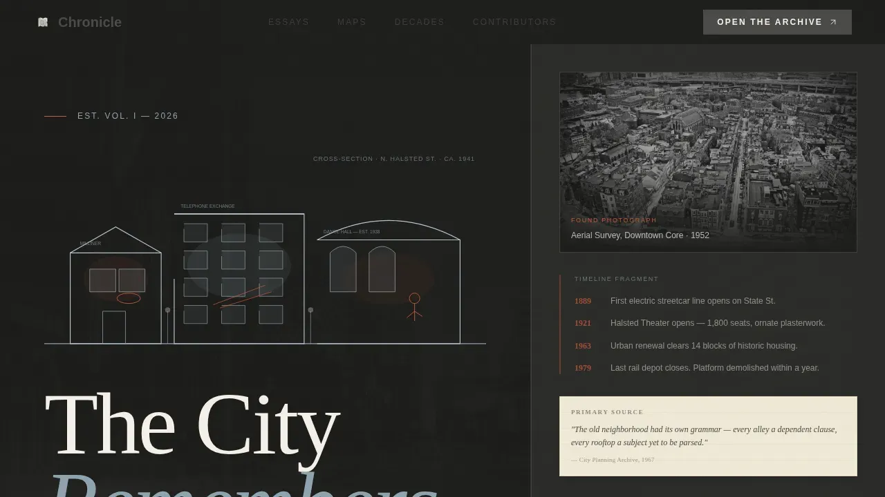
The hero section opens with a hand-drawn, cross-section view of a city block rendered in fine ink line with selective watercolor-style washes. The illustration loads progressively, line by line, as if being sketched in real time. Once complete, the blog title letterpresses itself into the top-left corner in a serifed typeface that reads as hand-set. This opening moment sets the archival tone and immediately signals to visitors that this is not an ordinary history website.
Draggable Then-and-Now Date Slider
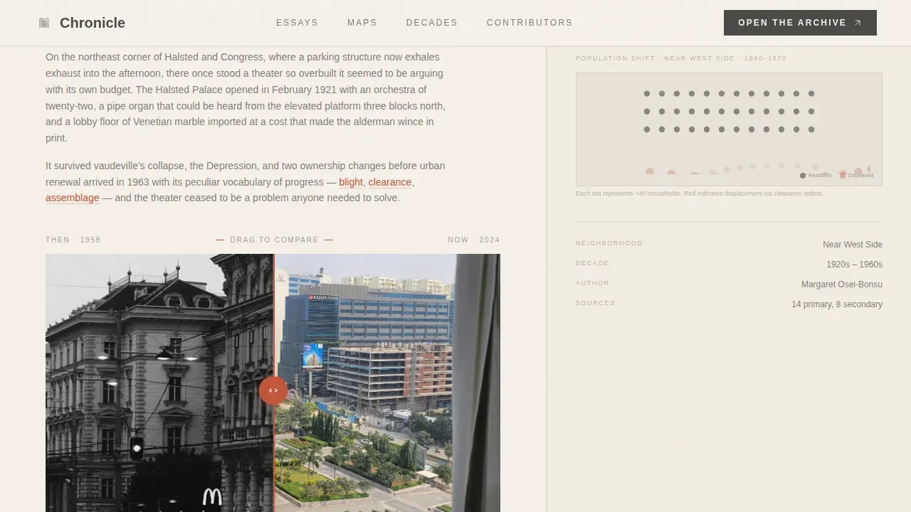
The featured essay section pairs two photographs of the same location taken decades apart. A draggable date slider lets users pull between the past and the present day, revealing how a street corner, a building facade, or an entire block has changed over time. This interactive element is one of the most effective ways to demonstrate the depth of archive collections without requiring visitors to read a single word first. The slider creates an immediate emotional connection to the project.
Asymmetric 60/40 Content Grid
The page is built on a deliberate split: the 60-column carries long-form essays and annotated maps on a warm parchment ground, while the 40-column runs in a darker graphite tone to house sidebar artifacts. Sidebar materials include captioned photographs, timeline fragments, and source citations displayed as archival margin notes. This layout ensures that research-heavy content remains readable while visual artifacts stay contextually close without competing for attention. Users who prefer to skim the sidebar and users who want to read every word both find a comfortable path through the page.
Bento-Grid Archive Sampler
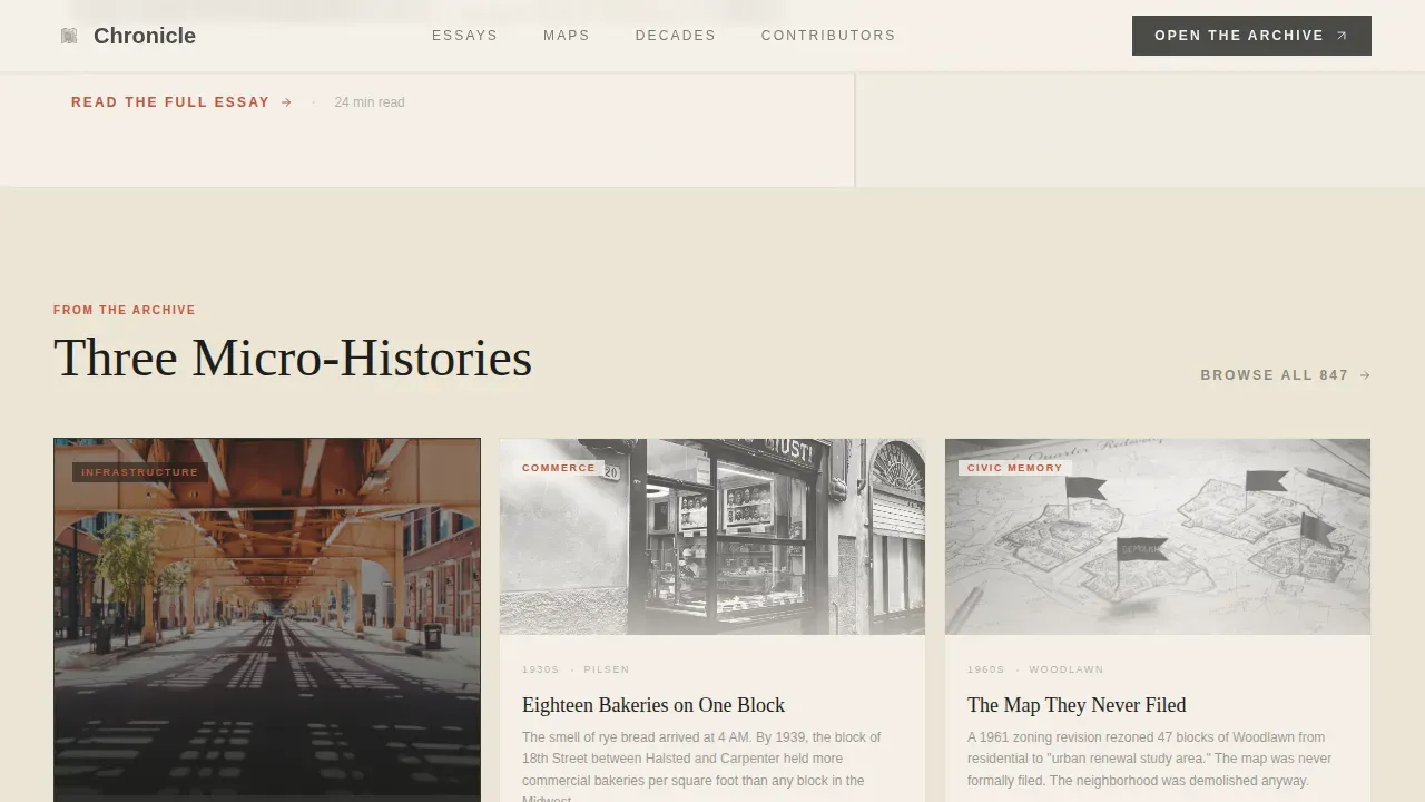
Three micro-history cards sit in an asymmetric bento arrangement beneath the featured essay. Each card carries a decade label, a neighborhood tag, and a short excerpt from a longer piece. The accumulation effect is intentional: by the time visitors reach the third card, they have absorbed enough history to feel genuinely invested in the fourth. The sampler functions as a curated exhibition of what the full archive contains, giving visitors a clear reason to explore further.
Mid-Scroll Newsletter Capture
A hand-lettered banner appears mid-scroll after the archive sampler. It collects only two pieces of data: an email address and a favorite neighborhood selected from a dropdown. The promise is a monthly dispatch of new findings. The banner is styled to feel like a printed broadsheet announcement rather than a standard form, keeping the archival atmosphere intact while enabling real audience growth. Placing the request after substantial content delivery makes the sign-up feel earned rather than premature.
Contributor Voices Section
The final content section before the footer presents editorial blockquote testimonials pulled from contributors and readers. Each blockquote is paired with a pencil-sketch portrait treatment that reinforces the hand-crafted visual identity. This section serves as social proof grounded in the project's creative world rather than generic star ratings or statistics. Reader pull quotes, contributor bylines, and decade or neighborhood metadata all appear here, giving visitors confidence that real people with real expertise stand behind the archive.
Page sections overview
| Section | Purpose |
|---|---|
| Hero Illustration | Progressive ink-sketch city cross-section with letterpress title reveal |
| Featured Essay Slider | Draggable then-and-now photo pair with date slider for cinematic comparison |
| Archive Sampler Grid | Three bento micro-history cards building accumulation and reader investment |
| Newsletter Banner | Mid-scroll hand-lettered email capture with neighborhood dropdown |
| Contributor Voices | Blockquote testimonials with pencil-sketch portrait styling and byline metadata |
| Footer Split | Logo and tagline left, navigation links right, archival pattern background |
Design & branding system
Chronicle's visual identity follows an Atelier Studio theme using the Cloud Canvas color system. The palette is drawn directly from archival materials: warm parchment, soft graphite, muted studio blue, and a faded vermillion used sparingly for links, pull quotes, and interactive highlights. The result feels like a conservator's worktable rather than a standard editorial website.
- Colors: warm parchment (#F5F0E8) for the main content ground, soft graphite (#4A4A48) for the sidebar column, muted studio blue (#8FA3B0) for supporting text and metadata, and faded vermillion (#C2553A) reserved for interactive elements and pull-quote markers
- Typography: Fraunces for all serif headlines, delivering a hand-set letterpressed quality; DM Sans for body text and user interface elements, ensuring clean and highly readable modern fonts pair naturally with the era-appropriate headline treatment
- Decorative details: pencil-sketch portrait treatments, period-typography newspaper clipping styles, annotated map styling, and margin-note source citations all contribute to a space that feels genuinely archival rather than decoratively vintage
Mobile & speed optimization
Chronicle is designed desktop-first to support long-form reading and archive browsing, which is the natural behavior of its primary audience. A mobile fallback layout is included so that visitors on smaller screens can still access the full page experience. Interactive widgets such as the date slider and the neighborhood dropdown are built as client components only, keeping the static hero and content sections lightweight.
- The progressive SVG illustration loads as a static asset on the hero before client-side animation begins, reducing initial load weight
- Scroll-triggered reveals and parallax effects activate only when the relevant section enters the viewport, avoiding unnecessary processing on sections the visitor has not yet reached
How this template helps you convert
Chronicle is structured so that every conversion moment is earned through content delivery. The page does not ask visitors for anything until it has already given them substantial value in the form of micro-histories, interactive artifacts, and editorial voices.
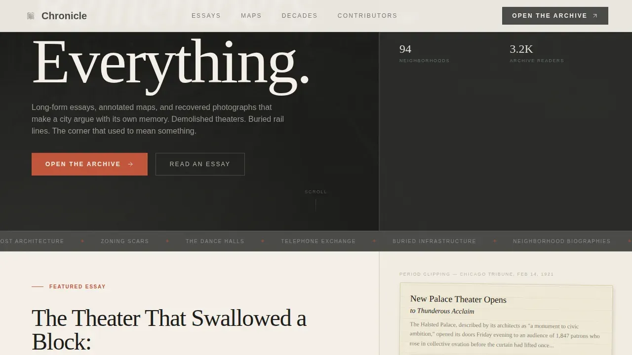
- The "Open the Archive" primary call to action appears after the hero, pointing visitors to a searchable, map-based article index organized by decade and neighborhood, giving users an immediate and purposeful next step
- The mid-scroll newsletter banner arrives after three full micro-history cards have been consumed, making the sign-up feel like a natural continuation of an experience the reader is already enjoying rather than an interruption
Other information about this template
Chronicle fits comfortably alongside the broader world of serious archive and library projects. Institutions like the Library of Congress are developing new experiences aimed at increasing access to vast collections and connecting visitors with archive collections that match their personal interests. The Explore Archives Storytelling Tool similarly aims to reshape archive data to enable new storytelling methods. Community-driven projects, from the University of East London's live-performance history archives to the University of Leicester's micro-volunteering initiative, show that education and community engagement in local history are growing priorities worldwide.
This template supports that same ambition at a smaller, more personal scale. It gives independent creators and local history groups a great opportunity to present their research with the seriousness and creativity it deserves, without requiring engineering resources or extensive programming knowledge. No-code platforms have made it significantly easier to begin a project like this, and Chronicle is designed to slot into that process naturally.
- The page layout supports content organized into clear sections that highlight key archival themes, consistent with best practices for digitized history collections
- Authentic, era-appropriate headline fonts are paired with clean modern body fonts throughout, following established guidance for archive website design
- Tools like tooltips or contextual links can be added to explain archaic terms, helping a wide range of users explore unfamiliar historical records without friction
- Community feedback gathered through the newsletter form can play an important role in improving the relevance of published archive collections over time
- The footer follows Pattern 7 (Arc Browser Split): logo and tagline on the left, navigation links on the right, keeping the site map clear and easy to navigate, as recommended for archive websites
- High-quality images, scans of documents, and snippets of newspapers are displayed throughout the page to evoke nostalgia and curiosity in the manner of strong visual storytelling
- The page is structured to invite visitors into the archive through accumulated content, consistent with community engagement principles that help archives better reflect the histories and experiences of underrepresented groups
- This template presents a great opportunity for local history groups to preserve fragile materials in a digital-first space, protect their legacy, and connect with audiences across the city and beyond
- Action-oriented microcopy guides users through every interactive element, from the draggable slider label to the newsletter form field, keeping the experience clear and engaging throughout
- The newsletter form serves as a simple but dedicated forum for reader feedback, helping the archive team understand which neighborhoods and decades matter most to their community
Theme
Atelier Studio
Creative direction
Industry Report
Color system
Cloud Canvas
Style
Asymmetric Grid (60/40)
Direction
Content/Resource
Page Sections
Progressive SVG Illustration Hero
Draggable Then-and-now Date Slider
Asymmetric 60/40 Content Grid
Bento-grid Archive Sampler
Mid-scroll Newsletter Capture Banner
Contributor Voices with Portrait Styling
Related questions
Can I replace the sample content with my own archive collections?
Does the draggable date slider work on mobile devices?
How many neighborhoods can I add to the newsletter dropdown?
Is this template suitable for a university department or institutional archive?
Can I extend the page with additional content sections?



