HRTech Startup Careers & Recruitment Website Template
The Hire recruiting pipeline landing page template is built for seed-stage teams drowning in spreadsheets and inbox threads. It gives founding engineers and heads of people a single, animated landing page that shows every stage of their hiring process at a glance, converts visitors with a frictionless signup flow, and makes a fragmented recruitment workflow feel like a finished product from day one.
by Rocket studio
Quick summary
The Hire template is a comparison-table landing page built for seed-stage HRTech startups. It replaces scattered recruiting tools with one polished page that visualises every stage of the recruitment pipeline, drives free trial signups through a sticky call-to-action bar and OAuth modal, and shows visitors exactly what a clean hiring process looks like before they read a single headline.
Who this template is for
This template is made for the small, overloaded teams doing serious recruiting without a dedicated recruiting ops function. If hiring and payroll land on the same desk, this page was designed for you.
- Founding engineers and technical co-founders screening fifty or more job applications every week who need pipeline visibility without a full HR team.
- Heads of people at fifteen-person startups who own the entire hiring process and need a recruitment plan that scales without adding headcount.
- HR professionals and hiring managers at seed-stage companies who want a structured recruitment workflow and a clean way to present their process to candidates.
What problem this template solves
Most seed-stage teams lose track of candidates between the third interview and the offer letter. The hiring pipeline lives in three spreadsheets, two inboxes, and one half-remembered link. This template solves that by making the recruitment process visible, structured, and easy to act on.
- Candidates fall through the cracks when there is no single view of the recruitment pipeline, hurting both candidate experience and hiring outcomes.
- Hiring managers and department heads waste time chasing feedback because there is no shared evaluation process or structured place to sort candidates and record notes.
- Job applications arrive faster than the hiring team can process them, so qualified candidates go cold while due dates slip and key dates are missed.
What you get with this template
This recruiting pipeline template gives you a complete, conversion-focused landing page that makes the recruitment process feel effortless. Every section is purposeful and tied directly to moving a visitor from "interested" to "signed up."
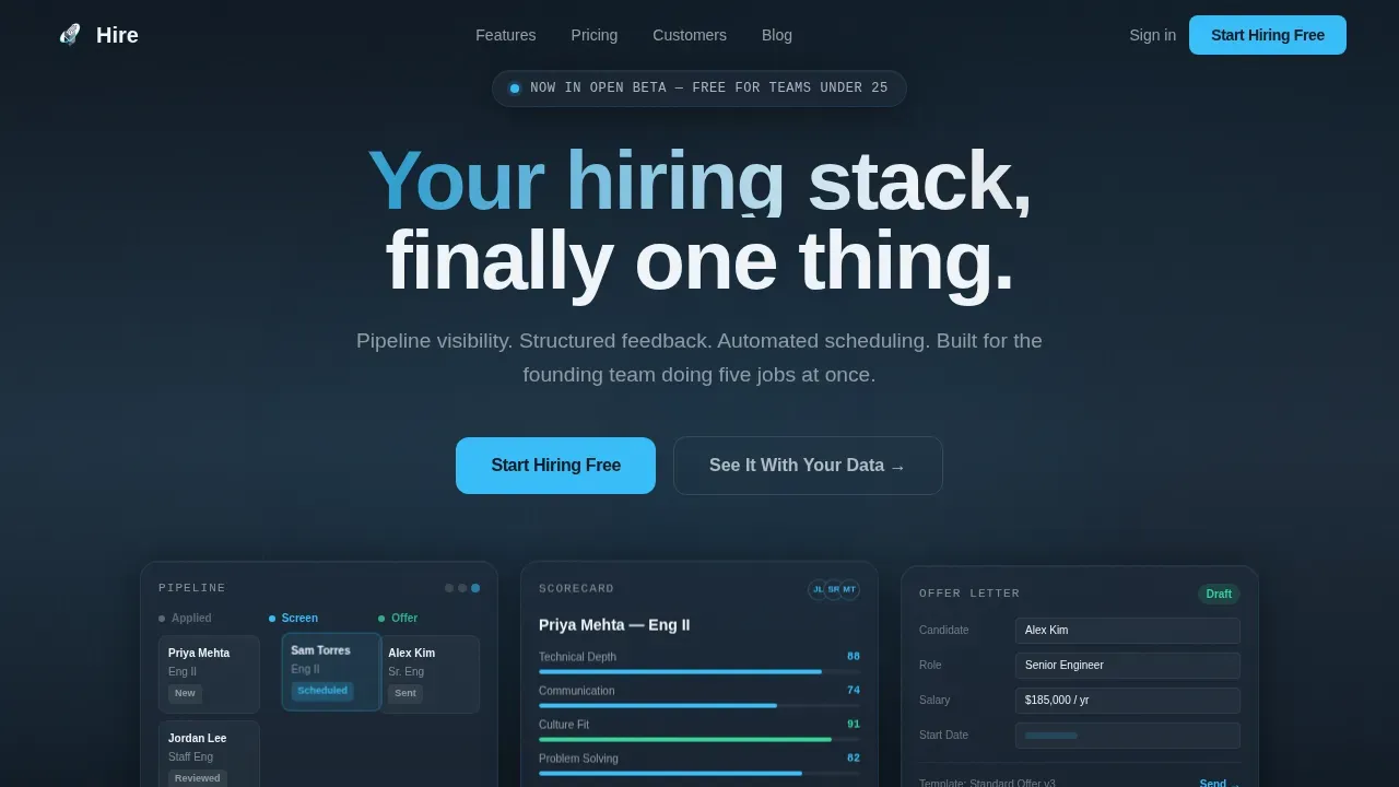
- A fully animated hero section with three dark glass panels showing a live kanban recruitment pipeline, a scorecard, and an offer letter filling in real time.
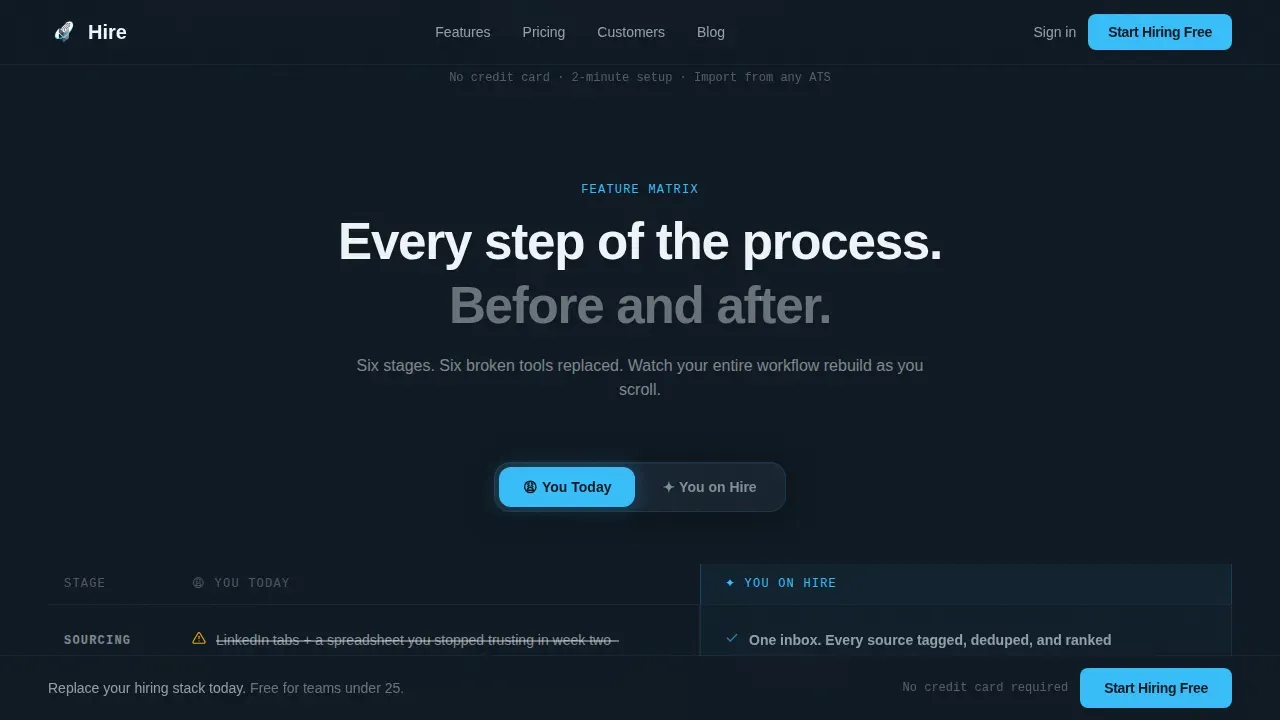
- A sticky feature matrix comparison table with a "You Today" versus "You on Hire" toggle, walking visitors through sourcing, screening, scheduling, scoring, offering, and onboarding row by row.
- A single-step signup flow with a work email field, a company size dropdown, and an OAuth button that removes password friction and helps hiring teams get started in minutes.
Feature list
This template is built around a set of carefully considered components. Each one serves a clear purpose in the hiring process and the visitor's path to conversion.
Animated Dark Glass Panel Hero
Three translucent hero cards float against a deep graphite background, each with a frosted-glass blur and a sky-blue border glow. The left panel shows a kanban recruitment pipeline with candidate cards mid-drag. The center panel displays a live scorecard with star ratings ticking upward. The right panel renders an offer letter template auto-filling fields. All three animate at once, giving visitors the immediate impression that the hiring process is already running.
Sticky Toggle Comparison Table
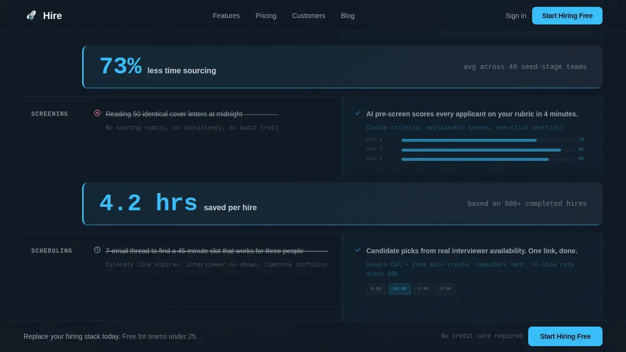
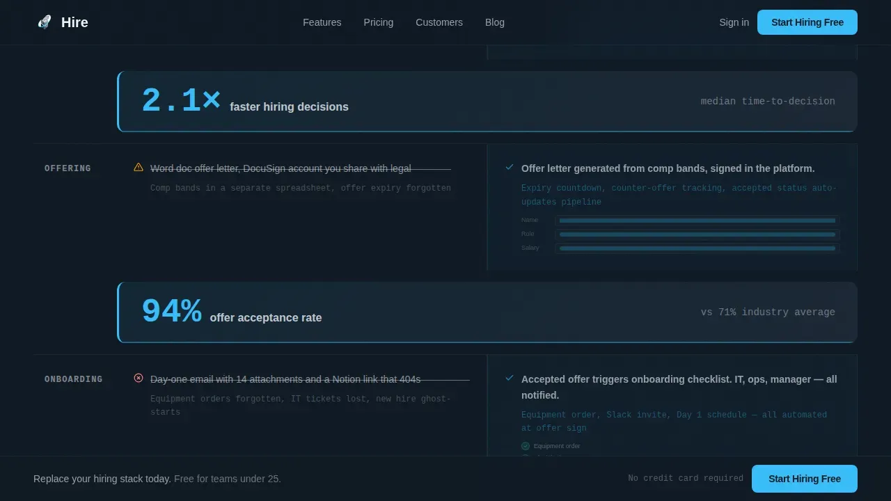
The feature matrix is the heart of this recruiting pipeline template. A sticky toggle lets visitors flip between the painful status quo and the product state. The left column renders muted slate with struck-through text and caution icons representing manual scheduling, lost feedback, and no pipeline visibility. The right column uses sky blue with checkmarks and micro-animations. Each row escalates the stakes across sourcing, screening, scheduling, scoring, offering, and onboarding, so visitors watch their entire recruitment workflow rebuilt as they scroll.
Scroll-Linked Stat Callout Bars
Between comparison blocks, single-stat callout bars slide in with motion easing. A bar might read "4.2 hours saved per hire" or show average time to first offer. These bars give the scroll rhythm, break up the comparison table, and make data driven decisions feel tangible. They surface key metrics without requiring visitors to dig into raw data.
Freemium Signup Modal with OAuth
The primary call-to-action reads "Start Hiring Free" in sky blue. It appears in the hero, pins to a slim bottom bar after the first scroll, and repeats at the final comparison table row. Clicking opens a single-step modal: work email, company size dropdown, and a Google Workspace or Slack OAuth button. Reducing form friction this way can dramatically increase conversion on job applications. A secondary path, "See It With Your Data," offers a fifteen-minute guided import using a CSV or applicant tracking system export.
Social Proof with Founder Metrics
Authentic testimonials from seed-stage founders with specific time-per-hire and pipeline statistics build trust in the recruitment process. Real candidate data points, rather than generic quotes, communicate that this is a tool built for the right talent sourcing challenges at this stage of growth.
Linear Single-Row Footer
The footer uses a clean, single-row layout that keeps contact details accessible and the page visually grounded without cluttering the bottom of a conversion-focused experience.
Page sections overview
| Section | Purpose |
|---|---|
| Dark Glass Hero | Animates three live pipeline panels to hook attention instantly |
| Feature Matrix Toggle | Compares current recruitment pain against the product state row by row |
| Stat Callout Bars | Surfaces key metrics between comparison blocks with motion easing |
| Signup call to action Modal | Converts visitors with a single-step, OAuth-powered free trial signup |
| Social Proof Block | Builds trust with founder testimonials and measurable hiring metrics |
| Sticky Bottom Bar | Keeps the primary call-to-action visible throughout the scroll |
| Linear Footer Row | Anchors the page with clean contact details and navigation links |
Design & branding system
The visual identity follows a Dynamic Motion theme built around a Slate and Sky color system. It feels like a rain-washed rooftop at dawn, where dark ground gives way to open sky.
- Deep graphite slate (#1E2A38) dominates the hero and footer; mid-tone steel (#4A5568) fills secondary surfaces; open sky blue (#38BDF8) lives exclusively on buttons, toggle states, and active table column highlights; atmosphere white (#F0F4F8) separates comparison rows so the eye never loses its place.
- Typography uses Manrope for headings to keep the tone clean and modern, and JetBrains Mono for data elements and code-style labels, reinforcing the technical credibility this audience expects.
- Dark glass morphism panels with frosted blur and sky-blue border glows give the hero a tactile, premium feel that signals a product with strong design intent.
Mobile & speed optimization
The template is built desktop-first, reflecting that founding engineers and hiring managers typically review candidates and make recruiting decisions at a desk. The layout still adapts for mobile to keep the recruitment process accessible across devices.
- Responsive column stacking ensures the comparison table and hero panels reformat cleanly on smaller screens, keeping candidate progress and key metrics readable without horizontal scrolling.
- The signup modal is designed with touch-friendly input sizing, so job applicants and team members accessing the page on a mobile device can complete the OAuth flow without friction.
How this template helps you convert
Effective recruitment planning connects the hiring strategy to business goals, and this template is built to make that connection visible and actionable for every visitor who lands on the page.
- The hero section delivers immediate visual proof that the recruitment pipeline is already working. Three simultaneous animations show a kanban hiring pipeline, a live scorecard, and an offer letter completing, so the value proposition lands before a visitor reads a word. Placing the primary call-to-action above the fold reduces drop-off and keeps the path to signup short.
- The feature matrix comparison table turns the entire hiring process into a narrative. Each row of the toggle lets visitors see their current recruitment workflow reflected back at them before showing the product state. By the final row, the visitor has mentally completed a new recruitment plan. Stat callout bars between rows keep the scroll moving and let data driven decisions do the persuasion work.
- The single-step OAuth signup reduces the average time from interest to activated account. A short form with a Google Workspace or Slack button removes every unnecessary field. The secondary "See It With Your Data" path offers a guided import that collapses time-to-value from days to minutes, making the free tier feel like a concierge experience and helping the hiring team feel confident from the first session.
Other information about this template
This template is part of a growing library of recruiting templates designed specifically for startup and HRTech use cases. A few additional things worth knowing before you build.
- A recruitment pipeline template like this one works best when the hiring team treats it as a living recruitment plan, updating candidate progress, key dates, and job description details regularly so hiring managers always have an accurate view.
- Recruitment pipeline templates can include Kanban and Calendar views to manage the hiring process from multiple angles. This template's kanban hero animation gives visitors an immediate visual representation of that experience.
- A good recruiting pipeline template should be easy to use and customizable. This template supports quick cloning and customization for different key roles and job openings without rebuilding from scratch.
- Monitoring key performance indicators like time-to-hire and cost-per-hire from the beginning of a recruitment plan helps the hr team make informed adjustments. Visual representations of these metrics, like the stat callout bars in this template, translate raw data into decisions.
- Notion Recruiting Templates and Wishpond both offer tools for managing the internal candidate pipeline and launching mobile-responsive pages quickly. This template occupies a different position: it is built as a high-conversion landing page that sells the recruitment platform itself, not just tracks candidates hired.
- Recruit Rooster's Landing Page Builder and Recruit Rooster Talent Engage are well-known options for brand-specific, single-page recruiting experiences. This template takes a similar no-code, high-call to action approach but adds a dynamic motion design system and a data-led comparison table that are purpose-built for the seed-stage HRTech niche.
- This template can support a sourcing strategy that spans job boards, employee referrals, and direct outreach, since the comparison table rows cover every stage of the talent pipeline from sourcing through onboarding.
- Related templates in the Startup and Launch category cover additional resources for SaaS product launches, onboarding flows, and waitlist pages, making it easy to build out a full site once your recruitment efforts are underway.
- The salary range, job title, and company culture sections of your actual recruitment plan are separate from this landing page template, but the design system and tone are flexible enough to carry those elements as you expand the page.
Theme
Dynamic Motion
Creative direction
Feature Matrix
Color system
Slate & Sky
Style
Comparison Table
Direction
Freemium/Trial
Page Sections
Animated Dark Glass Panel Hero
Sticky Toggle Feature Matrix
Scroll-linked Stat Callout Bars
Freemium Oauth Signup Modal
Founder Social Proof Block
Linear Single-row Footer
Related questions
Can the comparison table toggle be customized for my hiring stages?
Does this template work as a standalone landing page or does it need a full website?
How does the OAuth signup flow reduce drop-off?
What does the 'See It With Your Data' secondary call to action involve?
Is this template suitable for teams not yet using an applicant tracking system?



