Live Launch Command Center Landing Page Template
Hunt is a modular card-grid landing page template built for indie makers and bootstrapped founders who want to launch on Product Hunt with confidence. It combines an animated live launch command center dashboard, scroll-triggered phase cards, and Product Hunt comment thread styled social proof to make every visitor feel the energy of a real launch day before they ever click a call-to-action button.
by Rocket studio
Quick summary
Hunt is the hunt live launch command center landing page template designed for the creator economy Product Hunt launch market. It puts a pixel-perfect, animated dashboard front and center, walks visitors through every phase of launch day, and drives them toward a package selector with a single, electric violet call-to-action button. The result is a launch page that converts through experience before it converts through copy.
Who this template is for
This template is built for the people who stay up until 3am shipping. It speaks directly to solo developers, two-person design studios, and bootstrapped founders who are preparing to launch on Product Hunt and want a proven, visual playbook rather than a blank canvas. If you have a new product and you need more people to notice it, this template was made for you.
The target audience for this template includes:
- Solo developers shipping their first software as a service product and needing a credible launch presence fast.
- Two-person design studios with a side-project tool or plugin ready to post to the Product Hunt community.
- Bootstrapped founders who have watched competitors crack the top five and want to understand what playbook they missed.
What problem this template solves
Most indie makers know that timing, community, and messaging decide whether a product launch lands on the front page or disappears. The problem is that building a compelling launch presence from scratch takes days of design work that founders cannot spare. A generic landing page does not communicate urgency. A static screenshot does not make a visitor feel the energy of a live rank climbing in real time.
This template removes those friction points:
- It replaces the blank canvas with a fully structured launch page that is scannable, data-driven, and action-oriented from the first scroll.
- It communicates launch momentum through animated metrics, scroll-triggered card unlocks, and social proof styled as real Product Hunt comment threads, so visitors trust the offer before they decide to click.
- It gives the whole team a centralized mission control layout that is ready to prepare, customize, and publish without rebuilding the structure.
What you get with this template
You get a complete, modular card-grid landing page that covers every phase of a Product Hunt launch from pre-launch anticipation to post-launch authority. The layout is opinionated by design: each section has a clear job, a clear message, and a clear next step for the visitor.
Included in the template:
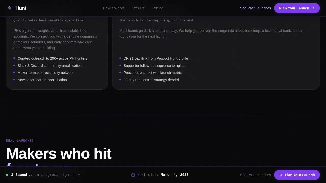
- An animated live launch command center header dashboard showing upvote velocity, rank position, countdown clock, referral source breakdown, and a toast notification strip.
- Four scroll-triggered launch phase cards (Pre-Launch Assets, Day-Of War Room, Community Activation, Post-Launch Momentum) that unlock from grayscale to full electric violet as the visitor scrolls.
- Product Hunt comment thread styled testimonial cards complete with maker badges, upvote counts, and the first comment format visitors recognize from the platform.
Feature list
This section covers the core capabilities built into the Hunt template as described in the source brief.
Animated Live Launch Dashboard
The header opens with a simple dashboard recreation of a live launch command center. Upvote count ticks upward in real time, a green delta arrow pulses beside the rank position, a countdown clock counts down from launch time, and a toast notification reads "Featured in Newsletter." Numbers animate, progress bars fill, and the overall effect gives every visitor the visceral sensation of a launch already in motion. Urgency triggers like this countdown timer motivate immediate action during the launch moment.
Scroll-Triggered Phase Card System
Below the dashboard, four modular bento-grid cards represent the four phases of a complete product hunt launch sequence. Each card starts in locked grayscale and flips to full violet-lit color as the visitor scrolls past it. This scroll-unlock mechanic simulates the actual emotional arc of launch day: calm strategy at the top, escalating energy in the middle, and grounded authority at the bottom. The system makes complex products feel approachable by breaking the launch story into clear, sequential stages.
Product Hunt Comment Thread Social Proof
Testimonial cards are styled as authentic Product Hunt comment threads. Each card shows a maker badge, a username, an upvote count, and a first comment format that Product Hunt users immediately recognize. Real-time social proof builds credibility fast. Visitors see feedback from actual community members formatted the same way they would appear on the platform, which removes doubt and builds trust before the click.
Before-and-After Case Study Cards
Case study cards show ranking screenshots from before and after a launch, paired with concrete visitor and signup numbers. This format answers the core buyer question in plain language: did this actually work? A single before-and-after card communicates more than a paragraph of copy ever could. Each card is a self-contained story that turns past launch success into present conversion confidence.
Sticky Call-to-Action Bar
A primary "Plan Your Launch" call-to-action button appears first inside the dashboard header as a floating element. After the visitor scrolls past the third card row, a sticky bottom bar repeats the same call-to-action in electric violet. There is no form on this launch page. The click leads directly to a package selector, keeping the conversion path clean and uninterrupted. A secondary direct link labeled "See Past Launches" offers a softer path to a case study gallery for visitors who need more evidence before they decide.
Footer Pattern One Layout
The footer follows a linear single-row pattern that keeps the page clean and authoritative at the close. It does not clutter the bottom of the page with excessive links or distracting elements. The footer supports the overall mission: keep the visitor focused on the launch story and the next steps.
Page sections overview
| Section | Purpose |
|---|---|
| Hero Dashboard Header | Animated command center showing live rank, upvote velocity, countdown clock, and referral toast |
| Launch Phase Cards | Four scroll-unlock bento cards covering Pre-Launch, Day-Of, Community, and Post-Launch stages |
| Social Proof Threads | Product Hunt comment thread styled testimonials with maker badges and upvote counts |
| Case Study Cards | Before-and-after ranking screenshots with concrete visitor and signup numbers |
| Call-to-Action Strip | Sticky bottom bar plus final conversion section with primary and secondary actions |
| Footer Row | Linear single-row footer closing the page cleanly |
Design & branding system
The visual identity follows a Directory and Discovery theme executed through the Void and Violet color system. The palette feels like a dark-mode dashboard at 2am: absolute void black as the base, electric violet as the active signal, phosphor lilac softening data-dense cards into something breathable, and terminal white surfaces floating over the void like product cards in an infinite scroll. Typography pairs Manrope for headings and body copy with JetBrains Mono for data, numbers, and metrics, giving the page the feel of a real engineering dashboard.
Design system highlights:
- Void and Violet palette: void black (#09090B), electric violet (#7C3AED), phosphor lilac (#C4B5FD), and terminal white (#FAFAFA) for card surfaces.
- Manrope headings paired with JetBrains Mono data labels to separate narrative from metric at a glance.
- Modular card-grid layout with bento-style phase cards, animated pulse indicators, and scroll-triggered color unlocks that escalate visual energy as the visitor moves down the page.
Mobile & speed optimization
The template is designed desktop-first to serve founders researching at 2am on a laptop, but it includes full mobile support. The layout adapts to smaller screens without losing the impact of the animated dashboard or the scroll-unlock phase cards. Mobile-first design principles ensure the command center uses thumb-friendly tap targets, and the card grid reflows cleanly at every breakpoint.
Key optimization considerations:
- Desktop-first layout with full mobile support, ensuring the animated dashboard and card grid remain functional and visually clear on all screen sizes.
- Server Components handle the static sections of the page, while Client Components manage the animated dashboard metrics, keeping the heavier interactive elements scoped to where they are needed.
- Scroll-triggered interactions and pulse indicators are scoped to client-side rendering, so the static content of the launch page loads predictably while the animated elements activate on demand.
How this template helps you convert
The Hunt template earns the click before it asks for it. Every design decision, every animated metric, and every unlocked phase card is engineered to build conviction that this launch system has been used dozens of times and the only variable left is the visitor's product. The page does not ask visitors to trust a description; it asks them to feel a launch.
- The animated dashboard creates immediate urgency. A dynamic countdown timer, a climbing upvote count, and a live rank position give the visitor the sensation of a launch already in progress. Urgency triggers like these motivate immediate action and drive traffic toward the primary call-to-action before the visitor has read a single line of body copy.
- The scroll-unlock phase card system builds purchase confidence progressively. As each card flips from grayscale to violet, the visitor mentally walks through the full product launch sequence. They arrive at the call-to-action having already rehearsed the plan, which removes hesitation and improves the conversion rate from visit to click.
- The social proof section closes the trust gap. Comment thread styled testimonials, before-and-after case study cards, upvote counts, and maker badges combine to show that this launch approach has produced measurable outcomes. Social proof at this level of specificity turns skeptical founders into customers far more effectively than a generic testimonials section ever would.
Other information about this template
The Hunt template lives at the intersection of the creator economy and the Product Hunt community. It was designed for the specific rhythm of a Product Hunt launch: 12 AM PST start, a critical first four hours of visibility, a full 24-hour sprint, and a post-launch momentum phase that keeps website traffic coming after the day badge drops off. The template supports that full arc from the coming soon page moment through to case study authority.
Additional context for buyers and teams:
- The template includes layout space for a coming soon page style teaser approach, where early visitors can follow progress before the full launch page goes live, helping build anticipation and grow an email list ahead of launch time.
- The launch email context is built into the template story. The social proof section and phase card system are designed to complement the launch email sequence a team sends on launch day. A strong launch email mobilizes the email list, directs subscribers to the Product Hunt page with a direct link, and the landing page handles conversion from that traffic. A SaaS Product Hunt launch email is a message sent to announce that a product is live on Product Hunt and to invite the audience to check it out, upvote, or share. The best launch emails explain why the launch matters, how users can help, and what is in it for them. Follow-up emails throughout the day can remind users to support the product and help maintain momentum. Sending multiple emails on launch day keeps the email list active and can produce more upvotes throughout the sprint.
- Social media posts and activity across social media platforms are a key part of any launch day plan. The template's visual language, dark-mode dashboard aesthetic, and animated metrics are designed to translate well into gallery images and animated gifs shared on social media posts, giving makers shareable assets that feel native to the Product Hunt ecosystem.
- Relevant forums and community channels can drive meaningful traffic to the launch page. The template is structured to receive that traffic with a clear message and a single primary call-to-action, so visitors from any source arrive at a page that is ready to convert.
- Product Hunt is a platform where tech creators and enthusiasts share their favorite new products, websites, apps, and features with a community. Launching on Product Hunt can bring brand exposure, industry clout, and a product hunt spike in website traffic. A Product Hunt launch can also provide a high authority backlink to your site, which can support broader discoverability.
- The template supports multiple makers on a single launch. When a team has multiple makers listed on their Product Hunt post, the testimonial and maker badge card format within the template reflects that structure naturally, allowing the company name and individual contributor voices to coexist clearly on the page.
- For web app and software as a service products especially, the combination of an animated dashboard, case study cards, and comment thread social proof answers the three core questions a visitor needs to resolve before they decide: What is it, how does it work, and why should I care.
- The page is designed to support a practice run scenario. Teams can use the template to walk through the full launch sequence layout, plan copy for each phase card, and write the first comment their maker account will post on launch day, all before the actual clock starts.
- Personal account credibility matters on Product Hunt. The template's maker badge card format is built to highlight individual personal account presence alongside company messaging, which aligns with the platform's emphasis on human-led launches.
- Having a dedicated hunter with a following can enhance visibility. The template includes layout space for a short description of the hunter and their role in the launch, keeping the message personal and community-native.
- Teams can use the phase card system to assign owners and prepare actionable checklists for each stage. The four-card structure maps naturally to the phases where different team members take the lead, from pre-launch asset preparation through post-launch feedback review.


Theme
Directory & Discovery
Creative direction
Launch Energy
Color system
Void & Violet
Style
Card Grid (Modular)
Direction
Click-Through
Page Sections
Animated Live Launch Command Center Dashboard
Scroll-triggered Phase Card Unlock System
Product Hunt Comment Thread Testimonials
Before-and-after Case Study Cards
Sticky Dual Call-to-action System
Linear Single-row Footer Pattern
Related questions
Does this template include a form for collecting signups?
Can I adapt this template to build a coming soon page before my launch goes live?
How does the scroll-triggered phase card unlock mechanic work?
Is the Hunt template suitable for solo makers as well as small teams?
What launch day planning does the template layout support?


