PropTech Startup Complete Professional Website Template
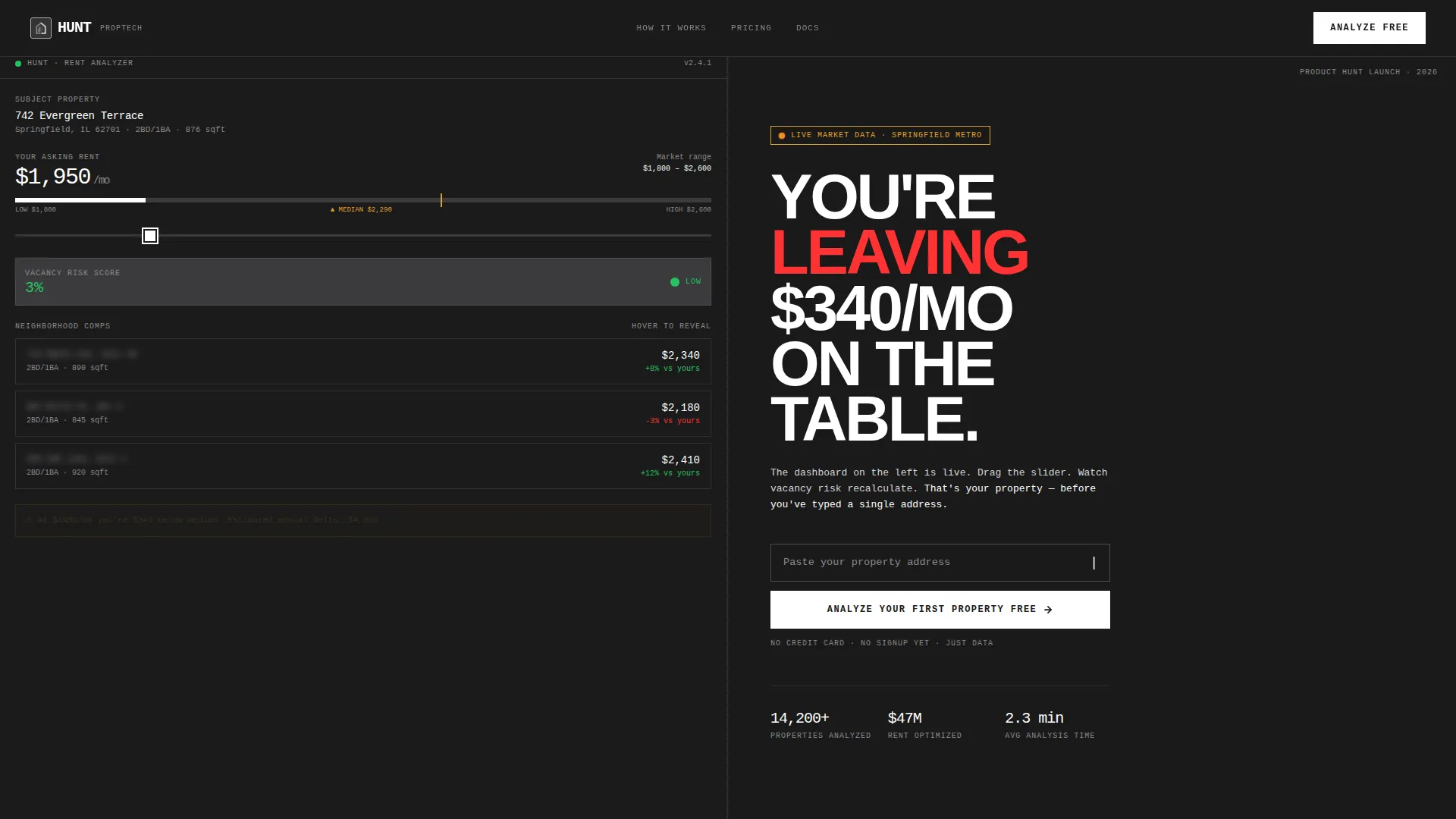
Hunt is a bold brutalist PropTech landing page template built for product launches. It uses a 50/50 split-screen layout with an interactive rent analysis dashboard on one side and a high-impact conversion flow on the other. Designed for landlords, property managers, and first-time investors, it turns browsers into users before they ever hit the sign-up button.
by Rocket studio
Quick summary
Hunt is a single-page PropTech launch template built on a split-screen layout. The left half shows a live, interactive rent analysis dashboard. The right half drives freemium sign-ups through a progressive three-step form. Every scroll unlocks a new layer of the product, making the page feel like hands-on tool exploration rather than passive reading.
Who this template is for
This template was designed for PropTech founders and product teams launching a rent analysis or portfolio management tool. It speaks directly to users who know their audience well and want the landing page to feel like the product itself.
- Solo landlords and small-portfolio investors who need to see real data before committing to a tool
- Mid-size property managers juggling multiple zip codes who want proof of value upfront
- First-time investors who just closed on a property and need clear, guided onboarding into a new platform
What problem this template solves
Most PropTech landing pages describe a product. This template demonstrates one. The typical pattern of headline, features list, and a sign-up button does not build confidence. Visitors arrive skeptical and leave before they convert.
- Landlords and investors cannot tell whether a tool understands their specific portfolio size or market
- Generic forms ask for too much too soon, creating friction before any value is delivered
- Static pages give no sense of how the product actually behaves under real conditions
What you get with this template
You get a fully structured, single-page launch layout with interactive components built into the design from the ground up. Nothing here is decorative. Every section has a functional purpose tied to conversion.
- A 50/50 split-screen header with a pre-filled rent analysis dashboard and a brutalist headline block
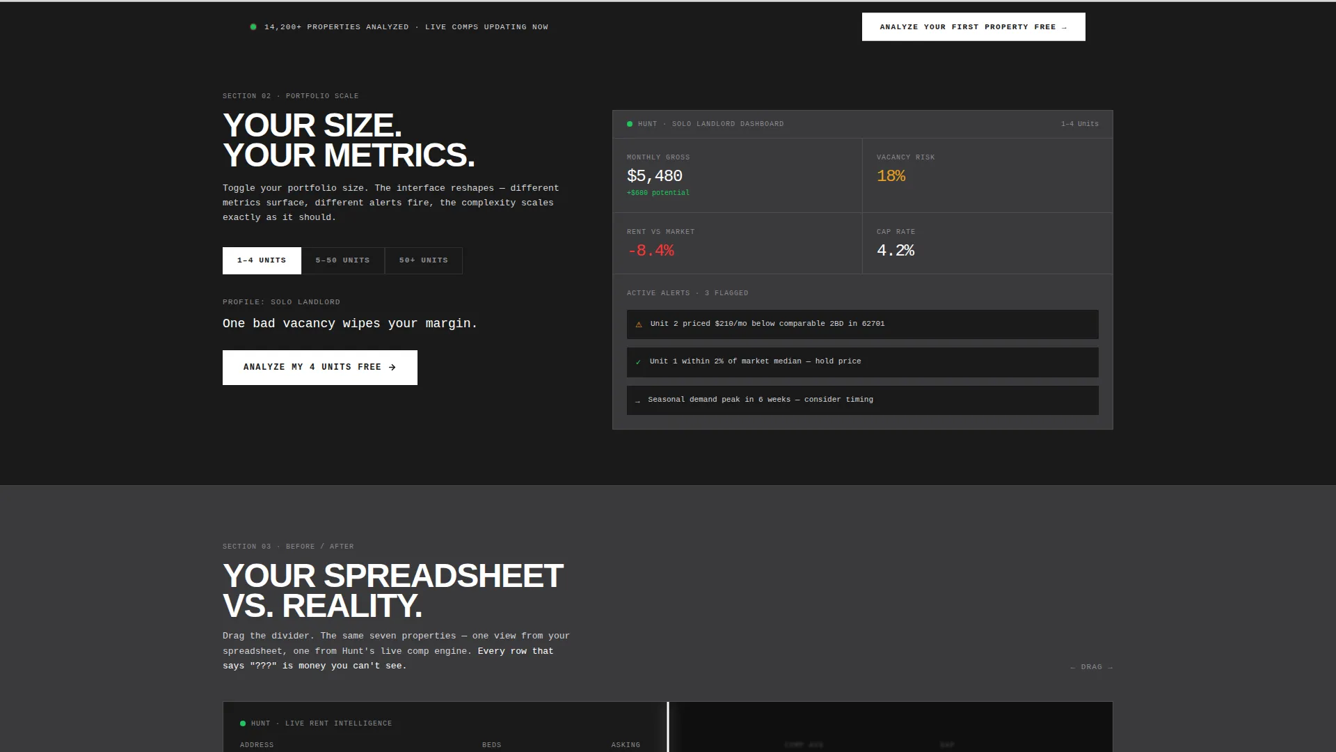
- Three scroll-depth sections that each reveal a distinct product capability through interaction
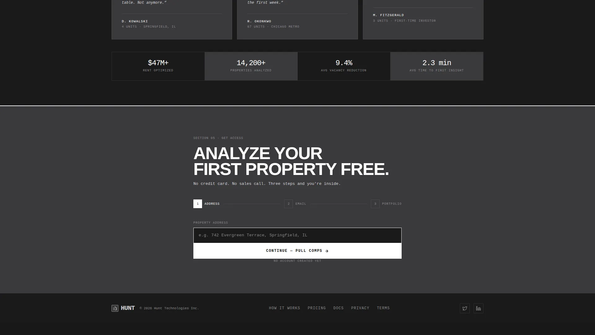
- A progressive three-step sign-up form that starts with only a property address, no credit card required
Feature list
This template includes purpose-built features grounded in the brief. Each one serves a specific role in the conversion flow.
Live Interactive Dashboard Panel
The left half of the header shows a stripped-down rent analysis interface with a real address pre-filled. Visitors see a rent range bar, three neighborhood comps with blurred addresses, and a vacancy risk score. Hovering comp cards reveals partial data. Dragging the rent slider recalculates the vacancy risk score in real time.
Portfolio Size Toggle
Section two lets visitors switch between three portfolio tiers: 1 to 4 units, 5 to 50 units, and 50 or more units. The interface on the left reshapes with each toggle. Different metrics surface, different alerts appear, and the visible complexity scales to match the selected portfolio size.
Before and After Comparison Slider
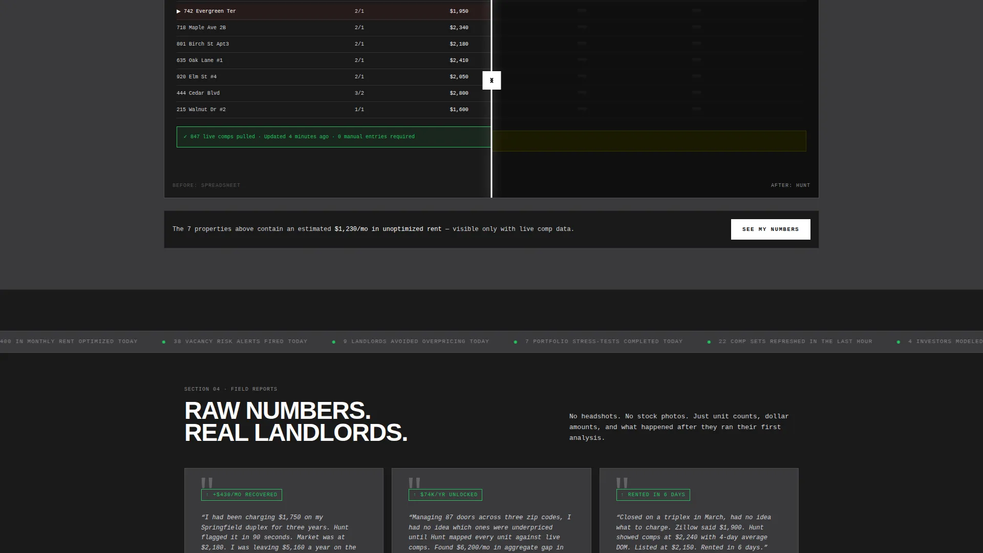
Section three places a blurred legacy spreadsheet on the left panel and the same data inside Hunt on the right. Visitors drag a wipe slider to compare the two views side by side. The interaction makes the product's clarity advantage immediately tangible.
Social Proof as Raw Data
Section four renders testimonials in monospaced type with no photos, just quotes, names, and unit counts. A live-updating ticker displays the number of rent optimizations calculated that day. The section feels like a data feed, not a marketing panel.
Progressive Three-Step Sign-Up Form
The freemium conversion flow is broken into three screens. Screen one asks for a property address. Screen two asks for an email. Screen three presents three clickable portfolio-size cards. Each step is small enough to feel frictionless and specific enough to feel personal.
Sticky Bottom Conversion Bar
A persistent bottom bar appears after 40 percent scroll depth. It repeats the primary call to action and stays visible as visitors continue reading. The bar activates only after visitors have already interacted with the dashboard, so the prompt arrives with earned context.
Page sections overview
| Section | Purpose |
|---|---|
| Split Screen Header | Combines interactive dashboard with headline and address form |
| Portfolio Toggle Section | Reshapes interface by portfolio size to show relevant metrics |
| Spreadsheet Comparison Slider | Wipes between legacy view and Hunt view for direct contrast |
| Social Proof Feed | Displays live ticker and monospaced testimonial blocks |
| Sticky Conversion Bar | Persists primary call to action after 40 percent scroll depth |
Design & branding system
The visual identity follows a Bold Brutalist theme. Every design decision is load-bearing. Nothing is added for decoration, and nothing is softened for comfort.
- Color system uses structural charcoal (#1A1A1A) for backgrounds, cold-rolled steel (#3A3A3C) for card surfaces, exposed aluminum (#D4D4D8) for body text, and searing white (#FFFFFF) reserved exclusively for buttons and interactive hotspots
- Typography is oversized, monospaced, and set without apology. The headline is 80px condensed sans-serif. Hover states invert to white-on-black like a terminal cursor blinking
- The palette and layout evoke an unpainted I-beam in a gutted warehouse: industrial, structural, and free of ornamentation
Mobile & speed optimization
The template is built with a single-page, section-led layout that keeps the structure lean and predictable. Interactive components are contained within defined scroll zones to avoid layout complexity on smaller screens.
- The split-screen layout is designed to reflow cleanly for narrower viewports without losing the core interactive behavior
- Component weight is concentrated in the dashboard panel and slider sections, which are self-contained and do not depend on external data calls described outside the brief
How this template helps you convert
This template earns the conversion before asking for it. By the time a visitor reaches the sign-up form, they have already used the product. That sequence is deliberate and reflected in every layout decision.
- Visitors interact with the live dashboard in the header and see their street name inside the interface, building personal relevance before any form appears
- The progressive sign-up form removes the biggest friction point by asking for only a property address on the first screen, delaying email capture to the second step
- The primary call to action, "Analyze Your First Property Free," repeats at the header, mid-page after the portfolio toggle, and in the sticky bottom bar, so the offer is always within reach without feeling aggressive
Other information about this template
Hunt was built specifically for a PropTech product launch context. The template style, creative direction, and conversion logic all reflect the niche expectations of that category.
- Template style: Split Screen (50/50), Bold Brutalist theme, Monochrome Steel color system
- Creative direction: Interactive Explorer, meaning scroll depth is used as a progressive product reveal mechanism
- Header concept: Interactive Preview, where the dashboard is a functional interface element, not a static image
- Launch direction: Freemium and trial conversion, built around a no-credit-card first-property analysis offer
- Category context: Startup and Launch, specifically PropTech Startup, with a product launch niche alignment
Theme
Bold Brutalist
Creative direction
Interactive Explorer
Color system
Monochrome Steel
Style
Split Screen (50/50)
Direction
Freemium/Trial
Page Sections
Live Interactive Dashboard Panel
Portfolio Size Toggle
Before and After Comparison Slider
Social Proof as Raw Data
Progressive Three-step Sign-up Form
Sticky Bottom Conversion Bar
Related questions
Is this template suitable for a SaaS product launch?
Can I change the pre-filled address and dashboard data?
How does the three-step sign-up form work?
Does the template require a specific platform or framework?
Who is the intended audience shown in this template's content?



