Premium Tech Newsletter Landing Page Template
Deploy is a hub-and-spoke newsletter landing page template built for senior infrastructure and platform engineering audiences. It pairs an editorial manifesto header with a sticky anchor nav, five curated spoke sections, and a friction-minimal waitlist form. The Warm Stone color palette and Atelier Studio typographic system give it the feel of a thoughtful field notebook rather than a vendor pitch page.
by Rocket studio
Quick summary
Deploy is a waitlist-focused newsletter landing page template designed for a senior technical audience. It opens with a letterpress-style manifesto, moves through five anchor-navigated spoke sections previewing past editorial content, and closes every spoke with a single "Reserve My Seat" call to action. The entire page is built to earn the signup before it asks for one.
Who this template is for
This template speaks directly to founders, editors, and creators launching a weekly infrastructure or platform engineering newsletter. It is built for people who have something sharp and curatorial to say and need a dedicated web page that communicates credibility before asking for an email address.
- Senior SREs, platform team leads, and CTOs who want to capture a technically literate target audience through a waitlist landing page
- Newsletter creators and content strategists who need a structured layout that feels editorial rather than promotional
- Digital marketers and marketing teams running B2B newsletter sign ups for a niche, signal-focused publication
What problem this template solves
Most newsletter landing page designs default to the same generic formula: a bold headline, a subscription form, and a few bullet points. That formula fails when your target audience is a senior engineer who filters vendor noise for a living. The real pain point is earning trust before asking for attention. A generic signup page does not prove editorial taste. This template solves that by structuring the landing page as a curated portfolio first and a lead capture page second.
- Vendor-heavy newsletters create skepticism in technical audiences; this template's editorial framing addresses that pain point directly
- A plain signup landing page gives readers no reason to believe the newsletter is worth their work email
- The hub-and-spoke structure encourages visitors to sample real content before committing, converting interest into sign ups more naturally
What you get with this template
You get a complete, single-page landing page structure with eight clearly defined content zones. Every zone is editable and purpose-built for a newsletter launch or waitlist campaign. The template's structured layout removes the guesswork from how to present curated infrastructure content to a skeptical, signal-seeking reader.
- A manifesto-style hero section with a bold headline, a terracotta rule, and a first-position "Reserve My Seat" call to action above the fold
- A sticky anchor nav that labels each spoke like chapters, plus five spoke sections each ending with a repeated call to action and a simple signup form
- A waitlist form with a work-email field, an optional segmentation toggle for high-value subscribers, and a live waitlist counter for social proof
Feature list
The key elements built into this template go beyond decoration. Each feature serves the core conversion goal: turning a skeptical website visitor into a confident subscriber.
Letterpress Manifesto Header
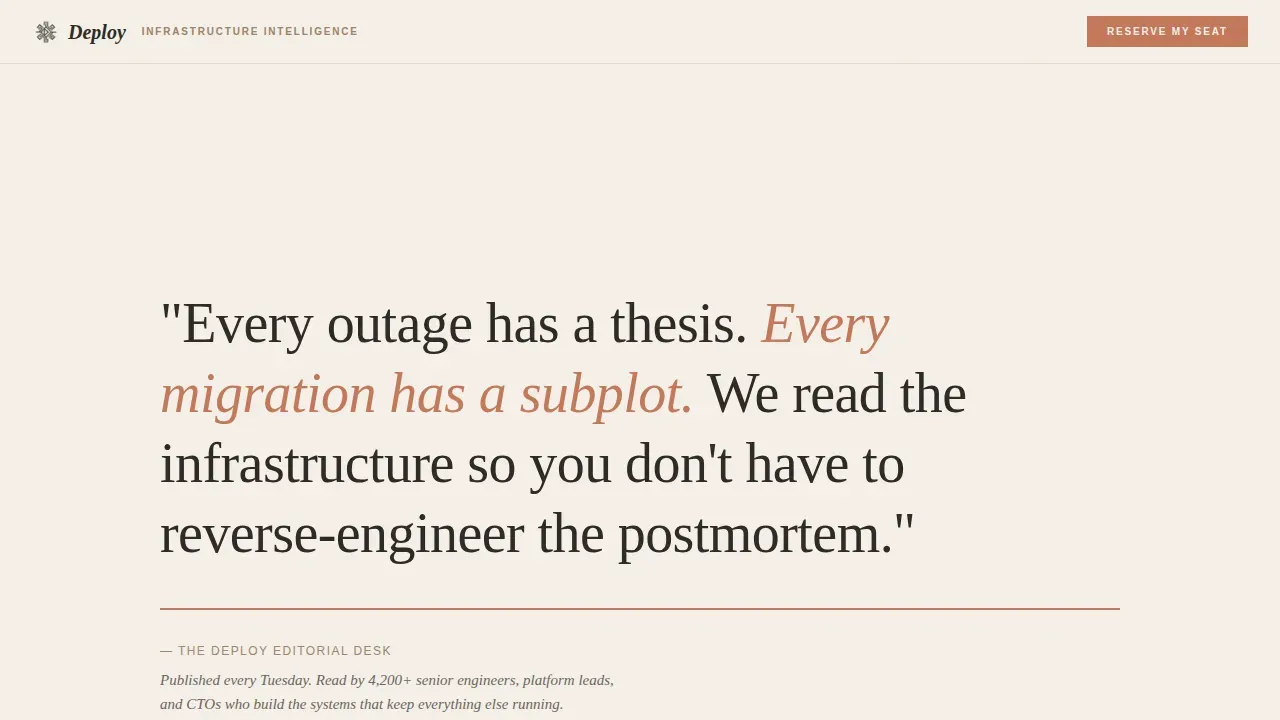
The header opens with large Fraunces serif display type set in charcoal graphite on raw parchment. The manifesto line reads as a bold headline without relying on a background image or animated visuals to carry the weight. A thin terracotta rule and a single editorial byline sit beneath the text. The whitespace itself is the design. This approach matches what top landing pages do best: deliver a concise headline that states the value proposition in under two seconds.
Sticky Anchor Navigation
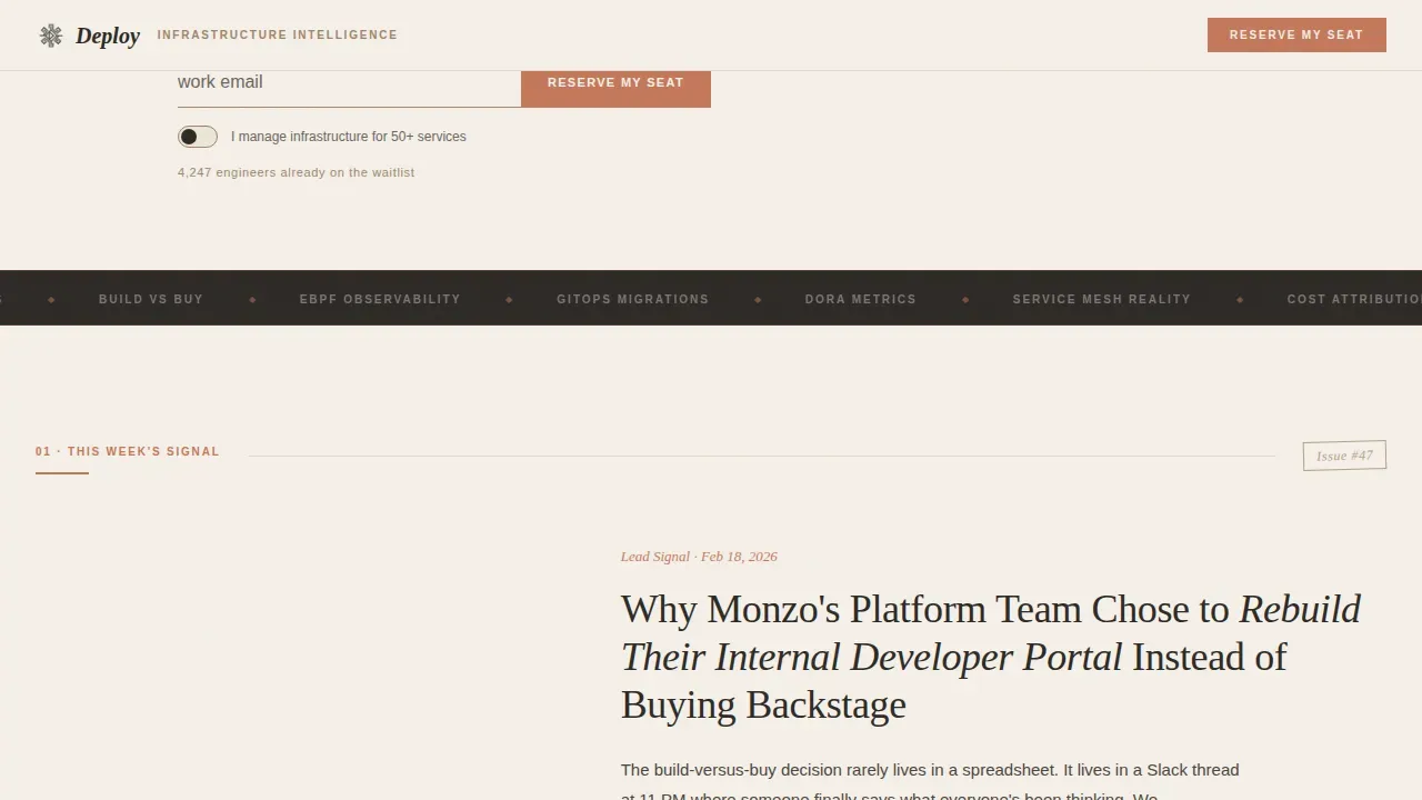
A sticky anchor nav pins to the top of the page and labels five spoke sections like chapters in a monograph. Each chapter label uses terracotta highlighting for interactive states, helping draw the user's attention to the next relevant section. The sticky call to action bar ensures the subscription form is never more than a single click away, no matter how far down the page the visitor scrolls. This is a key element for reducing friction on a high converting landing page.
Five-Spoke Curated Content Sections
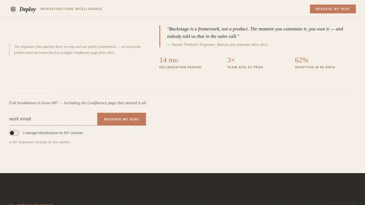
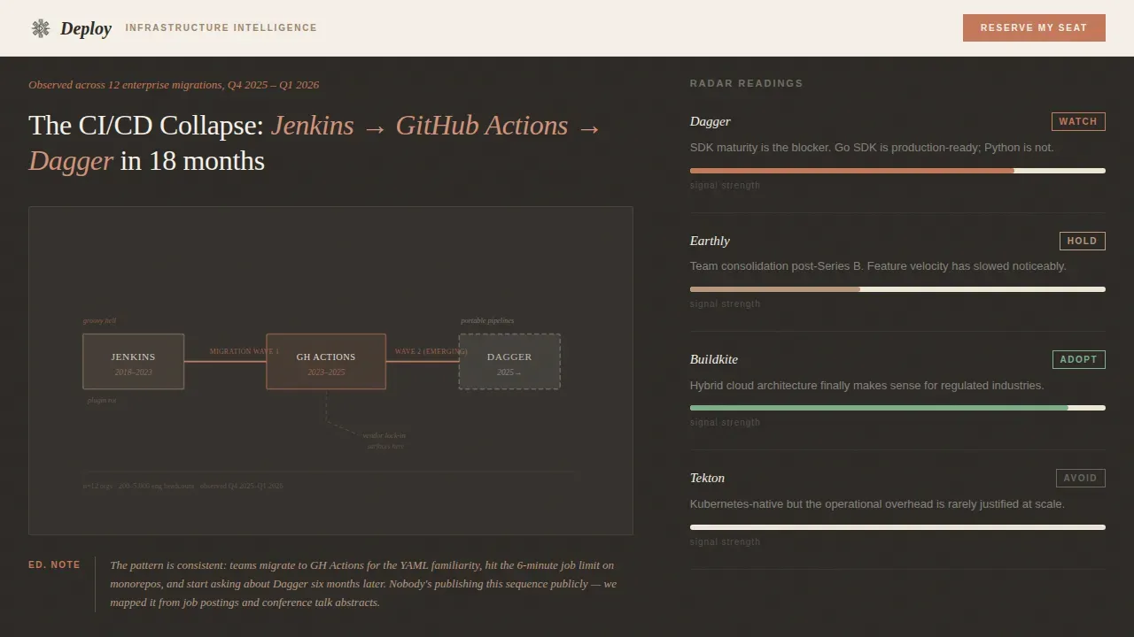
Each spoke previews a past edition highlight: a hand-drawn-style migration diagram, a pull quote from an incident review, a small warm-tone data chart, a pattern card with a curator's note, and a strategic data callout. These sections deliver actionable insights to the reader before asking for anything. Every spoke ends with a repeated call to action and a simple signup form, so the page has multiple natural moments to convert visitors without feeling pushy.
Waitlist Form with Segmentation Toggle
The subscription form collects only a work email address in the initial online form, keeping friction low. An optional toggle reading "I manage infrastructure for 50+ services" quietly segments high-value subscribers without adding form fields. Collecting only essential information in a simple signup form is a proven approach for improving newsletter sign ups. The simple form respects the reader's time while giving the publisher useful intent signals about their audience.
Live Waitlist Counter
A small counter beneath the signup form displays the current waitlist size. Using specific numbers in social proof increases trust and conversion rates on landing pages. The counter functions as passive peer validation, signaling to website visitors that peers in similar roles have already reserved their seat. This reinforces the perceived value of subscribing and makes the "Reserve My Seat" call to action feel timely rather than speculative.
Warm Stone Editorial Design System
The consistent color scheme uses four values: parchment white (#F5F0E8) for backgrounds, charcoal graphite (#2D2A26) for body text, kiln-fired clay (#A0846B) for section washes, and muted terracotta (#C4785B) reserved for calls to action and interactive states. The visual consistency across the entire page creates an analog, workshop-like atmosphere that differentiates the template from the default blue-and-white SaaS aesthetic. The design guides users from the manifesto through each spoke to the waitlist form using a clear visual hierarchy.
Page sections overview
| Section | Purpose |
|---|---|
| Manifesto Hero Header | Opens with bold letterpress type, terracotta rule, byline, and first-position call to action |
| Sticky Anchor Nav | Pins chapter-style labels to the top; terracotta highlights mark interactive states |
| This Week's Signal | Lead story preview with a pull quote to deliver immediate editorial value |
| Toolchain Radar | Migration path diagram with marginal annotation showing technical depth |
| Architecture Patterns | Pattern card with curator's note addressing platform engineering decisions |
| Incident Dissections | Pull quote from an incident review reinforcing the newsletter's editorial lens |
| The Data | Warm-tone chart and stat callouts offering strategic data to the reader |
| Footer Section | Minimal single-row footer consistent with the overall editorial aesthetic |
Design & branding system
The design identity follows an Atelier Studio theme that reads like a leather-bound field notebook left open on a drafting table. It is deliberately unhurried and tactile, working against the automation-worshipping aesthetic of most DevOps product pages. The consistent color scheme and typographic pairing carry the editorial voice across every section. Visual consistency is the template's primary trust signal, and it is built into the system rather than applied as an afterthought.
- Typography pairs Fraunces as the serif display face for headings with DM Sans as the body and user interface typeface; together they create contrast between editorial authority and functional clarity
- Backgrounds alternate between parchment white washes and soft clay washes; body text sits in graphite; terracotta marks every interactive state and call to action, giving the page a consistent color scheme that also functions as a visual hierarchy
Mobile & speed optimization
The template is designed desktop-first to match the primary context of senior engineers at workstations, while maintaining solid mobile support. The structured layout uses clip-path scroll reveals and staggered entrance animations that add tactile feedback without flash. Animation is low-to-medium intensity: no autoplay video, no heavy animated visuals beyond scroll-linked reveals. Static content is served through server components to minimize the JavaScript payload, keeping the page responsive across devices.
- Mobile layouts use large touch targets, with interactive elements sized to meet practical usability standards for buttons and form inputs across smaller screens
- The subscription form and "Reserve My Seat" call to action remain accessible and prominent on mobile, ensuring the signup form is never buried beneath content
How this template helps you convert
A well-optimized landing page can boost conversions significantly. According to research by Omnisend, newsletter landing pages achieve the highest conversion rate of all signup form types, reaching a 23% conversion rate. Deploy is structured around that insight. It does not ask for the email address until the reader has already received value. By the time a visitor scrolls through two spokes, the editorial quality has made the subscription form feel like a fair exchange rather than a cold ask.
- The manifesto header delivers the clear value proposition immediately, meeting the visitor's expectations within two seconds and keeping the first call to action above the fold where it can prompt immediate action
- The spoke sections function as live samples of the newsletter's editorial taste, turning the landing page into its own helpful content experience before the subscription form appears; this approach addresses the core pain point of earning trust in a skeptical technical audience, and it encourage visitors to stay engaged longer than a standard signup page would
- The live waitlist counter and optional segmentation toggle work as layered social proof and intent signals, giving the page depth of credibility that matches the perceived value of a curated, weekly infrastructure dispatch
Other information about this template
This template is part of a broader editorial landing page family built for niche B2B newsletters. The design system and structural logic apply broadly, but the copy and section content are optimized for a platform engineering and DevOps niche. The following notes cover practical deployment, integration, and customization context that buyers commonly ask about.
- The deploy curated infrastructure signal newsletter landing page template is built as a hub-and-spoke single-page structure, and the source code is organized so that customizing the five spoke sections requires editing clearly labeled content blocks rather than writing code from scratch
- Newsletter platforms like beehiiv and Kit offer built-in, mobile-responsive templates that can be connected to this landing page's subscription form; integrating with an Email Service Provider (ESP) like Kit or Mailchimp enables automated double opt-in flows and eliminates manual data entry after sign ups
- A custom domain enhances brand credibility for the landing page; pairing this template with a branded domain and an SSL certificate is recommended before going live to support the trust signals the design is already building
- The waitlist counter and segmentation toggle are interactive elements that rely on minimal JavaScript; they can support a feedback loop between subscriber volume data and editorial planning without requiring third party data integrations at launch
- For publishers comparing landing page examples from other technical newsletters: Demand Curve's newsletter landing page previews real insights before asking for the email; Milk Road's landing page uses subscriber counts and company logos as social proof; The Publish Press states publishing frequency in the subheadline to set clear expectations; this template is built on the same logic, turning the page sections themselves into best landing page examples of content-first conversion
- After a visitor submits the signup form, a personalized thank-you page can be configured to confirm the subscription and encourage low-stakes engagement such as sharing the waitlist link; this supports a feedback loop that extends professional growth and community building beyond the initial sign up
- For marketing teams and digital marketers adapting this template beyond a DevOps newsletter: the curated collection structure, hub-and-spoke navigation, and subscription form logic are transferable to any niche B2B newsletter with a high-trust, low-noise value proposition; the tailored messaging and visual system can be updated without altering the underlying conversion architecture
- Top landing pages in the B2B newsletter space share a set of traits: a unique value proposition stated clearly at the top, social proof that uses specific numbers rather than vague endorsements, user testimonials or peer role signals that speak directly to the target audience, and a simple signup form that collects only what is necessary; this template is designed with all of those key elements built in from the start
- The template supports A/B testing for the bold headline copy and call to action text; testing different concise headline variants can surface which framing best matches the target audience's specific pain point and improves sign ups over time
- Tailored messaging in the spoke section curator's notes means the template already demonstrates what targeted messaging looks like in practice; editors can replace the sample pull quotes and annotations with their own editorial voice without restructuring the page
- The design avoids a green background or other high-saturation color choices that compete with the editorial content; the Warm Stone palette is intentional, using subtle contrast to draw the user's attention to calls to action without visual noise
- For product landing use cases adjacent to the newsletter: the architecture of this template, with a manifesto header, spoke content previews, and a staged call to action, is directly applicable to a product landing page for a developer tool, a technical community, or a subscription-based data product; the same landing page examples logic applies across those contexts
- Customer testimonials and user ratings can be added to the social proof layer beneath the waitlist counter; the layout supports additional credibility signals without requiring structural changes to the template
- Performance metrics for the waitlist campaign, such as conversion rate by traffic source and toggle activation rate for the segmentation field, can be tracked by connecting the online form to an analytics layer; this gives publishers strategic data to refine their acquisition funnel over time
Theme
Atelier Studio
Creative direction
Curated Collection
Color system
Warm Stone
Style
Hub & Spoke (Anchor Nav)
Direction
Waitlist/Coming Soon
Page Sections
Letterpress Manifesto Hero Section
Sticky Anchor Navigation with Chapter Labels
Five Curated Spoke Content Sections
Friction-minimal Waitlist Signup Form
Live Waitlist Counter for Social Proof
Warm Stone Atelier Editorial Design System
Related questions
Can I use this template without writing code?
How does the segmentation toggle on the signup form work?
Does the template show publishing frequency to visitors?
What social proof does this landing page template include?
Can the subscription form connect to an email platform after sign ups?



