Book Author & Publisher Professional Website Template
Inkbound is a luxe minimal landing page template built for one-person self-publishing studios. It uses an asymmetric 60/40 grid, a Parchment and Rust color palette, and a Creator Spotlight layout to turn author transformation stories into a quiet, convincing sales engine. The page captures leads through a short intake form and a free downloadable publishing checklist.
by Rocket studio
Quick summary
Inkbound is a single-page template designed for boutique author services studios. It pairs editorial-grade typography with a cinematic 60/40 asymmetric grid to make every section feel like a page you want to turn. Real author spotlights, floating stat callouts, and a two-path lead capture work together to move visitors from curious to committed.
Who this template is for
This template is built for solo publishing professionals who offer manuscript-to-market services. It suits studios that handle editing, cover design, and distribution under one roof.
- First-time novelists and nonfiction authors looking for a professional publishing partner
- Indie authors on their second or third title who want covers and interiors that look traditionally published
- Self-publishing consultants ready to present their work with the visual authority it deserves
What problem this template solves
Many author services pages look generic. They list bullet points of deliverables but never show proof that the work actually transforms a manuscript into something worth selling. Visitors leave without believing the studio is the right fit.
- Authors cannot picture their own journey when a page shows only service descriptions and prices
- DIY-looking design signals undermine trust before a single word is read
- Scattered calls to action split attention and reduce the chance a visitor ever fills in a form
What you get with this template
Inkbound delivers a fully structured, design-ready landing page that tells the studio's story through the voices of its authors. Every section is built to feel considered and unhurried, the way a well-designed book interior earns its white space.
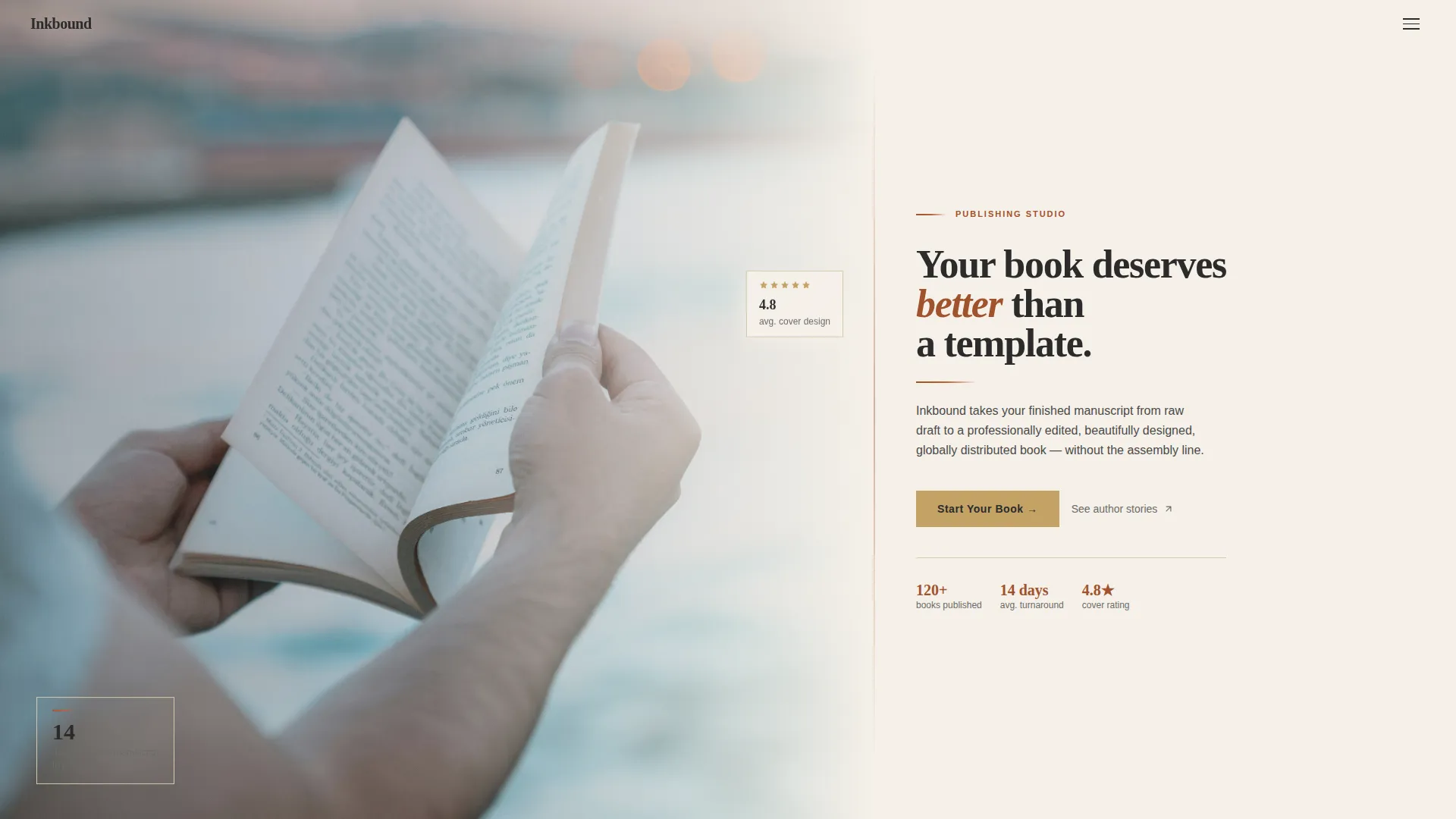
- A cinematic hero section with a 60/40 photo-and-text split, serif headline, and a single gold call-to-action button
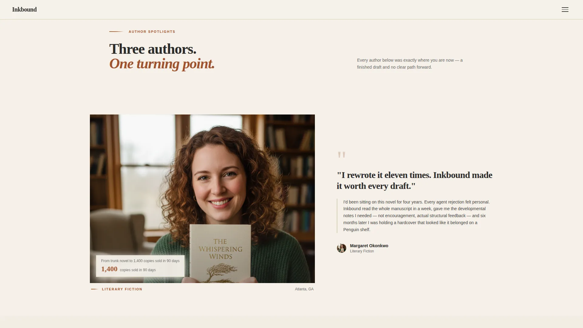
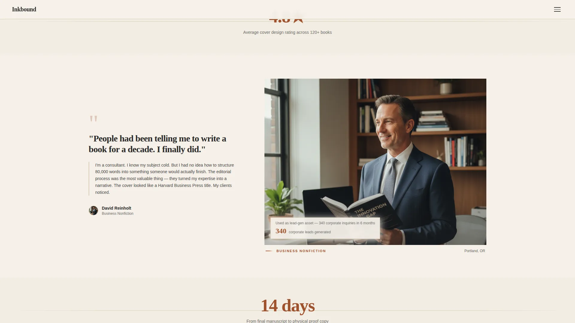
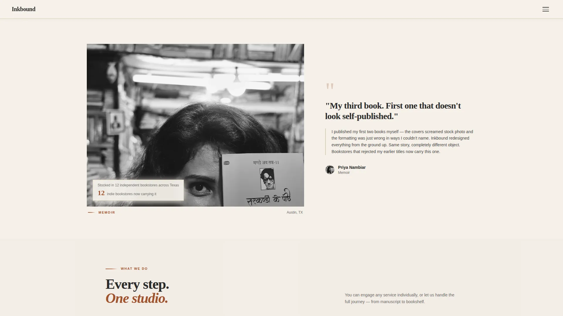
- Alternating Creator Spotlight cards that profile real author journeys with photographs and quoted testimonials
- A two-path lead capture section combining a short intake form and a gated free PDF download
Feature list
This section covers the core built-in capabilities that make Inkbound work as a lead-generation tool for author services studios.
Asymmetric 60/40 Grid Layout
The page uses a consistent 60/40 column split throughout. The ratio alternates sides between spotlight sections, creating a natural zigzag rhythm that keeps the eye moving down the page without feeling repetitive.
Creator Spotlight Section
Each spotlight card profiles one author's journey from manuscript to finished book. The card pairs a photograph of the author holding their published copy with a short quote in their own voice, building social proof one story at a time.
Floating Stat Callouts
Between spotlight cards, single-statistic moments appear in generous parchment whitespace. Examples built into the layout include turnaround time and cover design rating figures, each stated plainly without surrounding clutter.
Two-Path Lead Capture
The bottom section offers two entry points. Visitors ready to commit fill in a short intake form with genre, current manuscript stage, and email address. Visitors not yet ready can download a free self-publishing checklist PDF gated behind email only.
Services Bento Grid
An asymmetric card grid presents editing, cover design, and distribution services as distinct visual tiles. Each card earns its place without overcrowding the layout.
Scroll-Reveal and Hover Interactions
The template includes scroll-reveal stagger animations and hover micro-interactions. A parallax effect applies to the hero photograph, adding depth without distracting from the editorial tone.
Page sections overview
| Section | Purpose |
|---|---|
| Hero Photo Split | Introduces the studio with a cinematic 60/40 image and serif headline |
| Creator Spotlights | Alternating author story cards that build trust through real journeys |
| Stats Callout Moments | Single-figure callouts floating in whitespace to reinforce credibility |
| Services Bento Grid | Asymmetric tiles presenting editing, cover design, and distribution |
| Lead Gen Form | Intake form capturing genre, stage, and email for qualified leads |
| PDF Download Gate | Free checklist download capturing emails from early-stage visitors |
| Footer Split | Logo and tagline left, navigation links right |
Design & branding system
The visual identity follows a Luxe Minimal direction inspired by limited-edition letterpress printing. Every color and typeface choice is deliberately restrained, so that nothing competes with the author stories at the center of the page.
- Color palette: aged parchment cream (#F5F0E8) for backgrounds, deep rust (#A0522D) for headlines and accent borders, charcoal ink (#2B2B2B) for body text, and muted gold (#C4A265) for calls to action and hover states
- Typography: Fraunces serif for headlines to carry editorial weight, DM Sans for body text to keep prose readable at every size
- A single transparent hamburger menu icon keeps the header clean so nothing competes with the hero moment
Mobile & speed optimization
The template is built desktop-first to match the browsing habits of authors working on laptops, with full mobile responsiveness across all sections.
- Static page sections are structured as Server Components, keeping the initial load lean
- The intake form and PDF download gate are built as Client Components, isolating interactive logic from static content
- The 60/40 grid reflows cleanly on smaller screens so spotlight cards and the hero image remain legible on mobile
How this template helps you convert
The page is structured so that by the time a visitor reaches the lead capture form, they have already read three author stories that mirror their own situation. The selling happens through narrative, not pressure.
- The hero headline and gold call-to-action button establish a clear first action for visitors who arrive ready to start, capturing high-intent leads immediately at the top of the page.
- Creator Spotlight cards lower resistance by showing real transformation stories. A visitor who recognizes themselves in a featured author is far more likely to submit the intake form or claim the free checklist.
Other information about this template
Inkbound is categorized under Blog and Editorial, with a focus on the Book Author and Publisher subcategory and the Self-Published Author niche. It is localized for English-language markets in the United States, using USD and MM/DD/YYYY date formatting.
- The free downloadable resource is titled "The Self-Publishing Checklist: 27 Steps from Draft to Bookshelf" and is built into the template as a second lead capture path
- Distribution references within the layout are written to reflect global retail reach through platforms such as Amazon and IngramSpark, as well as direct sales
- The hamburger menu is a transparent icon that appears without competing with the hero composition, keeping the first impression cinematic and uncluttered
- The template ships with medium-level animation: scroll-reveal stagger on section entry, hover micro-interactions on cards and buttons, and a parallax effect on the hero photograph
Theme
Luxe Minimal
Creative direction
Creator Spotlight
Color system
Parchment & Rust
Style
Asymmetric Grid (60/40)
Direction
Lead Generation
Page Sections
Asymmetric 60/40 Grid Layout
Creator Spotlight Cards
Floating Single-stat Callouts
Two-path Lead Capture
Services Bento Grid
Scroll-reveal and Parallax Animations
Related questions
Who is this template designed for?
Can I adapt this template if I only offer one or two services?
How does the two-path lead capture work?
Is this template mobile friendly?
What visual style does this template use?



