Review & Comparison Site Specialist Reviews Website Template
Inkwell is a hub and spoke landing page template built for independent software review publications. It combines an editorial Ink and Paper visual identity with a structured anchor navigation layout, guiding technical decision-makers from founding story through methodology, featured reviews, tool comparisons, and editorial standards, all designed to earn the click through visible rigor.
by Rocket studio
Quick summary
Inkwell is a single-page, anchor-nav landing page template for editorial software review sites. It opens with a letterpress-style hero, walks visitors through an origin story and review methodology, then surfaces featured software cards, a side-by-side comparison section, and a clear editorial standards pledge, all within a warm Parchment and Rust visual identity.
Who this template is for
This template is built for publishers who take software evaluation seriously. It suits decision-support media, independent review blogs, and B2B content teams where editorial credibility is the product.
- Independent software review publishers building trust with technical readers
- B2B content teams producing vendor comparison guides for enterprise buyers
- Solo editors and small review publications launching their first structured review site
What problem this template solves
Most review site templates look indistinguishable from affiliate link farms. Visitors with high-stakes decisions, choosing a new tech stack, building a procurement case, committing six figures to an enterprise tool, need a page that signals genuine research before they invest their time. Inkwell solves the credibility gap that generic blog templates cannot.
- Visitors leave review sites that look paid or rushed before they ever click through
- Technical buyers need visible proof of methodology before trusting a verdict
- Review publishers lack a layout that communicates editorial independence visually
What you get with this template
You get a fully structured, single-page editorial layout with five purposeful anchor-linked sections. Every component is designed to move a skeptical technical reader from doubt to trust without a single form or gate in the way.
- A hero section with a Type Over Image header and a bold letterpress-style headline stamp
- Anchor navigation that pins to the top on scroll and keeps a persistent secondary call to action visible
- Featured software review cards showing scoring rubrics, reviewer credentials, and visible last-tested dates
Feature list
This template is built around a small set of high-impact, prompt-backed components. Each one earns its place by solving a specific trust or navigation problem for the editorial review format.
Persistent Anchor Navigation Bar
A sticky navigation bar pins to the top of the page once a visitor begins scrolling. It includes scroll-spy behavior so the active section is always highlighted in oxidized rust, and it keeps the secondary "Compare Two Tools" call to action visible at all times.
Type Over Image Hero Section
The hero fills the viewport with a softly desaturated editorial desk photograph. A bold Fraunces serif headline stamps across the image in iron-gall ink, styled to feel like a letterpress impression on parchment. No animation runs in this section, the weight comes from typography and honest visual context.
Origin Story and Methodology Block
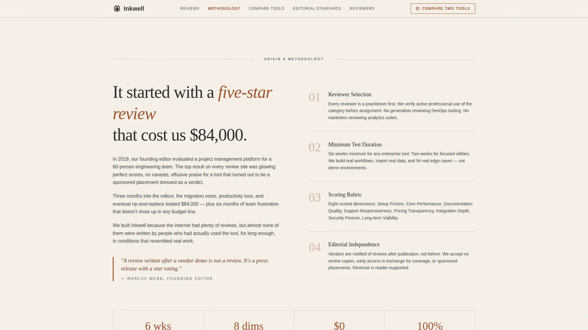
A narrative prose section opens with a short founding frustration story and then walks through the review process: how reviewers are selected, how long each tool is tested, and how scores are calculated. This section sets the editorial philosophy apart from content-farm conventions.
Featured Software Review Cards
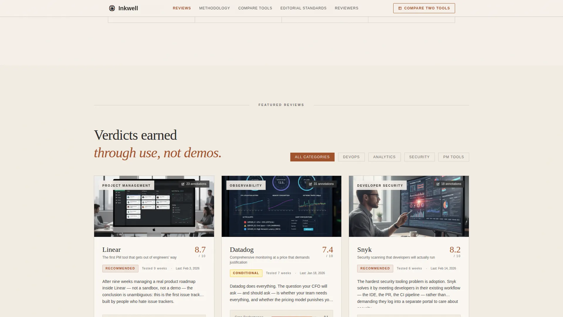
Each software card displays a scoring rubric with sub-categories, a reviewer credential line, an annotated screenshot count, and a visible last-tested date. A rust-colored "Read the Full Review" button sits at the base of every card, routing visitors directly into the full article.
Side-by-Side Tool Comparison Interface
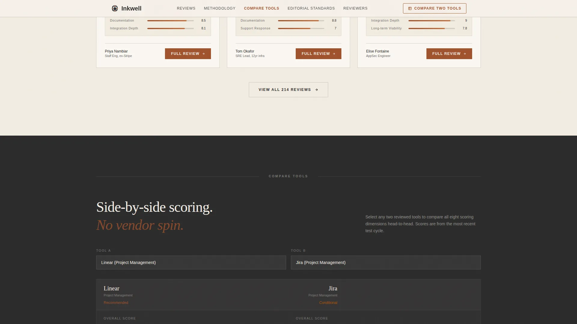
A dedicated Compare Tools section provides a structured user interface for placing two software options side by side using the same scoring dimensions. It gives procurement leads and ops managers a ready-made comparison view to reference during vendor evaluation.
Editorial Standards Section
A clearly marked section covers the anti-affiliate pledge, reviewer selection criteria, and independence markers. It closes the trust loop the origin story opened, giving visitors a concrete record of what "rust-stamped" editorial independence means in practice.
Page sections overview
| Section | Purpose |
|---|---|
| Hero header | Anchors editorial identity with letterpress headline over editorial desk photo |
| Origin Story | Builds credibility through founding narrative and review methodology detail |
| Featured Reviews | Displays scored software cards with reviewer credentials and last-tested dates |
| Compare Tools | Provides side-by-side scoring interface for two software products |
| Editorial Standards | States anti-affiliate pledge, reviewer selection, and independence markers |
| Footer | Delivers minimal horizontal-flow footer with essential navigation links |
Design & branding system
The visual identity follows an Ink and Paper editorial theme. Every color and type choice references the physical weight of a well-annotated reference book rather than the clean neutrality of a typical software product site.
- Parchment cream (#F5F0E8) backgrounds, iron-gall ink (#2B2B2B) for all body text and headlines, oxidized rust (#A0522D) on accents, and margin gray (#D5CEC5) for dividers and secondary containers
- Fraunces serif typeface for all headlines, DM Sans for body copy and interface labels
- Low-to-medium motion budget: scroll reveals and a subtle hero parallax, with no decorative animations that compete with content authority
Mobile & speed optimization
The template is designed desktop-first to match the primary use case, a technical buyer evaluating tools at a desk, while delivering full support across smaller screens. The layout adapts cleanly without sacrificing the editorial structure.
- Anchor navigation collapses gracefully on mobile, preserving section access without cluttering smaller viewports
- The template is built with a static-friendly architecture and React Server Components for content-heavy sections, keeping page delivery lean
How this template helps you convert
Inkwell converts through earned trust, not persuasion tricks. The entire page is sequenced to answer the skeptic's objection at every scroll depth before asking for a click.
- The hero headline and editorial desk photograph establish honest intent in the first second, filtering for serious readers and signaling that no paid placement exists behind the content.
- Scoring rubrics, reviewer credentials, last-tested dates, and annotated screenshot counts give every featured review card enough visible proof that the "Read the Full Review" button feels like a logical next step, not a risk.
- The persistent "Compare Two Tools" call to action at the right edge of the anchor nav stays available throughout the session, so procurement leads can act at the moment of readiness without scrolling back to find a link.
Other information about this template
Inkwell is purpose-built for the software review publishing niche where editorial reputation is the primary competitive advantage. A few additional details are worth noting for buyers considering this template.
- The template ships with a Hub and Spoke anchor navigation architecture, meaning each spoke section deepens the origin story rather than resetting the visitor's context
- The Parchment and Rust color system is pre-configured, with rust accents used exclusively on interactive and trust elements to guide the eye without crowding the editorial tone
- The footer follows a Vercel-style horizontal flow pattern, keeping the close of the page minimal so the last impression reinforces editorial restraint rather than promotional pressure
- The template suits U.S.-centric English-language publications using USD pricing references and MM/DD/YYYY date formatting on review cards

Theme
Ink & Paper
Creative direction
Origin Story
Color system
Parchment & Rust
Style
Hub & Spoke (Anchor Nav)
Direction
Click-Through
Page Sections
Persistent Anchor Nav with Scroll-spy
Type Over Image Hero
Origin Story and Methodology Narrative
Featured Software Review Cards
Side-by-side Comparison Interface
Editorial Standards Section
Related questions
Is this template suitable for a multi-author review publication?
Does the template include a form or email gate?
Can I adapt the scoring rubric categories on the review cards?
How does the anchor navigation behave on scroll?
Does this template work for a site that covers only one software category?



