Fountain Pen & Stationery Landing Page Template
Inkwell is a masonry-style landing page built for fountain pen and stationery Instagram accounts. It unfolds like a personal memoir, guiding visitors through chapter-by-chapter story cards before inviting them to subscribe. Two lead capture forms, a lightbox grid, and a Luxe Minimal visual identity work together to turn casual browsers into loyal newsletter readers.
by Rocket studio
Quick summary
Inkwell is a single-page, memoir-driven landing page template designed for fountain pen and stationery content creators. It uses a masonry chapter grid, GSAP scroll reveals, and two strategically placed lead capture forms to convert emotionally engaged visitors into newsletter subscribers. The visual identity is quiet, tactile, and editorial.
Who this template is for
This template is built for creators who treat stationery as a lifestyle, not just a hobby. If your Instagram feed is a curated record of inks, pens, and notebooks, this landing page gives that world a proper home outside the algorithm.
- Fountain pen enthusiasts and journalers who want to grow an email list around their passion
- Stationery collectors and calligraphy hobbyists ready to deepen community beyond social media
- Beginner-friendly content creators who also want to offer a practical starter resource as a lead magnet
What problem this template solves
Most Instagram creators have no owned channel to fall back on when reach drops. A stationery account with thousands of engaged followers can still lose connection overnight if the platform changes. This template solves the dependency problem by converting followers into subscribers you can reach directly.
- Visitors arrive from social with no clear next step; the chapter-led narrative gives them a reason to stay
- Generic newsletter sign-up pages feel disconnected from a curated aesthetic; this template matches the mood of the feed
- Dual conversion paths serve both community-driven and utility-driven visitors without compromising the story
What you get with this template
You get a fully structured, single-page layout that reads like the opening chapters of a handwritten journal. Every section is designed with intent, from the cinematic hero opening to the softly gated PDF download.
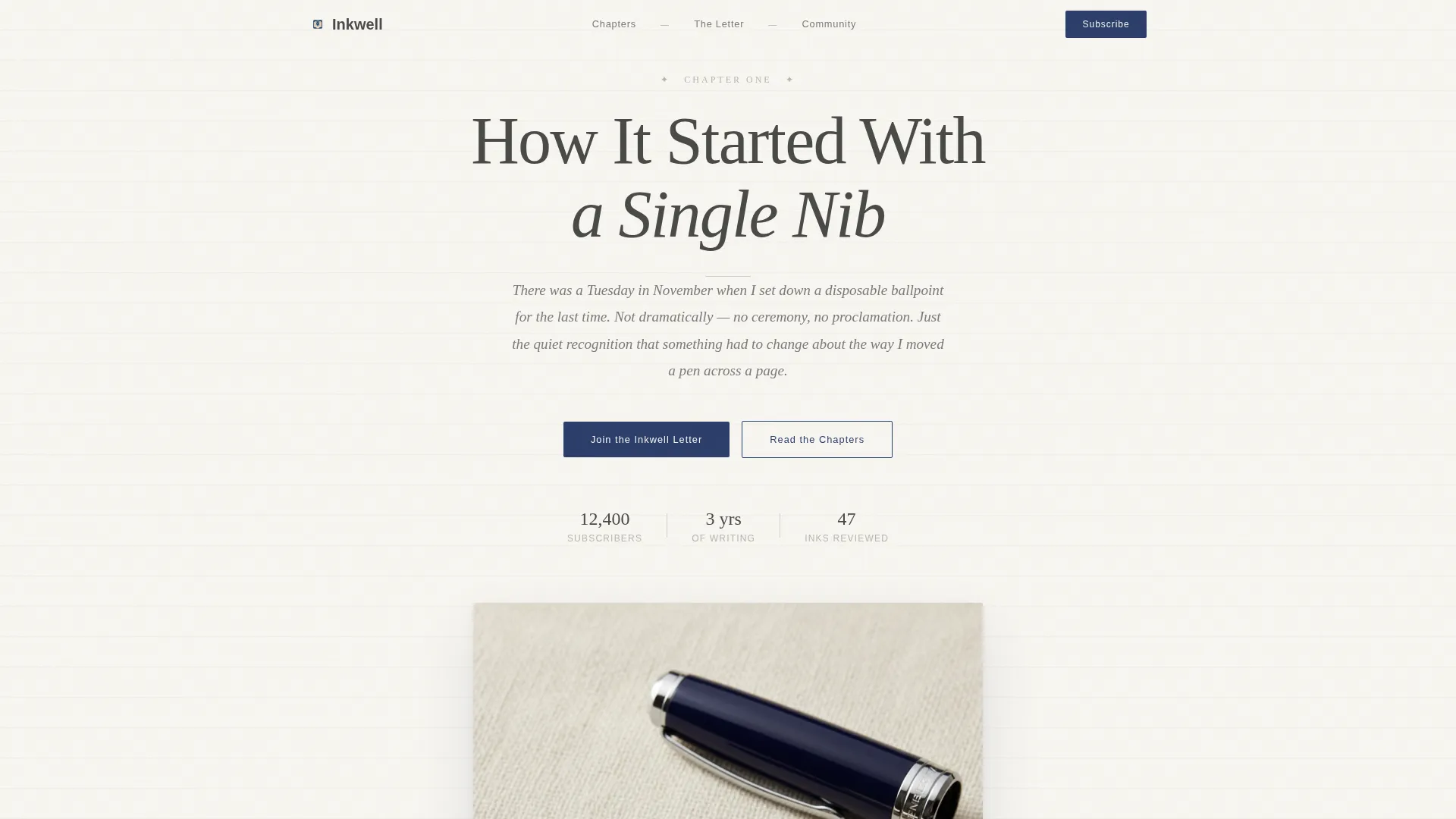
- A Chapter/Book hero section with a large serif headline and an overhead pen photograph
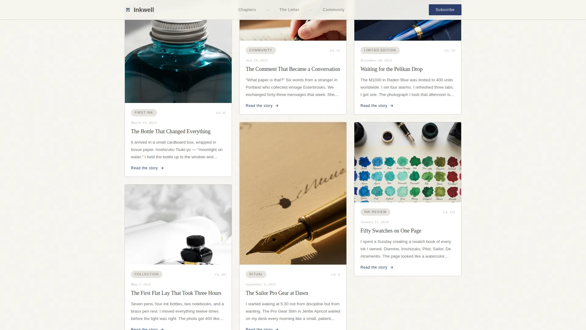
- A masonry chapter grid with handwritten-style dates, journal entries, and lightbox modal links
- Two lead capture forms: one for the weekly newsletter and one gating a downloadable beginner guide
Feature list
This template is built around deliberate interaction and narrative pacing. Each feature serves the story-first, conversion-second approach.
Chapter-by-Chapter Masonry Grid
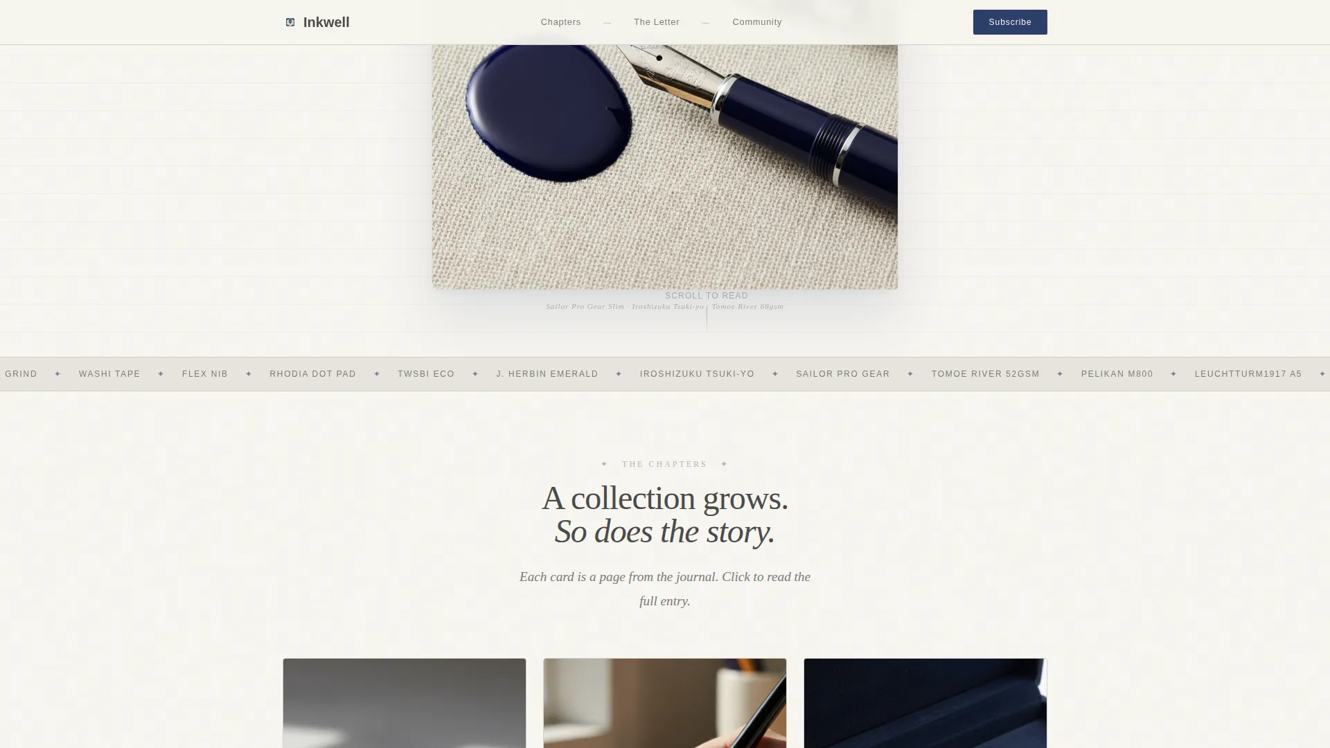
The grid is the heart of the page. Each card represents a chapter in the creator's stationery journey, pinned with handwritten-style dates and short journal entries. Visitors click any card to open a lightbox modal with the full story behind that pen, ink, or notebook.
GSAP Scroll Reveal Animations
Sections animate into view as the visitor scrolls, mimicking the sensation of turning a page. The pacing is medium and intentional, never distracting from the content.
Dual Lead Capture Forms
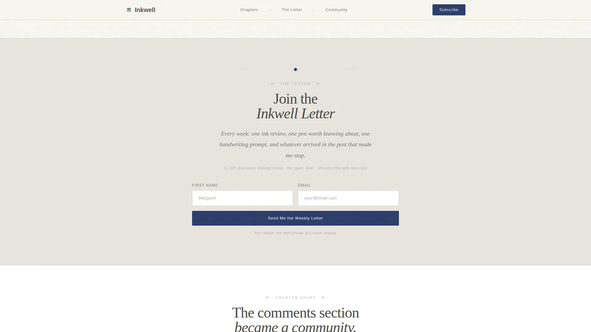
The primary form, placed after the third chapter card, invites visitors to join the weekly email letter. The secondary form gates a downloadable PDF starter guide. Both forms ask only for a first name and email address.
Lightbox Story Modal
Every image in the masonry grid opens a full lightbox overlay with the narrative context behind that photograph. This keeps visitors immersed in the story without navigating away from the page.
Community Proof Section
A dedicated section surfaces Instagram follower comments, testimonials, and community stats as social proof. It appears after the emotional build of the chapter grid, reinforcing trust before the final conversion nudge.
Desktop-First Responsive Layout
The layout is designed for a wide canvas where stationery flat lays can breathe. It stacks gracefully on smaller screens without losing the editorial atmosphere.
Page sections overview
| Section | Purpose |
|---|---|
| Chapter One Hero | Opens the page as a cream book page with a serif headline and overhead pen photograph |
| Masonry Chapter Grid | Displays story cards with dates, journal entries, and lightbox links |
| Primary Email Form | Captures first name and email for the weekly newsletter after chapter three |
| Community Proof | Shows Instagram follower comments and community stats as trust signals |
| Starter Kit Form | Gates a beginner PDF guide behind a two-field form as a utility conversion path |
| Horizontal Flow Footer | Closes the page with a clean, minimal footer following the Vercel Horizontal Flow pattern |
Design & branding system
The visual identity follows a Luxe Minimal approach. Every color, typeface, and spacing decision is chosen to feel like a stationery flat lay at golden hour: muted, tactile, and generous with whitespace.
- Color palette: parchment white (#F7F5F0) and warm fog (#E8E4DF) for backgrounds; graphite whisper (#4A4A48) for body text; bottled ink blue (#2C3E6B) reserved for links, buttons, and hover states
- Typography: Fraunces serif for headlines and chapter titles; DM Sans for body copy, form labels, and navigation
- Every element breathes inside open whitespace; nothing competes for visual attention
Mobile & speed optimization
The template is designed desktop-first to honor the wide flat-lay aesthetic, but it adapts cleanly to mobile viewports through a graceful stacking layout.
- The masonry grid reflows into a single column on smaller screens, preserving readability and card hierarchy
- GSAP animations are applied selectively using client components, while static sections use server components to keep the page light
- The lightbox modal and form interactions are handled client-side to maintain responsiveness without overloading the initial load
How this template helps you convert
The conversion strategy is built into the story structure itself. By the time a visitor reaches the first form, they have already read three chapters of someone's life told through stationery. The emotional investment does the persuasion work.
- The chapter grid builds genuine curiosity and connection before any ask is made, so the newsletter invitation feels like a natural next step rather than an interruption.
- The secondary PDF gate catches utility-first visitors who want practical guidance before committing to a community, ensuring no potential subscriber leaves empty-handed.
Other information about this template
This template is part of the Blog & Editorial category, specifically built for the Fountain Pen and Stationery Content subcategory. It is suited for creators in the fountain pen and stationery Instagram account niche who want a standalone destination page outside of social platforms.
- The template style is Masonry/Pinterest, structured around chapter cards rather than standard blog post thumbnails
- The creative direction follows an Origin Story arc, moving from private ritual to shared community across the scroll
- The header concept is Chapter/Book, designed to evoke the sensation of opening a linen-bound journal for the first time
- The landing page direction is Lead Generation, with every design decision serving the goal of growing an owned email audience
- The color system is named Soft Mist, reflecting the warm, fog-like neutrals that define the palette
- The theme classification is Luxe Minimal, emphasizing restraint, whitespace, and editorial precision
Theme
Luxe Minimal
Creative direction
Origin Story
Color system
Soft Mist
Style
Masonry/Pinterest
Direction
Lead Generation
Page Sections
Chapter-by-chapter Masonry Grid
GSAP Scroll Reveal Animations
Dual Lead Capture Forms
Lightbox Story Modal
Community Proof Section
Desktop-first Responsive Layout
Related questions
Can I use this template without an existing Instagram following?
How many lead capture forms does this template include?
Can I replace the chapter content and photographs with my own?
Is the lightbox modal component included in the template?
What typography and colors does the template use?



