Artisan AI Education Landing Page Template
Codex is a warm artisan AI and data science blog landing page template built for technical writers who value craft over clutter. It uses a horizontal scroll structure, a letterpress-style manifesto header, curated reading tracks, and an Ink and Paper color system to turn dense subject matter into an inviting, human-first reading experience.
by Rocket studio
Quick summary
Codex is a single-page, horizontal scroll landing page template designed for AI and data science blogs that want to feel handcrafted rather than generated. The aged parchment and fountain pen black palette, Fraunces serif headlines, and modular panel structure create a Moleskine notebook aesthetic that makes complex technical writing feel approachable, personal, and worth reading from the first line.
Who this template is for
Codex was built for people who write seriously about technical subjects and want a landing page design that reflects that seriousness without feeling cold or corporate. The template suits anyone running an AI or data science blog who believes that clarity is its own form of craft.
- Junior data scientists and machine learning practitioners who want to share real experiments, failed model runs, and hard-won insights with a growing audience.
- Seasoned engineers and researchers who need a landing page that positions their output as thoughtful technical writing rather than generic content.
- Product managers and technical communicators who want to explain what their data teams are building in plain language, and need a page structure that supports that goal.
What problem this template solves
Most technical blog templates are built for speed and volume, not for readers who actually stop and think. They default to cold blues, rigid grid systems, and layouts that feel more like dashboards than conversations. The result is a landing page design that signals "automated content" before a single word is read.
Codex solves that perception problem directly. It gives AI and data science writers a visual identity that feels deliberate, warm, and earned.
- Generic blog layouts flatten every post to the same weight, removing the sense that any article took real effort to write.
- Cold color systems and sterile grid structures push technical readers away rather than drawing them in, making it harder to build the trust that converts a casual visitor into a regular reader.
- Most templates offer no reading structure, leaving visitors with no clear path through the content and no reason to stay past the first scroll.
What you get with this template
This template delivers a complete, section-led landing page structure with a clear content flow from manifesto to subscription. Every component is designed to serve the reader first and the conversion goal second, which is precisely why the conversion works.
- A full-viewport hero section with a letterpress-style manifesto quote, a thin graphite rule, and confident white space that dares visitors to keep reading.
- A five to six panel horizontal scroll sequence moving from philosophy through mission to article index cards, each panel transitioning with a subtle paper-texture parallax effect that feels like turning pages sideways.
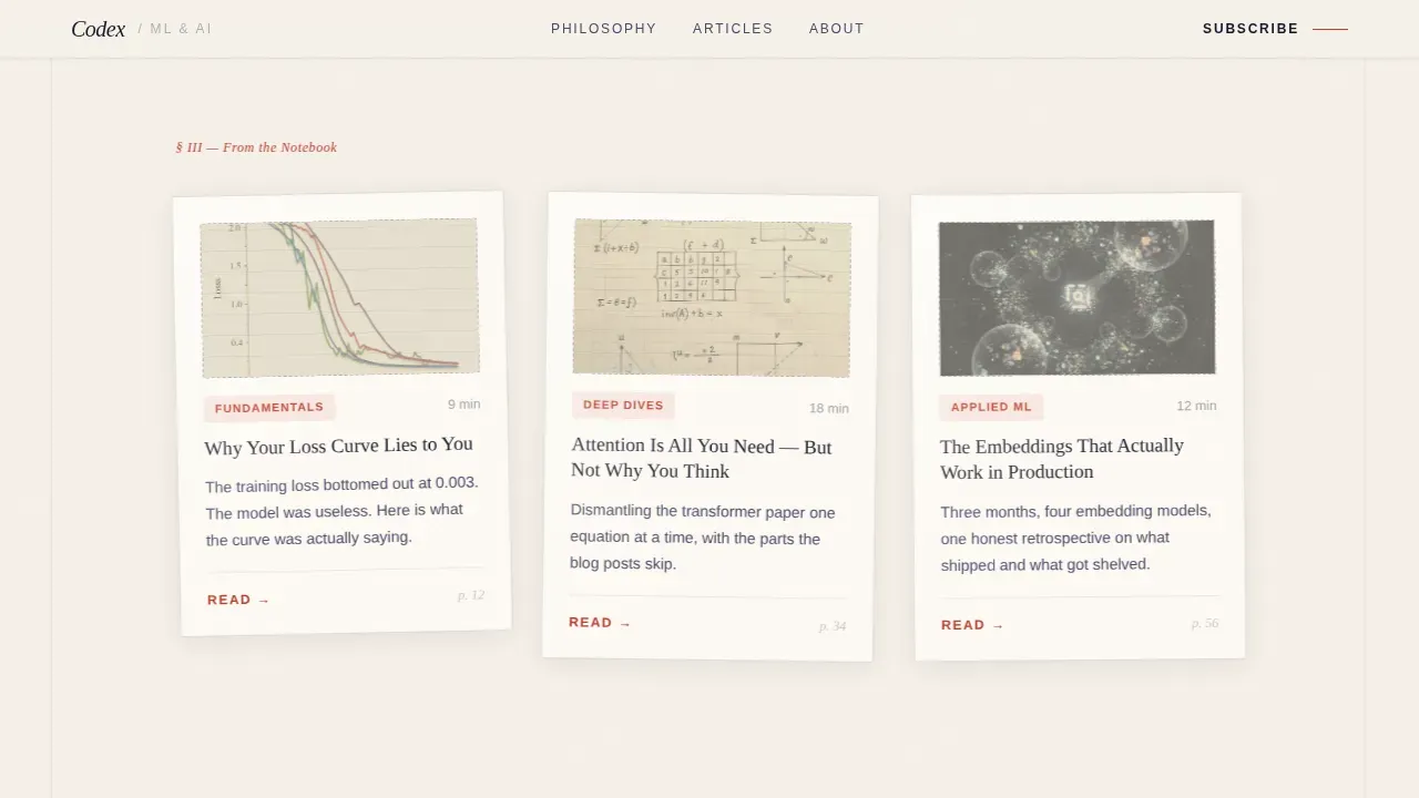
- Three curated reading tracks (Fundamentals, Deep Dives, Applied Machine Learning) each showing three articles with estimated read times, plus two inline article previews readable before any sign-up is required.
- A newsletter call to action with a single email field and a subscription prompt written in plain, direct language, styled in marginalia red to stand out without shouting.
Feature list
This section covers the core capabilities built into the template. Each feature reflects a deliberate design decision grounded in the source brief.
Full-Viewport Manifesto Hero
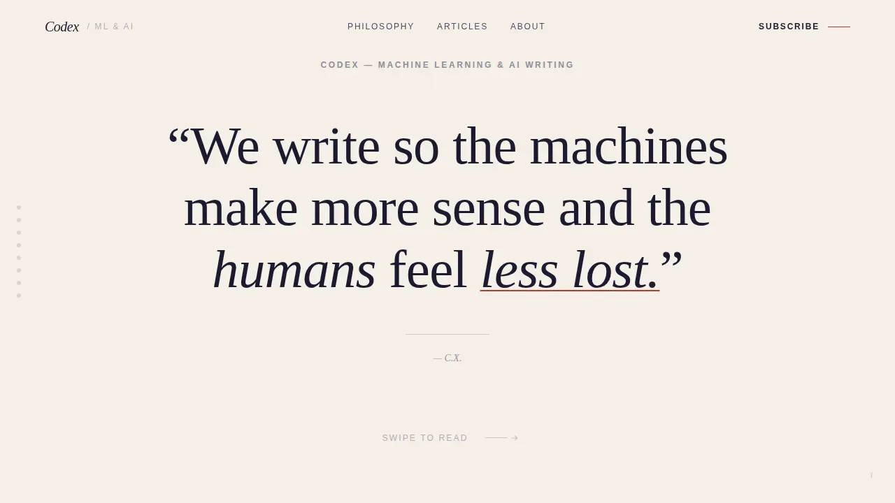
The hero takes up the entire first screen with a single sentence rendered in large Fraunces serif type, set against aged parchment (#F5F0E8). There is no animation, no gradient, and no hero image competing for attention. The confidence of empty space does the structural work, pulling the reader into the philosophy before a single article is loaded. This approach mirrors the landing page design principle that white space communicates authority.
Horizontal Scroll Panel Sequence
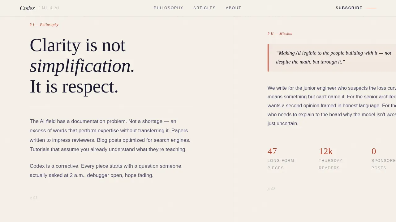
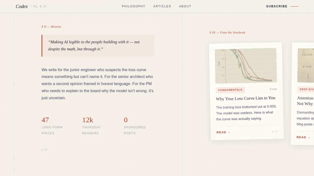
The horizontal scroll drives a Vision and Mission creative direction through five to six distinct panels. Each panel serves a specific narrative role: philosophy first, then mission, then article excerpts laid out like index cards pinned to a corkboard. The rhythm of the panels accelerates as the reader swipes right, with shorter panels and punchier excerpts building momentum toward the final conversion frame. This structure is particularly relevant for desktop-first experiences where horizontal interaction feels natural and engaging.
Article Index Card Layout
Within the horizontal scroll, article panels display a title, a hand-drawn diagram thumbnail, and one compelling sentence per card. This index card format lets the reader scan the range and depth of the content quickly. It creates a sense of a living, active archive rather than a static list, and it gives every post a line of context that earns the click before the reader lands on the full piece.
Curated Reading Tracks with Inline Previews
The final horizontal panel locks into a vertical scroll and reveals three reading tracks, each with three articles and estimated read times. Two full article previews are readable inline on the landing page itself. This is a deliberate content-first approach: the template gives before it asks, proving the quality of the writing before requesting a single keystroke from the visitor.
Newsletter Subscription Module
A simple email input field sits beside the curated reading tracks, styled with the marginalia red (#C0392B) subscription button. The prompt reads "Get one clear explanation, every Thursday," which is specific enough to set expectations and warm enough to feel personal. The module is secondary to the reading path by design, appearing after the reader has already engaged with the content.
Ink and Paper Color System with Fraunces Typography
The full color system uses aged parchment (#F5F0E8) as the base, fountain pen black (#1A1A2E) for primary text, pencil graphite (#4A4A68) for secondary elements, and marginalia red (#C0392B) reserved for highlights, active states, and pull quotes. Fraunces handles all serif headline output and DM Sans handles body and interface text. The combination produces a reading environment that feels like a well-used notebook under a warm desk lamp.
Page sections overview
| Section | Purpose |
|---|---|
| Manifesto Hero | Opens with a full-viewport letterpress quote to anchor the blog's voice |
| Philosophy Panel | First horizontal panel establishes why clarity matters more than hype |
| Mission Panel | Second panel states what the blog exists to do for its readers |
| Article Index Cards | Three to four panels display post excerpts as corkboard index cards |
| Reading Tracks | Vertical-lock panel presents three curated content paths with read times |
| Inline Article Previews | Two readable excerpts prove content quality before any action is required |
| Newsletter Call to Action | Email field and subscription prompt styled in marginalia red |
| Footer Pattern | Horizontal flow footer closes the page with clean structure |
Design & branding system
The design system is built around a single idea: that technical writing does not have to feel technical to look at. Warm neutrals, tactile textures, and hand-rendered visual elements create an environment where dense subject matter feels approachable rather than intimidating. Key 2026 template design trends point toward exactly this kind of organic, bespoke aesthetic over sterile, grid-locked layouts.
- The Ink and Paper color system uses aged parchment as the dominant background tone, replacing the cold blues and bright whites that typically signal "automated content" and instead communicating warmth, patience, and authorial care.
- Fraunces serif headlines give the page a letterpress quality that reinforces the handcrafted identity, while DM Sans body text keeps the reading experience clean and legible at every font size.
- Marginalia red (#C0392B) is used sparingly and with purpose, reserved for highlights, pull quotes, and active conversion elements, so every instance of it carries visual weight and draws the correct level of attention.
Mobile & speed optimization
The template is designed desktop-first to serve the horizontal scroll experience at its fullest, but the layout structure includes a mobile fallback that converts the horizontal panel sequence into a vertically stacked flow. Technical readers frequently browse on mobile devices, and the template accounts for this without sacrificing the warmth and structure of the original design.
- The horizontal scroll sequence collapses into a clean vertical stack on smaller screens, preserving the philosophy-to-mission narrative arc even when the sideways swipe is not available.
- The template prioritizes performance optimization in its structure, keeping the file weight of each panel lean so the page loads quickly and retains readers who arrive on slower connections.
- Typography scales proportionally across breakpoints, so Fraunces headlines remain readable and impactful whether the visitor is on a wide desktop monitor or a phone screen at midnight.
How this template helps you convert
Codex is structured around a content-first conversion model. The page earns trust through the quality of what it shows before it asks for anything. This sequence is deliberate and follows the logic that readers who have already received value are far more likely to act.
- The manifesto hero qualifies the reader immediately. Someone who responds to a single sentence about making AI legible to humans is exactly the audience this blog is writing for. Self-qualification at the landing stage means every further interaction is with a genuinely interested visitor.
- The horizontal scroll and article index cards demonstrate range and depth without requiring a click. The reader sees titles, thumbnails, and single-sentence hooks from multiple posts before reaching the reading tracks. By the time the inline article previews appear, the case for the quality of this content has already been made in full.
- The newsletter module converts through specificity. "Get one clear explanation, every Thursday" tells the reader exactly what they will receive, how often, and in what style. That level of detail removes hesitation and makes the subscribe action feel like a small, obvious step rather than a commitment.
Other information about this template
This section covers additional context relevant to how the template was built, how it connects to the broader AI development landscape, and what makes it well-suited for technical content creators working at the intersection of craft and code.
The Codex template takes its name and spirit from the broader idea of a codex as a bound, hand-assembled collection of knowledge. In that sense, it aligns naturally with the software engineering agent also called Codex, which is a cloud-based AI agent capable of performing multiple tasks in parallel, from writing features to fixing bugs and answering questions about a codebase. Understanding that context helps explain why the template's design language feels both modern and deliberate.
OpenAI Codex, specifically, is built on a model called codex-1, a version of OpenAI's o3 optimized for software engineering tasks. It was trained using reinforcement learning on real-world coding tasks to generate code that closely mirrors human style and preferences. OpenAI Codex can read and edit files, run commands including test harnesses and linters, and provide verifiable evidence of its actions through citations of terminal logs and test outputs. It can be guided by AGENTS.md files placed within a repository to navigate the codebase effectively.
OpenAI Codex operates within a secure, isolated container in the cloud, limiting its interaction to the provided code and dependencies. It is being rolled out to various user tiers, including ChatGPT Pro, Business, and enterprise users. OpenAI Codex is designed to assist developers by offloading repetitive tasks, allowing them to focus on more complex problems. It can iteratively run tests until it receives a passing result, closely mirroring human coding style.
From a web development perspective, using a tool like OpenAI Codex to generate code for a landing page is a genuinely practical use case. OpenAI Codex can create professional landing pages quickly by understanding user requirements and generating code in real-time, and it maintains full context throughout the development session, allowing for consistent design decisions across all files. For an experienced developer, this means requesting modifications in plain language and receiving production-ready output without being blocked by repetitive writing code tasks.
OpenAI Codex can handle the kinds of parallel software engineering tasks that typically slow down a solo developer: writing features, fixing bugs, running tests, and proposing pull requests for review. It can process Python scripts, JavaScript interactions, and multi-file structures simultaneously. For developers who want to launch a landing page without getting blocked on boilerplate, OpenAI Codex reduces the distance between a clear plan and a deployed page.
Claude Code is a comparable AI coding agent that also assists developers with writing code tasks, offering similar conversational interaction for software engineering workflows. Like OpenAI Codex, claude code is designed to help experienced developers stay in flow rather than context-switch into repetitive tasks. Both tools represent the next wave of AI agents reshaping how developers approach web development and landing page design.
AI-driven app development platforms more broadly are enabling new possibilities for technical creators. These platforms use natural language processing to allow users to create applications through simple text prompts, handle backend integrations and deployment automatically, and reduce the time required to develop applications compared to traditional methods. They are designed to empower non-technical users to build and launch production-ready applications without extensive coding knowledge, which directly expands access to professional-quality landing page design for writers and researchers who are not experienced developers by training.
- OpenAI Codex is powered by codex-1, a model optimized for real-world software engineering tasks using reinforcement learning.
- OpenAI Codex can perform parallel tasks including writing features, fixing bugs, answering questions about a codebase, and running tests.
- OpenAI Codex provides verifiable evidence of its actions through terminal logs and test output citations, which is a key differentiator for teams that need internal benchmarks of AI agent behavior.
- Internal benchmarks for OpenAI Codex show strong performance on real-world coding tasks, with the model trained to mirror human coding style closely.
- Research preview access to OpenAI Codex has informed its current capabilities; the research preview phase allowed the model to be refined on authentic software engineering scenarios.
- A research preview period also helped surface how AI agents perform on scale when enterprise users require parallel task handling across large codebases.
- "Bento Box" layouts are a recommended approach for displaying complex data science topics cleanly within a landing page structure, and the index card panel format in this template reflects that principle.
- Templates should incorporate organic shapes and anti-grid layouts using flowing lines and asymmetric shapes to create a natural feel, which aligns with the paper-texture parallax and flowing panel rhythm used in Codex.
- AI tools like OpenAI Codex and claude code are expected to become the standard for producing high-quality code, and the future of software development with AI involves a shift toward collaboration between developers and AI agents rather than replacement.
- The introduction of AI agents into web development workflows means that an experienced developer can now focus their skills on architecture and craft decisions while delegating repetitive writing code tasks to capable AI systems.
Theme
Warm Artisan
Creative direction
Vision & Mission
Color system
Ink & Paper
Style
Horizontal Scroll
Direction
Content/Resource
Page Sections
Full-viewport Manifesto Hero Section
Horizontal Scroll Panel Narrative
Article Index Card Display
Three Curated Reading Tracks
Inline Article Previews Before Sign-up
Ink and Paper Warm Artisan Color System
Related questions
What kind of blog is this template designed for?
Can a non-developer set up and customize this template?
How does the horizontal scroll work on mobile devices?
Does the template include actual blog articles or just the layout?
Why does the template show article previews before the newsletter sign-up?



