Compassionate Chronic Wellness Landing Page Template
Chronicle is a warm, journal-style chronic illness blog landing page built for spoonies, newly diagnosed readers, and caregivers who need honest, unhurried writing. The single-column layout follows a Day-in-the-Life scroll structure, moving from morning to evening through illustrated vignettes, pull quotes, reader testimonials, and a gentle five-question "Find Your Flare Pattern" quiz that delivers a personalized body calendar archetype.
by Rocket studio
Quick summary
Chronicle is a single-column chronic illness blog landing page designed around the rhythms of a body that negotiates every hour. The page moves readers gently from morning to evening through illustrated scenes, honest writing, and a five-question quiz that delivers a personalized reading path. The visual style is warm, editorial, and deliberately unhurried, built for people reading from a bed, a waiting room, or a slow afternoon couch.
Who this template is for
Chronicle is designed for writers and bloggers who live with chronic illness and want a blog landing page that reflects the real texture of that life. It is also a strong fit for caregivers who write plainly about support, and for health and wellness content creators building a community around honest, patient-centered storytelling. Personal stories are at the heart of this template, and the design makes space for that voice to lead.
- Spoonies and chronically ill bloggers who want a landing page that matches their lived experience and speaks directly to readers who understand flare days, fatigue management, and symptom tracking
- Newly diagnosed writers building their first blog or content platform, looking for a warm, accessible design without needing to write a single line of code
- Caregivers, patient advocates, and health writers who focus on community building and want to educate readers through personal, grounded storytelling
What problem this template solves
Most blog templates are built for productivity, speed, and high-energy calls to action. They feel misaligned when the content is about rest, pain management, and the quiet complexity of living inside a body that does not follow a standard calendar. Readers who visit a chronic illness blog often feel overwhelmed by clinical layouts, cluttered navigation, or aggressive email capture that demands a signup before delivering any value. Chronicle solves that mismatch.
- The page removes visual noise and slows the scroll intentionally, so readers who are tired or in pain can move through the content at their own pace without feeling rushed or overstimulated
- The quiz converts without pressure by delivering a personalized result first and asking for an email address only after the reader has already received something genuinely useful
- The Day-in-the-Life structure gives context and emotional resonance to every section, helping visitors understand immediately that this blog was written for them, not about them
What you get with this template
Chronicle delivers a fully designed, single-column landing page with a cohesive visual system, a structured narrative scroll, and an illustrated interactive quiz. Every component described below comes from the source brief and reflects what this template actually contains. The page is built to help bloggers create a meaningful first impression and convert curious visitors into loyal readers and email subscribers.
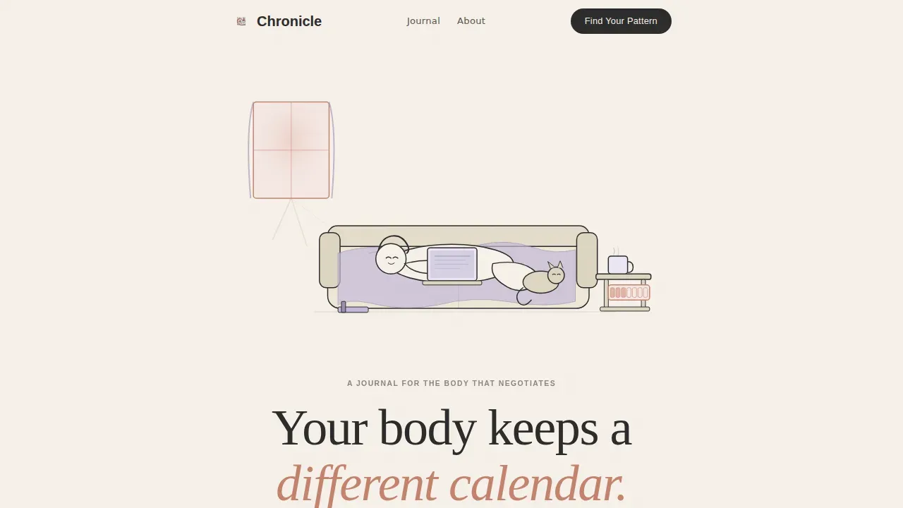
- A hero section with a custom hand-drawn illustration in ink and watercolor style, a serif headline in Fraunces typeface, and a tagline that opens the conversation gently and honestly
- Three Day-in-the-Life vignette sections anchored at morning, midday, and evening, each featuring a small illustrated scene, a reflective question, pull quotes, featured blog posts, and reader testimonials
- A five-question illustrated quiz with one-question-at-a-time fade transitions, a personalized body calendar archetype result, a curated reading path, and an email capture that follows the result rather than gating it
Feature list
Chronicle is built around a carefully considered set of features drawn directly from the project brief. Each one supports the blog's core purpose: to create a warm, honest, community-centered space for chronic illness readers and bloggers.
Day-in-the-Life Scroll Narrative
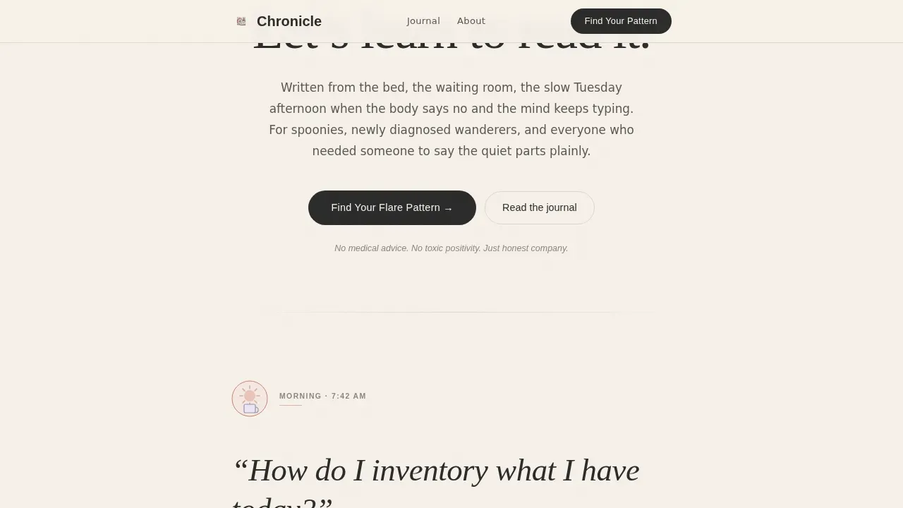
The page is structured as a single continuous scroll that moves through morning, midday, and evening. Each time block is anchored by a small illustrated vignette and a real question that chronic illness patients ask themselves at that hour. The scroll pacing is intentionally slow, matching the way a body negotiates transitions throughout the day. This narrative structure helps readers feel seen from the first section they land on.
Illustrated Quiz with Personalized Results
The "Find Your Flare Pattern" assessment is a five-question illustrated quiz built directly into the landing page. Questions appear one at a time with soft fade transitions and use plain language with no medical jargon. After completing the quiz, readers receive a personalized body calendar archetype and a curated reading path through the blog. This approach lets visitors access genuine value before any email capture is introduced, which builds trust and improves conversion naturally.
Custom Hand-Drawn Hero Illustration
The hero section features a custom illustration rendered in thin ink lines with watercolor washes. The scene shows a figure curled on a couch with a laptop, a cat, a medication organizer on the side table, and a mug going cold. Morning light is rendered in soft terracotta and lavender. The art style is loose and tender, not clinical, creating an immediate emotional connection with readers who recognize their own everyday life in the image.
Warm Artisan Visual System
The entire page uses the Ink and Paper color system: parchment cream (#F5F0E8) for backgrounds, fountain pen black (#2B2B2B) for body text, dried lavender (#9B8FB4) for accent links and interactive states, and muted terracotta (#C4826D) for pull quotes and highlighted passages. Typography pairs Fraunces as the editorial serif display face with DM Sans for body copy. The result is a design that feels like a handwritten letter on heavy cotton stock, warm and kind to tired eyes.
Reader Testimonials and Pull Quotes
The evening vignette section includes intimate reader testimonials from spoonies. Pull quotes appear throughout the page styled in terracotta, the way marginalia marks a favorite passage in a well-loved book. This social proof format feels personal rather than promotional, and it helps new visitors build trust with the blog quickly without feeling like they are reading a marketing page.
Minimal Footer with Horizontal Layout
The page closes with a clean, horizontally organized footer using a minimal pattern. It keeps the end of the scroll quiet and uncluttered, matching the overall unhurried tone of the template. Visitors can find what they need without the page becoming busy or demanding at the point where energy is often lowest.
Page sections overview
| Section | Purpose |
|---|---|
| Hero Illustrated Header | Opens the page with a custom ink-and-watercolor scene, serif headline, and tagline to establish emotional tone immediately |
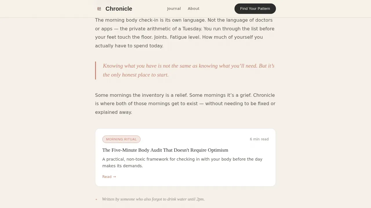
| Morning Vignette Block | Anchors the day's opening with an illustrated scene, a reflective question about energy inventory, and a pull quote |
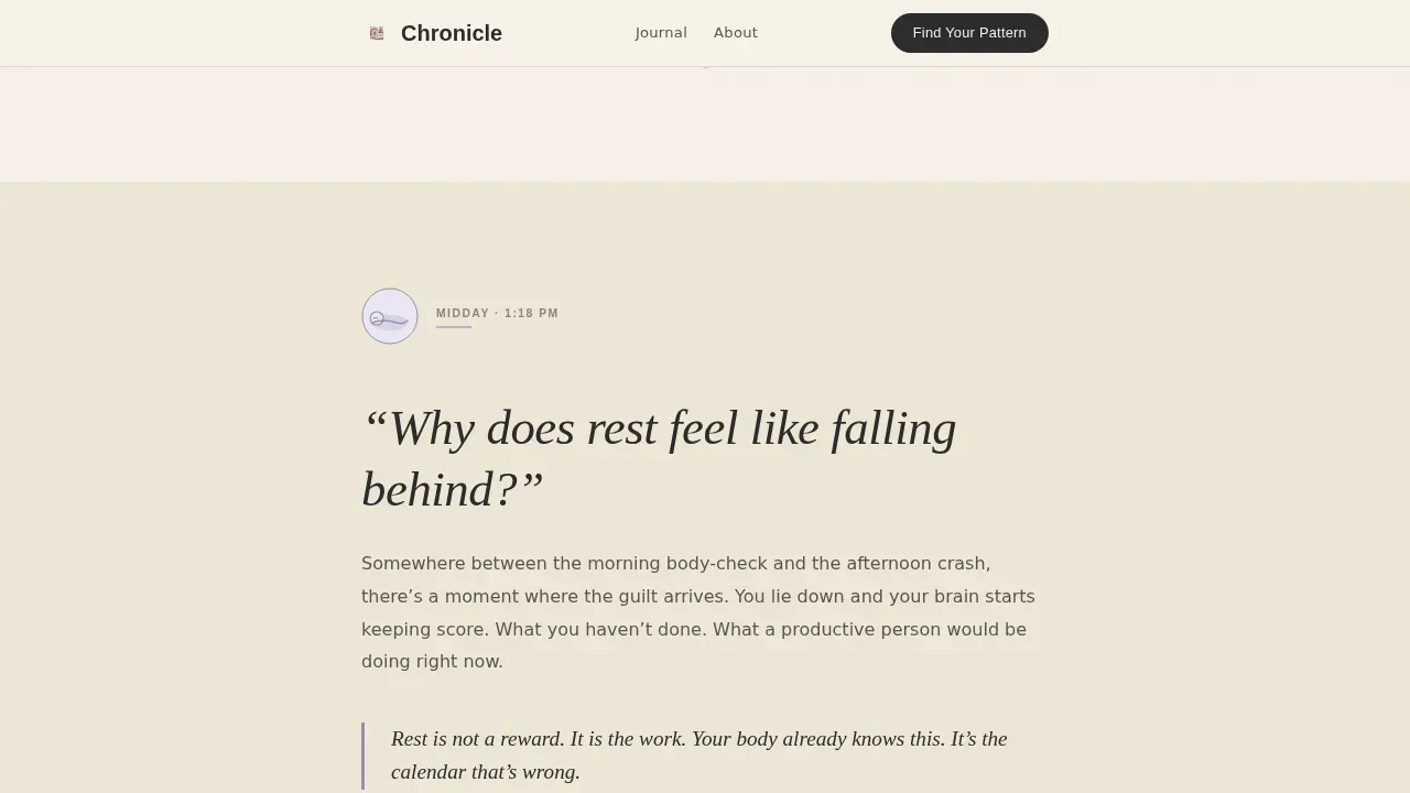
| Midday Featured Posts | Presents featured blog posts alongside a vignette and a question about rest and productivity guilt |
| Evening Testimonials Block | Closes the day narrative with reader testimonials, a reflective evening question, and intimate social proof |
| Quiz Call to Action | Houses the illustrated five-question "Find Your Flare Pattern" assessment with personalized results and post-result email capture |
| Minimal Horizontal Footer | Ends the page quietly with a clean, organized footer layout |
Design & branding system
The design language of Chronicle is built around the Warm Artisan theme and the Ink and Paper color system. Every visual decision reinforces the feeling of a handwritten journal left open on a kitchen table: textured, deliberate, and honest. The color palette stays warm throughout, backgrounds sit in the parchment cream family, and accent colors appear sparingly, the way a pressed flower marks a page worth returning to.
- Color palette includes parchment cream (#F5F0E8) for all backgrounds, fountain pen black (#2B2B2B) for body text, dried lavender (#9B8FB4) for links and interactive states, and muted terracotta (#C4826D) for pull quotes and highlighted passages that echo the beauty of handwritten marginalia
- Typography pairs Fraunces as the editorial serif display face for headlines and section anchors with DM Sans as the body typeface, giving the page a warm, readable, and polished editorial style that suits long-form personal storytelling
- Scroll-triggered reveals and soft fade transitions are used throughout the page, including the quiz question flow, so that animation supports the unhurried pacing of the content rather than competing with it
Mobile & speed optimization
Chronicle is built mobile-first because its readers are most often reading from bed, a waiting room chair, or a slow afternoon couch. The single-column flow means the layout does not need to reconfigure dramatically across screen sizes. CSS-native smooth scroll keeps transitions fluid without heavy JavaScript dependencies, and the quiz fade-in transitions are designed to work cleanly on touch screens.
- The single-column template style eliminates the need for complex grid reflows on smaller screens, so the page remains organized and easy to read whether visitors are on a phone, tablet, or desktop
- CSS-native smooth scroll and soft fade transitions are used throughout, keeping the interactive experience light and consistent on mobile devices where readers are most likely to complete the quiz
- The illustrated hero and vignette images are rendered to support the warm visual system without creating layout shifts, so the page stays stable and easy to navigate for users who may have limited energy for troubleshooting
How this template helps you convert
Chronicle converts by earning trust before asking for anything. The quiz delivers a personalized result first. The email capture comes after. That sequence matters enormously for an audience that has often been asked to give before they receive. The page is built around the idea that readers who feel understood are far more likely to become subscribers and long-term community members.
- The "Find Your Flare Pattern" quiz gives readers a specific, personalized body calendar archetype and a curated reading path through the blog, so visitors receive a genuinely useful result before any email address is requested. This value-first approach reduces friction and creates a natural reason to subscribe.
- The Day-in-the-Life narrative structure and intimate pull quotes help readers recognize their own experiences in the page, building the kind of emotional trust that makes a chronic illness blog feel like a community rather than a content feed. Readers who feel that recognition are far more likely to return, subscribe, and share posts across social media platforms.
Other information about this template
Chronicle sits at the intersection of several important content and publishing considerations that bloggers in the health and wellness space will want to understand before choosing a template. This section covers additional context about the template's broader fit within the chronic illness blogging world, its relationship to no-code publishing tools, and some helpful background on what makes this style of blog work well over time.
- Chronic illness blogging templates like Chronicle help users create visually appealing and informative blog pages without requiring design experience. Templates for chronic illness blogging can include personal stories, statistics, symptoms, and coping strategies, all of which this template is structured to support through its vignette and quiz format.
- Using a well-designed template makes it easier to communicate complex health information in an engaging format. When patients, caregivers, and doctors all engage with the same blog, a clear and consistent visual system helps everyone understand the content without added cognitive load.
- Personal storytelling in chronic illness blogs can create a sense of community and connection among readers. Sharing personal experiences through this kind of blog can help raise awareness about specific conditions, and effective storytelling often includes details about daily challenges and coping strategies, exactly the topics related to what Chronicle's Day-in-the-Life scroll is built to hold.
- Visual tools such as pictures, illustrated vignettes, and pull quote art enhance the storytelling experience. Maintaining a polished and accessible design is important for chronic illness blogs to effectively communicate personal stories, and Chronicle's warm artisan visual system was built specifically with that goal in focus.
- Chronic illness blogs can serve as platforms for advocacy and education about health issues. Engaging content in these blogs often includes personal anecdotes that resonate with readers' experiences, including moments around family life, meal prep routines, energy management, and the quiet weight of navigating a diagnosis alongside kids, partners, or other family members.
- Successful chronic illness blogs focus on community building and support. Engaging with readers through comments and social media platforms is a key strategy, and Chronicle's quiz-to-email flow is designed to create the kind of warm first touchpoint that turns a first visit into an ongoing relationship.
- Successful chronic illness blogs often feature guest posts or interviews to diversify content and perspectives. The Chronicle template's blog post grid in the midday section makes it straightforward to surface a collection of posts, including collaborative articles and interviews, that help readers find more of what matters to them.
- No-code blogging platforms allow users to create and manage blogs without needing to write code. These platforms typically offer drag-and-drop interfaces that simplify the design process for non-technical users, and Chronicle is designed to slot naturally into that kind of no-code environment, making it accessible to bloggers who are focused on writing rather than building.
- No-code platforms often include customizable templates to help users get started quickly. Users can often integrate social media sharing features into their blogs using these platforms, extending the reach of their posts and building community beyond the site itself.
- Many no-code blogging platforms provide analytics tools to track visitor engagement and performance metrics, along with customer support to assist users in troubleshooting and optimizing their blogs. These services complement a template like Chronicle by giving bloggers the business infrastructure to grow their audience over time.
- The chronicle warm artisan chronic illness blog landing page template is specifically named and scoped for this use case, making it easy to search for and identify within a template marketplace collection.
- Kapwing offers free chronic illness infographic templates that are fully customizable, which can be a helpful supplementary tool for bloggers who want to create shareable graphics or visual article summaries to post across social media platforms alongside their Chronicle blog content.
- Authenticity and transparency in sharing personal experiences resonate well with readers of chronic illness blogs. This template was designed to support that authenticity by keeping the visual tone warm and the conversion flow honest, never gating insight behind a form before value is delivered.
- Bloggers who write about family history, everyday life, or the intersection of chronic illness and food choices, including topics like meal prep adaptations for low-energy days, will find that Chronicle's vignette structure gives those personal posts a natural and organized home within the blog's reading path.
- The template supports a wide range of content types, from long personal essays and short photo captions to featured article roundups and reader feedback highlights. Whether you are a first-time blogger treating writing as a hobby or a serious content creator building a health and wellness business, Chronicle gives you a starting point that feels genuinely considered.
- Visitors who arrive at this site and feel understood from the first scroll are more likely to decide to subscribe, return, and share. That is the core idea behind Chronicle's entire design: a blog page that inspires trust by feeling human, organized, and kind.
Theme
Warm Artisan
Creative direction
Day-in-the-Life
Color system
Ink & Paper
Style
Single Column Flow
Direction
Quiz/Assessment
Page Sections
Day-in-the-life Scroll Narrative
Illustrated Five-question Quiz
Custom Hand-drawn Hero Art
Warm Artisan Color and Type System
Reader Testimonials and Pull Quotes
Minimal Horizontal Footer
Related questions
Who is the Chronicle template designed for?
Does the quiz work without coding knowledge?
Can I customize the colors and typography?
What content fits inside this template?
Is this template suitable for a first-time blogger?



