Craft & Hobby Blog Specialist Blog Website Template
Journal is a masonry-style landing page template built for analog planning and bullet journaling blogs. It combines a cinematic overhead video header, a scroll-triggered masonry content grid, and a sticky email opt-in banner into one editorial layout. The warm craft-paper color system and editorial magazine typography make every section feel like a curated notebook spread.
by Rocket studio
Quick summary
Journal is a single-page editorial template designed for bullet journaling and analog planning blogs. It opens with a looping overhead video reel, flows into a masonry content grid with category filters, and closes conversions through a sticky opt-in banner offering a free downloadable Starter Kit. The warm stone palette and serif-plus-sans typography give every section a tactile, intentional feel.
Who this template is for
This template is built for bloggers and content creators who teach practical planning through analog methods. It suits writers who produce high volumes of tutorials, printable templates, and method guides and need a layout that shows off that depth at a glance.
- Bullet journaling bloggers who publish spread tutorials, supply roundups, and printable downloads
- Planning content creators targeting overwhelmed readers such as grad students, new mothers, and creative freelancers
- Independent bloggers building an email list through free PDF opt-ins
What problem this template solves
Most blog templates present content as a flat, chronological feed. For a planning blog with many categories and downloadable resources, that format buries depth and slows discovery. Readers leave before they see how much the blog actually covers.
- A flat feed makes it hard for visitors to self-sort by interest, difficulty, or notebook type
- Generic layouts fail to communicate authority through volume and visual specificity
- Standard opt-in forms appear too early and feel disconnected from the content being explored
What you get with this template
You get a fully structured single-page layout that balances editorial storytelling with practical conversion architecture. Every section is pre-designed with the analog planning reader journey in mind, from first impression to email sign-up.
- A cinematic hero section with a looping overhead reel, editorial headline, and sticky opt-in banner
- A twelve-card masonry content grid with category filter tabs, read-time labels, and warm thumbnail placeholders
- A "Most Downloaded This Month" editorial strip and a "Browse All Templates" section with a secondary call-to-action button
Feature list
This section describes each major functional component built into the template.
Cinematic Overhead Hero Reel
The header is designed for a looping fifteen-second overhead video showing hands building a monthly spread in real time. A single editorial headline fades in over the footage. No voiceover is needed. The composition directs full attention to the notebook and the act of planning.
Sticky Email Opt-In Banner
A slim opt-in banner appears after three scroll depths. It holds two fields (first name and email) and a single segmentation checkbox asking whether the visitor is a beginner or experienced planner. This timing keeps the offer from interrupting early browsing while catching engaged readers before they leave.
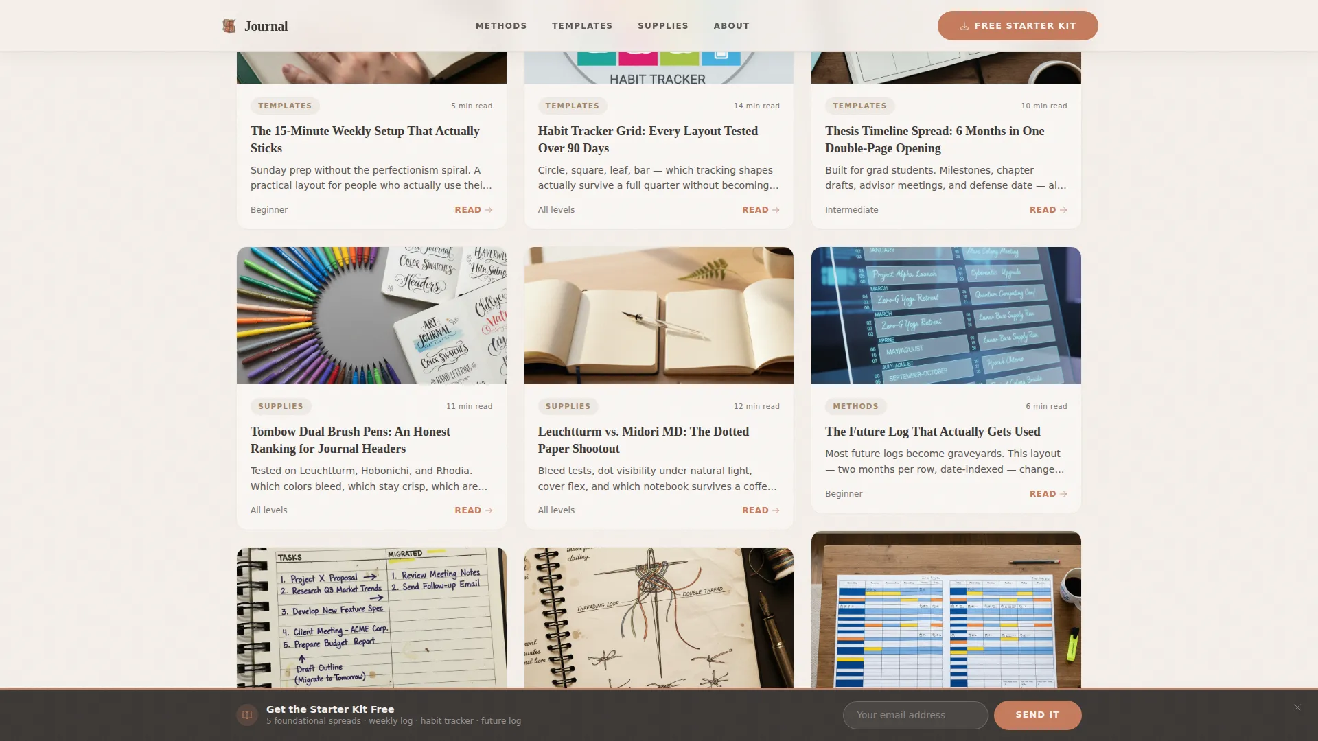
Masonry Content Grid with Category Filters
Twelve blog cards tile outward in a masonry layout with scroll-triggered stagger animation. Each card carries a category tag, an estimated read time, and a warm overhead-style thumbnail. Filter tabs at the top let visitors sort by category, difficulty, or notebook size without leaving the page.
"Most Downloaded" Editorial Strip
Midway through the scroll, a full-width editorial strip breaks the masonry grid. Three featured printables are displayed at near-actual size, showing dotted grids and pre-drawn modules clearly enough to evaluate before clicking. Download counts add social proof inline.
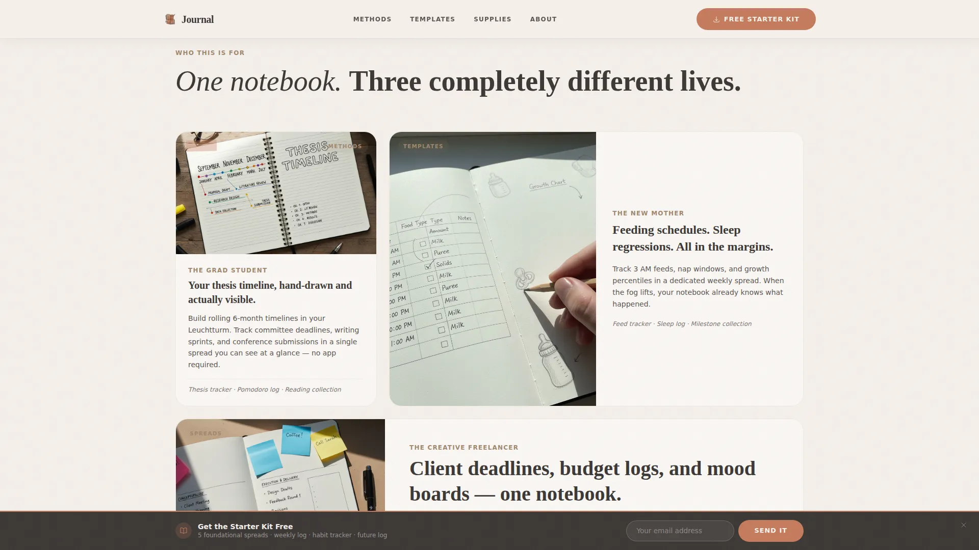
Reader Persona Cards
Three asymmetric cards present specific reader use cases: the grad student building a thesis timeline, the new mother tracking feeding schedules, and the creative freelancer managing client deadlines and budget logs. Each card anchors the content to a real, recognizable situation.
Accordion-Style FAQ Section
An interactive accordion component handles reader questions in a compact, scannable format. Sections expand on tap or click, keeping the page uncluttered while still addressing common hesitations about the practice or the free download.
Page sections overview
| Section | Purpose |
|---|---|
| Hero Video Reel | Introduces blog identity with overhead footage and editorial headline |
| Sticky Opt-In Banner | Captures email after three scroll depths with a two-field form |
| Reader Persona Cards | Connects the content to three specific reader use cases |
| Masonry Content Grid | Displays twelve blog cards with filters, tags, and read times |
| Most Downloaded Strip | Features three printables at near-actual size with download counts |
| Browse All Templates | Anchors a category filter and secondary call-to-action button |
| Footer | Horizontal flow pattern with dot separators and site navigation |
Design & branding system
The template follows an Editorial Magazine theme built on a Warm Stone color system. Every color has a defined role, creating a consistent hierarchy from background to interactive element.
- Linen (#F5F0EB) for backgrounds, graphite (#3B3735) for body text, and wet clay (#A0876D) for category labels and secondary text
- Terracotta (#C67B5C) reserved exclusively for links, tags, and hover states to create a consistent interactive signal
- Fraunces serif for display headings and DM Sans for body text and interface labels, pairing editorial warmth with clean readability
Mobile & speed optimization
The template is built mobile-first, reflecting the reality that most planning blog readers scroll on their phones while sitting at their desk with a notebook open. The masonry grid and hero video are structured to reflow gracefully on smaller screens.
- Images are lazy-loaded so the page stays responsive as the masonry grid fills in on scroll
- Server Components power the static content grid, keeping the initial load light even with twelve cards and filter tabs active
- The sticky banner and accordion interactions are lightweight touch-friendly components designed for one-handed use on mobile
How this template helps you convert
The template is architected as a content and resource hub where conversion follows demonstrated value rather than interruption. Every layout decision supports the reader's path from discovery to download.
- The masonry grid shows content depth and specificity up front, building trust through volume before any opt-in is requested
- The "Most Downloaded" editorial strip presents printables at near-actual size, letting readers evaluate the quality of the free Starter Kit before committing their email address
- The sticky banner appears only after three scroll depths, targeting readers who have already engaged with the content and are more likely to convert
Other information about this template
This template is part of the Blog and Editorial category, under the Bullet Journaling and Planning Content subcategory. It is built for a content and resource hub use case with a masonry Pinterest-style layout.
- The template is localized for English (US) audiences and includes no currency formatting
- Animation intensity is set to medium: scroll-triggered card reveals, masonry stagger on load, and hover states on all interactive elements
- The footer uses a horizontal flow pattern with dot separators, consistent with the editorial tone throughout the page
- The free Starter Kit PDF bundled into the opt-in offer contains five foundational spreads: weekly log, habit tracker, future log, monthly calendar, and collection index


Theme
Editorial Magazine
Creative direction
Industry Report
Color system
Warm Stone
Style
Masonry/Pinterest
Direction
Content/Resource
Page Sections
Cinematic Overhead Hero Video Section
Scroll-triggered Sticky Opt-in Banner
Masonry Grid with Category Filters
Most Downloaded Editorial Strip
Reader Persona Cards
Accordion FAQ Component
Related questions
Can I use this template without a video for the hero section?
How does the sticky opt-in banner appear during scrolling?
Can I edit the masonry grid cards to match my own blog content?
What printables does the free Starter Kit include?
Who is this template best suited for?


