Travel Blog Blog Website Template
Wander is an editorial solo travel blog landing page template built for women who travel alone and write beautifully about it. It uses an Ink & Paper color palette, a full-viewport manifesto quote header, and an origin-story scroll arc that moves readers from fear to freedom. One focused call-to-action earns the click without friction.
by Rocket studio
Quick summary
Wander is a single-column editorial landing page template for a solo travel blog. It opens with a stark typeset manifesto, traces an origin story arc through emotional chapters, and closes with one clear call-to-action. The design feels like a Moleskine notebook left open in Lisbon: analog, unhurried, and deeply personal. It is built to make readers feel something before they click.
Who this template is for
This template is built for a very specific kind of travel blogger: one whose writing is the product, not just the packaging. It suits a personal editorial voice more than a broad travel aggregator or travel agency directory.
- Solo female travel writers who want a blog website that reads like a memoir opening rather than a content hub
- Women returning to travel after a life reset, who need a personal platform that earns reader trust from the first sentence
- Emerging travel bloggers who are serious about solo travel storytelling and want their first landing page to feel considered and intentional
What problem this template solves
Most travel blog templates are built around destination grids, affiliate link roundups, and category menus. They are perfectly functional, but they were not designed to hold a confessional voice or an emotional arc. A blogger writing intimate solo travel dispatches needs a different kind of page, one where the writing leads and the design follows.
- Generic blog templates dilute the personal tone that solo travel readers come for, making it harder to build a loyal audience
- A landing page with no emotional pull loses visitors before they reach the call-to-action, regardless of how good the writing is
- Writers without a professional designer background need a starting structure that already understands pacing, pull quotes, and editorial rhythm
What you get with this template
This template gives you a complete single-column landing page structured as an origin story. Every section is sequenced to build emotional momentum from the hero through to the final call-to-action. No form, no friction, just a compelling scroll toward a single click.
- A full-viewport manifesto header, emotional chapter grid, origin story sections, two call-to-action placements, and a footer using Pattern 3 Vercel Horizontal Flow
- Fraunces editorial serif and DM Sans body typography pre-configured with the Ink & Paper color system: parchment, manuscript black, pencil-sketch gray, and stamped-passport vermillion
- Scroll-reveal animations, hover states on chapter cards, and smooth scroll behavior built in at a low-to-medium animation weight
Feature list
This section covers the core built-in features of the Wander template. Each one is grounded in the design brief and the page structure as specified.
Full-Viewport Manifesto Header
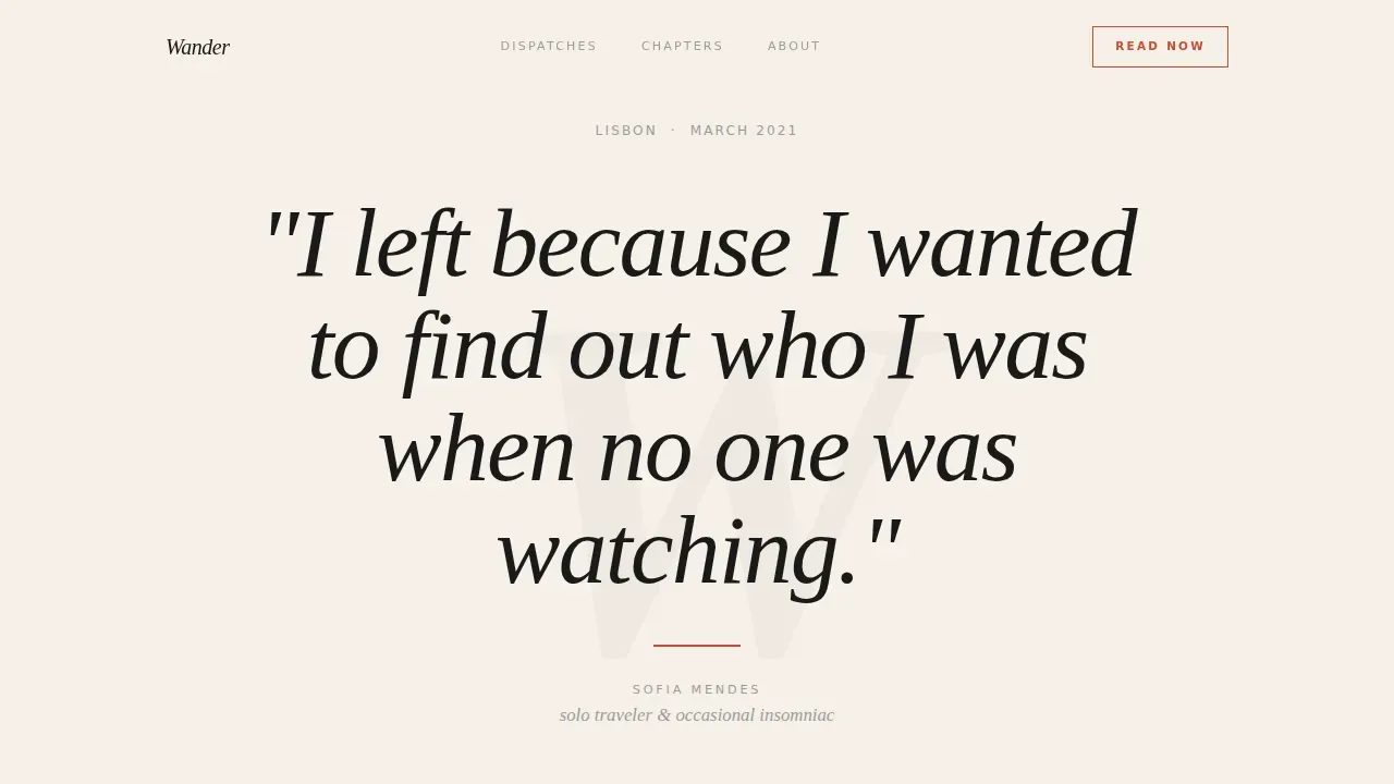
The header occupies the entire viewport with a stark parchment background and a single editorial serif sentence set in large type. A thin vermillion rule sits below it, followed by a dateline and the author name in small caps. There is no image competing with the words. The opening reads like the first line of a memoir, which is exactly the intention.
Origin Story Scroll Arc
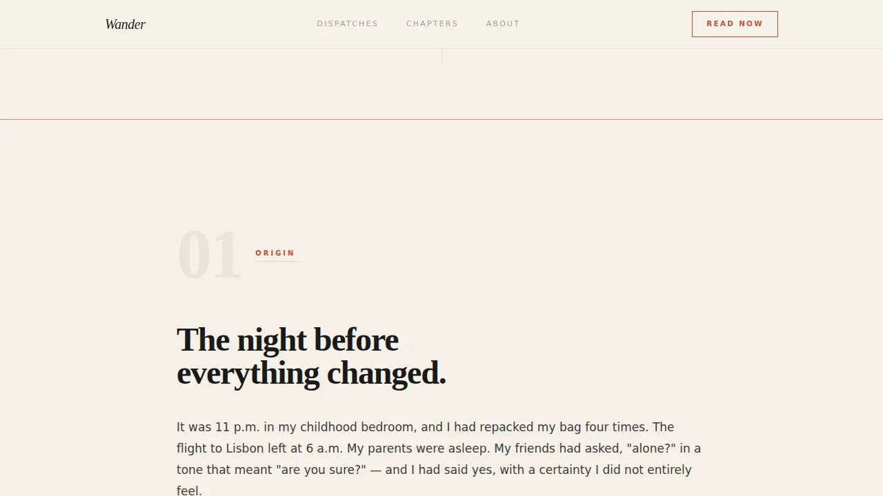
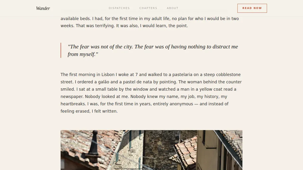
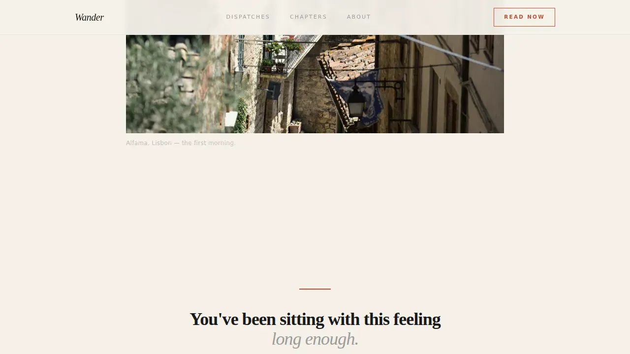
The page is structured as a narrative journey rather than a content menu. It opens with a confessional paragraph about the night before the first departure, moves through the first morning alone in a foreign city, then unfolds into an emotional chapter grid. Each section builds courage and expands the story, so readers feel the arc before they reach the call-to-action.
Emotional Chapter Grid
Three editorial chapters are laid out in a bento-style grid: Getting Lost, Eating Alone, and The Stranger Who Changed Everything. Each chapter opens with an oversized italic pull quote, followed by a photograph and a short excerpt. This grid organizes the blog content not by destination but by feeling, which is a far more resonant structure for solo travel writing.
Dual Call-to-Action Placement
The primary call-to-action, styled in vermillion on parchment, appears after the emotional peak of the origin story. It is repeated once at the close of the page. Both instances read "Read the First Dispatch." There is no form, no opt-in, and no friction. The page earns the click by creating genuine anticipation.
Ink & Paper Design System
The entire visual identity is built on four colors: deep manuscript black (#1A1A1A), warm parchment (#F5F0E8), pencil-sketch gray (#9B9B9B), and stamped-passport vermillion (#C84B31). Vermillion is reserved for links, pull quotes, and the call-to-action only. The palette is deliberately analog and restrained, so the writing remains the focal point on every section of the page.
Scroll Animations and Hover States
The template includes scroll-reveal animations and subtle fade-ins at a low-to-medium weight. Chapter cards have hover states built in. Smooth scroll is active across the page. These interactions add life to the reading experience without relying on heavy JavaScript, keeping the page feeling editorial rather than promotional.
Page sections overview
| Section | Purpose |
|---|---|
| Manifesto Quote Header | Opens the page with a full-viewport typeset sentence that acts as an emotional hook |
| Vermillion Rule & Dateline | Anchors the header with the city, month, and author name in small caps |
| Origin Story Paragraph | Confessional writing about the night before the first departure |
| First Morning Section | Narrates the moment fear became curiosity in a foreign city |
| Emotional Chapter Grid | Bento layout of three chapters organized by feeling, not destination |
| Primary Call to Action | Vermillion call to action placed at the emotional peak of the origin arc |
| Closing Call to Action | Second call to action placement at the bottom of the page |
| Page Footer | Pattern 3 Vercel Horizontal Flow footer |
Design & branding system
The Wander template uses an Editorial Magazine visual theme executed through the Ink & Paper color system. The design is intentionally minimal and typographic. Every color choice, spacing decision, and font pairing reinforces the analog, journal-like identity of the blog.
- Color palette: parchment (#F5F0E8) as the dominant background, manuscript black (#1A1A1A) for body text, pencil-sketch gray (#9B9B9B) for secondary labels, and vermillion (#C84B31) reserved exclusively for links, pull quotes, and calls-to-action
- Typography: Fraunces editorial serif for headlines, manifesto text, and pull quotes; DM Sans for body paragraphs and navigation; the pairing creates a clear hierarchy between story and utility
- The logo placement, small-caps author name, dateline styling, and thin rule details are all part of a cohesive brand identity system that feels handcrafted rather than templated
Mobile & speed optimization
Over 60% of traffic to travel pages arrives on mobile devices. Readers of solo travel blogs are often browsing on their phones during a lunch break, on a train, or in a café. This template is built with a mobile-first layout so the reading experience holds up on every screen size.
- Single-column flow adapts naturally to smaller screens without layout shifts or truncated text; the full emotional arc remains intact on mobile
- Low-to-medium animation weight with scroll reveals and subtle fade-ins keeps the page light; heavy JavaScript is deliberately avoided to protect load performance
- Fast loading is a priority because even a small delay can significantly affect conversion rates on landing pages; the template uses Server Components and minimal JavaScript to support this goal
How this template helps you convert
This template is designed around one goal: earning a single, meaningful click. It does not ask for an email address on arrival or interrupt the reading experience with pop-ups. The conversion strategy is narrative-first. Readers who feel something are far more likely to click through to the archive than readers who are simply shown a button.
- The origin story arc builds genuine emotional investment before the call-to-action appears, so visitors arrive at the call to action already wanting more; a prominent, contrasting vermillion button on parchment makes the next step unmistakably clear
- The emotional chapter grid demonstrates the range and depth of the blog content, giving readers a preview of what they will find in the archive and making the click feel like a natural continuation rather than a conversion event
- Repeating the call-to-action at the close of the page captures readers who scrolled all the way through, ensuring that engaged visitors always have a clear next step regardless of where they finished reading
Other information about this template
The Wander template is well suited to travel bloggers who are just starting out as well as writers who have been sharing dispatches for years and want a more intentional home for their work. Here is additional context that may be helpful when deciding whether this template fits your plan.
- This is a click-through landing page, not a multi-page blog website; it is designed to serve as the front door that sends visitors to your archive, making it an ideal starting point before you start building out full blog pages
- The template works as a standalone page or as a campaign landing page alongside a broader blog site; you can link it from your social media handles, your bio on Instagram, or other platforms where your audience already follows your writing
- Blog name and logo placement are included in the design; your blog name appears in the header area and your logo can be placed consistently across the page to reinforce brand identity
- The page has no built-in newsletter form, but it can support a future sign-up section if you choose to add one through your blogging platform of choice; many travel bloggers use a dedicated sign-up page linked from the footer
- Travel blogging is more competitive now than ever, and a well-defined niche makes a measurable difference; this template is built specifically for the solo travel niche, which helps your landing page speak directly to your target audience rather than everyone browsing the internet for generic travel guides
- Focusing on a specific niche like solo travel can also simplify the process of monetizing your blog later; common income streams for travel bloggers include sponsored posts, affiliate marketing for products and services related to travel, selling advertising space, creating premium content like eBooks, donations through platforms like Patreon, workshops, and selling photos with a good camera and high quality images
- Creating a business plan early helps travel bloggers set realistic goals and define their target audience before they publish their first blog post
- Staying consistent with your posting schedule matters: regularly publishing new blog content keeps readers engaged and supports visibility over time
- A content calendar is a practical tool for planning posts week by week and maintaining a consistent schedule that your audience can rely on
- Learning the basics of SEO (Search Engine Optimization) helps your blog post pages appear in search results; tools like Google Analytics can be used alongside this template to track how visitors find and interact with your site once it is live
- Google Analytics is a free web service that lets you monitor traffic, understand your audience's behavior, and plan future content based on what is already working
- Nomadic Matt is a widely cited example in the travel blogging world; like that kind of blog, Wander is built around a personal voice and a clearly defined niche rather than broad travel agency content
- Whether solo travel feels like just a hobby or the beginning of something larger, this template gives your writing the visual home it deserves
- The template is fully customizable; you can update the travel blog name, domain references, and color values to match your own brand without needing a professional designer
- Securing your domain name and selecting reliable hosting services are the first practical steps before you publish; once those are in place, this template is ready to drop in
- Your social media platforms, including Facebook, Twitter, and Instagram, should link back to this landing page so that every social media handle you maintain drives traffic to the same focused destination
- High quality content and an informative writing style are what keep visitors returning; this template gives that content the editorial frame it needs to make a strong first impression
Theme
Editorial Magazine
Creative direction
Origin Story
Color system
Ink & Paper
Style
Single Column Flow
Direction
Click-Through
Page Sections
Full-viewport Manifesto Header
Origin Story Scroll Arc
Emotional Chapter Grid
Dual Vermillion Call-to-action
Ink & Paper Color System
Scroll Reveals and Hover States
Related questions
Is this template suitable for a brand-new solo travel blog?
Can I customize the color palette and typography?
Does this template include a newsletter sign-up form?
How does this template handle mobile visitors?
Can I use this template on WordPress or other platforms?



