Specialist Legal & Policy Blog Privacy Policy & Terms Website Template
Jurisprudence is a single-column international law blog landing page built for scholars, practitioners, and policy professionals. It organizes long-form legal analysis into thematic reading collections, pairs restrained Atelier Studio typography with a Japanese Zen color palette, and converts engaged readers into subscribers through a quiet, pressure-free email form.
by Rocket studio
Quick summary
Jurisprudence is a content-first landing page for an international law blog. It presents long-form legal analysis as a curated reading experience rather than a scrolling feed. Thematic article collections, generous whitespace, and a calm subscription form make the page feel like a scholar's private study built for serious readers.
Who this template is for
This template is designed for legal writers, academics, and policy communicators who publish serious, long-form analysis. It fits anyone who wants their content to signal depth and credibility before asking for anything from the reader.
- Junior associates at international law firms preparing for arbitration hearings
- Policy advisors at foreign ministries who write and read position papers regularly
- LL.M. students and academic researchers covering international legal institutions
What problem this template solves
Most blog templates optimize for volume and recency. They push posts into reverse-chronological feeds and bury the work behind generic layouts. For a niche like international law, that approach undermines credibility. Readers arrive, see a wall of links, and leave without understanding the publication's depth or voice.
- No clear editorial identity to help readers decide if the publication is worth their time
- Article collections lack the contextual framing that serious legal analysis deserves
- Subscription forms feel transactional, which conflicts with the trust required in academic publishing
What you get with this template
You get a fully structured single-column landing page that functions as a content hub. The layout sequences your best work into thematic collections so that each scroll reveals editorial intent, not just more posts.
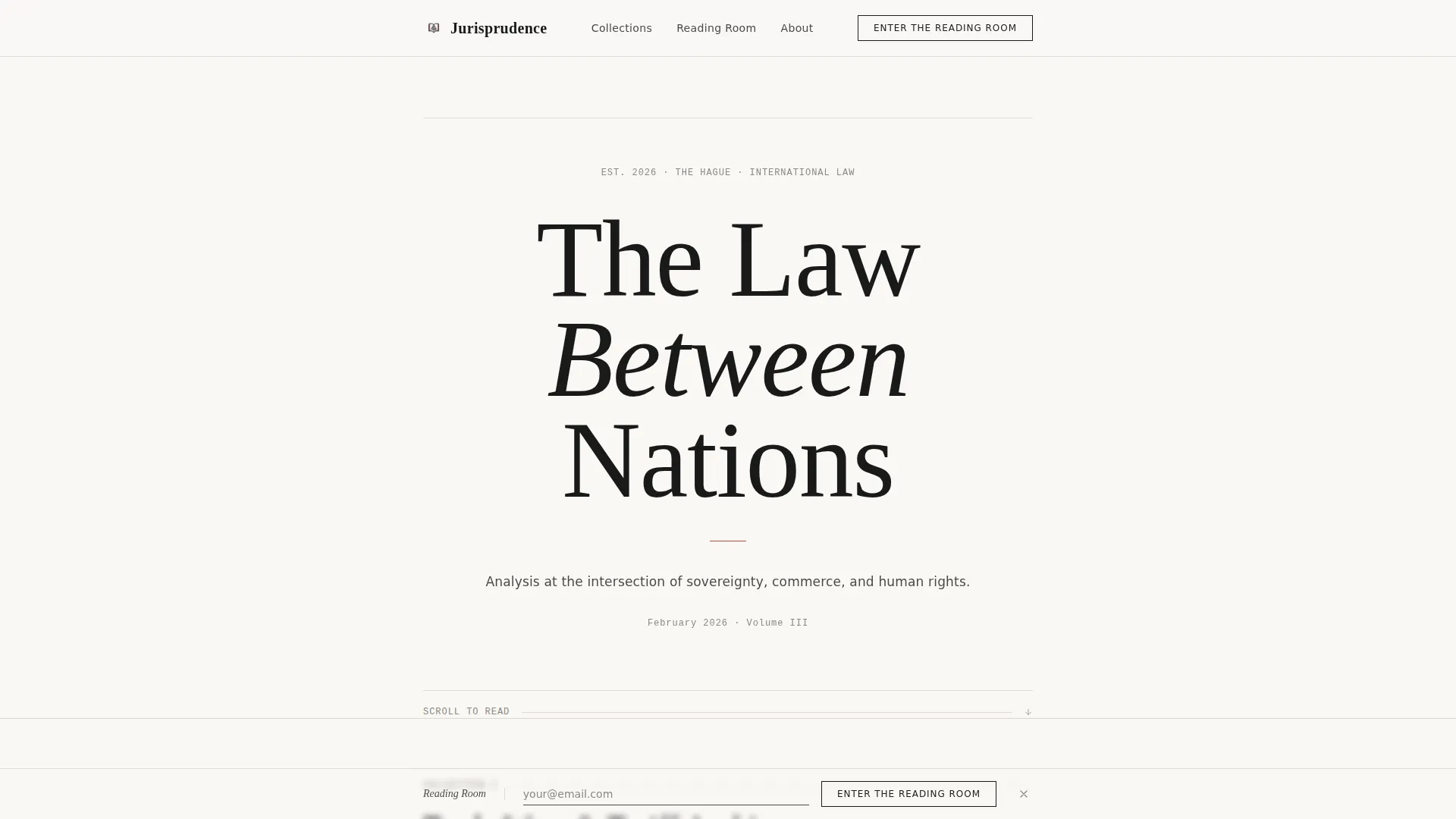
- A typography-led hero section with the centered headline "The Law Between Nations" in a refined serif at full scale
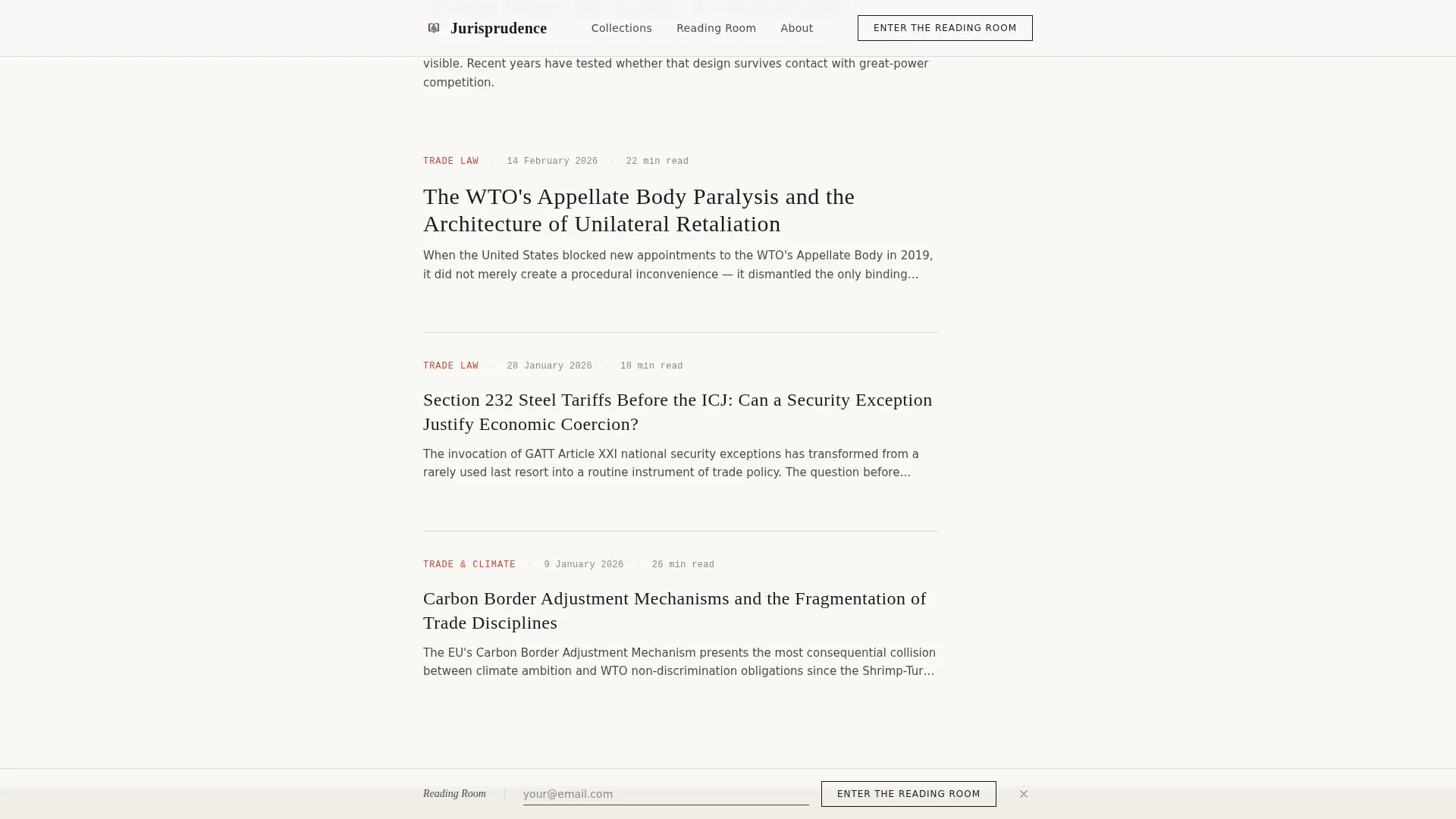
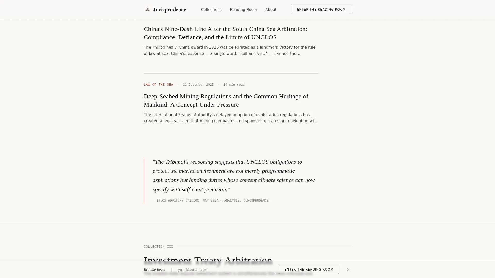
- Three thematic article collection sections, each introduced by an explanatory sentence and presenting three to four article cards with publication dates and estimated reading times
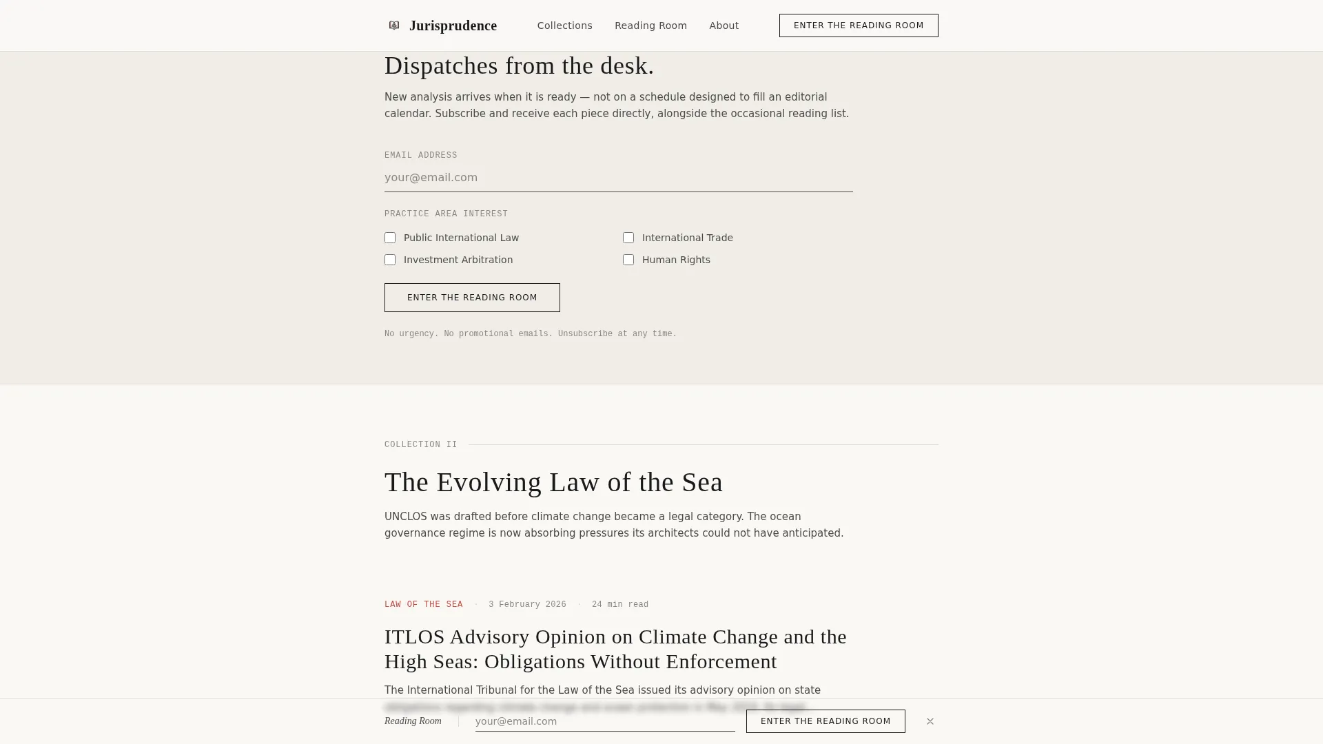
- A quiet inline subscription form and a fixed bottom subscription bar that appears on deeper scroll, both asking only for an email address and a single practice area checkbox
Feature list
This landing page delivers a focused set of components designed around editorial restraint and reader trust.
Giant Centered Hero Headline
The hero is pure typography. A single serif headline at enormous scale sits centered against the shoji white background with nothing else competing. Below it, a one-line subtitle in stone gray sets the editorial scope without visual clutter.
Thematic Article Collection Layout
Content is organized into named thematic collections rather than a chronological feed. Each collection opens with one framing sentence, followed by three to four article cards. Cards display the article title, publication date, and estimated reading time.
Quiet Inline Subscription Form
An unobtrusive email subscription form appears after the second article collection. It requests only an email address and a single checkbox for practice area interest. The options cover public international law, international trade, investment arbitration, and human rights.
Fixed Bottom Subscription Bar
On deeper scroll, a fixed bar at the bottom of the viewport surfaces the subscription call to action again. It persists without interrupting reading. No pop-ups and no urgency language appear anywhere on the page.
Washi Paper Color System
The full color palette uses shoji screen white for the background, black ink for headlines, stone garden gray for body text, and muted vermillion reserved exclusively for links, pull quotes, and accent rules. The result is warm and minimal without being sterile.
Fraunces and DM Sans Typography Pairing
Headlines use Fraunces, a refined serif with weight and ink-like character. Body text and interface elements use DM Sans for clean readability. Metadata such as dates and reading times are set in JetBrains Mono for a precise, editorial distinction.
Page sections overview
| Section | Purpose |
|---|---|
| Hero Headline | Centers the publication title in oversized serif typography against a bare background |
| Hero Subtitle | Introduces the editorial scope in a single stone-gray line below the headline |
| Collection One: Trade | Presents article cards on trade wars and tariff architecture under one framing sentence |
| Inline Email Form | Captures subscriber interest quietly after the second collection, no urgency language |
| Collection Two: Sea Law | Groups articles on the evolving law of the sea into a titled thematic block |
| Collection Three: Arbitration | Closes the main content with investment treaty arbitration articles and reading metadata |
| Fixed Bottom Bar | Resurfaces the subscription prompt as a persistent bar on deep scroll |
| Minimal Footer | Delivers a horizontal flow footer with essential links and no visual noise |
Design & branding system
The visual identity follows an Atelier Studio approach interpreted through a Japanese Zen color system. Every element earns its place through restraint. Whitespace functions as negative space in a woodblock print, giving each article collection room to breathe.
- Color palette: shoji white (#FAF8F5) background, black ink (#1A1A1A) headlines, stone garden gray (#4A4A48) body text, muted vermillion (#C4453C) for links, pull quotes, and accent rules only
- Typography: Fraunces for serif headlines, DM Sans for body and interface text, JetBrains Mono for metadata and publication dates
- Spacing philosophy: generous margins between collections signal editorial curation; nothing competes for attention unnecessarily
Mobile & speed optimization
The template is designed desktop-first to match how its primary audience works. Junior associates, policy advisors, and researchers typically read at a desk. The layout also adapts responsively for tablet use.
- Desktop-first single-column flow maintains full typographic hierarchy on wide screens
- Tablet-responsive layout preserves article card readability and subscription form usability
- Subtle fade-in animations on scroll are the only motion effect; no flashy transitions compete with the reading experience
How this template helps you convert
The page earns subscriptions by demonstrating editorial value before making any ask. By the time a reader has scanned three collections and read two opening paragraphs, they already understand the voice and depth of the publication.
- The thematic collection structure signals editorial intelligence early, building trust before the first subscription form appears
- The inline form after the second collection places the ask at the natural moment of peak engagement, not at the top of the page
- The fixed bottom bar keeps the subscription option visible during deep reading without disrupting the flow or introducing pressure language
Other information about this template
This template is suited to academic publishers, legal think tanks, and independent practitioners who want their digital presence to reflect the quality of their scholarship. It is built to feel like a considered publication, not a blog.
- Publication dates are formatted in DD Month YYYY style to match international editorial conventions
- The footer uses a horizontal flow pattern to keep the page close without drawing attention away from content
- The page uses static-first rendering with server components handling all content, keeping load behavior consistent across sessions
- This template can support expansion into additional thematic collections by repeating the established collection section pattern
Theme
Atelier Studio
Creative direction
Curated Collection
Color system
Japanese Zen
Style
Single Column Flow
Direction
Content/Resource
Page Sections
Giant Centered Hero Headline
Thematic Article Collection Sections
Quiet Inline Subscription Form
Fixed Bottom Subscription Bar
Japanese Zen Color Palette
Fraunces and DM Sans Type System
Related questions
Can I change the thematic collection titles?
How does the subscription form work?
Is this template suitable for a solo legal writer?
Can I add more article collections as my archive grows?
What makes this different from a standard blog template?



