Artisan Typography Blog Landing Page Template
Kerning is a hub-and-spoke typography landing page built for editorial depth. It uses a warm artisan visual identity, a collage-style hero, and a pinned left-rail anchor nav to guide readers through six rich content sections. The primary call to action captures email addresses in exchange for a complete annual review of type culture, written for designers who take letterforms seriously.
by Rocket studio
Quick summary
Kerning is a single-page editorial destination for a typography blog's annual report. It delivers curated essays, glyph comparisons, and an interactive kerning demo across six spoke sections, all unified by a warm letterpress aesthetic. The page earns reader trust by giving away three full sections of analysis before ever asking for an email address.
Who this template is for
This template is built for editorial-minded designers and type enthusiasts who want a content destination that feels as considered as the subject matter itself. It suits anyone running a design publication, annual report, or deep-dive resource that needs both visual authority and a clear email-capture path.
- Graphic design students and junior designers researching type history and current trends
- Senior art directors and independent type designers who want a reference-quality resource hub
- Design media publishers and editorial teams launching an annual industry review
What problem this template solves
Most blog templates are built for post archives, not for long-form editorial experiences. They flatten depth into feeds and bury the most compelling content behind pagination. Kerning solves the problem of presenting dense, specialist content without losing readers to scroll fatigue or visual monotony.
- Readers lose trust when a page asks for an email before delivering real value
- Typography content is visually rich but most templates cannot support glyph demos or specimen-style layouts
- Hub-and-spoke navigation is hard to implement cleanly on a single page without disorienting the reader
What you get with this template
You get a fully structured landing page with six distinct content spokes, each designed to hold a different content format without visual repetition. The layout alternates between dense reading sections and open breathing room, keeping the eye moving from start to finish.
- A collage-style hero section with a sticky left-rail anchor nav covering five spoke labels
- Four editorial content spokes covering trends, specimens, interviews, and data visualizations
- A full-width email-capture call-to-action section and a sticky bar that appears after the second spoke
Feature list
This template is built around several purposeful features, each grounded in the needs of a specialist editorial audience. Every component earns its place on the page.
Collage Scrapbook Hero
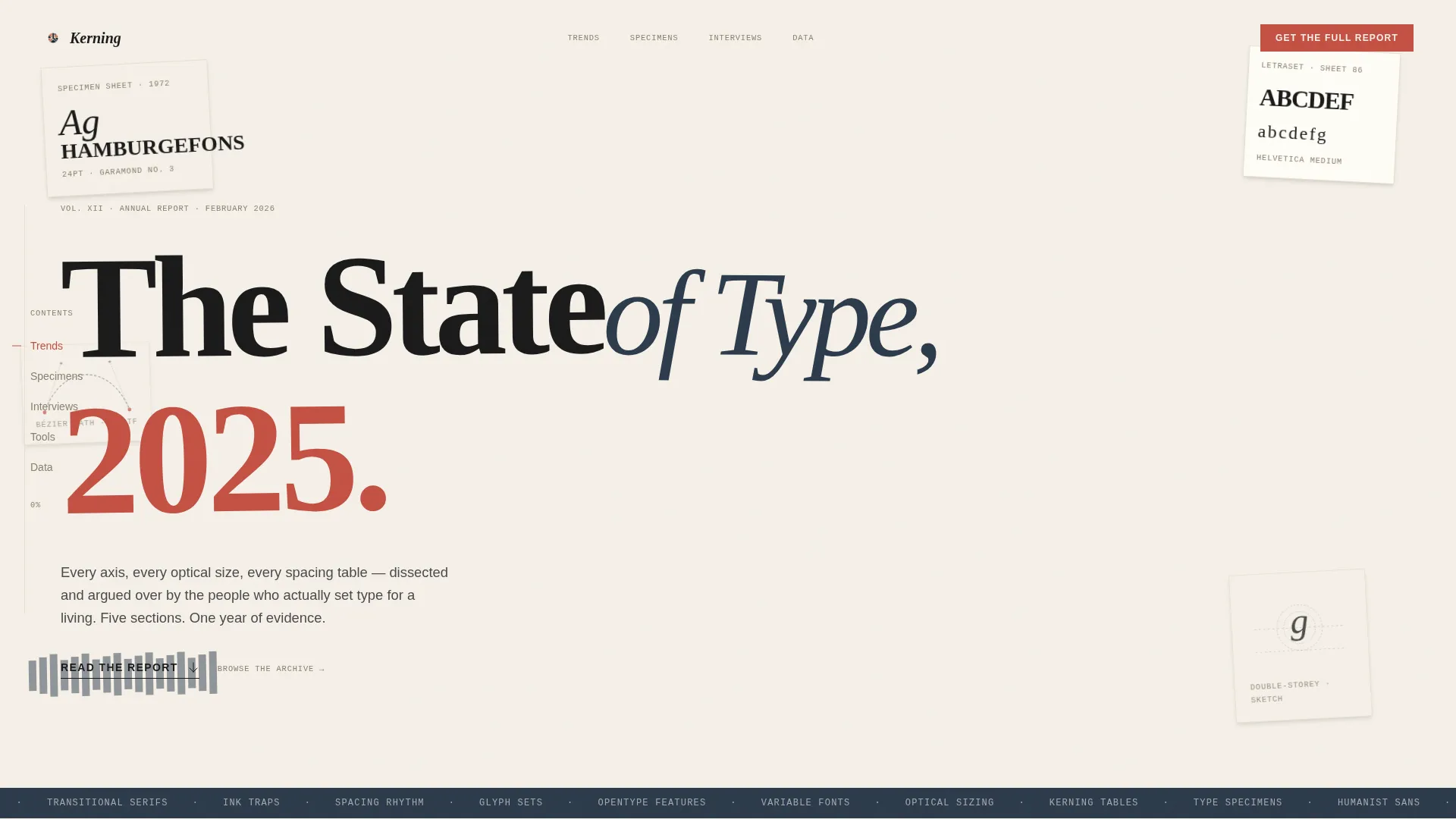
The hero section layers overlapping specimen sheets, torn catalog fragments, a Bézier curve printout, and a pencil sketch of a lowercase 'g' at slight rotations against a cotton background. A large transitional serif headline clips the viewport edge, making the disorder feel deliberate and inviting.
Sticky Left-Rail Anchor Nav
The anchor navigation pins to the left rail and remains visible as the reader scrolls through all five spoke sections. Spoke labels include Trends, Specimens, Interviews, Tools, and Data, each highlighted in faded red pencil on the active state.
Interactive Kerning Demo
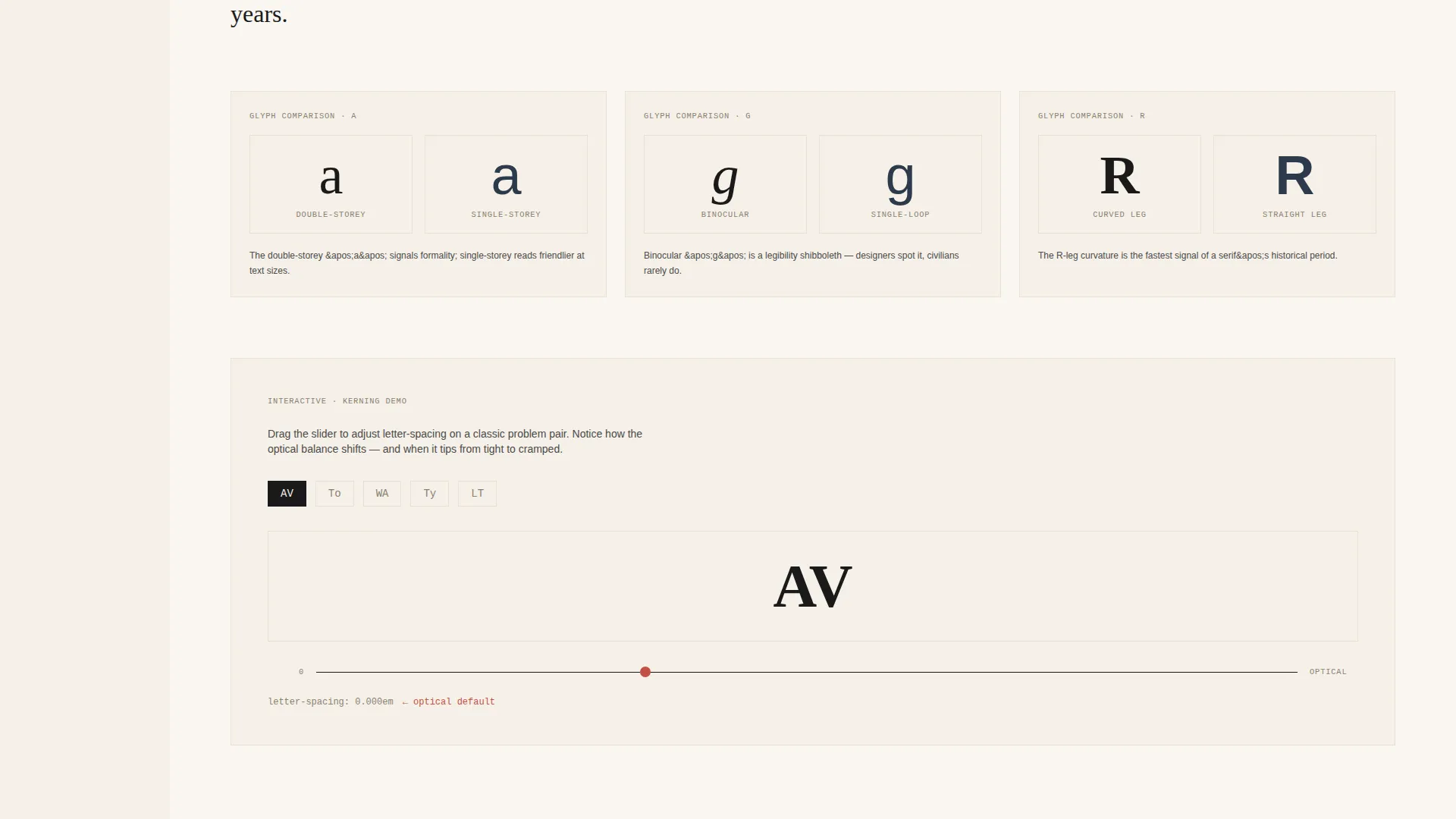
The Specimens spoke includes an embedded interactive kerning demo alongside glyph comparison cards. Readers can engage directly with letter spacing rather than just reading about it, making the section genuinely useful for students and working designers alike.
Display-Scale Pull Quotes and Statistics
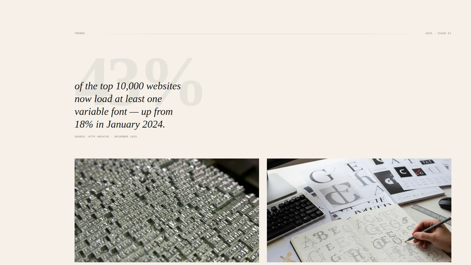
Each spoke opens with a single provocative statistic or pull quote rendered at display scale. This gives every section a strong entry point before unfolding into curated essays and supporting content.
Dual-Path Call to Action
The primary call to action, "Get the Full Report," appears first as a sticky bar after the second spoke and again as a full-width lockup at the page bottom. Both instances use a single typewriter-styled email input field. A secondary path, "Browse the Archive," links to the spoke index.
GSAP Scroll-Triggered Animations
The page uses GSAP ScrollTrigger for marquee scrub effects, staggered content reveals, and smooth anchor transitions. These animations support the editorial pacing without distracting from the reading experience.
Page sections overview
| Section | Purpose |
|---|---|
| Hero Collage Header | Establishes visual identity and sets the editorial tone with a large serif headline and left-rail anchor nav |
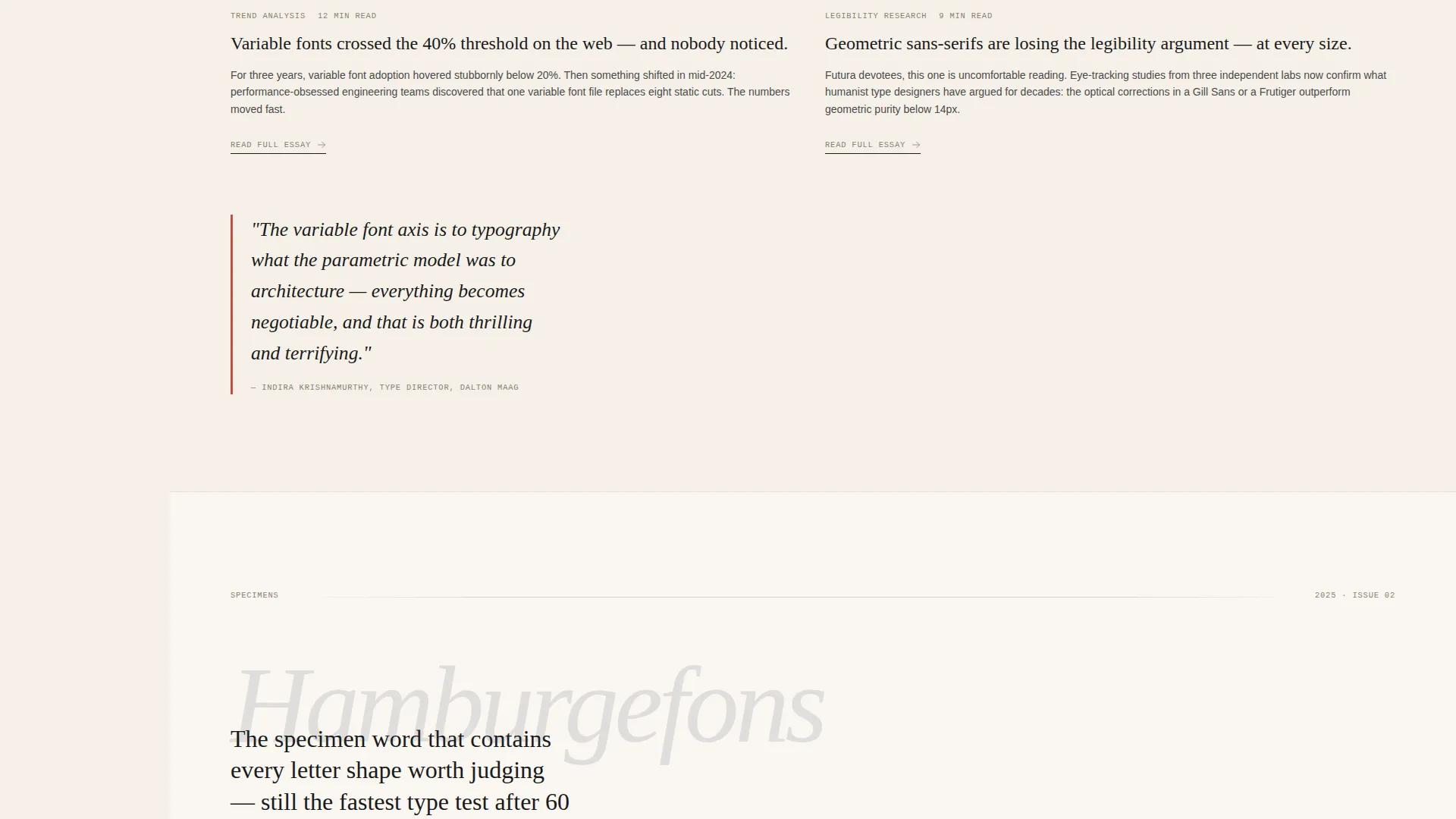
| Trends Spoke | Opens with a display-scale statistic and unfolds into two-column essay previews on current type trends |
| Specimens Spoke | Presents glyph comparison cards and an interactive kerning demo for hands-on exploration |
| Interviews Spoke | Features pull quotes at display scale followed by a curated list of named type designer interviews |
| Data Spoke | Displays a type download data visualization alongside a tools grid for practical reference |
| Call to Action Lockup | Full-width email capture with a sticky bar, a typewriter input, and a "Browse Archive" secondary link |
Design & branding system
The visual identity follows a Warm Artisan theme that feels like a letterpress printer's desk at golden hour. Every color and type choice is deliberate, referencing physical print production rather than digital convention.
- Color palette: cotton stock (#F5F0E8) background, lampblack (#1A1A1A) for body text and headings, faded red pencil (#C45043) for highlights and pull quotes, bookcloth navy (#2C3A4B) for section dividers and secondary accents
- Typography: Fraunces as the display serif for headlines and specimen labels, DM Sans as the body and navigation typeface for legibility at smaller sizes
- Visual texture: slight rotations, overlapping layers, and hand-crafted imperfection throughout the layout reinforce the specimen book aesthetic
Mobile & speed optimization
The template is built desktop-first, reflecting the primary audience of art directors working on large screens. Responsive behavior ensures the layout remains coherent and readable on smaller devices without losing the editorial character.
- Native CSS smooth scroll handles anchor navigation transitions without additional JavaScript overhead
- Server Components are used for static content sections, keeping initial page load lean
- The sticky anchor nav and sticky call-to-action bar adapt to narrower viewports so key navigation and conversion elements remain accessible
How this template helps you convert
The conversion strategy is built on earned trust rather than immediate asks. The page gives readers substantive value before presenting any email request, which means the audience arriving at the call to action is already engaged and informed.
- Three complete content spokes are delivered before the sticky "Get the Full Report" bar appears, so readers have already experienced the depth of the resource before being asked to subscribe
- The full-width call-to-action lockup at the page bottom reinforces the offer with a single-field typewriter-styled input, keeping the commitment low and the action clear
Other information about this template
This template is designed for design media teams, independent publishers, and editorial studios who want a content destination with genuine visual character. It is especially well-suited to annual report formats, specimen book launches, and deep-dive resource hubs in the art and design space.
- The template uses Fraunces and DM Sans, both available as free variable web fonts, making typographic customization straightforward
- The hub-and-spoke structure can support five content verticals simultaneously without requiring a multi-page architecture
- The Ink and Paper color system and collage header concept are built to feel unique to the typography and design editorial niche, not generic
Theme
Warm Artisan
Creative direction
Industry Report
Color system
Ink & Paper
Style
Hub & Spoke (Anchor Nav)
Direction
Content/Resource
Page Sections
Collage Scrapbook Hero Section
Sticky Left-rail Anchor Nav
Interactive Kerning Demo
Display-scale Statistics and Pull Quotes
Dual-path Call to Action Design
GSAP Scroll-triggered Animation System
Related questions
Who is this landing page template designed for?
Can I use this template for content categories other than typography?
How does the email capture work in this template?
Does the template include the interactive kerning demo component?
What animation features are built into this template?



