Editorial Typography Landing Page Template
Kerning is a single-column editorial landing page built for a typography and lettering publication. It blends print-magazine rhythm with scroll-linked interactivity, guiding readers through trend analysis, designer profiles, and foundry release roundups. A persistent email call-to-action and a mid-page gated report convert engaged readers into newsletter subscribers without interrupting the editorial experience.
by Rocket studio
Quick summary
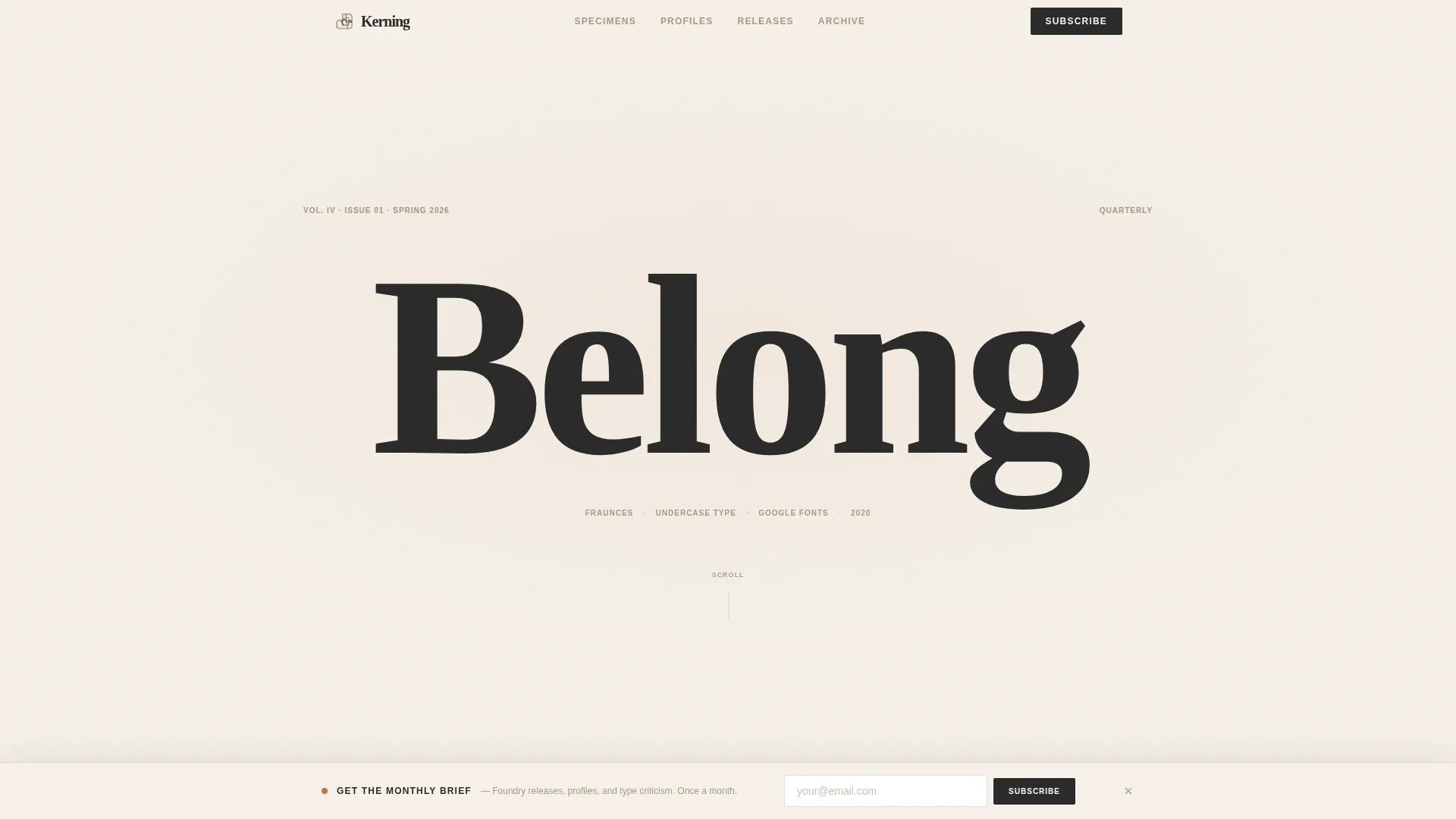
Kerning is a typographically obsessive editorial landing page for a design industry publication. It opens with a 20vw specimen headline, then flows through trend analysis, a designer profile, and a curated release roundup. Every section earns the reader's attention before asking for anything. The result is a content destination that feels like a well-art-directed print magazine, built for the web.
Who this template is for
This template is built for people who publish serious content about type and design. It suits independent editorial projects and niche design publications that need a web presence with real craft behind it.
- Typography and lettering bloggers who want a page that matches the quality of their writing
- Design educators and researchers publishing industry reports or font trend analyses
- Brand and creative studios running editorial arms for professional audiences
What problem this template solves
Most blog templates trade editorial depth for generic layouts. For a typography publication, that mismatch destroys credibility before a single word is read. Readers who spot a misused ligature from across a room will immediately notice a template that does not respect type.
- Generic blog layouts undermine the authority of specialist design writing
- There is no natural place for gated content that feels earned rather than forced
- Single-purpose hero sections waste the scroll depth that editorial readers are willing to give
What you get with this template
You get a complete single-column flow landing page built around editorial rhythm and typographic display. Every section is designed to reward careful readers while nudging them toward subscription.
- A 20vw giant headline hero with a credit line, a mid-page gated report gate, and a persistent bottom-bar email form
- Scroll-linked animations including glyph reveals, marquee type, and parallax single-glyph moments
- A warm stone color system using limestone cream, charcoal ink, terracotta clay, and weathered sandstone
Feature list
Every capability below comes directly from the template structure described in the source brief.
Giant Headline Specimen Hero
The page opens with a single word set at roughly 20 viewport width units. The letterform is large enough to study its ink traps and stroke contrast. A small, letterspaced credit line below names the typeface, the designer, the foundry, and the year. Nothing else competes for attention.
Scroll-Linked Typographic Moments
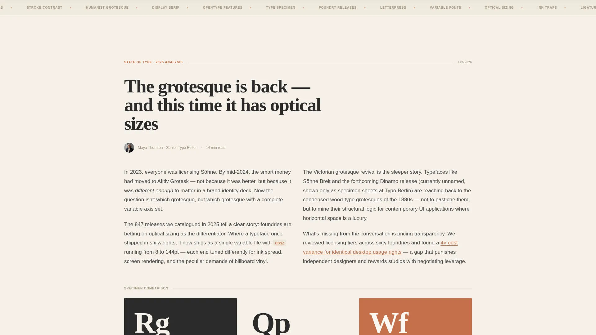
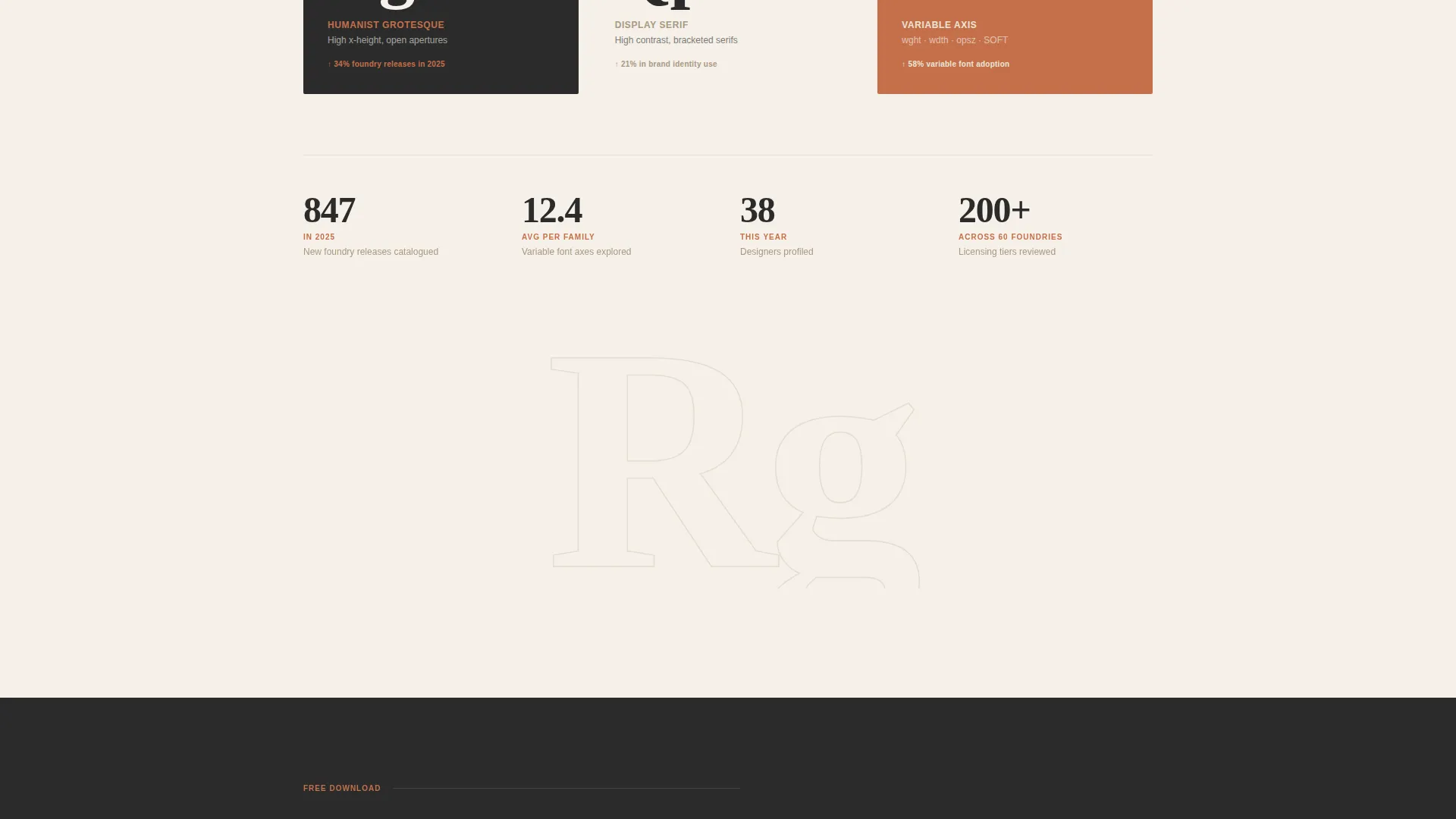
Between editorial sections, single glyphs fill the full viewport as the reader scrolls. Kerning pairs animate at scroll speed. These moments break up dense reading columns and recreate the breathing rhythm of a well-designed print spread, all driven by scroll position.
Mid-Page Gated Report Gate
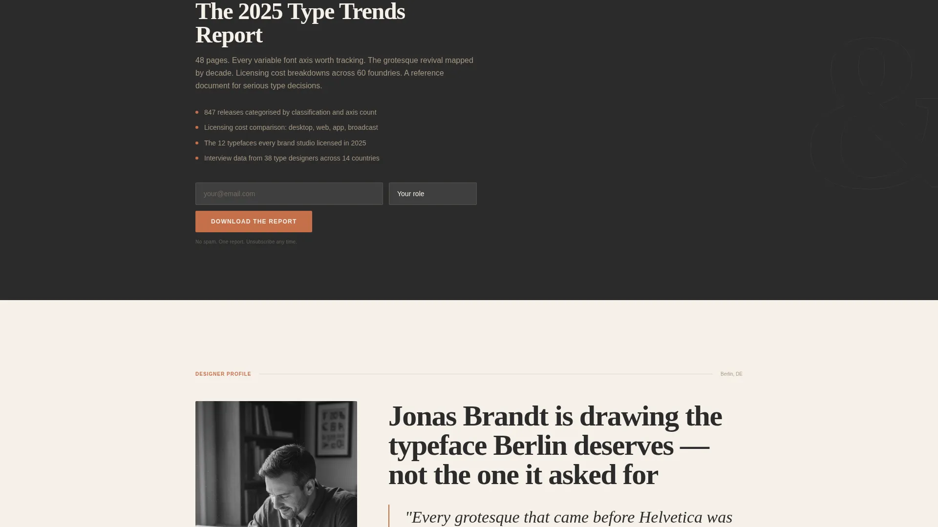
After the trend analysis section proves editorial depth, the page offers a downloadable report. Readers provide their email address and select a role from four options: designer, brand strategist, student, or educator. The gate earns the click by arriving only after the content has already delivered value.
Persistent Bottom-Bar Email Form
After two sections of scroll, a bottom bar appears and stays in view. It asks only for an email address in a single inline field. The call-to-action reads "Get the Monthly Brief." The bar is unobtrusive but always present, giving readers a low-friction path to subscribe at any moment.
Curated Release Roundup with OpenType Details
The release roundup section presents foundry releases with license-tier pricing and OpenType feature breakdowns. Tab switching lets readers compare specimens without leaving the section. This structure serves graphic designers and brand strategists who need to evaluate and justify type choices quickly.
Editorial Department Structure
The page flows like a magazine with distinct departments. A data-rich trend analysis comes first, followed by a designer profile with oversized pull quotes set in the subject's own typeface. Then the release roundup closes the editorial arc. Each section has a defined role and a defined visual register.
Page sections overview
| Section | Purpose |
|---|---|
| Hero Specimen | Display the featured typeface at full visual impact with a minimal credit line |
| Trend Analysis | Present data-rich type industry insights with inline specimen comparisons |
| Gated Report | Offer the 2024 Type Trends Report behind a short email-plus-role form |
| Designer Profile | Feature an oversized pull quote section set in the profiled designer's typeface |
| Release Roundup | List curated foundry releases with pricing tiers and OpenType feature details |
| Persistent Bottom Bar | Capture email subscriptions via a single inline field fixed to the bottom of the viewport |
| Minimal Footer | Close the page with an ultra-minimal horizontal flow footer |
Design & branding system
The visual identity is built around a warm stone palette that recalls a letterpress broadsheet left on a sunlit desk. Every tone defers to the type, keeping ornamentation minimal and craft central.
- Color system: limestone cream (#F5F0E8) as the background, charcoal ink (#2B2B2B) for body text, terracotta clay (#C4704B) for pull quotes and accent links, weathered sandstone (#A89882) for rules, captions, and metadata
- Display typeface: Fraunces, a variable serif suited to large-scale editorial headlines and pull quotes
- Interface typeface: DM Sans, used for body copy, captions, metadata labels, and form elements
Mobile & speed optimization
The template is designed desktop-first, reflecting the reality that its core audience works on large screens with font managers open. Responsive behavior is still included for readers who arrive on mobile.
- Desktop-first layout prioritizes wide reading columns, large specimen display, and scroll-triggered animation at full fidelity
- Server Components handle static editorial content, while Client Components manage scroll behaviors and interactive form elements
- Responsive adjustments scale the specimen headline, reading columns, and release roundup tabs for smaller viewports
How this template helps you convert
The conversion strategy is built into the editorial structure itself. Readers give their attention in stages, and the template asks for their email only after it has earned that attention.
- The trend analysis and designer profile sections build credibility before any form appears, so the mid-page gated report request arrives at the right moment
- The persistent bottom-bar form stays visible after two sections of scroll, giving returning and engaged readers a constant low-effort way to subscribe without disrupting reading
Other information about this template
This template is a strong fit for design publications, type foundry blogs, and editorial projects within the art and design space. It can also support portfolio-adjacent editorial work where the visual execution needs to reflect the craft being written about.
- Template style: Single Column Flow, suited to long-form editorial content with a clear reading hierarchy
- Theme: Editorial Magazine, drawing on print-magazine layout conventions adapted for the web
- Creative direction follows an Industry Report structure, moving from analysis to profile to roundup
- The header concept is a Giant Headline Centered, using a quarterly-rotating typographic specimen
- The landing page direction is Content and Resource, with two distinct conversion paths: newsletter subscription and report download
- Color system name: Warm Stone, referencing the natural material palette of aged print production
- Built for the typography and lettering blog niche within the broader art and design blog category
Theme
Editorial Magazine
Creative direction
Industry Report
Color system
Warm Stone
Style
Single Column Flow
Direction
Content/Resource
Page Sections
Giant Headline Specimen Hero
Scroll-linked Typographic Moments
Mid-page Gated Report
Persistent Bottom-bar Email Form
Release Roundup with Opentype Details
Editorial Department Structure
Related questions
Who is the intended audience for this landing page template?
Can I change the featured typeface in the hero section?
What are the two conversion paths built into this template?
Is this template suitable for a desktop-first audience?
How does the release roundup section work?



