Ceramics Online Course Landing Page Template
Kiln is a single-column landing page template built for pottery and ceramics online courses. It follows an industry-report scroll structure with chapter headings, data-backed findings, and marginalia-style testimonials. The design uses an Ink and Paper visual identity with Japanese Zen colors, refined serif typography, and a lead generation flow built around a syllabus download form.
by Rocket studio
Quick summary
Kiln is a lead generation landing page template for ceramics and pottery courses. It scrolls like a typeset industry report, building a structured case for enrollment through data, curriculum chapters, and student evidence. The primary call to action collects a first name and email in exchange for a course syllabus download.
Who this template is for
This template suits educators, studio instructors, and course creators who teach ceramics or pottery online. It works best when the offer is a structured curriculum rather than a casual workshop, and when the audience responds to evidence over hype.
- Pottery instructors launching a structured online course with defined modules
- Ceramics educators targeting hobbyist makers, career-changers, or working potters
- Course creators who want a long-form, authority-building page to generate leads before a purchase decision
What problem this template solves
Most course landing pages either oversell with flashy visuals or undersell with generic copy. Neither approach works for a knowledge-dense subject like ceramics, where trust and credibility must be earned. Kiln solves this by presenting the course as a researched, evidence-backed body of work.
- Self-taught pottery learners need proof that structured instruction solves real, specific problems before they commit their email
- Instructors lack a page format that communicates curriculum depth without feeling like a sales pitch
- Generic course templates do not reflect the craft aesthetic or the intellectual seriousness that ceramics audiences expect
What you get with this template
The template delivers a complete, publication-quality single-column landing page structured as a five-chapter scroll. Every section has a defined role in building the reader's trust and moving them toward the lead capture form.
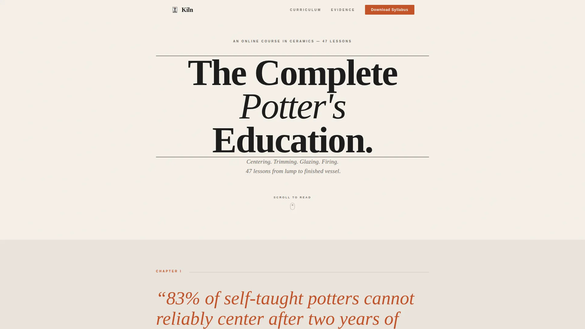
- A title-page hero section with a giant centered serif headline, horizontal rules, and an italicized subline
- Three numbered chapter sections covering the problem, the curriculum, and the evidence, each with annotated data presentation and marginalia-style testimonials
- A lead capture section with a minimal two-field form, a sticky bottom call-to-action bar on scroll, and a secondary free-lesson video path
Feature list
This template includes a focused set of built-in capabilities grounded in the source brief.
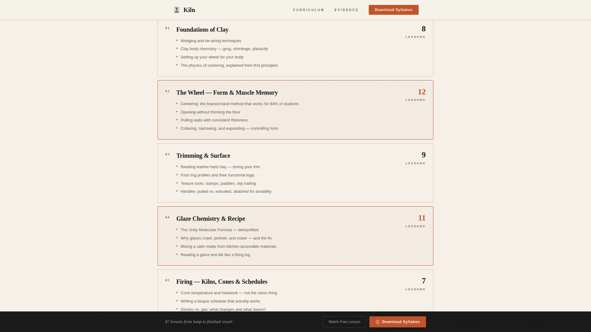
Chapter-Structured Scroll Layout
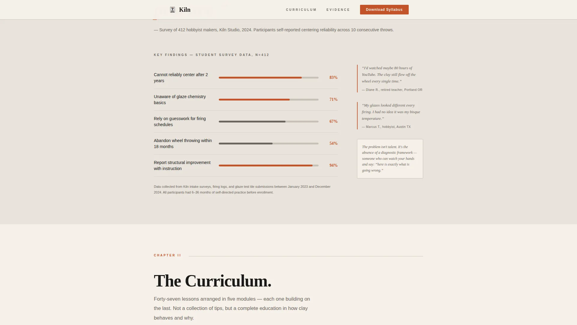
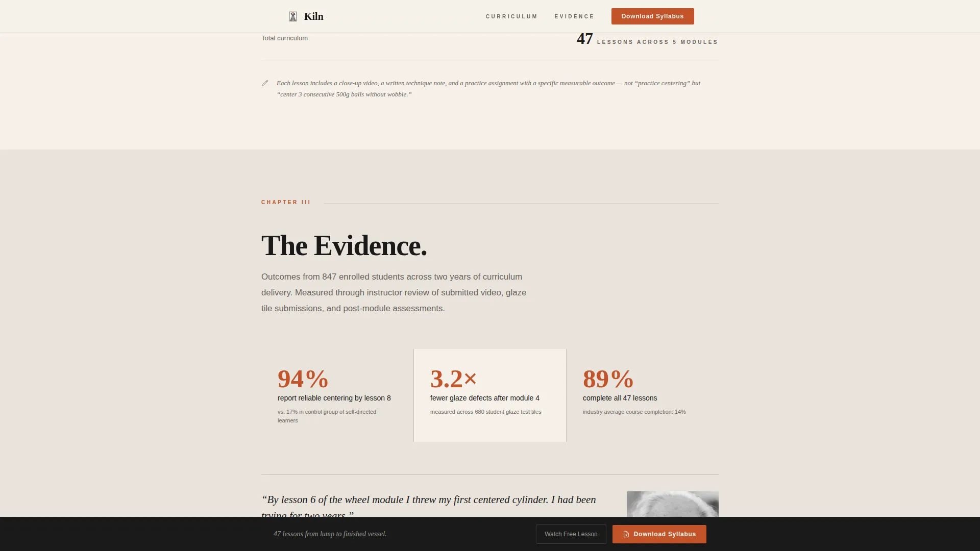
The page is organized into numbered chapter headings, each opening with a key data finding rendered at large scale. This format guides the reader through a logical argument: here is the problem, here is the solution, here is the proof.
Title-Page Hero Section
The hero uses a giant centered serif headline set in Fraunces display type at massive scale, framed by thin horizontal rules above and below. A single italicized subline reads below the rule. No images compete with the typography.
Marginalia-Style Testimonials
Student testimonials appear as small, handwritten-feel annotations placed beside the chapter section they reference. This keeps social proof contextual and credible without interrupting the reading flow.
Two-Path Lead Capture
The primary call to action asks readers to download the course syllabus using a two-field form collecting first name and email only. A secondary path offers a free centering lesson through a gated video that collects the same two fields.
Sticky Bottom Call-to-Action Bar
After the third chapter section, a fixed bar appears at the bottom of the viewport on scroll. It keeps the syllabus download action accessible throughout the rest of the page without interrupting reading.
Scroll-Reveal Animations
Section content enters the viewport with low-to-medium scroll reveal animations using cubic-bezier easing. The effect feels deliberate and unhurried, matching the page's editorial tone.
Page sections overview
| Section | Purpose |
|---|---|
| Hero headline | Establishes authority with title-page typography and italicized subline |
| Chapter 1: The Problem | Presents data on self-taught potter failure rates with annotated findings |
| Chapter 2: The Curriculum | Breaks down 47 lessons into modules with chapter structure |
| Chapter 3: The Evidence | Shows student results alongside marginalia-style testimonials |
| Syllabus download form | Captures first name and email with minimal friction |
| Free lesson path | Offers gated video access via the same two-field form |
| Footer | Minimal horizontal flow layout |
Design & branding system
The visual identity follows an Ink and Paper theme using a Japanese Zen color palette. The design feels like a calligraphy brush dragged across handmade paper: restrained, deliberate, and warm inside the negative space.
- Colors: unbleached washi white (#F5F0E8) and warm gray (#E8E3DB) alternate as section backgrounds; sumi ink black (#1A1A1A) is used for all body text; wet clay gray (#6B6560) carries secondary text; kiln-fire orange (#C2532A) is reserved for buttons and pull-quotes only
- Typography: Fraunces serif is used for display headlines; DM Sans is used for body copy; line height is generous throughout, giving each paragraph the feel of a passage in a printed craft monograph
- Layout: single-column flow with no competing imagery in the hero; data and photographs are presented as minimal charts and annotated visuals in later chapters
Mobile & speed optimization
The template is built desktop-first for long-form reading but is fully responsive for mobile viewports. Technical choices are kept lean to support the editorial reading experience.
- Server Components handle all static content sections, keeping JavaScript to a minimum
- Scroll reveal animations use cubic-bezier curves without relying on heavy animation libraries
- The sticky call-to-action bar is designed to remain unobtrusive on smaller screens while keeping the form action accessible
How this template helps you convert
The page earns the lead by building genuine intellectual trust before asking for anything. The structure mirrors the reader's natural decision journey from awareness to desire.
- The chapter-by-chapter scroll presents evidence first, including survey data, firing statistics, and curriculum detail, so that by the time the form appears, downloading the syllabus feels like the obvious next step rather than a cold ask.
- The two-path conversion model gives hesitant readers a lower-commitment entry point through the free centering lesson video, capturing the same lead data while reducing perceived risk.
Other information about this template
This template is suited to long-form editorial content strategies where trust must be built before a conversion action. It is designed for English-language audiences in the United States and does not display pricing, making it appropriate for pre-sale and lead generation sequences.
- The footer uses a horizontal flow pattern with minimal elements, keeping the page exit clean
- The form includes a mock submit interaction, allowing you to preview the lead capture experience before connecting a live form handler
- Kiln works well as part of a broader content marketing approach for ceramics education, where the syllabus download feeds into an email nurture sequence managed separately from this template
- The template style is classified as Single Column Flow under the Blog and Editorial category, with a subcategory focus on Pottery and Ceramics Content
Theme
Ink & Paper
Creative direction
Industry Report
Color system
Japanese Zen
Style
Single Column Flow
Direction
Lead Generation
Page Sections
Chapter-structured Scroll Layout
Title-page Hero Section
Marginalia-style Testimonials
Two-path Lead Capture
Sticky Bottom Call-to-action Bar
Scroll-reveal Animations
Related questions
What kind of course is this template designed for?
Can I use this template if I am not selling the course immediately?
How many fields does the lead capture form include?
Is this template suitable for mobile visitors?
Can I update the testimonials with my own student quotes?


