Fitness & Exercise Blog Landing Page Template
Kinetic is a masonry-layout landing page template built for a depth-first fitness and exercise blog. It blends a newspaper masthead header, a Pinterest-style origin story grid, and a click-through conversion flow into one editorial-quality page. Designed for serious adult athletes and movement professionals, it earns the reader's trust through typography and storytelling before it ever asks for a click.
by Rocket studio
Quick summary
Kinetic is a single-page editorial landing page template for a fitness and exercise blog. It opens with a broadsheet-style masthead, flows into a masonry origin story grid, and closes with a focused call to action. The design language is Luxe Minimal with a Japanese Zen palette, built for readers who train seriously and expect the writing to match.
Who this template is for
This template is made for thoughtful fitness content creators who want their landing page to reflect the depth of their work. It suits journals, editorial blogs, and methodology-driven publications in the health and wellness space.
- Self-programming athletes and coaches building a depth-first training journal
- Physical therapists, movement educators, or sports professionals launching an editorial platform
- Former competitive athletes pivoting to long-form content around longevity and movement science
What problem this template solves
Most fitness landing pages lead with lead capture forms, loud color gradients, and generic stock photography. For a publication that competes on intellectual credibility, that approach actively repels the right reader. This template solves the mismatch between editorial ambition and generic web templates.
- Readers who train seriously leave pages that feel like supplement ads
- A form-first layout signals that the content is a product, not a publication
- Standard blog templates lack the visual hierarchy needed to communicate editorial quality at first glance
What you get with this template
You get a fully structured, single-page layout that guides a discerning reader from first impression to first click. Every section is designed to build credibility before asking for anything in return.
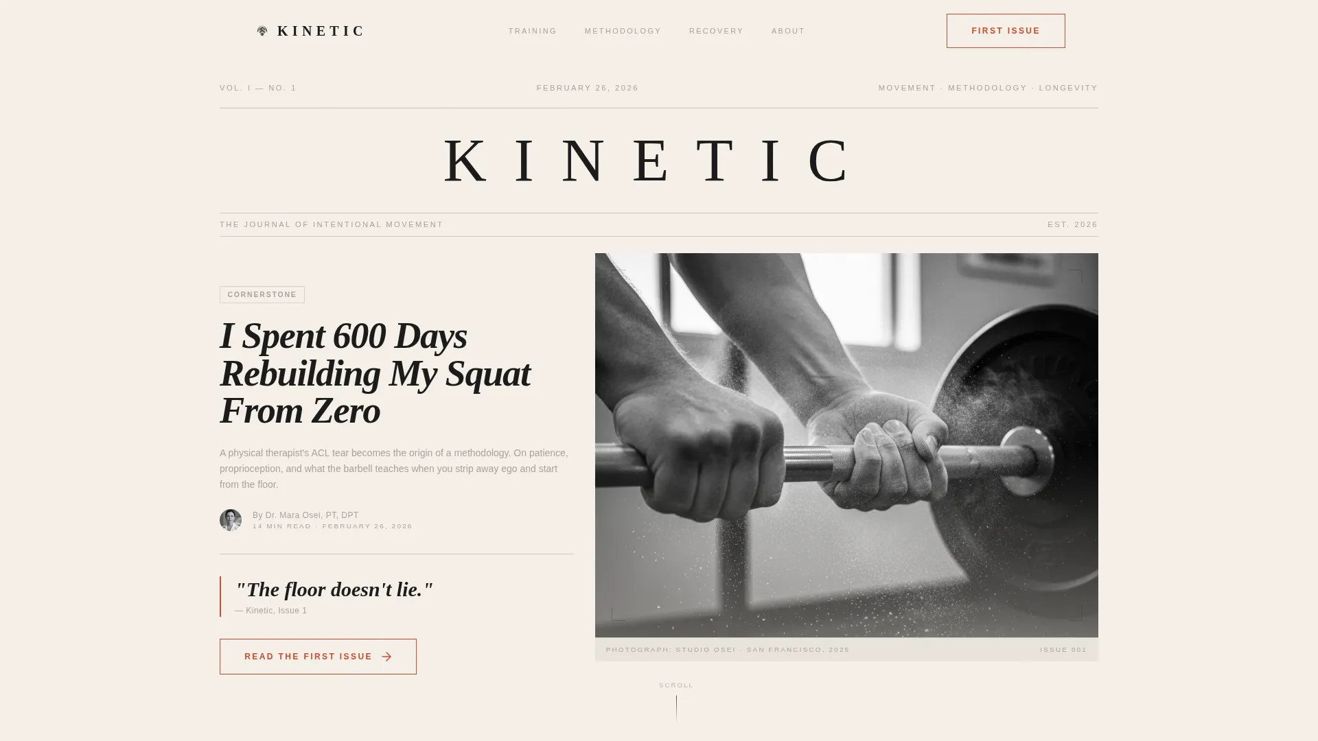
- A newspaper-style masthead with wide-letterspaced serif logotype, editorial headline, dateline, byline, and a black-and-white hero photograph
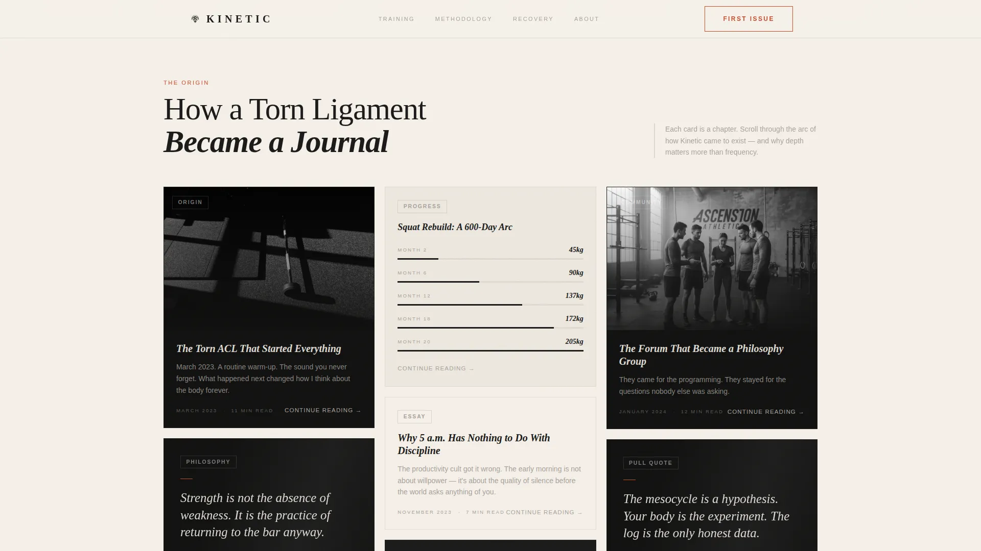
- A masonry origin story grid with typographic pull quote cards, muted photo cards, and data visualization cards at varied heights
- A click-through call-to-action section with a persimmon-accented primary button and subtle inline text links inside each card
Feature list
This section covers the core built-in capabilities of the Kinetic template as described in the source brief.
Newspaper Broadsheet Masthead
The hero section presents "KINETIC" in wide-letterspaced display serif type across the top. Below it sits a large editorial headline, a dateline, and a byline. A thin typographic rule separates this from a black-and-white cinematic photograph. No color appears above the fold, keeping the opening frame focused and composed.
Masonry Origin Story Grid
The Pinterest-style masonry grid unfolds the brand's story through varied card types. Some cards are typographic pull quotes on ink-black backgrounds. Others are muted photographs with overlaid titles. A few display training progression data. Cards stagger at different heights, creating a curated magazine feel as the reader scrolls.
Editorial Philosophy Section
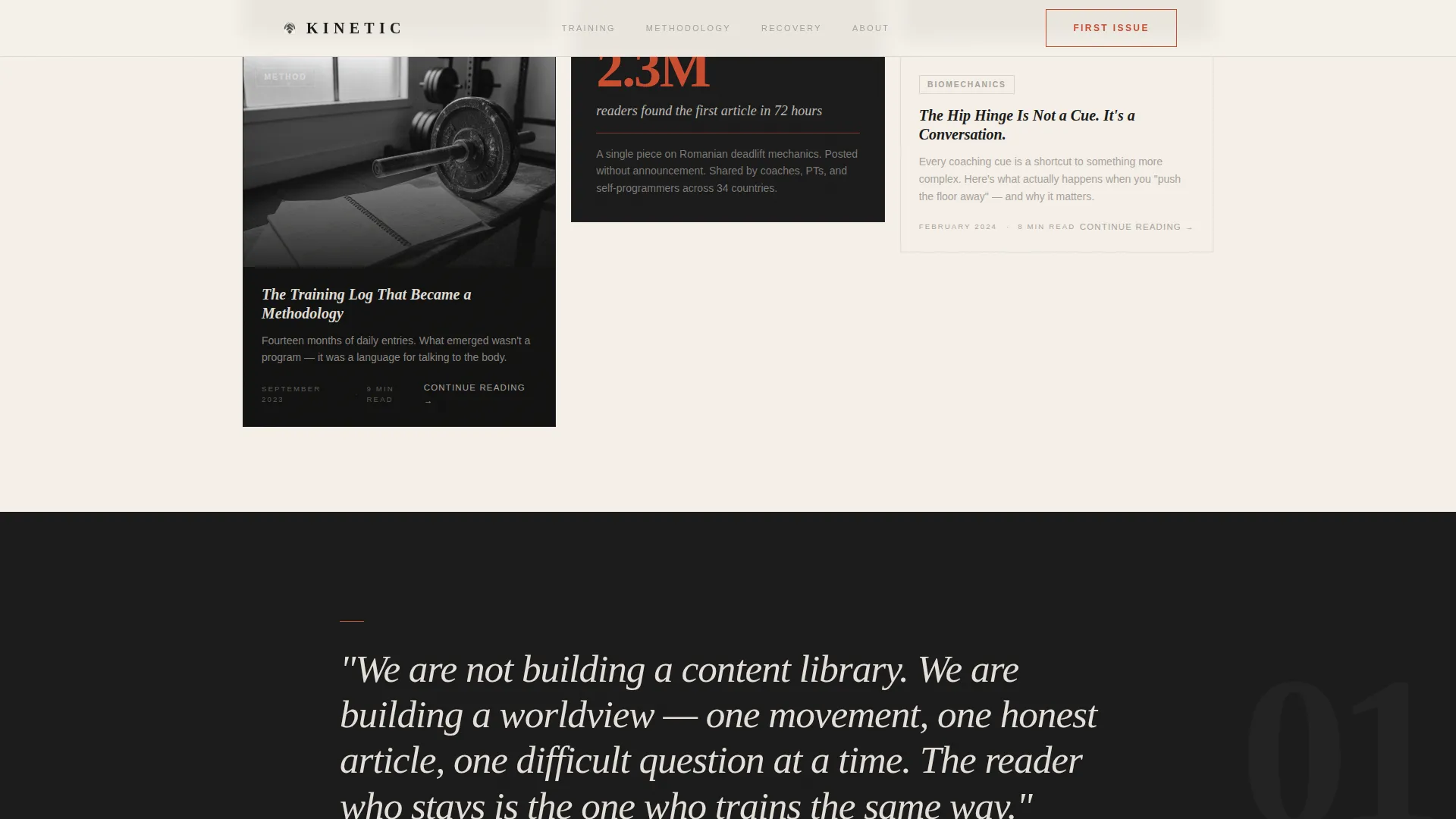
A full-width pull quote section on an ink-black background sits between the masonry grid and the featured articles. This section anchors the publication's core viewpoint in one clear statement, giving the page an editorial punctuation point that reinforces the journal's identity.
Featured Articles Layout
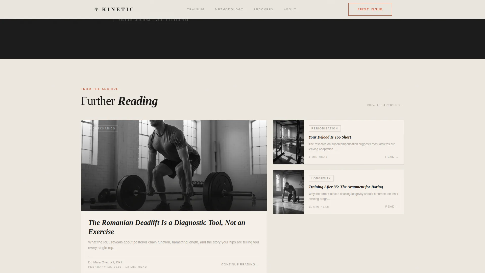
An asymmetric editorial card layout presents the blog's cornerstone content. The arrangement is intentionally non-uniform, borrowing visual logic from print magazine spreads rather than uniform blog grid patterns.
Click-Through Conversion Flow
The primary call to action, "Read the First Issue," appears as a persimmon-accented button after the origin story resolves. A secondary path lives inside each masonry card as a subtle "Continue Reading" text link. There is no form or gate, meaning the page earns the click through demonstrated editorial quality alone.
Scroll-Triggered Animation System
The template includes a medium-weight animation layer. A cinematic entrance plays on the hero image. Staggered slide-up fade reveals activate as sections enter the viewport using scroll-based triggers. Card hover states lift the card and reveal persimmon accent color. A shimmer effect applies to glass-style cards.
Page sections overview
| Section | Purpose |
|---|---|
| Hero Masthead | Establishes editorial identity with broadsheet typography and cinematic photography |
| Origin Story Grid | Tells the brand story through a masonry layout of mixed card types |
| Editorial Philosophy | Reinforces publication voice with a full-width pull quote on a dark background |
| Featured Articles | Surfaces cornerstone content in an asymmetric editorial card layout |
| Call to Action | Converts reader interest with a persimmon-accented primary button |
| Footer | Closes the page with a horizontal flow layout |
Design & branding system
The visual identity uses a Japanese Zen color system paired with a Luxe Minimal typographic approach. Typography carries as much visual weight as photography, following the compositional logic of vintage broadsheets and contemporary editorial print.
- Color palette: tatami warm white (#F5F0E8) for backgrounds, sumi ink black (#1A1A1A) for primary text, dry stone gray (#A8A29E) for card borders and secondary elements, and persimmon (#C94C2F) reserved strictly for hover states and pull quote accents
- Typography: Fraunces display serif for headlines and the masthead logotype, DM Sans for body copy and card labels
- Visual tone: monochromatic calm in the base palette with persimmon appearing only as an interactive or editorial accent, never in static decoration
Mobile & speed optimization
The template is built desktop-first, reflecting the reading habits of its target audience. It delivers full mobile responsiveness so the experience holds across tablets and smaller screens.
- Desktop and tablet layouts are prioritized, with masonry grid reflow on smaller viewports
- Animations use CSS only, with no dependency on heavy JavaScript libraries, keeping motion smooth without adding rendering weight
- Server Components handle static content sections, reducing unnecessary client-side processing
How this template helps you convert
This template is built around a single conversion principle: earn the click by proving editorial quality first. No form, no gate, no friction until the reader is already convinced.
- The masthead establishes immediate credibility through print-quality typography and a cinematic hero image, making a strong first impression before the reader scrolls.
- The masonry origin story grid deepens investment by unfolding the publication's history and philosophy across varied card formats, turning passive scrolling into active reading.
- The persimmon-accented "Read the First Issue" button appears only after the origin arc resolves, so the call to action feels like a natural next step rather than an interruption.
Other information about this template
This template is categorized under Blog and Editorial, with a specific fit for Health and Wellness Blog and Fitness and Exercise Blog use cases. It is built as a click-through landing page, meaning the conversion goal is a single forward action rather than data collection.
- The Intersection Match Score for this template's niche alignment is 13, reflecting a strong fit between the Blog and Editorial category, Health and Wellness subcategory, and Fitness and Exercise niche
- The footer follows a horizontal flow layout pattern suited to editorial publications
- Date formatting uses the United States standard (Month DD, YYYY), and all copy is in English (US)
- The creative direction follows an Origin Story arc, meaning the page reads as a narrative rather than a product catalog
- The header concept is drawn from Newspaper and Publication design conventions, not from standard web hero patterns
Theme
Luxe Minimal
Creative direction
Origin Story
Color system
Japanese Zen
Style
Masonry/Pinterest
Direction
Click-Through
Page Sections
Newspaper Broadsheet Masthead Header
Masonry Origin Story Grid
Full-width Editorial Philosophy Section
Asymmetric Featured Articles Layout
Click-through Conversion Flow
Scroll-triggered Animation Layer
Related questions
What type of content is this template designed for?
Does this template include a lead capture form or email opt-in?
Can I adapt the masonry grid cards to show my own content?
How does the persimmon accent color work in the layout?
Is this template suitable for a physical therapist or coach launching a publication?



