Scalable Restaurant Infrastructure Landing Page Template
The Seed Ghost Kitchen API Infrastructure Landing Page Template is a split-screen, investor-grade pitch page built for pre-seed foodtech startups. It leads with an interactive unit economics calculator, walks visitors through a problem-to-solution architecture flow, and closes with social proof sections that push foodtech angels and operator-VCs toward a Calendly demo booking.
by Rocket studio
Quick summary
This template gives food entrepreneurs and pre-seed founders a fully structured landing page designed to win investor attention fast. The layout opens with a live unit economics calculator, proves the business model before arguing it, and guides visitors toward a frictionless demo booking. It is purpose-built for ghost kitchens pitching API infrastructure to angels, operators, and accelerator partners.
Who this template is for
This landing page is built for a specific kind of founder: one who has real data, a working API model, and an audience of skeptical, numbers-first investors. It speaks directly to the people building the unseeable plumbing that powers modern food delivery at scale.
- Foodtech pre-seed founders pitching ghost kitchen infrastructure to angels and operator-VCs
- Food entrepreneurs launching delivery-only restaurant concepts who need to demonstrate unit economics clearly
- Accelerator applicants and B2B API teams targeting operators, pilot kitchens, and delivery network partners
What problem this template solves
Ghost kitchens operate across disconnected stacks. Menus live in one system, delivery data lives in another, and pricing logic is patched together from scratch every time demand shifts. Investors see this fragmentation and want proof that your API actually collapses it. A generic pitch deck page cannot show that. This landing page can.
- Investors leave before they understand the model because the pitch leads with copy instead of proof
- Founders building for ghost kitchens struggle to communicate technical depth without losing non-technical visitors
- Standard pages do not let visitors interact with the product logic before asking for their time or purchase commitment
What you get with this template
You get a complete, single-page layout designed to convert investor visitors into booked demos. Every section has a defined role: show the math, expose the problem, reveal the solution, stack the proof, and earn the click. Nothing is decorative. Everything does work.
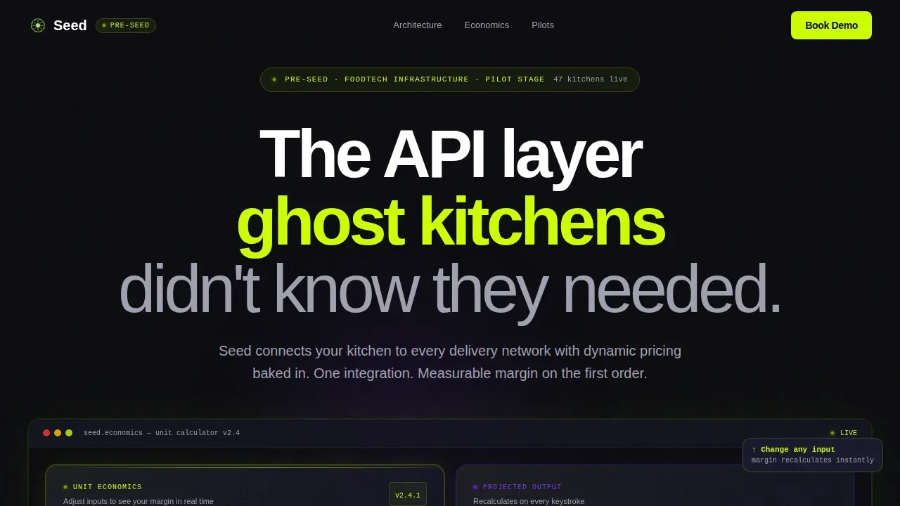
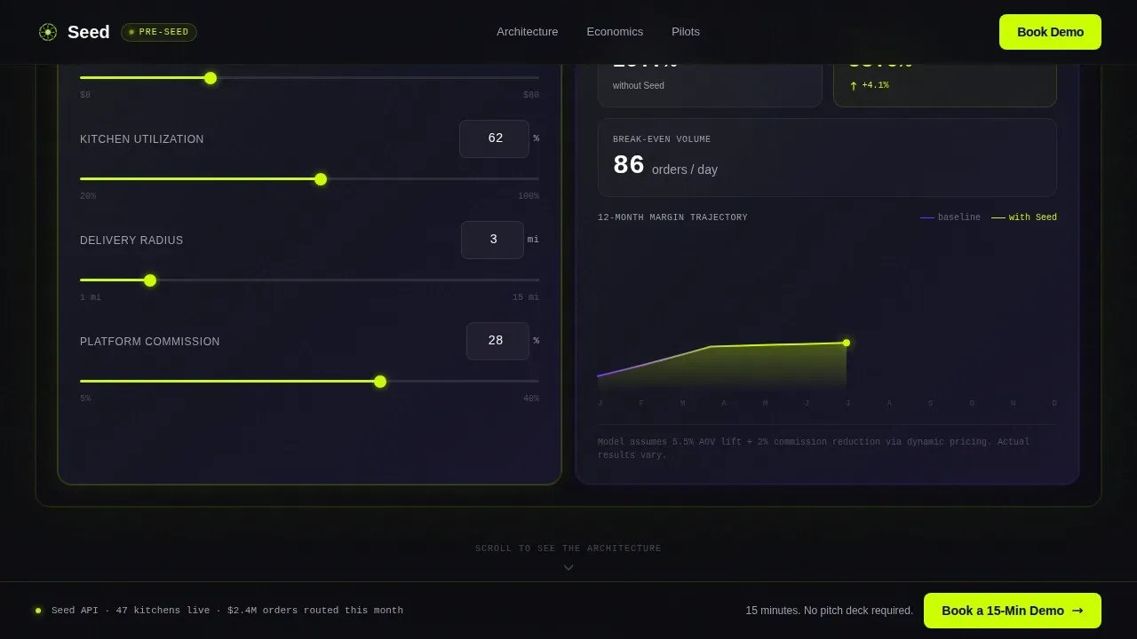
- A 50/50 split-screen hero with a live unit economics calculator on the left and real-time output panel on the right, including a 12-month margin sparkline
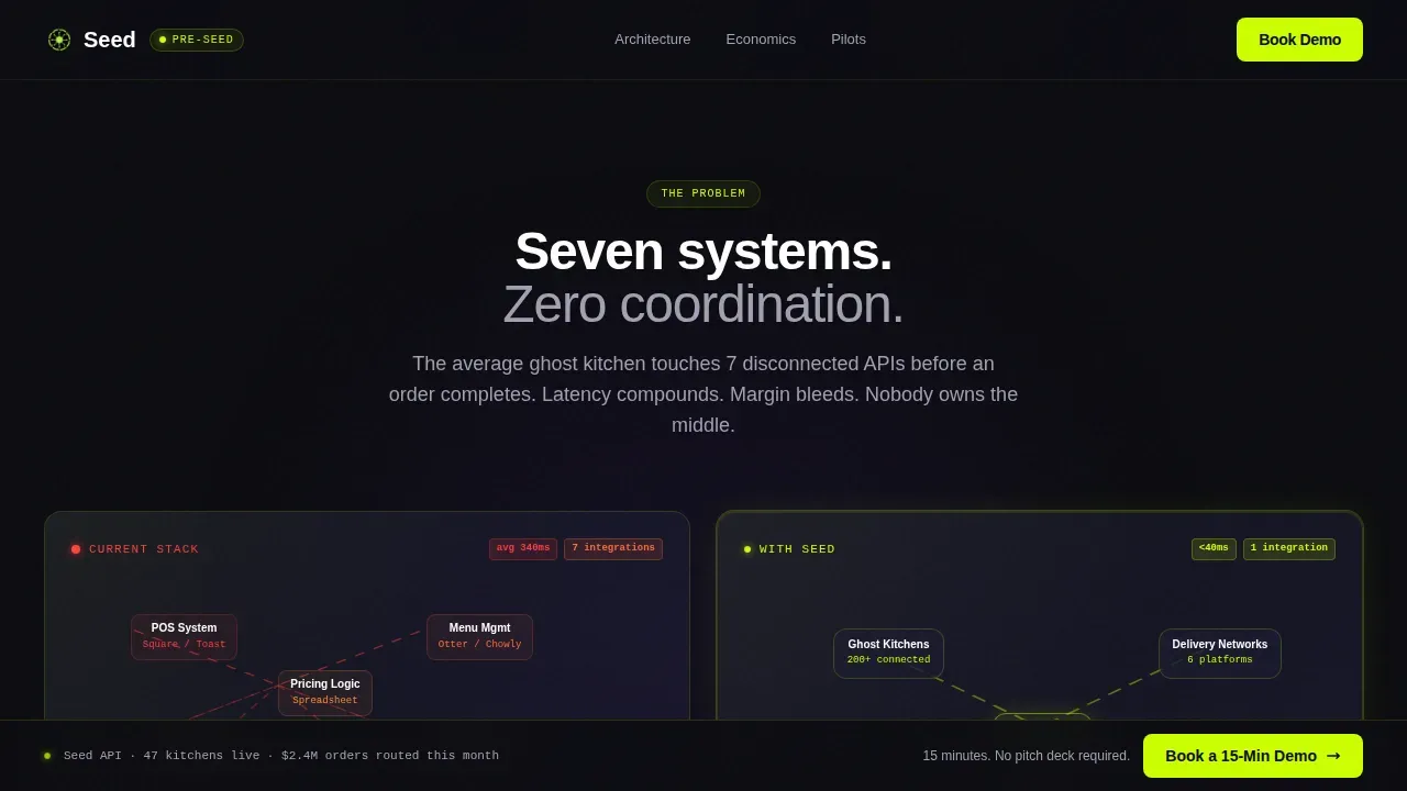
- A scroll-driven problem-versus-solution section with an animated flowchart showing fragmented ghost kitchen stacks collapsing into a clean three-node API layer
- Social proof sections featuring pilot kitchen logos, an operator testimonial quote, and a Loom dashboard embed placeholder, plus a persistent bottom-bar call to action
Feature list
This template is built around five core structural and interaction concepts that work together to move investors from curious to committed.
Interactive Unit Economics Calculator
The hero section places a live calculator at the center of the pitch. Visitors input average order value, kitchen utilization rate, delivery radius, and commission percentage. The right panel updates in real time, displaying projected gross margin, break-even order volume, and a sparkline tracking margin improvement across 12 months. The cursor blinks inside the first field on load, inviting engagement before a single line of copy is read. This approach lets the data argue the model before any text does.
Scroll-Linked Architecture Animation
Below the hero, the left panel displays an animated flowchart of a typical ghost kitchen's current stack: seven disconnected logos connected by red latency markers. The right panel mirrors it with the startup's single API layer, collapsing those links into three clean nodes. Each scroll increment strips away a layer of complexity. By mid-page, visitors have felt the friction of the old model and seen the elegance of the new one. This scroll-driven structure keeps attention locked without requiring visitors to read dense paragraphs.
Social Proof and Dashboard Preview Section
After the architecture section, the page stacks conviction with pilot kitchen logos, a direct operator quote, and a 30-second Loom embed placeholder showing the live dashboard. These elements build trust in sequence. Logos signal market access. The quote provides human feedback from someone who has actually used the product. The dashboard preview lets visitors see the interface before they ever book a call.
Persistent Bottom-Bar Call to Action
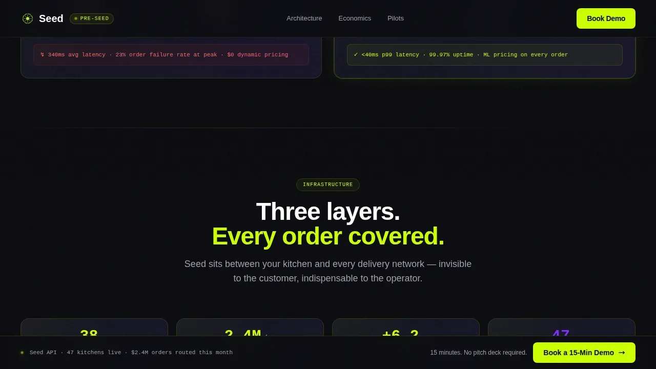
A fixed bottom bar carries a secondary call to action throughout the entire scroll experience. It stays at arm's reach no matter how deep visitors go into the page. The bar uses acid lime text on a void black background, making it visually sharp without competing with the main content. It links directly to a Calendly booking flow with pre-filled context so no form fields slow the path to a meeting.
Primary Calculator-Triggered Call to Action
The primary call to action appears inside the calculator panel the moment a visitor changes any input value. It is framed as a reward for engagement, not a generic button. This placement is deliberate: the visitor has already interacted with the product logic, so the ask feels earned. The call to action links to the same Calendly flow. No form on page. No friction between interest and calendar.
Page sections overview
| Section | Purpose |
|---|---|
| Hero Calculator Panels | Dual glass panels with live unit economics calculator and real-time output sparkline |
| Problem versus. Solution | Animated flowchart contrasting fragmented delivery stack with single API layer |
| Architecture Diagram | Three-node API visual with live latency and throughput data display |
| Social Proof Stack | Pilot kitchen logos, operator quote, and Loom dashboard embed placeholder |
| Full-Width Booking | Primary booking section reinforcing the demo call to action |
| Persistent Bottom Bar | Fixed secondary call to action visible at all scroll depths |
| Footer | Linear single-row footer with essential links and brand mark |
Design & branding system
The visual identity is built on a Tech Glass aesthetic using an Acid Digital color system. Every design decision serves the same goal: make the data feel alive and make everything else recede. The palette is intentionally stark. Void black backgrounds swallow ambient noise. Acid lime marks only what matters.
- Color palette: void black (#0B0B0F) for backgrounds, smoked glass (#1A1A2E) for panel surfaces, electric lime (#CCFF00) for all interactive elements and data outputs, ultraviolet (#7B2FFF) for hover states and graph accents, cool gray (#A0A0B0) for body text, and pure white for headlines
- Typography: DM Sans is used for all headlines and body copy; JetBrains Mono is used for all data outputs, calculator numbers, and metric ticks to reinforce the developer-centric, infrastructure feel
- Glass panel styling: two frosted-glass rectangles with depth-of-field blur and thin lime-green border glows float against the void, giving each panel a physical sense of depth and separation
Mobile & speed optimization
The template is built desktop-first, reflecting the investor pitch context where calculator interaction and side-by-side panel layouts are central to the experience. The 50/50 split-screen model is designed to perform at full width. However, the layout structure also supports responsive stacking for mobile access, which is essential since restaurant operators often check dashboards and review materials on mobile devices.
- Desktop-first layout with responsive stacking so the split panels reflow naturally on smaller screens
- Client Components handle the live calculator and scroll-linked animations; Server Components handle all static sections, keeping the loading profile lean for sections that do not require interactivity
- The persistent bottom bar remains visible and tappable at all screen sizes, keeping the demo booking call to action within arm's reach at every scroll depth
How this template helps you convert
This landing page is engineered as a click-through page with a single conversion goal: get the visitor to book a 15-minute demo. Every section earns the next click by adding proof before asking for attention.
- The calculator panel converts passive visitors into active participants the moment they change an input value. Engagement with the data triggers the primary call to action, which appears as a reward rather than an interruption. This sequence improves conversion rates by tying the ask directly to a moment of demonstrated interest.
- The scroll-driven architecture section removes skepticism layer by layer. By the time visitors reach the social proof stack, they have already worked through the unit economics model, felt the friction of the fragmented delivery stack, and seen the clean API solution. The Loom embed and operator quote close the remaining gap. The persistent bottom bar then keeps the booking action at arm's reach through the final section, so the path to a Calendly slot is always one tap away.
Other information about this template
This template is specifically classified as the seed ghost kitchen api infrastructure landing page template in the Startup and Launch category, under the FoodTech Pre-Seed Startup niche. It is one of a growing library of pages designed for food entrepreneurs operating in high-velocity, delivery-only markets.
- Ghost kitchens are designed for delivery and takeout only, with no dine-in service. This template reflects that model by focusing entirely on delivery data, menus, and margin logic rather than ambiance or front-of-house presentation.
- Designing an effective layout is crucial for ghost kitchen operations. The same principle applies here: the page layout is engineered for a logical flow, moving visitors from curiosity to conviction without dead ends or wasted space.
- A linear assembly-line layout works well for ghost kitchens focused on high-efficiency small batches prep. This template mirrors that thinking: sections stack in a deliberate sequence, each one preparing the visitor for the next.
- Ghost kitchens often host multiple virtual brands, requiring modular setups. Food entrepreneurs running multiple brands from a single kitchen space will find this template's architecture framing directly relevant to their pitch.
- Small batch production allows businesses to pivot quickly and respond to market demand. The calculator section is designed to reflect this flexibility, letting visitors model different scenarios and see how the numbers adapt.
- Producing food in small batches based on actual or forecasted demand can reduce waste and lower cost. The template's unit economics model can surface these savings visually when inputs are adjusted.
- Small batch production lowers barriers to entry for culinary entrepreneurs launching with lower upfront costs. This template suits founders at exactly that stage, pre-revenue or early-revenue, making the case to investors without overstating maturity.
- Small batch production enhances customer engagement by allowing businesses to market limited releases and locally sourced ingredients. The social proof section of this template can reflect those stories through operator quotes and pilot kitchen logos.
- Ghost kitchens thrive on lean, efficient operations designed for delivery-only channels, making them ideal for small batch production. This template is built with the same lean philosophy: no decorative sections, no wasted scroll.
- The ghost kitchen ecosystem is growing rapidly, driven by increased food delivery demand and low overhead costs. This template is positioned to capture that momentum at the pre-seed stage.
- The branded satellite model allows established restaurant brands to deploy ghost facilities to densify delivery zones and reduce delivery radii. Founders using this model can use the architecture section to demonstrate that geographic logic to investors.
- Ghost kitchens can operate across food delivery apps or remain exclusive to one platform. The template's delivery stack animation reflects this distribution reality.
- Real-time inventory management prevents selling out-of-stock items across food delivery apps. This template can highlight that capability through the architecture and feature sections.
- Unified menu management allows instant updates to pricing and menu items across all channels. The template frames this as a core API value proposition in the problem-solution section.
- Order aggregation consolidates all orders from various channels into one format. This concept fits naturally into the three-node API diagram section.
- Real-time webhooks provide immediate notifications for new orders, driver status, and cancellations. These capabilities can be surfaced in the architecture diagram section of the template.
- Performance analytics provides data on top-performing menus, peak hours, and courier wait times. The dashboard Loom embed placeholder is designed to preview exactly this kind of output.
- Multi-brand management allows launching multiple virtual brands from one kitchen. Food trucks, pop-up concepts, and restaurant brands scaling into delivery-only models are all relevant use cases for this template.
- Food trucks and pop-up food entrepreneurs are part of the broader ghost kitchen ecosystem and may use this template to pitch a delivery-first expansion model to early investors.
- Ghost kitchens create a procurement environment where scale matters more than presentation, emphasizing automation and repeatability. This template reflects that priority by leading with tools and data rather than photography or lifestyle imagery.
- Data-driven design can help ghost kitchens reduce bottlenecks and improve layout efficiency. This template applies the same principle to the pitch itself, using live data and interactive tools to reduce investor skepticism.
- The focus at the seed stage is on demonstrating trust, speed, and reliability to early adopters. This template is designed to build trust through proof: real numbers, real architecture, real operator feedback.
- Social media platforms can amplify a launch, but this template focuses its energy on direct investor conversion rather than broad awareness. The page is a tool for warm-traffic outreach, not cold discovery.
- Including testimonials and reviews on a landing page helps build credibility with new visitors. The operator quote section serves exactly this function.
- An attractive landing page tailored to food businesses can capture more leads and generate new business. This template is designed to do both, for the specific audience of pre-seed investors and pilot kitchen partners.
- Recipes for success in pre-seed fundraising combine proof, clarity, and a frictionless path to conversation. This template delivers all three in a single, scroll-driven experience.
Theme
Tech Glass
Creative direction
Calculator/Tool First
Color system
Acid Digital
Style
Split Screen (50/50)
Direction
Click-Through
Page Sections
Live Unit Economics Calculator Panel
Scroll-driven Problem-to-solution Flow
Three-node API Architecture Diagram
Social Proof and Dashboard Preview
Persistent Bottom-bar Call to Action
Calculator-triggered Primary Call to Action
Related questions
Who is this landing page template designed for?
Can I customize the calculator inputs to match my own business model?
Does this template include a contact form?
Is this template suitable for multi-brand ghost kitchen operations?
What makes this template different from a standard startup pitch page?



