FoodTech Startup Specialist Professional Website Template
Kitcheniq is a dashboard-style landing page template built for pre-revenue foodtech startups seeking seed investment. It combines an interactive feature tab switcher, a draggable unit economics explorer, and a traction timeline into one high-signal investor experience. The design uses a dark carbon fiber palette with telemetry green calls to action to communicate momentum, credibility, and a defensible technical thesis.
by Rocket studio
Quick summary
Kitcheniq is a single-page, dashboard-driven landing page template designed for a seed-stage kitchen intelligence startup. It translates a pre-revenue technical pitch into an immersive product experience. Investors arrive, interact with live-feeling data, adjust unit economics sliders, and arrive at the call to action having already explored the thesis firsthand.
Who this template is for
This template is built for founders raising a seed round at the intersection of food operations and applied machine learning. It speaks directly to the investor audience that evaluates these deals.
- Series A venture capital firms scanning for defensible moats in restaurant technology
- Angel investors with software-as-a-service backgrounds seeking exposure to physical-world artificial intelligence
- Accelerator partners evaluating cohort applications where team conviction matters before traction exists
What problem this template solves
Pre-revenue startups in foodtech face a specific credibility gap: the product is technically sophisticated, but there is nothing to show yet. A standard pitch deck page cannot carry the weight of that argument. Investors leave before they believe.
- Founders need a page that makes the technology feel real and testable, not just described
- The pitch must communicate a defensible competitive moat without relying on revenue numbers
- The conversion path must work for investors at different stages of diligence readiness
What you get with this template
You get a fully structured, investor-facing landing page that moves visitors through the product thesis at their own pace. Every section is designed to deepen engagement before asking for anything.
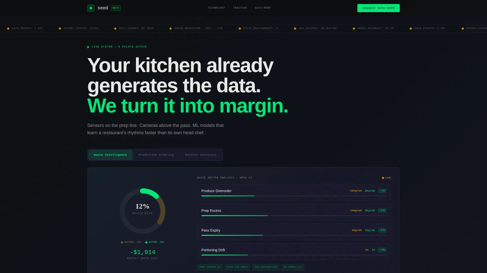
- A three-tab animated dashboard header with simulated data visualizations for waste intelligence, predictive ordering, and kitchen analytics
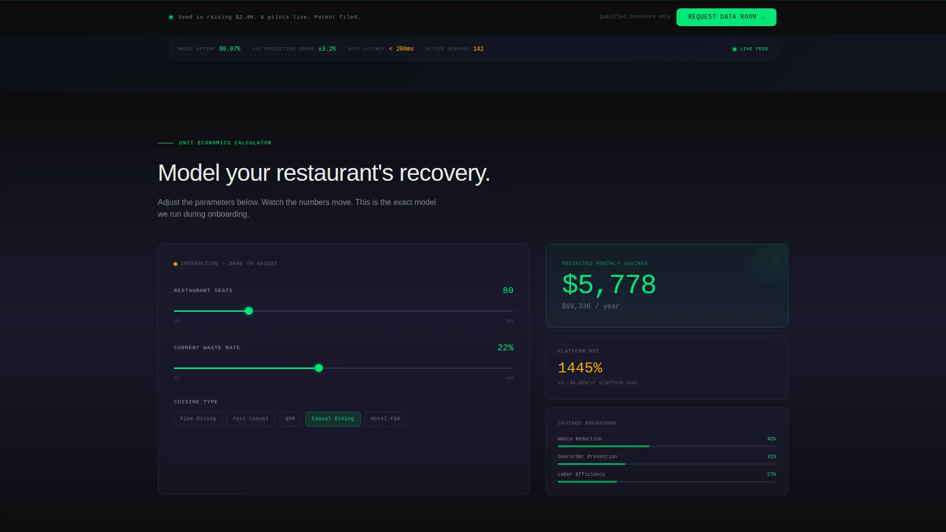
- A draggable unit economics explorer that lets visitors adjust inputs and watch projected savings update in real time
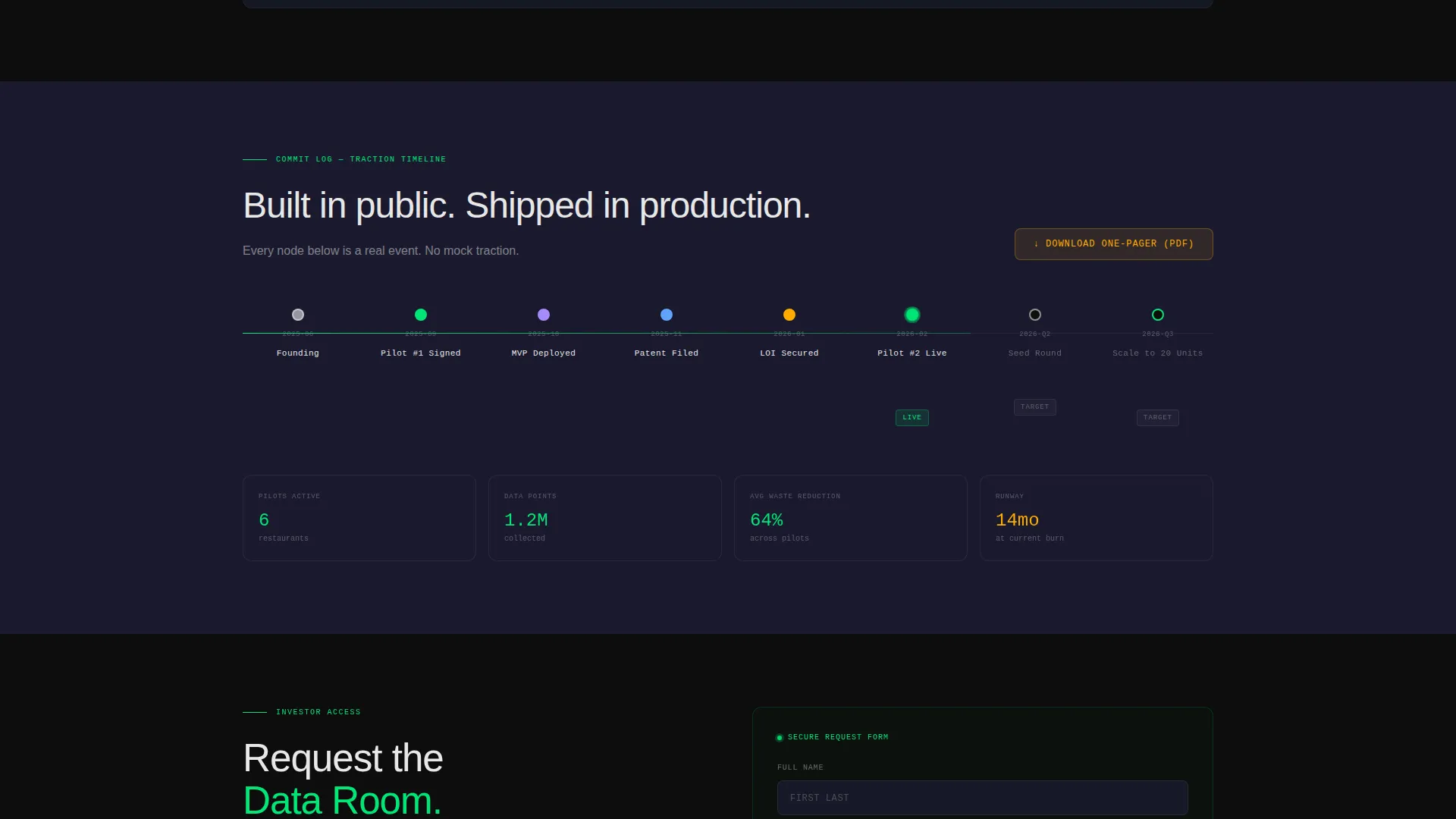
- A horizontal traction timeline styled as a commit log, plus two conversion paths including a sticky data room request bar and a one-pager PDF gate
Feature list
This template is built around interactive components that make a pre-revenue pitch feel like a live product demonstration. Each feature earns its place by moving an investor closer to belief.
Animated Feature Tab Switcher
Three clickable tabs sit above the headline: Waste Intelligence, Predictive Ordering, and Kitchen Analytics. Each tab reveals a distinct simulated dashboard view. Panels slide laterally on click with no page reload, and each view contains animated data including a donut chart ticking from 34 percent to 12 percent, a converging line graph over a 90-day window, and an amber-pulsing kitchen heatmap.
Draggable Unit Economics Grid
A scrollable section below the header presents a cost-per-plate reduction calculator. Visitors adjust three sliders covering restaurant size, cuisine type, and current waste percentage. Projected savings animate in real time as sliders move, making the financial thesis tangible before a single conversation happens.
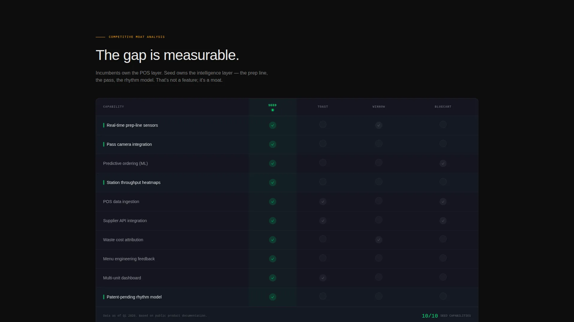
Competitive Moat Comparison Table
A structured data table compares the platform against incumbent solutions. Verified capabilities appear as telemetry green checkmarks. Empty cells render in muted gray. The layout communicates differentiation at a glance without requiring the founder to narrate it.
Traction Timeline as Commit Log
A horizontal timeline renders key milestones as nodes in a developer-style commit log. Each node, pilot signed, letter of intent secured, patent filed, pulses with a subtle animation as it enters the viewport on scroll. This section anchors credibility without overstating progress.
Sticky Data Room call to action Bar
A bottom-anchored bar appears after the visitor interacts with the first tab. It contains the primary call to action: Request the Data Room. The form collects three fields only: full name, fund or affiliation, and email address. No dropdown menus. No extra friction.
Gated One-Pager Download
A secondary conversion path sits inside the traction timeline section. Visitors can download a PDF one-pager by entering only their email address. This path serves investors who are not yet ready for full diligence but want to stay in the funnel.
Page sections overview
| Section | Purpose |
|---|---|
| Feature Tab Header | Showcases three animated dashboard views with live-feeling data |
| Unit Economics Explorer | Lets visitors model projected savings with draggable sliders |
| Competitive Moat Table | Compares platform capabilities against incumbent alternatives |
| Traction Commit Log | Displays key milestones as a scrollable, animated timeline |
| Sticky Data Room Bar | Anchors the primary investor call to action after first tab interaction |
| One-Pager PDF Gate | Offers a lower-commitment download path for early-stage leads |
Design & branding system
The visual identity follows a Startup Velocity theme built on a Carbon Fiber color system. Every color decision serves a functional purpose: the palette communicates speed, precision, and live instrumentation.
- Backgrounds stay within deep cockpit black (#0D0D0D) and woven carbon gray (#1A1A2E), with signal white (#E8E8E8) used for all primary text
- Telemetry green (#00E676) is reserved exclusively for upward-trending metrics, active interface states, and the primary call-to-action button, so the eye associates green with forward motion
- Electric amber (#FFAB00) marks live data point accents and hover states, most visibly in the kitchen heatmap hot zones and the interactive slider highlights
Mobile & speed optimization
The template is structured to maintain its dashboard aesthetic and interactive behavior across screen sizes. Visitor experience stays coherent whether the page loads on a laptop at midnight or a phone between meetings.
- Tab switcher panels and the unit economics grid are designed to reflow cleanly on smaller viewports
- Animated elements including pulsing timeline nodes and live-ticking chart values are scoped to stay lightweight so they do not interrupt the scroll experience
How this template helps you convert
This template converts by letting investors experience the product logic before they are asked to engage. The conversion architecture is deliberate and sequenced.
- The interactive tab switcher and unit economics sliders create a hands-on product impression early, so visitors arrive at the call to action already engaged with the thesis
- Two distinct conversion paths, the sticky Data Room request bar and the one-pager PDF download, serve investors at different points in their diligence process without forcing a single decision
Other information about this template
This template is part of the Startup and Launch category, specifically built for the FoodTech Seed Stage Startup niche. It pairs a Dashboard and Data Grid template style with an Interactive Explorer creative direction and a Feature Tab Switcher header concept. The Lead Generation landing page direction keeps the entire page focused on capturing qualified investor contacts.
- The Startup Velocity theme and Carbon Fiber color system make this template a strong fit for any deep-tech or hardware-software hybrid startup that needs to signal sophistication before revenue
- The template is built as a single-page flow, making it easy to deploy quickly without a full site infrastructure in place
- Founders can adapt the placeholder data in the charts, sliders, and timeline nodes to reflect their own pilot metrics and milestone history as the company progresses
Theme
Startup Velocity
Creative direction
Interactive Explorer
Color system
Carbon Fiber
Style
Dashboard/Data Grid
Direction
Lead Generation
Page Sections
Animated Feature Tab Switcher
Draggable Unit Economics Grid
Competitive Moat Comparison Table
Traction Timeline as Commit Log
Sticky Data Room Request Bar
Gated One-pager PDF Download
Related questions
Can I use this template before my product is fully built?
How customizable are the slider values and chart data?
Is the sticky call to action bar always visible on the page?
Who is the one-pager download path designed for?
Can I update the traction timeline as my startup hits new milestones?



