Artisan Fiber Art Newsletter Landing Page Template
Knot is a Luxe Minimal landing page template built for a macramé and fiber art newsletter. It pairs an oversized editorial serif manifesto header with a staggered masonry grid, interactive flip cards, and a warm Warm Stone color palette. The design earns subscriber trust by letting visitors read before they commit.
by Rocket studio
Quick summary
Knot is a single-page newsletter landing page template for fiber art and macramé content creators. It uses a masonry grid layout, interactive edition flip cards, and a click-through structure to let visitors experience the newsletter before subscribing. The warm, tactile visual identity is built around raw cotton, sandstone, and deep walnut tones.
Who this template is for
This template is designed for creators who publish in the fiber art and macramé space and want a landing page that feels as intentional as the work they write about. It is equally useful for someone launching their first paid letter and someone refreshing a long-running publication.
- Fiber artists selling at juried craft fairs who want to grow a weekly readership
- Interior designers and makers publishing editorial content for a professional audience
- Advanced hobbyists and independent craft educators turning deep technique knowledge into a newsletter
What problem this template solves
Most newsletter landing pages ask visitors to subscribe before they have any reason to trust the content. For a niche publication like a macramé and fiber art letter, that friction is especially costly. The audience is discerning and not easily persuaded by generic promises.
- Visitors leave before subscribing because they cannot preview what they are signing up for
- Generic subscription pages fail to communicate craft, voice, or editorial quality
- There is no visual language connecting the newsletter's content to the landing page experience
What you get with this template
You get a fully designed, single-page landing page that guides visitors through a deliberate editorial experience before presenting the subscribe call to action. Every section is purposeful and built to reflect the texture and rhythm of a quality craft newsletter.
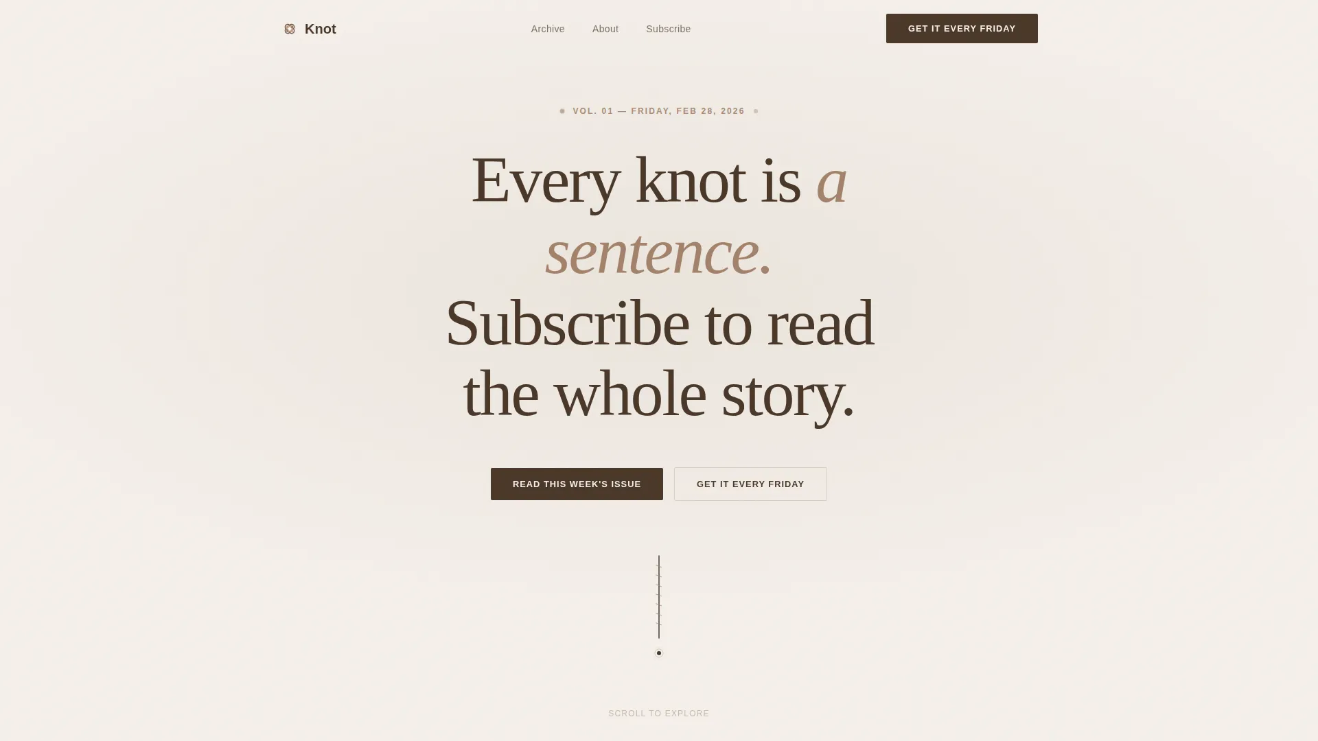
- A manifesto hero section with an oversized serif headline and a jute plumb line SVG animation
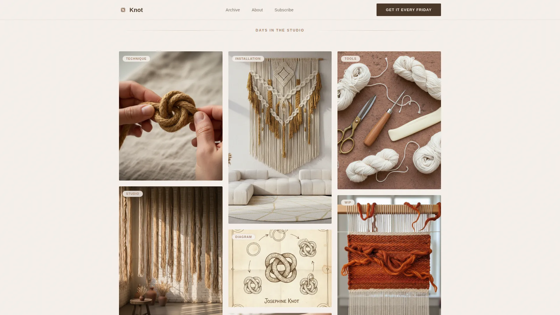
- A staggered masonry grid showing studio moments and newsletter previews with scroll reveal animations
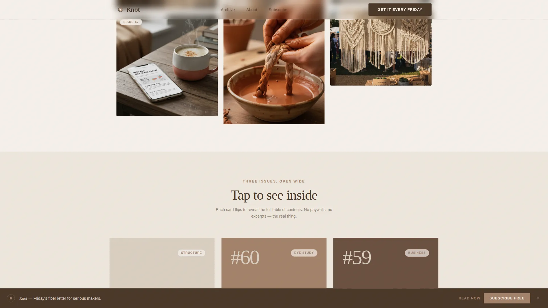
- Three interactive flip cards that reveal a sample edition's table of contents on tap
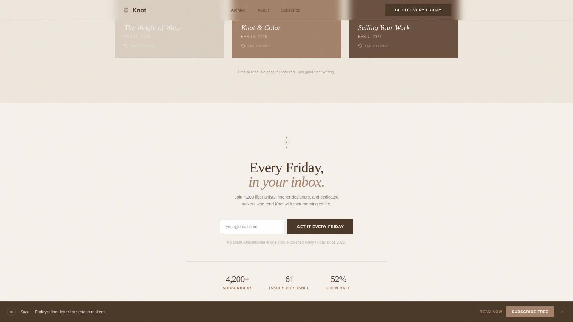
- An inline subscribe form and a sticky bottom bar call to action that appears after the third grid row
- A minimal footer following the Superhuman Extreme Minimal pattern
Feature list
This template is built around a small set of carefully considered interactive and visual features. Each one serves the single goal of earning reader trust before asking for an email address.
Manifesto Hero with SVG Animation
The hero section displays a single oversized manifesto line set in an airy editorial serif against a raw cotton background. A jute plumb line SVG draws downward on load, acting as a visual thread that pulls the eye into the page scroll.
Staggered Masonry Grid
A Pinterest-style masonry grid presents studio photography moments in a staggered layout. Cards enter the viewport through scroll reveal animations with stagger timing, so the grid feels alive without being distracting.
Interactive Edition Flip Cards
Three sample edition cards are interactive. Each card flips on tap to reveal the table of contents from a past issue. This lets visitors read actual content structure before deciding to subscribe.
Sticky Subscribe Bar
After the visitor scrolls past the third row of the masonry grid, a sticky bottom bar appears with the secondary call to action. The bar stays visible during continued scrolling and links directly to the inline subscribe form.
Inline Email Subscribe Form
A clean inline email field with a single input and a deep walnut-colored submit button sits in the subscribe section. The form is compact and distraction-free, designed to convert once trust is established.
Click-Through Primary Call to Action
The primary call to action, "Read This Week's Issue," appears twice: once beneath the hero manifesto and once in the sticky bottom bar. Both link to the latest free edition so visitors read before they commit.
Page sections overview
| Section | Purpose |
|---|---|
| Hero Manifesto | Introduces the editorial voice and delivers the primary call to action |
| Masonry Moments Grid | Communicates the rhythm and texture of the newsletter through studio imagery |
| Sample Edition Cards | Lets visitors preview past issue contents through interactive flip cards |
| Inline Subscribe Form | Captures email addresses with a minimal single-input field and submit button |
| Sticky Bottom Bar | Keeps the secondary call to action visible during scroll after the third grid row |
| Minimal Footer | Closes the page with an extreme minimal pattern, keeping focus on conversion |
Design & branding system
The visual identity follows a Luxe Minimal editorial style that pairs a letterpress sensibility with a maker studio warmth. Typography uses Fraunces for display headings and DM Sans for body text, giving the page an artisan editorial feel without sacrificing readability.
- Color palette: raw undyed cotton (#F5F0EB) for backgrounds, deep walnut (#4A3728) for type and interactive elements, kiln-fired clay (#A3826A) for hover states and divider accents, and sun-bleached sandstone (#D9CFC1) for section backgrounds
- A faint linen paper texture sits behind the hero type, suggesting letterpress printing on handmade stock
- Clay surfaces on hover states and divider details reinforce the tactile, hand-crafted quality of the brand
Mobile & speed optimization
This template is built with a mobile-first approach because fiber artists and craft practitioners often browse on phones at markets and in studios. The layout and interactions are optimized for small screens without sacrificing the editorial feel.
- Masonry grid reflows gracefully for single-column mobile viewing while preserving the staggered rhythm
- Flip cards respond to tap events, making the interaction natural on touch screens
- Server Components handle all static rendering to keep client-side JavaScript minimal and page load lean
How this template helps you convert
The click-through structure is the template's core conversion strategy. Rather than asking for an email upfront, it earns trust through a sequence of content experiences that build confidence in the newsletter's quality.
- The hero section presents the manifesto and the primary call to action, directing first-time visitors to read the latest free issue before any subscription request appears
- The masonry grid and flip cards show the visual and editorial quality of the content, replacing generic testimonials with tangible proof
- The sticky bottom bar and inline subscribe form appear only after the visitor has had time to experience the content, making the subscribe request feel timely rather than pushy
Other information about this template
This template is a strong fit for independent newsletter creators working in craft, textile, and maker editorial spaces. It is built to feel considered and unhurried, which matches the expectations of an audience that values craft over convenience.
- The template style is Masonry and Pinterest-inspired, making it well suited for visual-forward newsletters where imagery and editorial craft matter equally
- The Warm Stone color system and Fraunces serif typography give the page a premium, gallery-adjacent feel without heavy design overhead
- This landing page can support a fiber art newsletter, a macramé technique publication, or any artisan editorial content brand that prioritizes showing over telling
- The footer follows a Superhuman Extreme Minimal pattern, keeping the page clean and focused on the subscribe outcome
Theme
Luxe Minimal
Creative direction
Day-in-the-Life
Color system
Warm Stone
Style
Masonry/Pinterest
Direction
Click-Through
Page Sections
Manifesto Hero with SVG Jute Animation
Staggered Masonry Moments Grid
Interactive Edition Flip Cards
Sticky Bottom Subscribe Bar
Inline Email Subscribe Form
Click-through Primary Call to Action
Related questions
Who is this landing page template designed for?
Can I use the flip cards to showcase different newsletter editions?
Does the sticky bar appear immediately when the page loads?
How does the click-through structure work in practice?
Can this template work for a fiber art content brand that is not a newsletter?



