Time-Lapse Photography Newsletter Landing Page Template
Lapse is an editorial landing page template built for time-lapse photography newsletters. It pairs a cinematic split hero with a masonry archive grid, three audience cards, a featured issue preview with a soft content gate, and a sticky subscribe bar. The design follows a Japanese Zen palette and magazine-grade typography to earn every subscription through visible editorial depth.
by Rocket studio
Quick summary
Lapse is a single-page newsletter landing page designed for time-lapse photography creators. It leads with a dramatic half-page photo and serif headline, then unfolds a masonry grid of past issue tiles that builds archive credibility before asking for a subscription. Every section is built to prove value before requesting an email address.
Who this template is for
This template is made for photographers and visual creators who publish newsletters about time-lapse craft. It fits people who already have an audience to grow or are launching their first subscriber list.
- Hobbyist photographers who own a slider and want to share intervalometer techniques and field notes with a growing readership
- Astrophotographers documenting star trail sessions and moonless-sky captures who want a refined home for their weekly writing
- Construction and commercial documentarians billing clients for long-form rooftop captures who need a professional subscriber page
What problem this template solves
Most newsletter landing pages give visitors one reason to subscribe: a headline and a form. That approach fails for niche photography audiences because it never shows the depth of what they are signing up for. Lapse solves this by letting the archive do the convincing.
- Visitors have no way to judge newsletter quality from a blank sign-up form, so they leave without subscribing
- A visual-first audience needs to see the craft before they commit to giving an email address
- Generic templates lack the editorial weight and photographic atmosphere that a time-lapse photography newsletter demands
What you get with this template
You get a fully structured, single-page landing page layout with six distinct sections and a cohesive Japanese Zen visual identity. Every component is designed to reflect the editorial tone of a time-lapse photography publication.
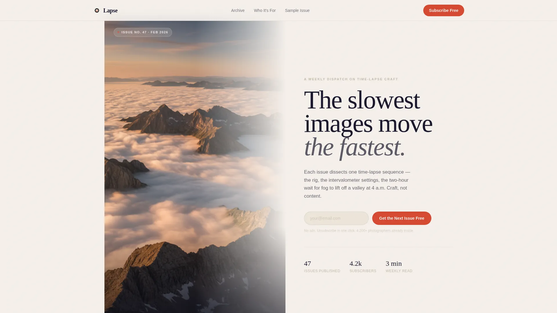
- A cinematic split hero section with a vertical time-lapse still, a generous serif headline, body text, and a vermillion subscribe button
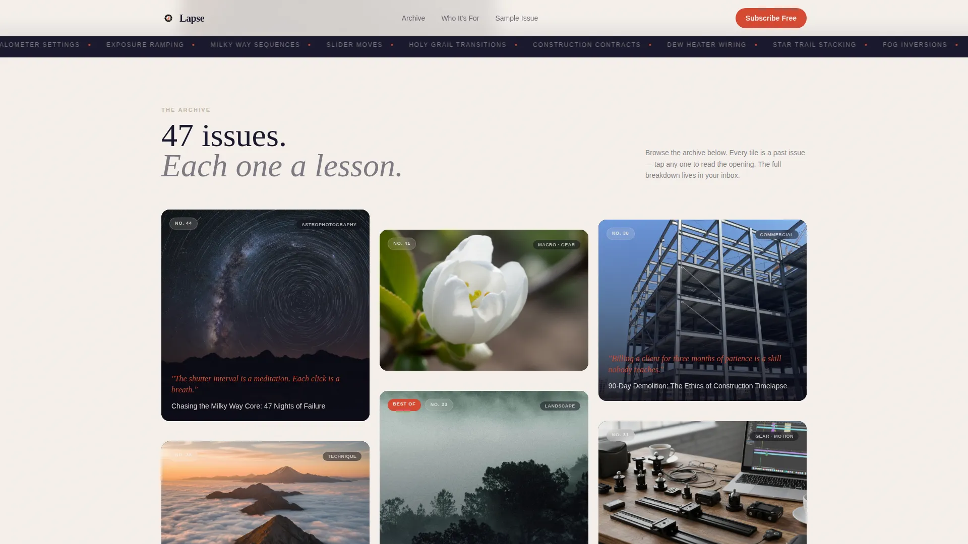
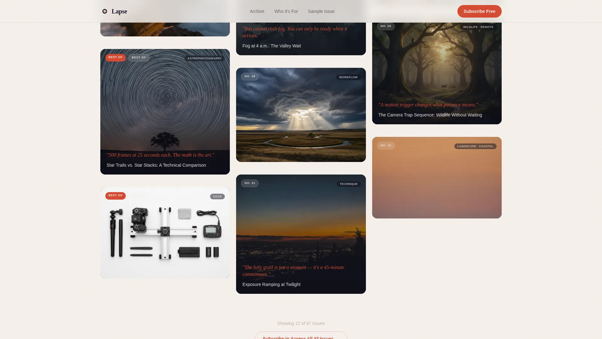
- A masonry archive grid of past issue tiles including pull quotes, image-only cards, and subject categories like astrophotography, gear breakdowns, and long-form capture sequences
- A sticky subscribe bar that appears after two scroll depths, a featured issue preview with a soft content gate, three reader discipline cards, and a footer in horizontal flow layout
Feature list
This section covers the core functional and design capabilities built into the Lapse template.
Cinematic Split Hero Section
The hero divides the screen in half. The left side holds a full-height vertical time-lapse still with visible grain and no stock-photo polish. The right side sets a serif editorial headline on shōji white with a single line of body text and a vermillion call-to-action button. The tension between stillness and implied motion is the central hook.
Masonry Archive Grid
Below the hero, a Pinterest-style masonry grid displays past newsletter issues as visual tiles. Tiles vary in height and visual weight. Some are pure image, some carry a vermillion pull quote overlay. The grid shifts from recent issues to best-of collections and gear breakdowns as the visitor scrolls, creating a sense of a rich, browsable archive.
Three Reader Discipline Cards
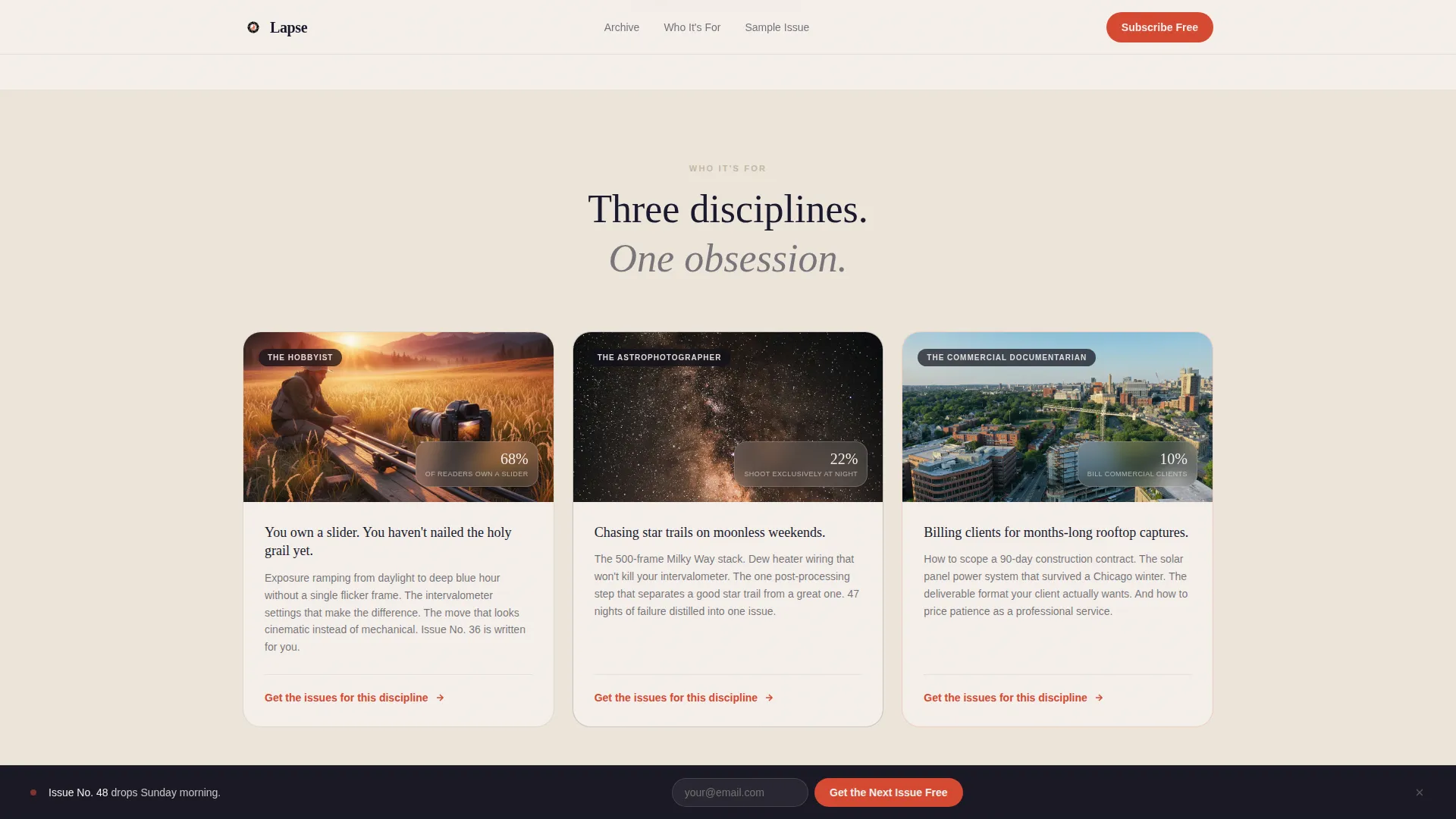
A dedicated row presents three audience cards: hobbyist photographer, astrophotographer, and commercial documentarian. Each card speaks directly to that reader's specific craft context, helping visitors self-identify and feel that the newsletter was written for them.
Featured Issue Preview with Soft Content Gate
One issue is surfaced in full preview mode. The excerpt ends mid-insight, and the read-more path is gated softly with the message "Full breakdown in your inbox." This turns editorial curiosity into a subscribe trigger without hard-locking content behind a paywall.
Sticky Subscribe Bar
After two scroll depths, a slim subscribe bar appears and stays pinned at the top of the viewport. It contains a single email input field and a vermillion submit button. The bar keeps the primary call to action visible without interrupting the browsing experience.
Tile Preview Modal with Hover States
Each masonry tile is interactive. A hover state reveals a brief preview of the issue topic. Clicking a tile opens a modal excerpt, giving visitors a taste of the writing before they reach the soft content gate. This layer of interactivity deepens engagement without leaving the page.
Page sections overview
| Section | Purpose |
|---|---|
| Split Hero | Introduce the newsletter with a cinematic still and serif headline |
| Masonry Archive Grid | Display past issues as browsable visual tiles to prove depth |
| Reader Discipline Cards | Help hobbyist, astrophotography, and commercial readers self-identify |
| Featured Issue Preview | Surface a full excerpt that ends at a soft subscribe gate |
| Sticky Subscribe Bar | Keep the email sign-up visible after two scroll depths |
| Footer | Close the page with a horizontal flow layout and final context |
Design & branding system
The visual identity follows an Editorial Magazine theme rooted in Japanese Zen minimalism. The layout is unhurried, with generous white space that gives each element room to breathe, the way a Zen garden places weight on a single stone.
- Four-color palette: sumi ink (#1A1A2E) for backgrounds and text, tatami warm gray (#C4B7A6) for supporting surfaces, shōji screen white (#F5F0EB) for editorial panels, and torii vermillion (#D64933) reserved strictly for buttons and pull quotes
- Typography pairing: Fraunces serif display for headlines and pull quotes, DM Sans for body text and labels, creating a contrast between editorial authority and readable utility
- Scroll reveal animations, parallax grain on the hero image, and masonry hover states are included to reinforce the motion-photography atmosphere without overpowering the editorial calm
Mobile & speed optimization
The template is designed desktop-first to honor the editorial magazine feel, but it includes responsive stacking behavior so the layout reads well on smaller screens.
- The masonry grid collapses into a stacked single-column layout on mobile, preserving tile readability without horizontal scroll
- The sticky subscribe bar and hero split stack vertically on narrower viewports, keeping the call to action accessible regardless of device
How this template helps you convert
Lapse earns the subscription before it asks for it. The page architecture is built to accumulate trust through visible editorial volume so that the subscribe moment feels earned rather than demanded.
- The masonry archive proves the newsletter's depth visually. Dozens of tiles, each representing a real issue, communicate that the creator has been doing this for a long time and has more to offer.
- The soft content gate on the featured issue preview converts natural reading curiosity into a subscribe action. The visitor is already halfway through an insight when the gate appears, and completing the thought requires only an email address.
Other information about this template
This template is a strong fit for photography creators working in the newsletter and creator economy space. It is built with the editorial sophistication that a niche photography audience expects.
- The page is localized for English-language audiences with implicit United States dollar context, though it suits international photography communities equally well
- Issue count and subscriber number displays are included as social proof elements within the masonry grid tiles
- The footer uses a horizontal flow pattern that works well for linking to archives, social profiles, or past issue indexes
- This template works well for creators building their presence on newsletter platforms where a polished standalone landing page strengthens subscriber trust and platform independence
Theme
Editorial Magazine
Creative direction
Curated Collection
Color system
Japanese Zen
Style
Masonry/Pinterest
Direction
Content/Resource
Page Sections
Cinematic Split Hero Layout
Masonry Archive Grid
Tile Preview Modal and Hover States
Soft-gated Featured Issue Preview
Scroll-triggered Sticky Subscribe Bar
Three Reader Discipline Cards
Related questions
Who is the Lapse template designed for?
What sections does the Lapse template include?
Can I use this template if I am just starting my newsletter?
How does the soft content gate work?
What is the visual style of this template?



