D2C Product Hunt Launch Landing Page Template
LaunchCommand is a hub-and-spoke landing page template built for direct-to-consumer brands engineering a Product Hunt launch. It combines a terminal-style header, an anchor navigation system, a twelve-dimension comparison table, and two conversion paths into one dark-mode, data-driven layout. Every section is designed to move a prepared founder from skepticism to action.
by Rocket studio
Quick summary
LaunchCommand is a single-page, anchor-nav landing page template purpose-built for D2C brands preparing a high-stakes Product Hunt launch. The layout fuses an industry-report content structure with a dark-mode terminal aesthetic. It gives founders a tactical, data-forward presentation that builds trust fast and pushes visitors toward a concrete next step.
Who this template is for
This template is built for founders and small growth teams who treat a Product Hunt launch as a coordinated campaign, not a casual post. It speaks directly to people who have already done the groundwork and need a page that matches their preparation level.
- Solo founders planning a Product Hunt top-five finish with limited runway
- Two-person D2C growth teams who have spent weeks warming up an audience before launch day
- Bootstrapped makers who need every tactical edge mapped and presented before the 12:01 AM window opens
What problem this template solves
Most launch-related landing pages either oversell vague promises or bury the strategy in generic copy. Founders who arrive with real questions deserve a page that mirrors their intensity and gives them something specific to act on.
- There is no structured way to show the gap between a DIY launch and an engineered one without a side-by-side format
- Pre-launch credibility is hard to establish quickly when visitors are time-pressured and skeptical
- Two separate visitor types, those ready to engage and those still researching, rarely get captured by the same page flow
What you get with this template
You get a fully structured, single-page layout that does the heavy lifting across every stage of the buying decision. The template is visually distinctive and content-ready from the first scroll.
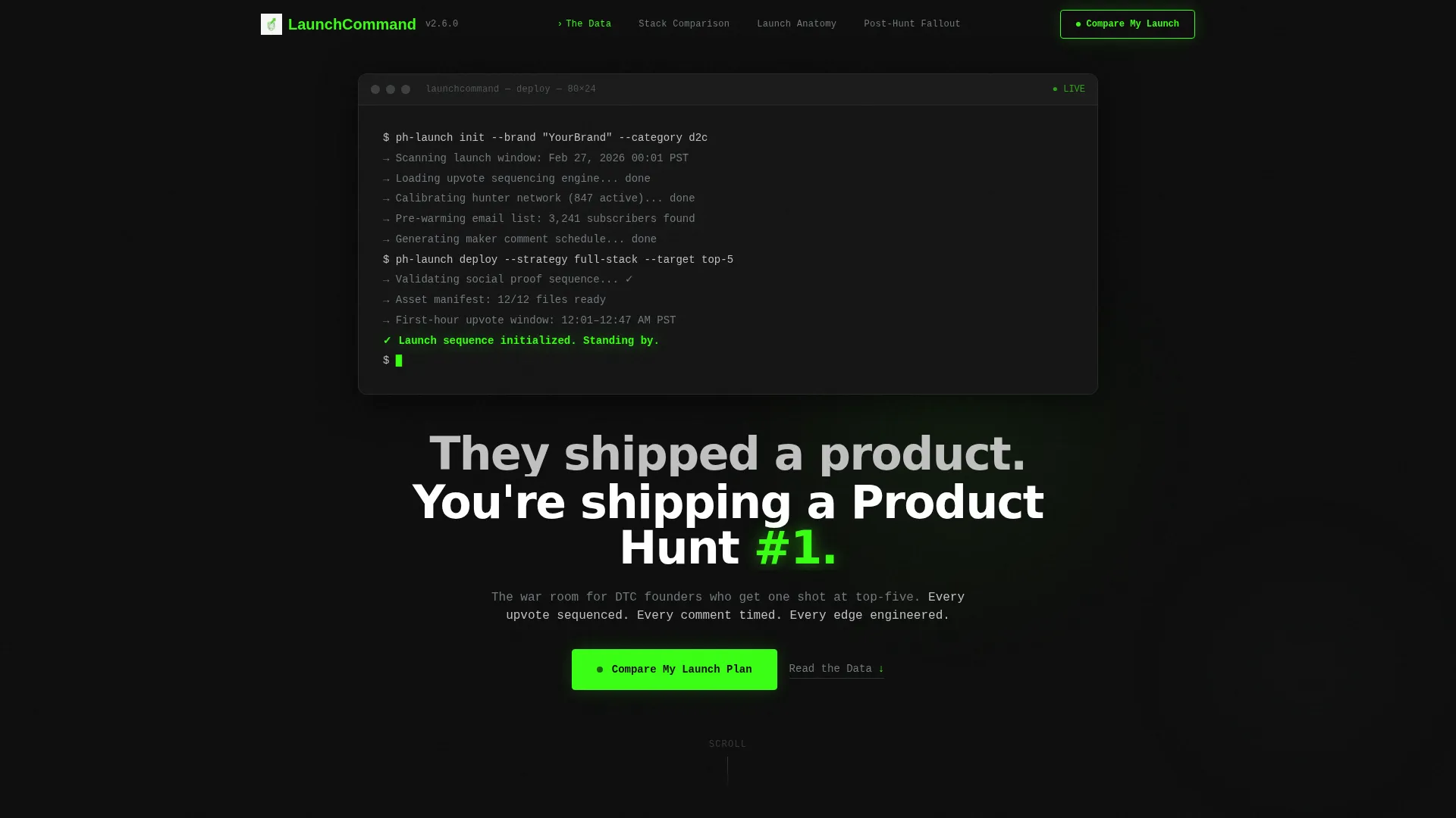
- A full-viewport terminal header with a cascading deployment script and a blinking green confirmation line
- An anchor navigation bar pinned to the top with spoke labels connecting to each major content section
- A twelve-dimension interactive comparison table pitting DIY launch against an engineered approach, with two conversion entry points built in
Feature list
This template is built around five core capabilities that work together to move an informed, time-sensitive audience toward action.
Terminal Header with Live Deploy Script
The header occupies the full viewport as a dark terminal window. A realistic deployment command cascades in monospaced type, ending with a blinking electric green confirmation line. A single system-font headline fades in below, setting the tone before a visitor reads a single word of body copy.
Pinned Anchor Navigation Bar
The anchor nav pins to the top of the page and stays visible throughout the entire scroll. Spoke labels such as "The Data," "Their Stack versus. Yours," "Launch Anatomy," and "Post-Hunt Fallout" let visitors jump to the section most relevant to their current question without losing context.
Twelve-Dimension Comparison Table
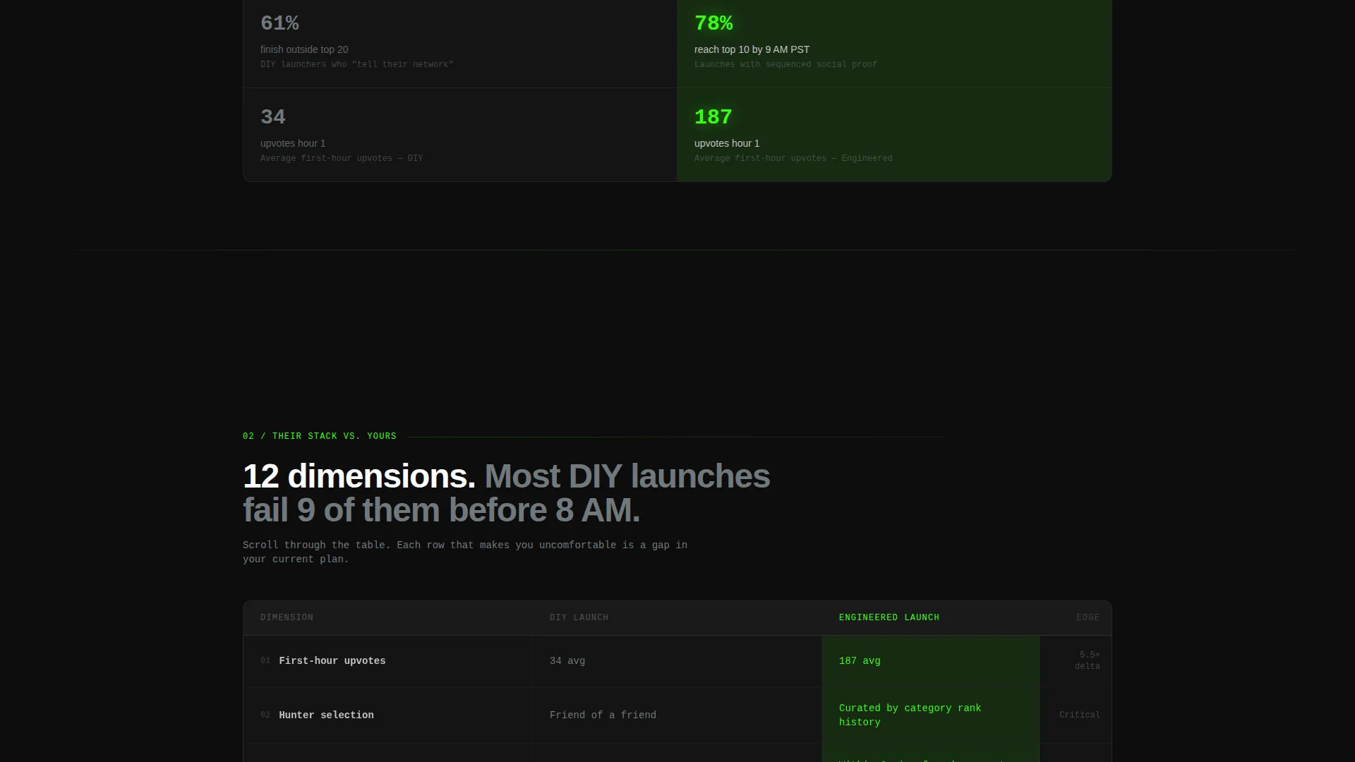
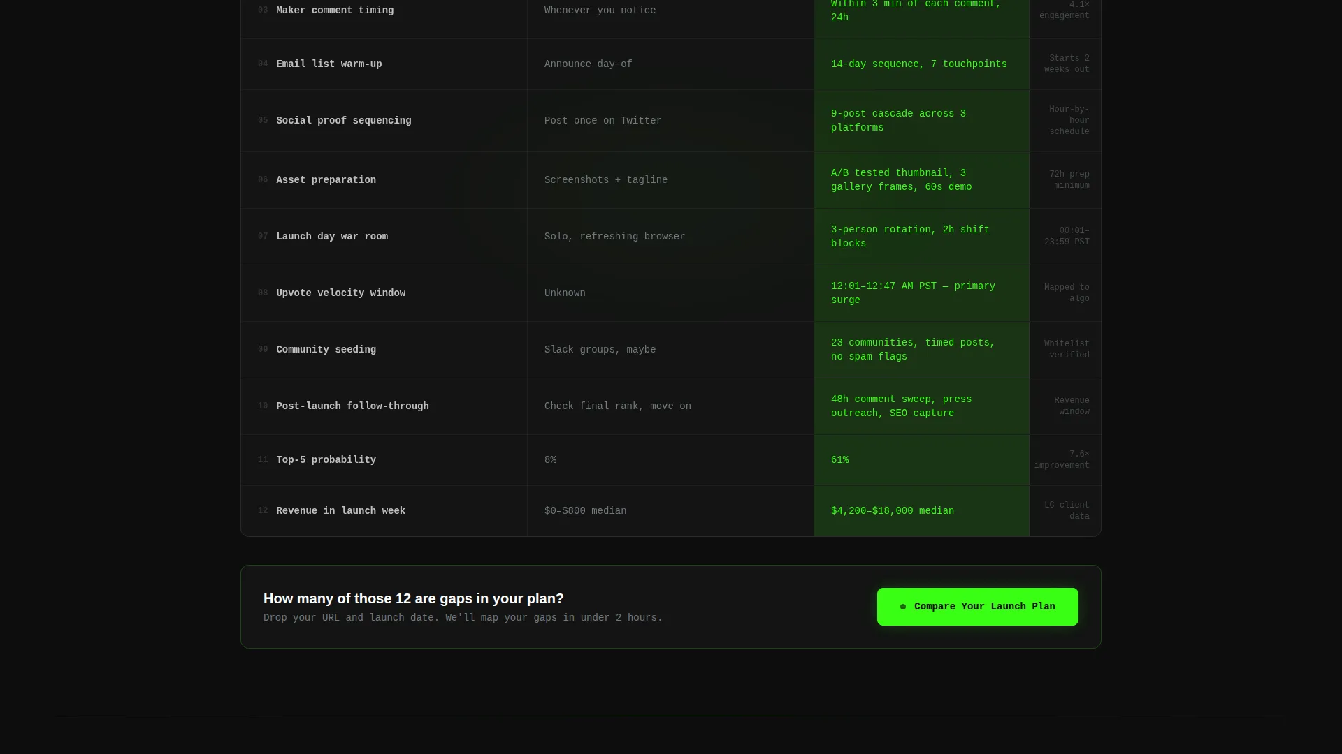
A central interactive table compares a DIY launch against an engineered launch across twelve specific dimensions. Each row reveals on scroll, with the DIY column rendered in steel gray and the engineered column pulsing in electric green. Covered dimensions include first-hour upvotes, maker comment timing, social proof sequencing, and hunter selection, among others.
Dual Conversion Path System
Two distinct calls to action capture visitors at different readiness levels. The primary call to action, "Compare Your Launch Plan," opens a three-field form collecting brand URL, planned launch date, and current email list size. A secondary path offers a downloadable teardown gated behind a single email field for visitors who are not yet ready to commit.
Industry Report Section Structure
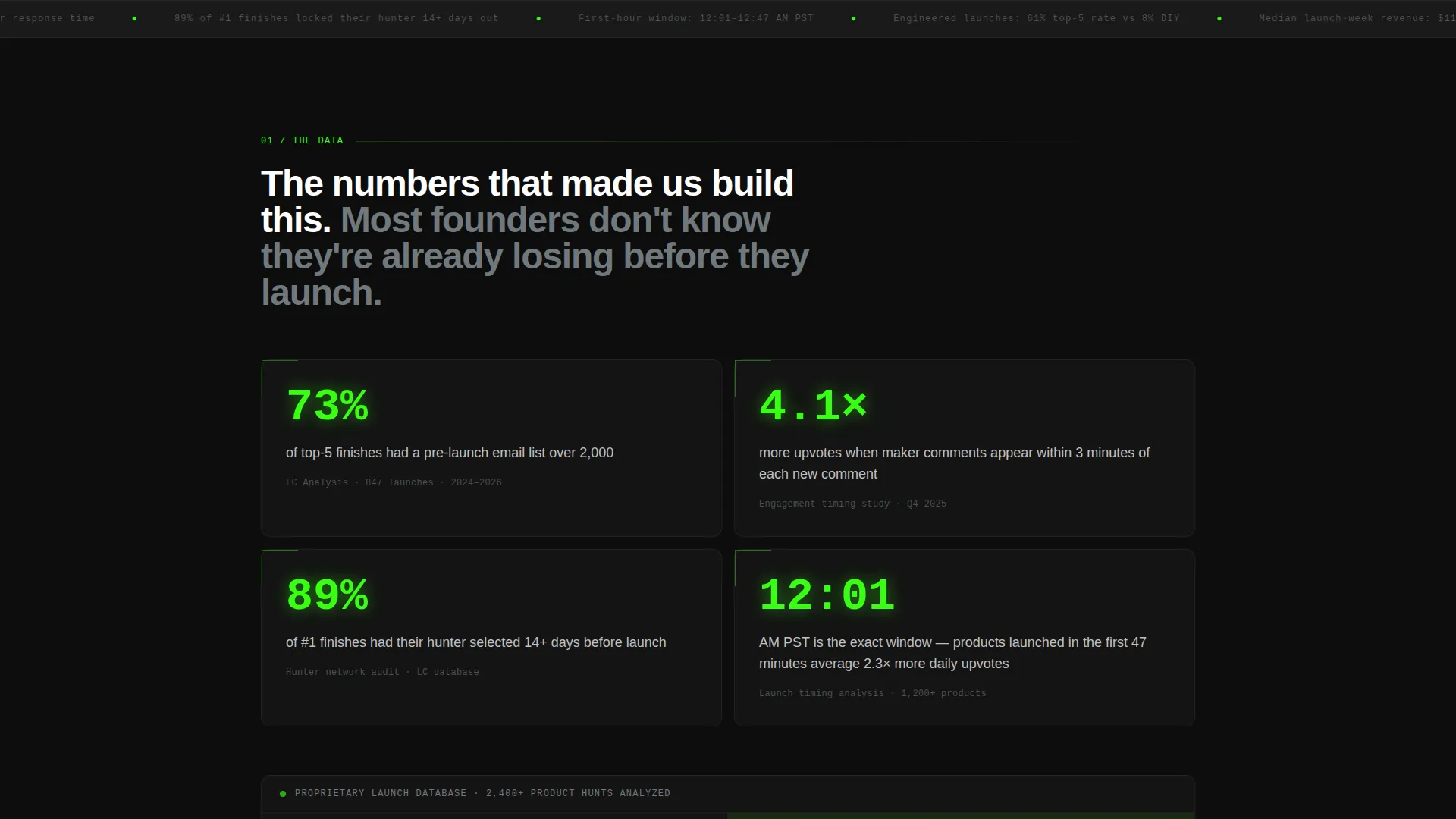
Each anchor section opens with a bold stat or specific finding before unpacking the methodology behind it. The scrolling experience is designed to feel like reading a proprietary teardown, progressively more specific and tactical, rewarding visitors who read all the way through.
Page sections overview
| Section | Purpose |
|---|---|
| Terminal Deploy Header | Sets launch-day tension and frames the core positioning statement |
| Pinned Anchor Nav | Gives visitors instant access to any spoke section without losing place |
| The Data | Opens with a hard stat to establish credibility and launch intelligence |
| Their Stack versus. Yours | Highlights the gap between typical and engineered launch preparation |
| Launch Anatomy | Breaks down the day-of sequencing with specific timing and tactics |
| Post-Hunt Fallout | Addresses what happens after the vote window closes |
| Comparison Table | Side-by-side twelve-dimension breakdown with mid-page primary call to action |
| Primary call to action Form | Three-field form capturing brand URL, launch date, and email list size |
| Teardown Download Gate | Secondary email capture for visitors not yet ready for the primary ask |
Design & branding system
The visual identity follows a Monochrome Steel system. Every color choice is intentional, and the single accent color earns its attention by appearing only where something is active or actionable.
- Core palette: terminal black (#0D0D0D) for backgrounds, brushed steel (#71797E) for supporting text and inactive table rows, and cold aluminum (#C0C0C0) for primary body text
- Electric green (#39FF14) is reserved exclusively for interactive elements, calls to action, live data points, and the blinking terminal confirmation line
- Typography uses monospaced system fonts in the header and clean system fonts in body sections, reinforcing the dark-mode developer aesthetic throughout
Mobile & speed optimization
The layout is designed to stay readable and functional on smaller screens without losing the atmosphere that makes the desktop experience compelling.
- The terminal header scales to viewport width, preserving the code-block visual even on compact screens
- The anchor navigation collapses gracefully so spoke labels remain accessible without crowding the mobile header
- The comparison table is structured for horizontal scroll on narrow viewports, keeping all twelve dimensions intact rather than collapsing the data
How this template helps you convert
The conversion architecture is built for two distinct visitor types and guides each one toward a meaningful action before they leave.
- Visitors who are ready to act see the "Compare Your Launch Plan" call to action at the table midpoint and again at the bottom, giving them two natural moments to engage without feeling pushed.
- Visitors who are still evaluating get the "Download the Full Teardown" secondary path, which trades a single email address for a piece of content they genuinely want, keeping them inside the funnel without friction.
- The progressive reveal of the comparison table rows on scroll builds investment as visitors read deeper, so by the time they reach either call to action, they have already spent meaningful time with the data.
Other information about this template
This template is part of the Startup Velocity theme family and was designed specifically for the D2C brand startup niche within the broader Startup and Launch category. A few additional details worth knowing before you build with it.
- The hub-and-spoke anchor navigation structure means each section functions as a self-contained spoke while the comparison table serves as the central hub tying everything together
- The Monochrome Steel color system ensures the electric green accent never competes with other elements, which keeps the calls to action visually dominant at every scroll depth
- The Industry Report creative direction means content blocks open with data before explaining methodology, a structure that resonates with analytically minded founders who distrust vague claims
- The template is designed for a single-page layout with no multi-page routing required, which simplifies deployment for small teams without a dedicated engineering resource
Theme
Startup Velocity
Creative direction
Industry Report
Color system
Monochrome Steel
Style
Hub & Spoke (Anchor Nav)
Direction
Comparison/Versus
Page Sections
Terminal Deploy Header
Pinned Anchor Navigation
Twelve-dimension Comparison Table
Dual Conversion Path
Industry Report Section Structure
Related questions
What type of page is this template designed for?
Can I customize the comparison table dimensions?
Do I need a designer to use this template?
Is the secondary email capture separate from the main form?
Who gets the most value from this template?



