SpaceTech Startup Directory Website Template
Launchpad is a scroll-reveal landing page template built for SpaceTech pre-seed startup directories. It combines a Feature Tab Switcher header, animated stat counters, and side-by-side comparison tables inside a carbon-fiber dark visual system. Designed for angel syndicates, accelerator scouts, and corporate venture teams, it turns raw deal-flow data into a compelling, scannable discovery experience.
by Rocket studio
Quick summary
Launchpad is a single-page directory template purpose-built for SpaceTech pre-seed deal discovery. It opens with a tab-driven startup mosaic, escalates through counter-animated stat reveals, and closes every scroll stage with a clear comparison or download call to action. The Carbon Fiber color system keeps long data sessions readable without visual fatigue.
Who this template is for
This template is built for serious deal-flow professionals who need speed and depth at the same time. If your sourcing workflow currently relies on spreadsheets, it will feel immediately familiar and immediately better.
- Angel syndicates and investor groups scanning early-stage SpaceTech allocation opportunities
- Accelerator scouts processing hundreds of startup applications each week
- Corporate venture arms at defense and aerospace primes evaluating dual-use or satellite-as-a-service plays
What problem this template solves
Early-stage SpaceTech deal sourcing is fragmented. Investors juggle spreadsheets, pitch decks, and disconnected databases while the most promising pre-seed rounds close quietly. This template replaces that friction with a single, structured discovery surface.
- No clear way to compare startups side by side without building a custom tracker
- Useful signals buried under presentation noise rather than surfaced as scannable data points
- No gated but low-friction path to deliver a full index to qualified investors
What you get with this template
You get a fully structured, scroll-reveal landing page with every major section pre-built and ready to populate with real directory data. The layout moves visitors from curiosity to comparison to conversion without extra pages or redirects.
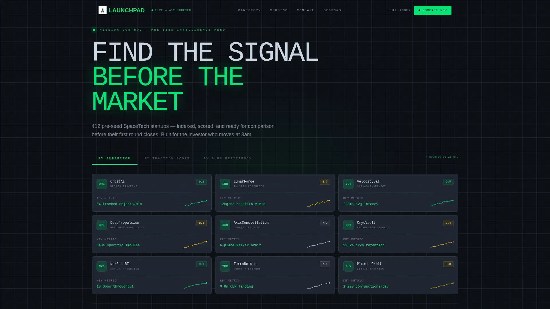
- Feature Tab Switcher header with three sorting views and a live-updating startup card mosaic
- Stats-First progressive reveal sections with counter animations and slide-in comparison tables
- Dual conversion paths: a primary comparison call to action and a gated PDF download form
Feature list
This section breaks down the core interactive and layout components included in the Launchpad template.
Feature Tab Switcher Header
Three tabs labeled "By Subsector," "By Traction Score," and "By Burn Efficiency" sit above a mosaic of startup cards. Switching tabs triggers a fluid cascade re-sort animation. Each card displays a company glyph, a single key performance indicator, and a micro-sparkline. The active tab glows in telemetry green; inactive tabs recede into carbon gray.
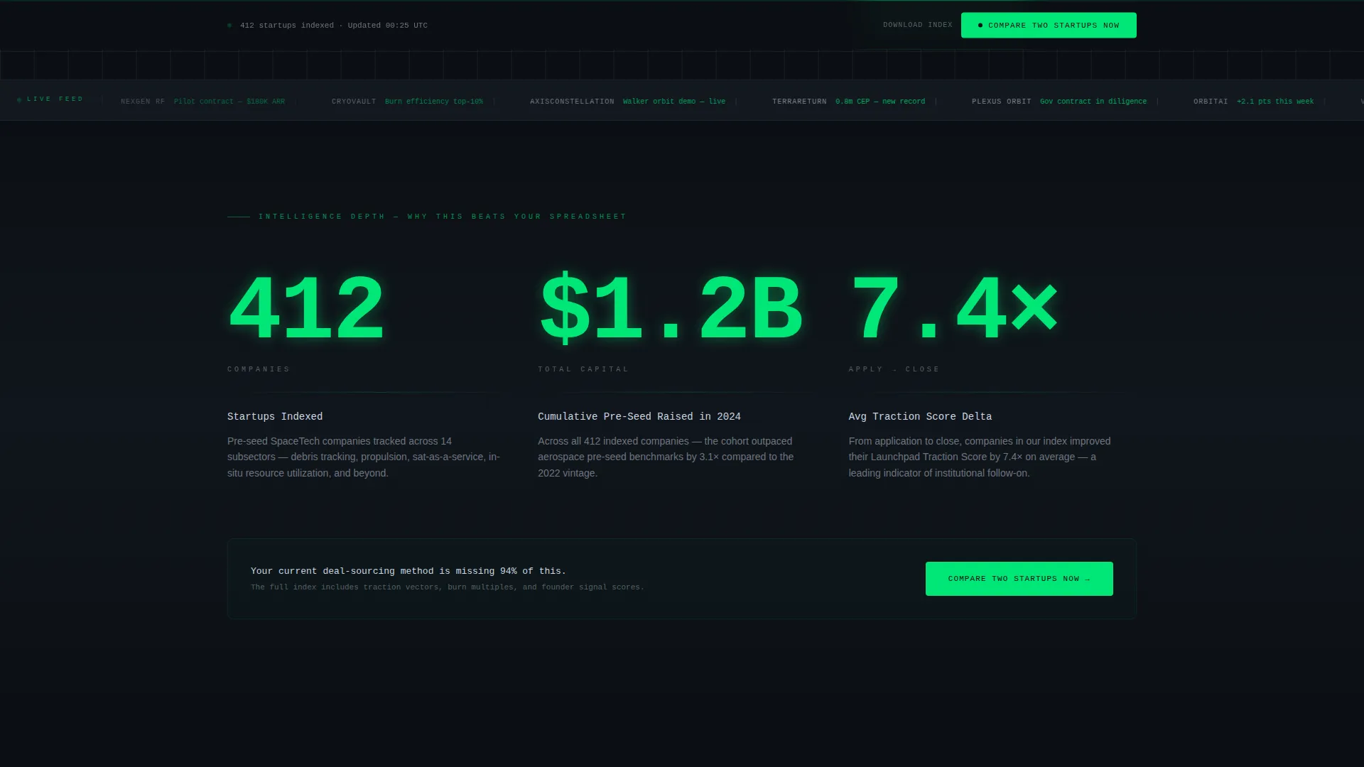
Scroll-Reveal Progressive Sections
Each scroll stage opens with a single oversized metric that lands with a counter animation. Supporting context fades in beneath the number. Stat reveals escalate logically: from total market coverage to directory depth to head-to-head comparison capability.
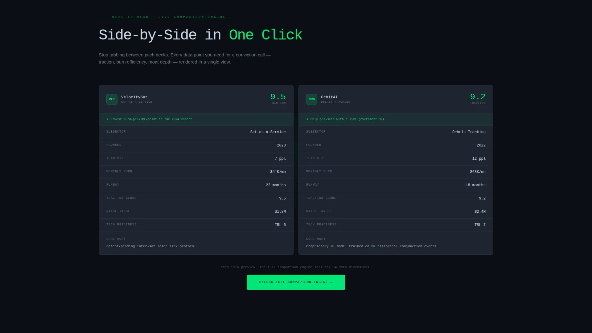
Side-by-Side Comparison Tables
Comparison tables slide in from opposite edges of the viewport. They lock into a side-by-side layout when the visitor reaches that scroll position. This component makes the visitor's current deal-sourcing method feel incomplete by design.
Gated PDF Download Form
A lightweight lead-capture form gates the full index download. It collects a work email, an investor-type dropdown (angel, venture capital, corporate, or accelerator), and a single sector-alerts checkbox. The form is intentionally minimal to reduce drop-off.
Sticky Comparison Call to Action Bar
A persistent bottom bar repeats the primary "Compare Two Startups Now" call to action after the second content section. It stays visible as visitors scroll, keeping the highest-intent action reachable at all times.
Carbon Fiber Visual System
The dark cockpit palette uses deep black, woven mid-gray, telemetry green accents, and cold titanium body text. Single-pixel green divider lines interrupt the darkness at key moments. The system is engineered to reduce eye fatigue during extended comparison sessions.
Page sections overview
| Section | Purpose |
|---|---|
| Tab Switcher Header | Sorts startup cards by subsector, traction, or burn efficiency |
| Startup Card Mosaic | Displays company glyph, one key metric, and micro-sparkline per card |
| First Stat Reveal | Lands oversized metric with counter animation before context fades in |
| Primary call to action Block | Prompts visitors to compare two startups immediately after first stat |
| Second Stat Reveal | Escalates narrative from market size to directory depth |
| Comparison Table Section | Slides tables in from opposite edges for side-by-side startup views |
| Sticky call to action Bar | Keeps "Compare Two Startups Now" visible after second section |
| PDF Download Gate | Collects work email, investor type, and sector alert preference |
Design & branding system
The visual identity follows a Directory and Discovery theme built entirely on the Carbon Fiber color system. Every color choice serves legibility and data focus during long, high-stakes review sessions.
- Deep cockpit black (#0B0F14) as the base canvas, woven carbon mid-gray (#1E2530) for card and panel surfaces
- Telemetry green (#00E676) reserved for live data accents, hover states, active tab indicators, and single-pixel divider lines
- Cold titanium (#CBD5E1) applied to body text and structural dividers to maintain readable contrast without harsh brightness
Mobile & speed optimization
The Launchpad template is structured to work across screen sizes without sacrificing the density that professional users expect. Scroll-reveal animations and card mosaics are built with viewport-aware triggers.
- Cascade animations and counter reveals are tied to scroll position, so they fire correctly on both desktop and mobile viewports
- The sticky call to action bar adapts to smaller screens without overlapping critical content or blocking comparison table rows
How this template helps you convert
Every layout decision in Launchpad is built around moving a high-intent visitor toward one of two actions: comparing startups or downloading the full index.
- The tab-switching mosaic proves directory depth before visitors scroll, reducing bounce from skeptical professionals who need evidence before they engage further.
- Counter-animated stat reveals create progressive urgency by showing exact coverage numbers, raising the perceived cost of relying on a personal spreadsheet instead.
- The gated download form asks for only three inputs, keeping friction low for qualified investors who are ready to act but cautious about lengthy sign-up flows.
Other information about this template
Launchpad is categorized under Startup and Launch with a SpaceTech Pre-Seed Startup niche focus. It carries an intersection match score of 13, reflecting strong alignment between the template style, theme, and target audience. A few additional details worth noting:
- Template style: Scroll Reveal (Progressive), meaning each section activates as it enters the viewport rather than loading all at once
- Creative direction: Stats-First Impact, where data leads every section before narrative context follows
- Landing page direction: Comparison and Versus, making side-by-side evaluation the central user journey
- Header concept: Feature Tab Switcher, the most interactive element above the fold
- The directory covers topics ranging from debris-tracking constellations to lunar regolith printers, giving the template broad coverage across SpaceTech verticals
Theme
Directory & Discovery
Creative direction
Stats-First Impact
Color system
Carbon Fiber
Style
Scroll Reveal (Progressive)
Direction
Comparison/Versus
Page Sections
Feature Tab Switcher with Cascade Animation
Counter-animated Stat Reveals
Slide-in Comparison Tables
Gated Full-index Download Form
Persistent Sticky Call to Action Bar
Carbon Fiber Dark Visual System
Related questions
Who is the Launchpad template designed for?
Can I customize the tab labels and startup card data?
What does the gated PDF download form collect?
Is this a single landing page or a multi-page site?
How does the sticky comparison bar work?


