Creator Economy Pre-Seed Investor Matching Landing Page
Launchpad is a split-screen landing page template built for pre-seed founders in the creator economy. It leads with a syntax-highlighted API code block, flows into an interactive funding-fit calculator, and closes with a comparison table and a gated call to action. The design uses a terminal-dark Slate and Sky color system that feels precise, urgent, and built for founders who move fast.
by Rocket studio
Quick summary
Launchpad is a single-page, split-screen landing page template designed for a pre-seed investor-matching product in the creator economy space. The left panel carries a live-style code snippet; the right panel drives conversion through a funding-fit calculator, a comparison table, and a gated form. Every scroll frame builds conviction and removes friction for technical founders.
Who this template is for
This template is built for founders who know their product but need a sharper way to reach the right investors. It speaks the language of operators, not marketers.
- Solo technical founders who have shipped a minimum viable product and need to start conversations with angels and scout programs quickly
- Two-person teams managing runway pressure while pursuing their first syndicate lead or micro-fund introduction
- Former large-tech-company operators entering the creator economy who understand cap-table mechanics but lack an efficient outreach system
What problem this template solves
Cold outreach to investors is slow, scattered, and demoralizing. Most founders spend weeks sending pitch decks to people who will never write a check at their stage or in their niche. This template is designed to change that first impression entirely.
- It replaces the generic pitch-deck homepage with an interactive tool that demonstrates value before asking for anything
- It makes the old spray-and-pray approach look exhausting by showing head-to-head data in a comparison table
- It creates a low-friction conversion path that feels earned, not pushed, because the calculator has already done the persuasion
What you get with this template
You get a fully structured, single-page layout organized into purpose-built scroll frames. Each frame has a clear job, and together they move a skeptical founder from curiosity to sign-up.
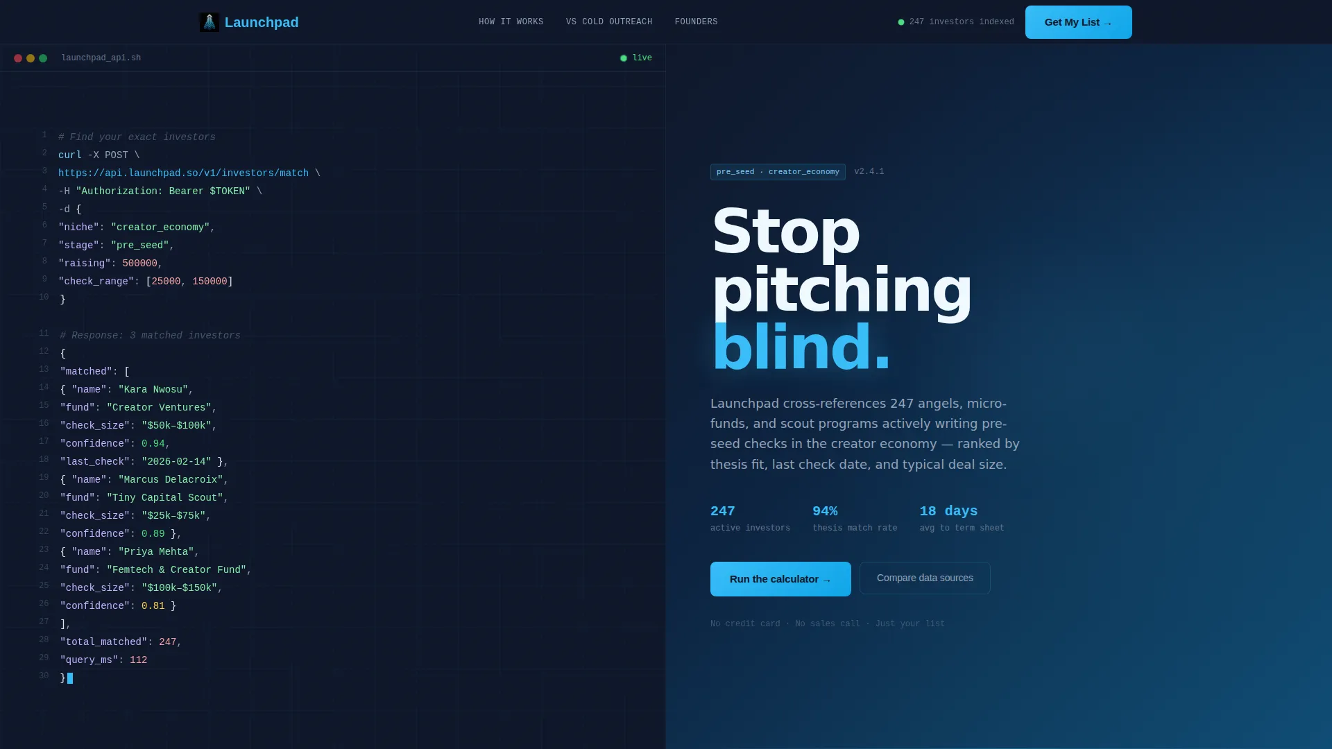
- A syntax-highlighted code snippet header showing a realistic API call to
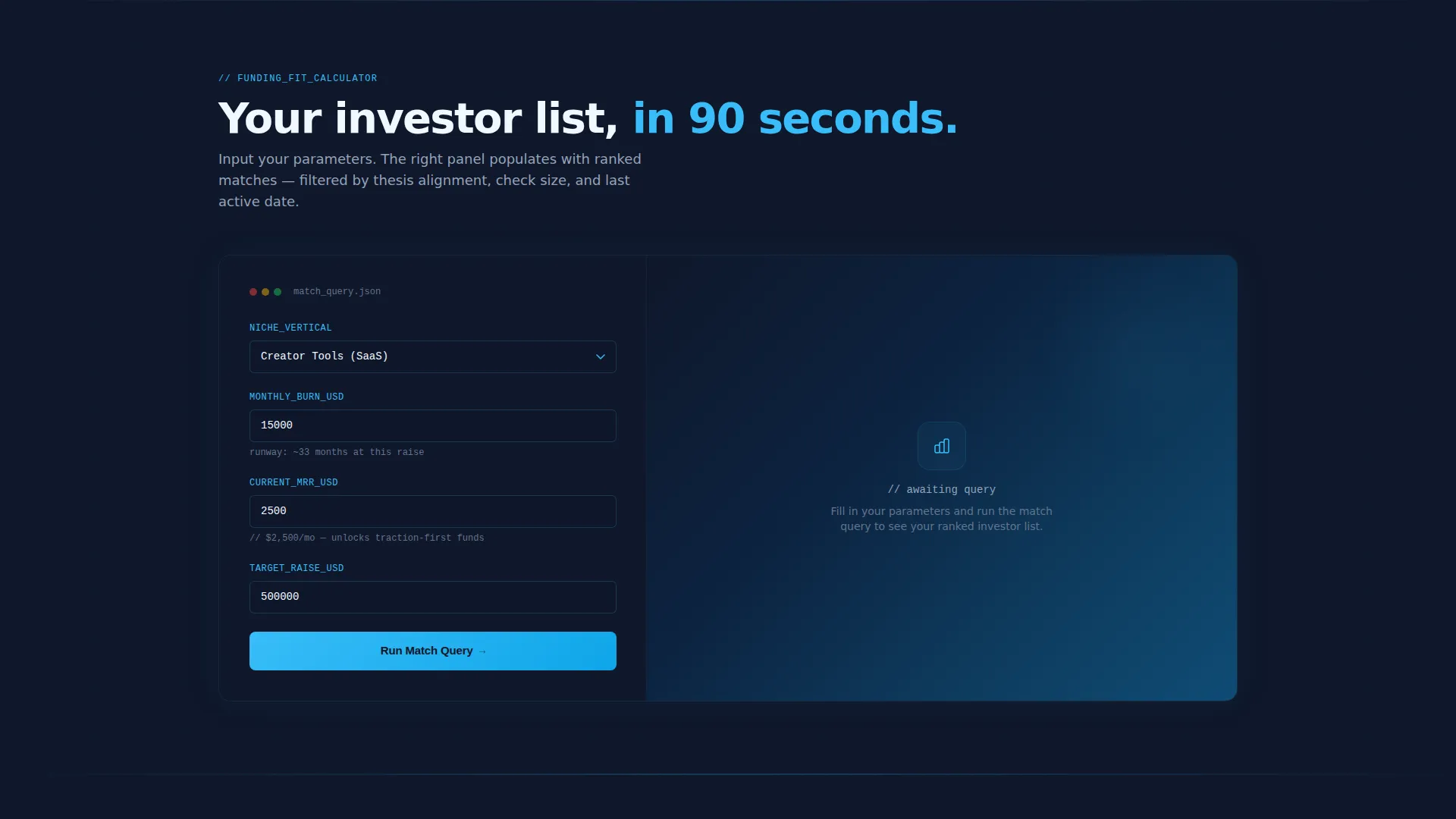
/v1/investors/matchwith a sample JSON payload and three investor response objects including names, check sizes, and match-confidence scores - An interactive funding-fit calculator where visitors enter their niche vertical, monthly burn, current monthly recurring revenue, and target raise, then receive a ranked investor directory on the right panel filtered by thesis alignment and typical check size
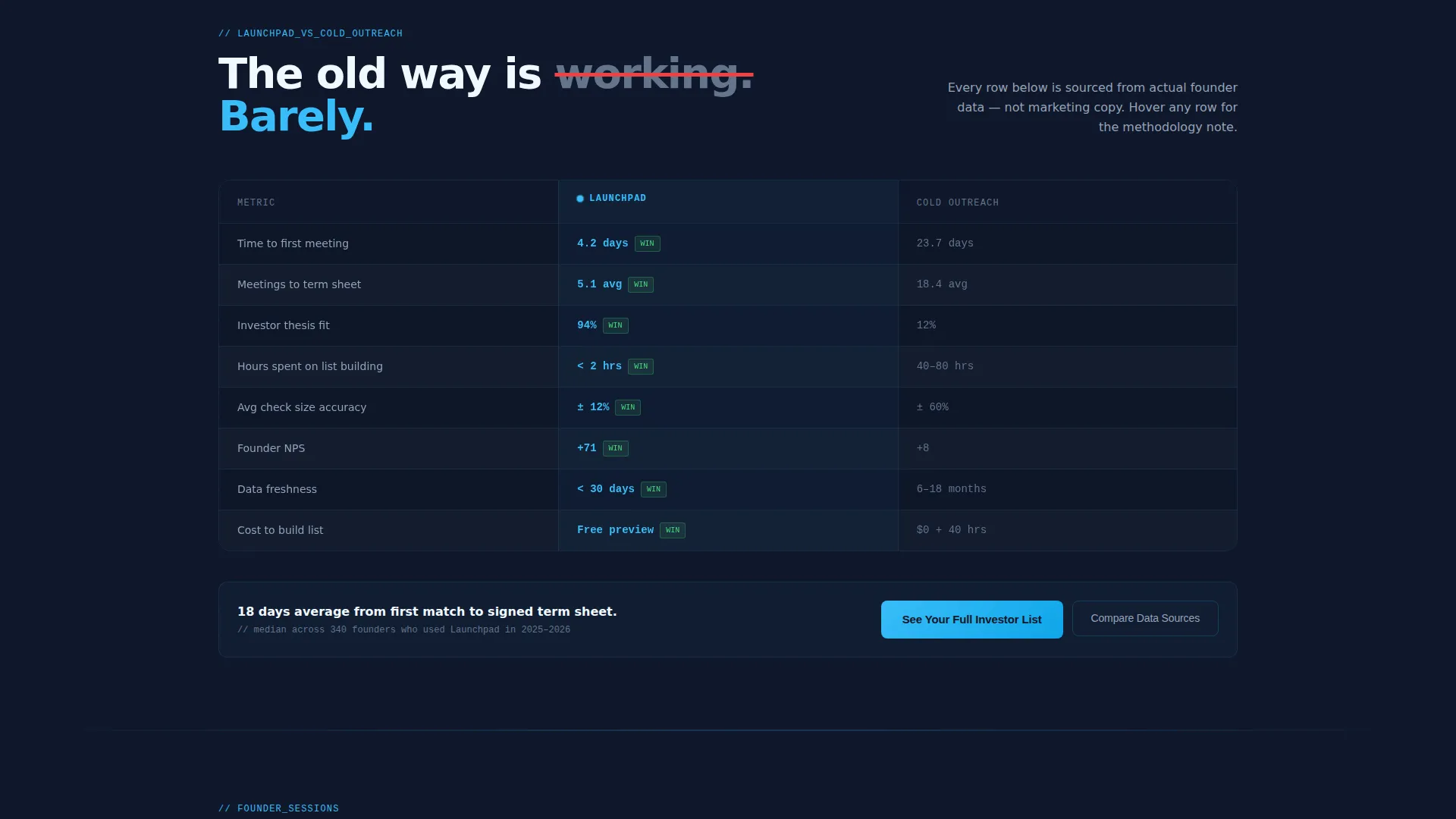
- A comparison table contrasting curated matching against cold-outreach approaches across metrics like time-to-term-sheet, average meetings-to-close, and founder net promoter score, plus a dual conversion path with a primary gated form and a secondary methodology link
Feature list
This template is built around a tight set of purposeful components. Each one does specific work inside the conversion arc.
Split-Screen Header with Code Snippet
The header divides the viewport into two equal panels. The left panel displays a syntax-highlighted, realistic API call with a structured JSON payload and a multi-object investor response. The right panel holds a single stark white headline: "Stop pitching blind." The contrast between dense code and minimal text sets the tone immediately.
Interactive Funding-Fit Calculator
The calculator is the centerpiece of the second scroll frame. Visitors input four variables: niche vertical, monthly burn, current monthly recurring revenue, and target raise amount. The right panel instantly populates a ranked list of matched investors filtered by thesis alignment and check size. The tool does the persuading before the form ever appears.
Comparison Table Section
A structured versus table follows the calculator results. It pits the curated matching approach against cold-outreach spray-and-pray across three visible metrics: time-to-term-sheet, average meetings-to-close, and founder net promoter score. Every row makes the alternative look more costly.
Dual Conversion Path
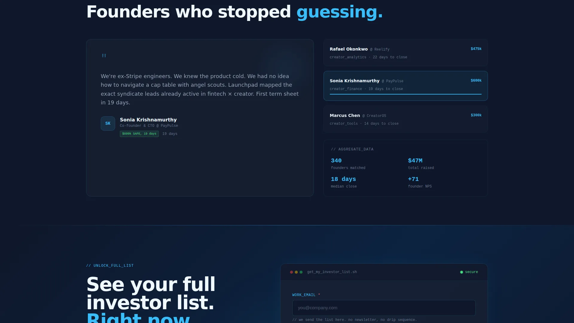
The primary call to action, "See Your Full Investor List," is gated behind a lightweight form asking for a work email, a one-line product description, and a target raise amount. A secondary path, "Compare Our Data Sources," serves skeptics who want methodology before commitment. Both paths are present without competing.
Directory and Discovery Layout
The ranked investor output panel functions as a live directory. Each entry surfaces investor name, typical check size, and match-confidence score. The layout mirrors a developer tool rather than a marketing brochure, which builds trust with a technical audience.
Slate and Sky Color System
The palette pairs deep terminal slate with sky blue interactive accents and pale horizon white for breathing room. The result feels like a focused code editor at dawn, dark on the left where work happens and brightening on the right where possibility opens up.
Page sections overview
| Section | Purpose |
|---|---|
| Split-screen header | Anchor attention with a live-style API code block and a single bold headline |
| Funding-fit calculator | Let visitors self-qualify by inputting burn, revenue, and raise target |
| Investor match results | Populate the right panel with a ranked, filtered investor directory |
| Comparison table | Show head-to-head metrics against cold-outreach to build conviction |
| Primary conversion form | Gate the full investor list behind a three-field lightweight sign-up |
| Secondary call to action link | Offer a methodology path for skeptics who need proof before committing |
Design & branding system
The visual identity follows a Directory and Discovery theme where every design choice reinforces precision and focus. The color system is called Slate and Sky, and it earns that name.
- Deep terminal slate (#1E293B) anchors the left panels and background surfaces, while mid-tone graphite (#475569) handles secondary surfaces and supporting text
- Expansive sky blue (#38BDF8) drives all interactive accents including buttons, highlighted syntax, and active states, creating a clear visual hierarchy that guides the eye
- Pale horizon white (#F0F9FF) opens up breathing room between dense data blocks, preventing the dark palette from feeling claustrophobic
Mobile & speed optimization
The split-screen layout is designed with stacked mobile behavior in mind. On smaller viewports, the two panels reflow into a single vertical column so that the code snippet, calculator, and results remain fully readable without horizontal scrolling.
- The calculator inputs and result panel stack cleanly on mobile so the interactive flow is preserved end to end
- The comparison table is structured to scroll horizontally on narrow screens, keeping all metric columns accessible without truncation
- Lightweight form fields in the conversion section keep the sign-up experience frictionless on touch devices
How this template helps you convert
The conversion arc is built into the scroll sequence itself. Each section removes one more objection before the form appears.
- The code snippet header establishes credibility in the first three seconds by showing a realistic, functional-looking API response rather than abstract promises, signaling to technical founders that this product was built by people who think like they do
- The interactive calculator creates a personalized result before asking for any commitment, which means the visitor has already seen value by the time the gated form appears, making sign-up feel like a natural next step rather than a gamble
- The comparison table reframes the status quo as the costly choice, so the call to action arrives at the moment when continuing without Launchpad feels harder than signing up
Other information about this template
This template sits inside the Startup and Launch category with a Creator Economy Pre-Seed Startup niche focus. A few additional details are worth knowing before you use it.
- The template style is a 50/50 split screen, meaning left and right panels carry equal visual weight throughout the page
- The header concept is a Code Snippet, and the creative direction is Calculator and Tool First, so the interactive element is not a supporting component but the primary conversion driver
- The landing page direction is Comparison and Versus, meaning the scroll arc is explicitly designed to position the product against an inferior alternative rather than making standalone feature claims
- The theme is Directory and Discovery, which shapes every layout decision from the investor result cards to the ranked output panel
Theme
Directory & Discovery
Creative direction
Calculator/Tool First
Color system
Slate & Sky
Style
Split Screen (50/50)
Direction
Comparison/Versus
Page Sections
Split-screen Header with Code Snippet
Interactive Funding-fit Calculator
Ranked Investor Directory Panel
Comparison Table Section
Dual Conversion Path Design
Slate and Sky Visual System
Related questions
What kind of founder is this template designed for?
Can I customize the calculator inputs and investor result fields?
Do I need design or coding skills to use this template?
What is the purpose of the dual conversion path?
Is the comparison table data editable?



