Artisan Personal Finance Newsletter Landing Page
Ledger is a warm, artisan-styled personal finance newsletter landing page built to turn curious visitors into loyal email subscribers. The masonry archive layout showcases real digest headlines across a corkboard-inspired grid, proving editorial value before asking for anything. It is designed for personal finance daily digest creators who want a calm, trustworthy first impression.
by Rocket studio
Quick summary
Ledger is a single-page lead generation template for a personal finance daily digest. It opens with a full-viewport typographic manifesto, then unfolds into a masonry grid of past digest headlines. Every design choice, from the parchment background to the walnut ink type, signals that this is a money briefing worth reading every weekday morning.
Who this template is for
This template is built for newsletter creators and independent editors who publish a personal finance daily digest. It suits writers who have built a real archive of content and want to let that content do the selling.
- Personal finance newsletter operators ready to grow their subscriber list
- Independent editors running a weekday money briefing for working adults
- Freelance writers and content businesses launching a curated finance digest
What problem this template solves
Most newsletter landing pages make a promise and ask for an email. Readers are tired of that trade. Ledger flips the script by showing the full archive upfront, so visitors already feel informed before they sign up.
- Visitors leave generic newsletter pages because the value is invisible until after signup
- Finance audiences are skeptical and need proof of editorial range, not just taglines
- A cold email field with no context creates friction and kills conversions
What you get with this template
You get a fully structured, single-page lead generation layout with every section pre-built and ready to customize. The page is designed to carry a reader from first impression to subscription in one smooth scroll.
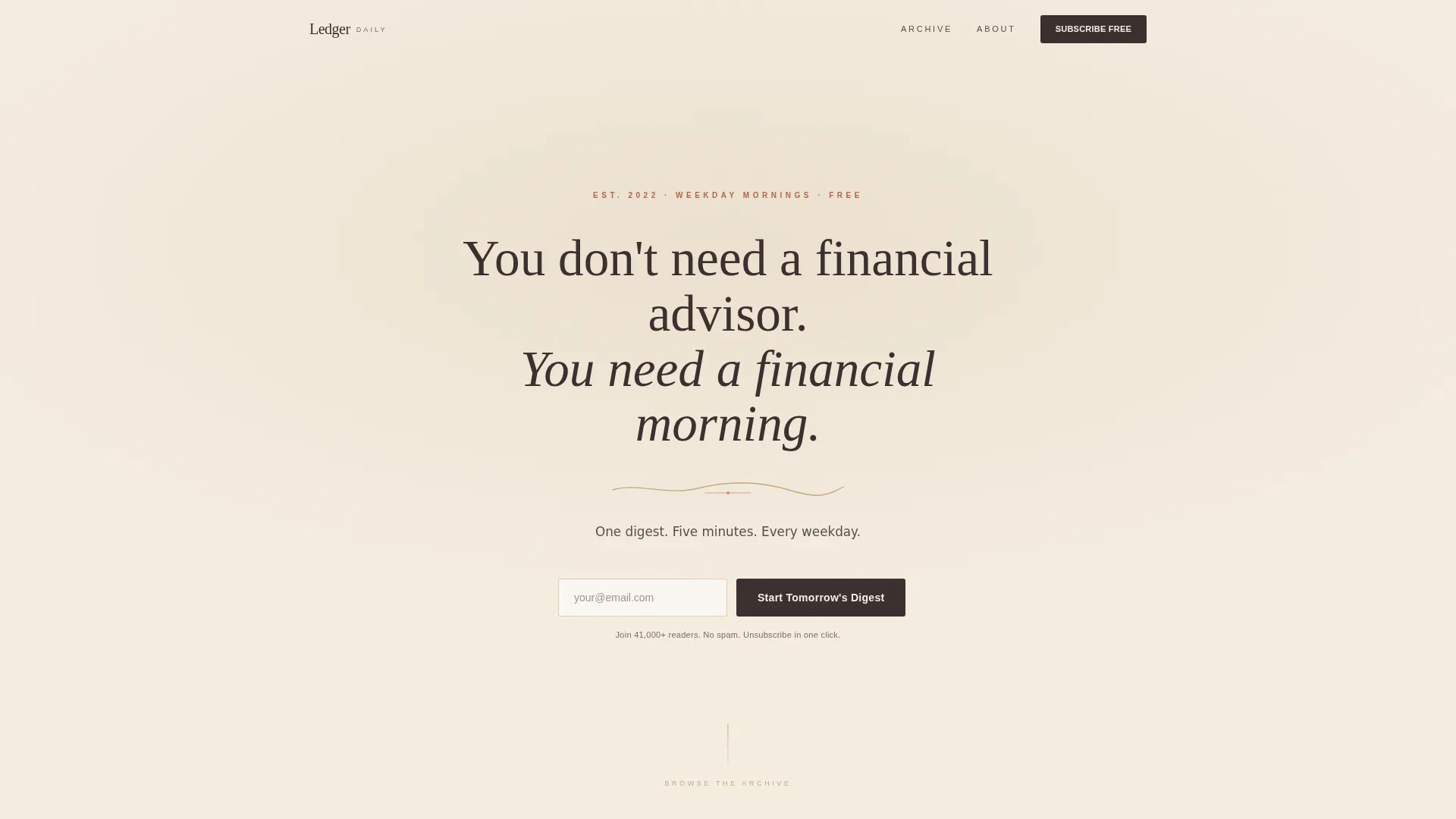
- A full-viewport manifesto header with a primary email capture field
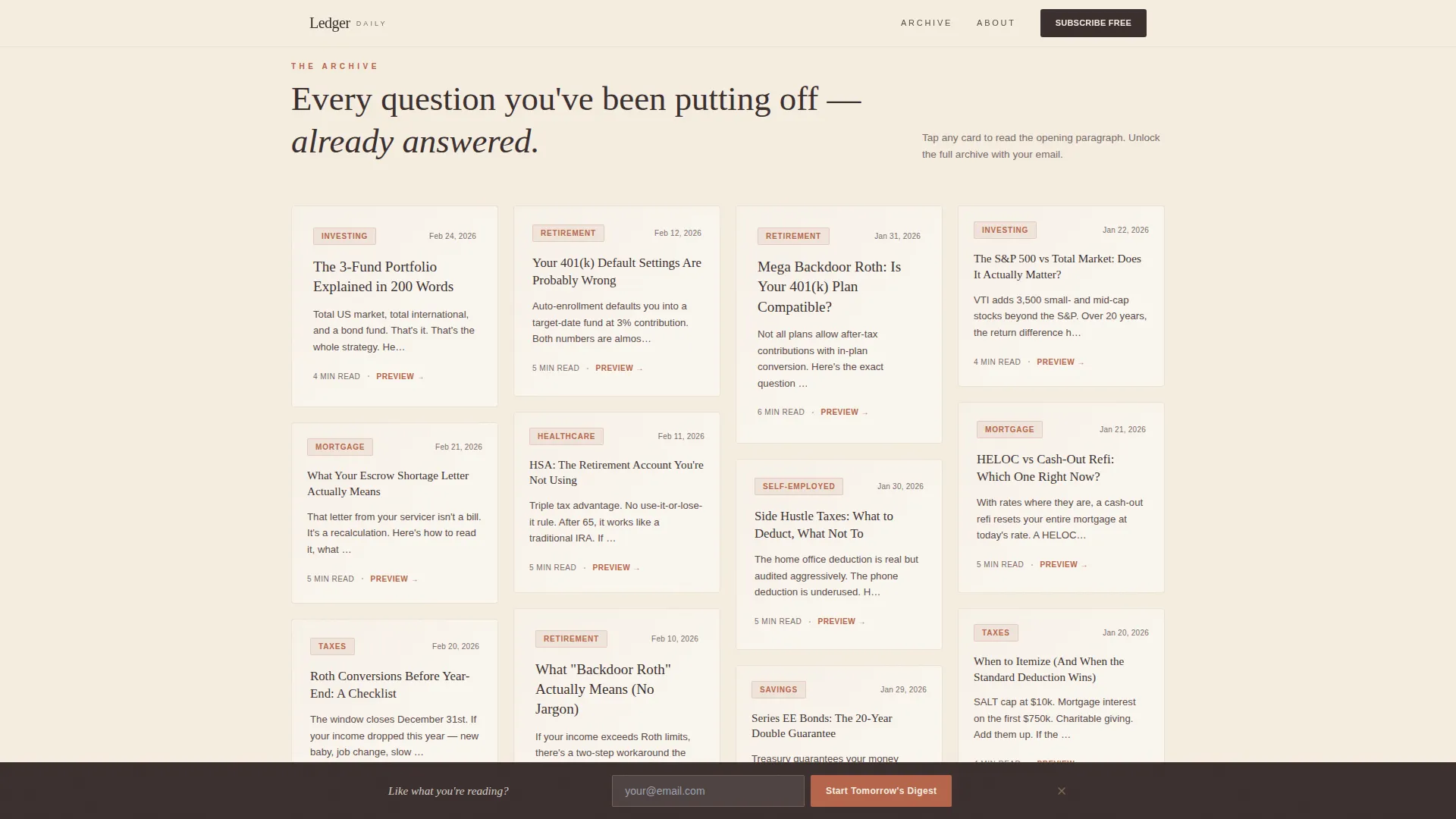
- A masonry archive grid displaying up to fifty digest headline cards with topic tags and date stamps
- Persona strips, a trust and format section, and a final full-width email capture with a floating bottom bar
Feature list
This template ships with a specific set of interactive and visual components drawn directly from the design brief.
Full-Viewport Manifesto Header
The hero section uses a single serif typographic statement on an ecru background. A hand-drawn divider line and a short subhead sit beneath it. The first email call to action appears here, beneath the manifesto, before any other content competes for attention.
Masonry Archive Grid
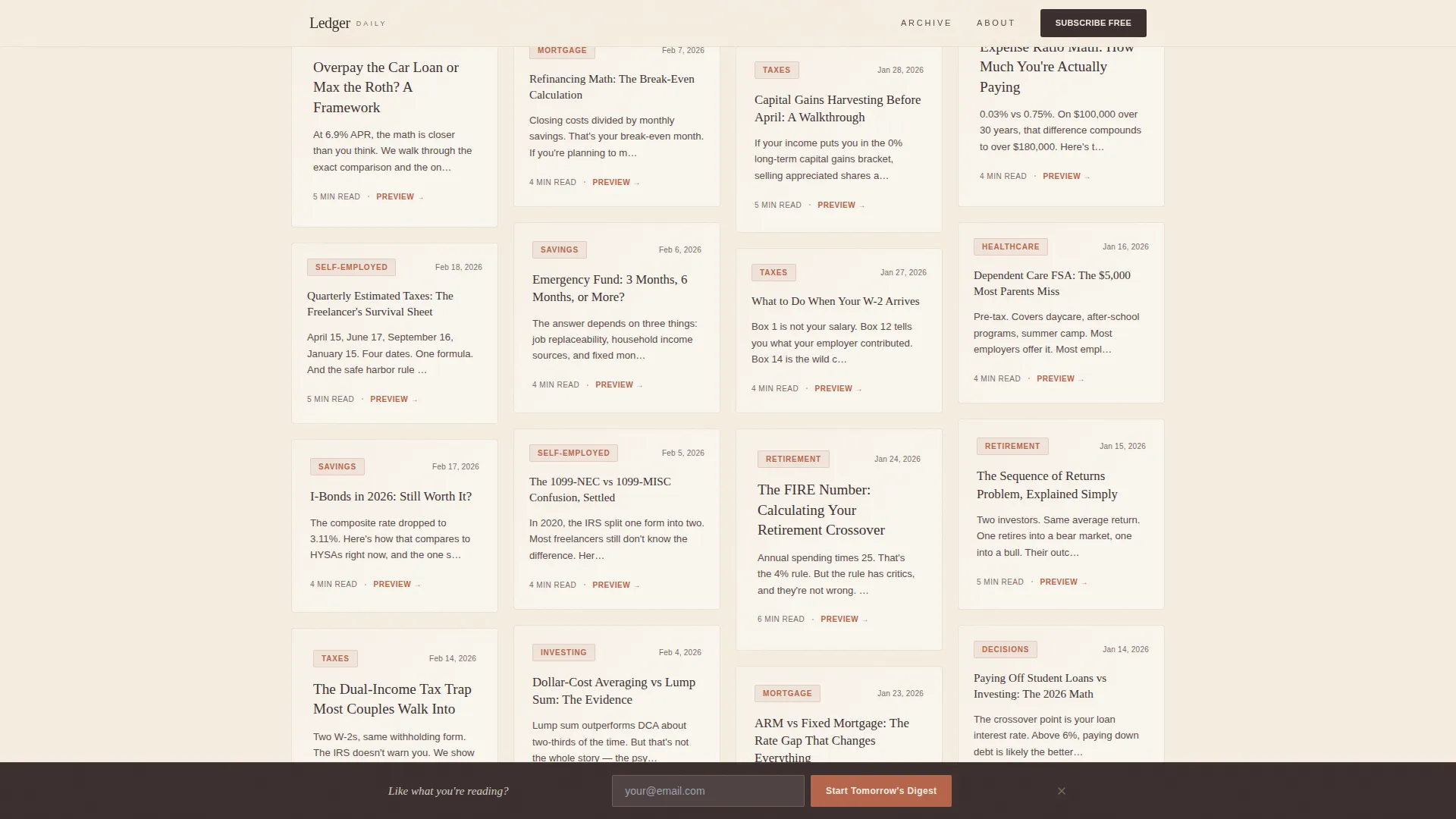
Below the hero, the page breaks into a Pinterest-style masonry grid of digest cards. Each card shows a real headline, a terracotta topic tag, and a date stamp. Cards stagger at different heights to create a natural corkboard energy as the visitor scrolls.
Blurred Preview Modal
When a visitor taps or clicks any archive card, a redacted preview opens. The first paragraph is readable; the rest is blurred. An inline signup prompt reading "Unlock the Full Archive" converts curiosity into a subscription without leaving the page.
Floating Bottom Bar Call to Action
Once a visitor scrolls into the masonry grid, a calm bottom bar floats into view. It carries the primary call to action, "Start Tomorrow's Digest," with a single email field. It stays persistent without being intrusive.
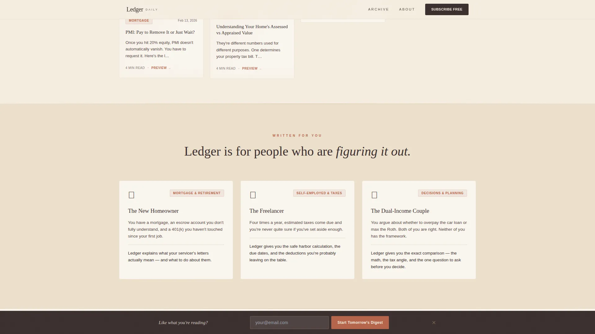
Reader Persona Strips
Three dedicated strips identify the specific reader types this digest serves. Each strip names a real financial pain point, from escrow shortage letters to quarterly estimated tax payments, creating immediate recognition for the right audience.
Warm Artisan Typography System
The template pairs Fraunces, a serif display typeface, with DM Sans for body copy. The combination gives every headline a letterpressed editorial weight while keeping body text clean and easy to scan on a small screen.
Page sections overview
| Section | Purpose |
|---|---|
| Hero Manifesto Header | Opens with a typographic statement and first email capture |
| Masonry Archive Grid | Displays fifty past digest headline cards with tags and dates |
| Who It's For | Three reader persona strips with specific financial pain points |
| Format and Trust | Covers cadence, digest format, and subscriber proof metrics |
| Final Email Capture | Full-width signup section with persistent floating bottom bar |
| Footer | Single-row linear footer with minimal navigation |
Design & branding system
The visual identity follows a Warm Artisan theme built around a Warm Stone color palette. Every color choice reinforces the feeling of a handwritten plan rather than a fintech dashboard.
- Parchment (#F5EDE0) page background, deep walnut ink (#3B2F2F) for body text, sun-baked sandstone (#C4A882) for structural accents, and muted terracotta (#B5654A) for buttons and interactive topic tags
- Fraunces serif for all display headings and card headlines, paired with DM Sans for body paragraphs and user interface labels
- Hand-drawn divider lines, scroll-reveal animations, and masonry stagger transitions bring the corkboard aesthetic to life without heavy scripting
Mobile & speed optimization
The template is built mobile-first, reflecting the morning coffee reading context of its target audience. Layout decisions prioritize legibility and thumb-friendly tap targets on small screens.
- CSS masonry layout handles the grid without heavy JavaScript dependencies, keeping load behavior lean
- Scroll-reveal animations and the blur-unlock card interaction are designed to perform smoothly on mobile devices
- The floating bottom bar call to action is optimized for small viewports, staying visible without covering critical content
How this template helps you convert
The conversion strategy is built around showing value before asking for anything. Every structural decision moves a skeptical visitor closer to subscribing.
- The masonry archive of real headlines builds trust through volume and variety, answering the question "is this actually useful?" before the email field appears
- The blurred card preview creates a natural unlock moment, turning passive browsing into active intent without any hard sell
- The floating bottom bar keeps the primary call to action, "Start Tomorrow's Digest," reachable at any scroll depth without interrupting the reading experience
Other information about this template
This template is a good fit for any personal finance content creator building a daily digest brand from the ground up or refreshing an existing newsletter page.
- The page includes social proof placements for a subscriber count metric and a publication longevity signal such as "weekday since 2022"
- All content is localized for English-language audiences using USD and US date formatting
- The template is built as a static single-page layout, making it straightforward to deploy and maintain without a complex content management setup
- The Warm Artisan visual style and corkboard editorial tone are well suited to personal finance, budgeting, and money education niches where clinical or corporate aesthetics tend to push readers away
Theme
Warm Artisan
Creative direction
Curated Collection
Color system
Warm Stone
Style
Masonry/Pinterest
Direction
Lead Generation
Page Sections
Full-viewport Manifesto Hero
Masonry Archive Grid
Blurred Card Preview Modal
Floating Bottom Bar
Reader Persona Strips
Warm Artisan Typography Pairing
Related questions
Who is this landing page template designed for?
Can I customize the digest headline cards with my own content?
How does the blurred preview feature work?
Does this template include the email signup functionality itself?
Is this template suitable for a freelance finance writer just starting out?



