Construction Blog & Media Blog Website Template
Ledger is a single-column landing page template built for a weekly construction industry report. It combines a broadsheet newspaper aesthetic with editorial report-card sections, real data callouts, and a click-through structure designed for estimators, regional general contractors, and project owners who rely on bid volumes, material costs, and project pipeline intelligence every week.
by Rocket studio
Quick summary
Ledger is a construction industry report landing page template with a bold broadsheet identity. It delivers weekly market intelligence through a vertical editorial flow, alternating data callouts, analytical paragraphs, and category tags. A persistent call-to-action bar drives readers toward the current issue, while a secondary archive path serves returning subscribers.
Who this template is for
This template is built for publishers and operators running a data-focused construction media product. It fits teams that produce real weekly market reporting and need a page that earns reader trust before anyone clicks.
- Estimators and regional general contractors who need bid volume and material cost data before the workday starts
- Project owners and developers making strategic ground-break timing decisions based on pipeline and permit trends
- Construction media publishers launching or repositioning a weekly industry report or intelligence dispatch
What problem this template solves
Construction professionals are drowning in generic industry noise. They need a publication that leads with real numbers, not commentary. Most newsletter and report landing pages bury the value behind a sign-up wall and give readers no reason to trust the content before they commit.
- Visitors land and see no proof the report contains real data, so they bounce before clicking
- The publication has no visual authority to match the seriousness of a market intelligence product
- There is no clear editorial rhythm to communicate that each issue is structured, timely, and worth reading
What you get with this template
You get a full single-column landing page with a typographic masthead, editorial report-card sections, and a click-through conversion path that does not use an on-page form. Every section is structured to give real data away, building the case that the full report is worth opening.
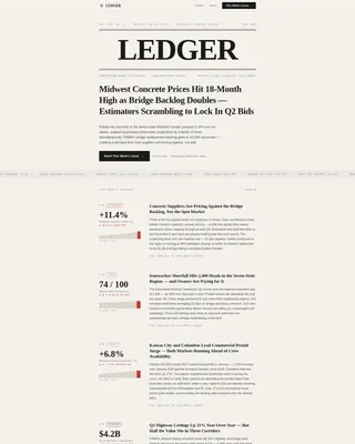
- A full-width newspaper masthead with heavy condensed serif headline type, a dateline, a lead headline, and a two-sentence lede paragraph
- An alternating editorial scroll with data callouts, analytical paragraphs, category tags, a pull quote block, and a large red-pencil stat callout
- A current issue preview section, a secondary archive browse path, a persistent bottom call-to-action bar, and a single-row linear footer
Feature list
Ledger's feature set is built around editorial credibility, data visibility, and a conversion path that earns the click rather than demanding it.
Typographic Newspaper Masthead
The header spans full width and sets the publication's authority before a word is read. "LEDGER" is set in a heavy condensed serif typeface across the top like a printed banner. A dateline beneath it displays the current issue number and coverage region, followed by a large editorial lead headline and a short lede paragraph separated by a thin rule.
Editorial Report-Card Scroll
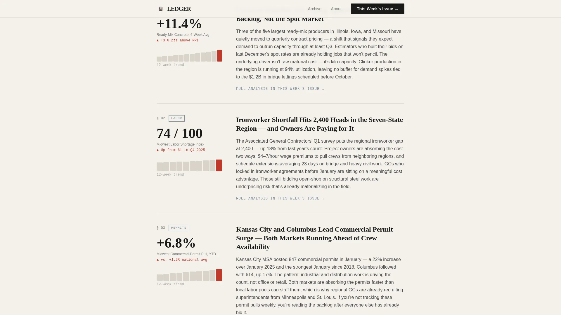
Each scroll section is a discrete report card. A chart or data callout anchors the left margin, a tight analytical paragraph sits beside it, and a category tag labels the topic as Materials, Labor, Permits, or Pipeline. The rhythm alternates between data-dense snapshots and breathing room, creating the feel of flipping through a well-edited journal.
Pull Quote and Big-Stat Callout
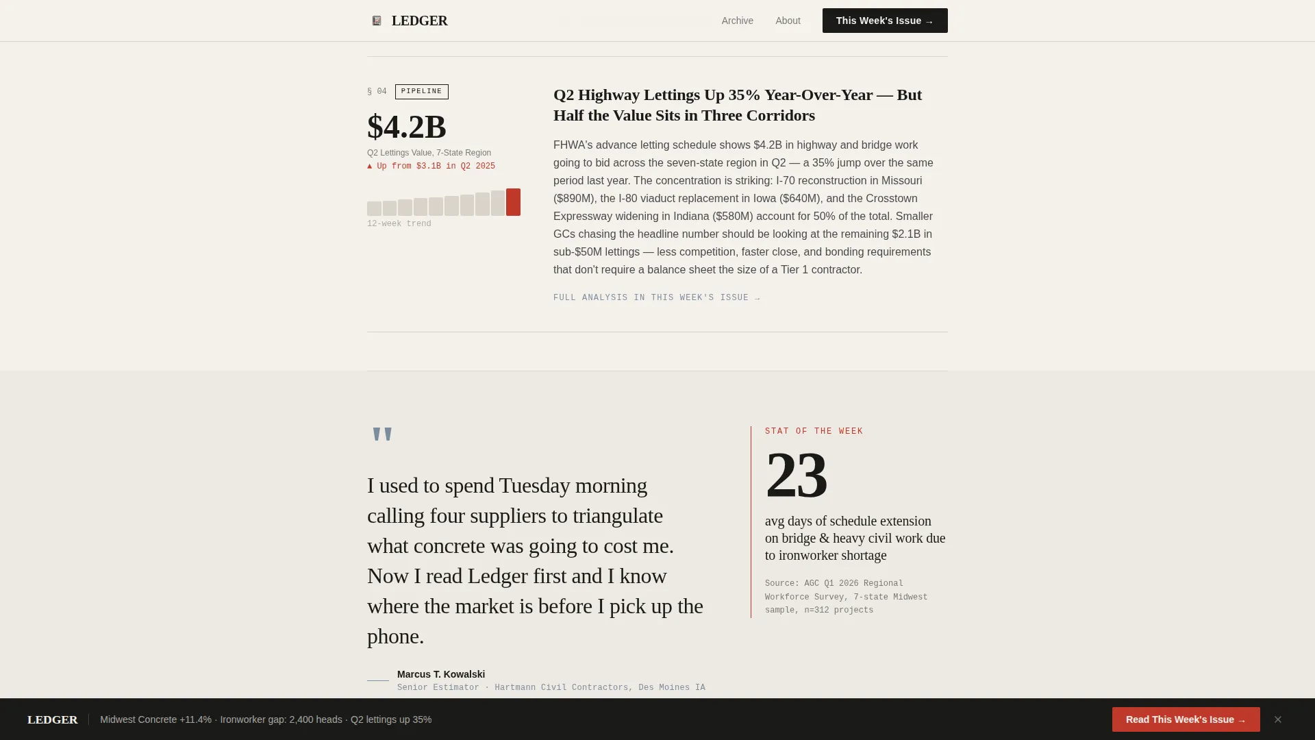
A superintendent pull quote and a single large-format statistic are set in red-pencil markup styling and scaled to command the viewport. These blocks break the data rhythm and add a human voice to the numbers, reinforcing that real practitioners back the reporting.
Current Issue Preview Section
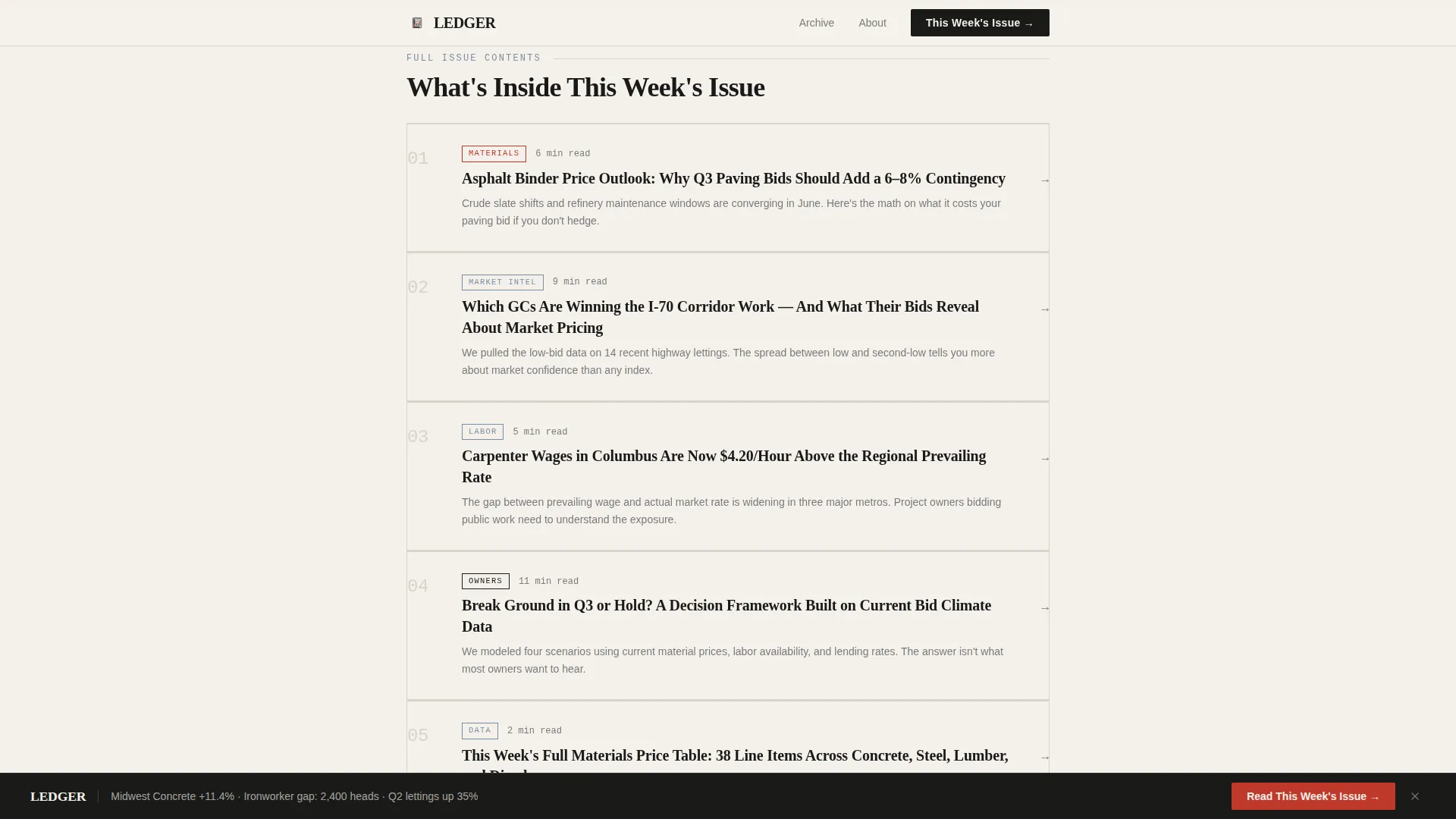
A table-of-contents card grid previews the current week's coverage topics. This section proves the issue is already written and ready, reducing hesitation before the primary click. It also signals editorial structure and consistency to first-time visitors.
Persistent Bottom Call-to-Action Bar
After the reader passes the third section, a fixed bar appears at the bottom of the viewport with the primary call to action, "Read This Week's Issue." The bar stays visible as the reader scrolls, keeping the conversion path accessible without interrupting the editorial flow.
Archive Browse Path
A secondary text link, "Browse the Archive," appears after the curated collection scroll. It gives returning readers a self-select path without competing with the primary call to action. This keeps the page conversion-focused while still serving subscribers who want back issues.
Page sections overview
| Section | Purpose |
|---|---|
| Masthead & Dateline | Sets publication authority and frames the lead story |
| Lead Headline & Lede | States the week's top market finding in editorial type |
| Primary Call to Action | Drives the first click to the current issue |
| Editorial Report Cards | Delivers real data snapshots with category tags |
| Pull Quote Block | Adds practitioner voice and breaks the data rhythm |
| Big-Stat Callout | Highlights a single high-impact number in red markup |
| Issue Preview Cards | Shows this week's coverage topics as a table of contents |
| Archive Browse Link | Gives returning readers a path to back issues |
| Persistent call to action Bar | Keeps the primary click accessible after scroll depth |
| Single-Row Footer | Closes the page with minimal distraction |
Design & branding system
The visual identity follows an Ink and Paper editorial theme. The palette is built from four tones that together feel like a marked-up spec sheet under a desk lamp: muted, legible, and serious without being sterile.
- Newsprint off-white (#F4F1EC) for the body background, pencil-lead gray (#4A4A4A) for body text, faded blueprint steel (#7B8D9E) for pull quotes and chart labels, and red-pencil markup (#C0392B) reserved for data highlights, callouts, and hover states
- Typography uses Fraunces, a heavy condensed serif, for all headlines and the masthead banner, paired with DM Sans for body copy, category labels, and navigation elements
- Section dividers are thin pencil-lead rules, and the overall layout mirrors a broadsheet newspaper column with no decorative imagery, letting typographic hierarchy carry all the visual authority
Mobile & speed optimization
The template is designed desktop-first to serve estimators checking data before morning coffee, with a clean single-column fallback that keeps the editorial hierarchy readable on any screen size.
- Scroll-reveal animations are staggered at medium intensity, with rule-draw effects on section dividers and number count-up animations on data callouts to reinforce the live-reporting feel
- Static content is built with Server Components and minimal JavaScript to keep the persistent call-to-action bar and hover states responsive without heavy client-side overhead
- The single-column layout collapses cleanly to mobile without restructuring, so report cards, pull quotes, and the issue preview section remain readable at smaller viewports
How this template helps you convert
This template treats every section as a reason to click, not a barrier to it. Real data is visible before any sign-up prompt appears, so the reader builds trust through the scroll rather than being asked for it upfront.
- The primary call to action, "Read This Week's Issue," appears immediately below the masthead lead headline and then again as a persistent bottom bar after the third scroll section, giving readers two natural moments to convert without pressure
- The editorial report cards and big-stat callout give away real numbers and actual trends, proving the full report contains more of the same and making the click feel like a logical next step rather than a gamble
- The archive browse path after the curated collection serves returning readers who already trust the publication, reducing friction for a second conversion action without pulling focus from new visitors
Other information about this template
This template is purpose-built for the construction intelligence publishing niche and includes design and structural details that match the conventions experienced industry readers expect.
- The Soft Mist color system and Ink and Paper theme are pre-configured in the template, so the four-tone palette is ready to apply without custom color work
- The Curated Collection creative direction drives the scroll structure, meaning the editorial report cards are designed to feel like a publication's front section rather than a product marketing page
- The Newspaper and Publication header concept is intentional and distinct: no hero images, no gradient backgrounds, and no icon-driven layouts are present, keeping the masthead purely typographic
- The Click-Through landing page direction means no forms are present on the page by design; the conversion path leads to the full current issue or a free-registration gate on a separate page
- The single-row linear footer pattern keeps the page exit clean and minimal, consistent with the broadsheet aesthetic
Theme
Ink & Paper
Creative direction
Curated Collection
Color system
Soft Mist
Style
Single Column Flow
Direction
Click-Through
Page Sections
Typographic Newspaper Masthead
Editorial Report-card Scroll
Pull Quote and Big-stat Callout
Current Issue Preview Section
Persistent Bottom Call-to-action Bar
Archive Browse Path
Related questions
Does this template include an email sign-up form on the page?
Can I update the lead headline and dateline each week without rebuilding the page?
Is this template suitable for a regionally focused construction publication?
What does the persistent bottom call-to-action bar do?
Does the template work for a publication that gives away data before asking readers to subscribe?



