Financial Services Blog & Media Careers Website Template
Ledger is a content-first landing page template built for a private financial professionals community forum. It pairs a manifesto-style editorial flow with an asymmetric 60/40 grid, an Ink and Paper visual identity, and a conviction-led membership gate. Solo registered investment advisors, mid-career analysts, and retired finance professionals will feel at home here immediately.
by Rocket studio
Quick summary
Ledger is a single-page landing page template designed for a private financial services community forum. It uses a 60/40 asymmetric grid, a warm parchment and ink color palette, and a manifesto-style scroll that earns trust before asking for anything. The page guides serious financial professionals from a bold hero headline to a curated content archive and a thoughtful membership application.
Who this template is for
This template is built for community founders and operators who want to attract credible, serious financial professionals. It speaks directly to people who are tired of sponsored noise and want a professional home with real discourse.
- Independent registered investment advisors (RIAs) building practices outside of large firms
- Mid-career analysts and retired chief financial officers seeking substantive peer dialogue
- Financial community builders who want a content-first, application-gated membership model
What problem this template solves
Independent financial work can be isolating. The public forums available to most professionals are cluttered with sales pitches, sponsored content, and surface-level commentary. There is no good default template for a community that values intellectual seriousness over easy sign-ups.
- Financial professionals lack a polished, credible digital gathering space that reflects their expertise
- Generic community or blog templates do not carry the gravitas or editorial weight that serious practitioners expect
- Most landing pages ask for commitment before proving value, which filters out exactly the people worth keeping
What you get with this template
You get a fully structured, single-page layout that unfolds like a well-edited journal. Every section is positioned to deepen conviction before the membership gate appears. The design system is consistent from top to bottom.
- A five-section page flow: hero, manifesto, live thread excerpts, archive browse, and membership application form
- A typographically rich Ink and Paper design with parchment, sandstone, fountain pen black, and oxblood accents
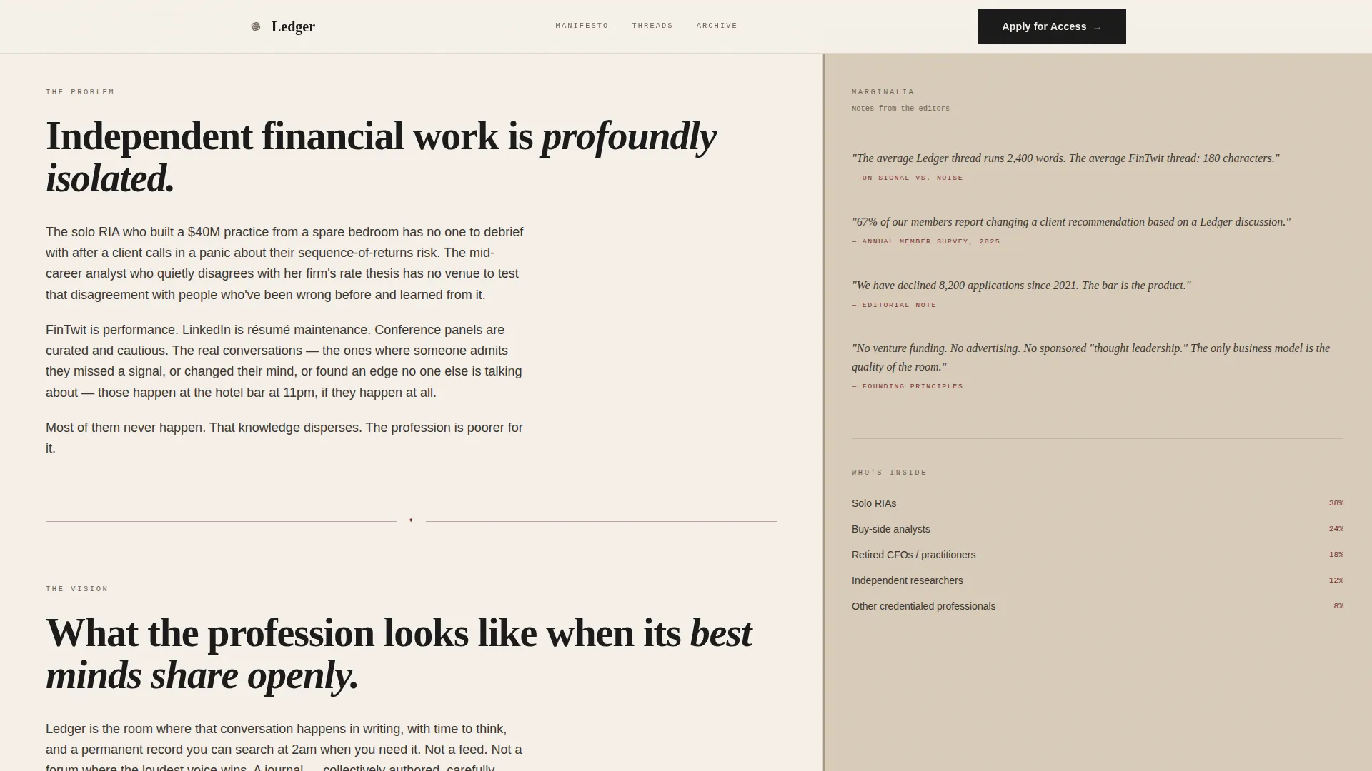
- An asymmetric 60/40 grid that separates long-form editorial content from marginalia, thread counts, and contributor details
Feature list
This template is built with deliberate structure. Each feature serves the community forum context and supports the goal of attracting committed financial professionals.
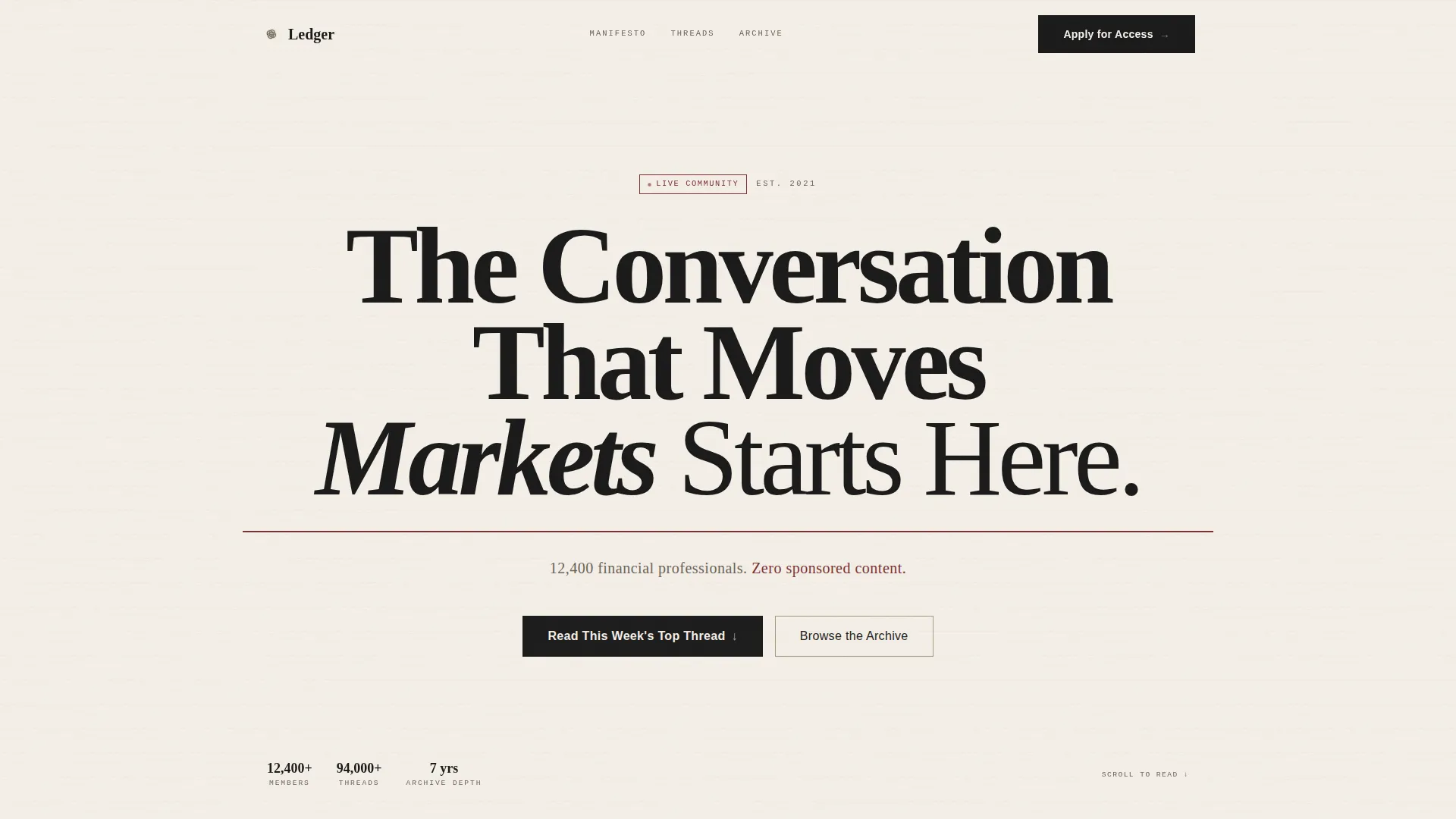
Giant Headline Hero Section
The hero opens with a full-viewport serif headline set in high-contrast ink on parchment. A subtle paper-grain texture shifts beneath the text. A thin oxblood rule separates the headline from a single line of subtext confirming member count and zero sponsored content policy.
Asymmetric 60/40 Editorial Grid
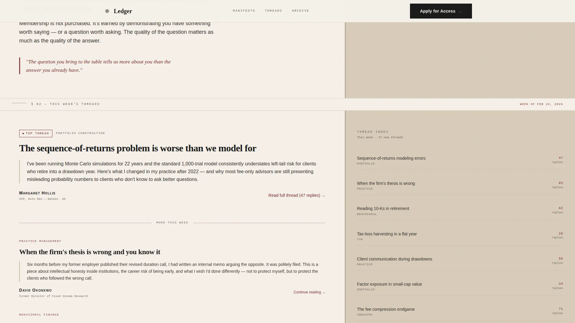
The main body uses a 60-column for long-form content and member voices, and a 40-column for marginalia, reply counts, contributor bios, and resource links. The layout recreates the feeling of a printed page beside its annotated margin.
Manifesto Content Flow
The page scrolls like a manifesto read aloud. It moves from the problem of professional isolation, to the vision of open discourse, to proof in the form of real discussion thread excerpts. Each section deepens the visitor's conviction before the next appears.
Live Thread Excerpts Block
Discussion threads are rendered as typeset journal entries. Member names appear in small caps, reply counts appear in the margin column, and contributor credentials are displayed inline. This social proof section reads like a real document, not a testimonial carousel.
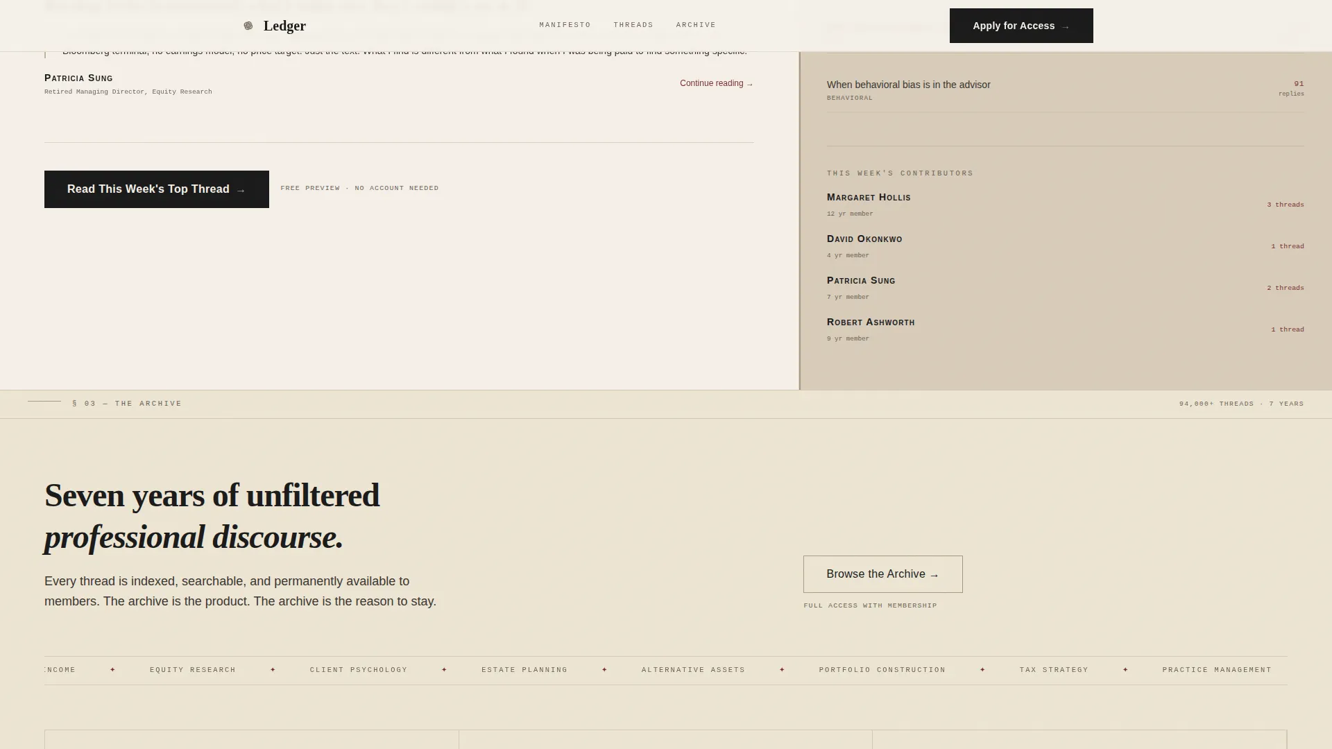
Archive Browse with Primary Call to Action
A categorized topic grid covers tax strategy, portfolio construction, practice management, and behavioral finance. The primary call to action, "Read This Week's Top Thread," appears here and gives value before asking for commitment. A secondary path offers "Browse the Archive."
Application-Gated Membership Form
The membership gate appears only after the visitor has read real content. It asks for name, professional role, and a single open-text prompt: "What question are you bringing to the table?" This design filters for intellectual seriousness rather than impulse sign-ups.
Page sections overview
| Section | Purpose |
|---|---|
| Hero Headline | Sets authoritative tone and community scale |
| Manifesto Block | Articulates problem, vision, and professional value |
| Live Thread Excerpts | Demonstrates real discourse through typeset proof |
| Archive Browse Grid | Organizes topics and surfaces primary call to action |
| Membership Application Form | Gates entry with a thoughtful, qualifying prompt |
| Footer | Delivers minimal linear navigation on parchment |
Design & branding system
The visual identity is built around an Ink and Paper aesthetic rooted in a Warm Stone color system. Every design decision references the feel of a mahogany library desk, a cloth-bound journal, and the weight of a fountain pen on thick paper.
- Color palette: aged parchment (#F5F0E8) as the ground, weathered sandstone (#C4B49A) for the margin column, fountain pen black (#1A1A1A) for body text, and muted oxblood (#7B3032) for links, active states, and pull-quotes
- Typography pairing: Fraunces for serif display headlines, DM Sans for body and interface text, and JetBrains Mono for thread metadata and reply counts
Mobile & speed optimization
The template is designed desktop-first, reflecting the primary usage habits of financial professionals who work at a desk. A mobile fallback layout is included for visitors accessing from other devices.
- Desktop-first grid collapses gracefully so margin column content reflows beneath editorial sections on smaller screens
- Scroll-triggered reveals, staggered text animations, and paper-grain texture shifts are designed at medium intensity to preserve performance feel across devices
How this template helps you convert
This template is built around the principle of giving before asking. Every layout decision is made to earn the visitor's trust through content exposure first, then invite their commitment at the right moment.
- The manifesto flow moves visitors from problem recognition to genuine desire, so they arrive at the membership gate already motivated rather than cold
- The primary call to action, "Read This Week's Top Thread," appears before the form, rewarding curiosity and building credibility before a single field is filled in
Other information about this template
This template carries a strong editorial identity that suits any content-first professional community, not only the financial services niche it was designed for. A few additional details are worth noting.
- The footer follows a linear single-row pattern, minimal and consistent with the ink-on-parchment design language throughout
- Localization is set for English-language, United States financial context, including references to RIA structures, 10-K filings, and MM/DD/YYYY date formatting
- Interactivity includes FAQ-style thread expand behavior, archive hover states, and form validation on the membership application
- Animation is set at medium intensity, with scroll-triggered reveals, a marquee ticker, and staggered text reveals that feel editorial rather than decorative
- The template uses a server component approach for static sections and a client component for the form and interactive elements, as specified in the project brief
Theme
Ink & Paper
Creative direction
Vision & Mission
Color system
Warm Stone
Style
Asymmetric Grid (60/40)
Direction
Content/Resource
Page Sections
Full-viewport Hero Headline
Asymmetric 60/40 Content Grid
Manifesto-style Scroll Flow
Typeset Live Thread Excerpts
Archive Browse and Primary Call to Action
Qualifying Membership Application Gate
Related questions
Who is this landing page template designed for?
Can I customize the thread excerpts and archive categories?
Does this template include a working membership form?
What makes the membership gate different from a standard sign-up form?
Is this template suitable for a non-finance professional community?



