Fintech Newsletter Privacy Policy Website Template
Ledger is a hub-and-spoke landing page template built for a monthly fintech deep-dive journal. It combines an editorial manifesto header, anchor navigation, contributor spotlights, a five-question diagnostic quiz, and a back-issue archive into one cohesive page. The warm artisan aesthetic and email-gated conversion paths are designed to attract compliance officers, solo founders, and venture analysts who value primary-source depth.
by Rocket studio
Quick summary
Ledger is a single landing page template for a monthly fintech journal. It uses a hub-and-spoke anchor navigation structure to guide readers through contributor spotlights, a personalized blind-spot quiz, and a curated back-issue archive. The design feels like a leather-bound quarterly: warm, unhurried, and built for readers who value substance over noise.
Who this template is for
This template is designed for independent fintech publishers and editorial teams who want a landing page that commands respect before a single word is read. It suits founders of subscription journals, solo analysts building an audience, and content studios producing long-form regulatory or market analysis.
- Compliance officers at mid-size banks who need a credible resource for parsing new regulatory frameworks
- Solo fintech founders and venture analysts who distrust the hype cycle and want primary-source depth
- Editorial teams publishing structured, contributor-led fintech journalism for a professional B2B audience
What problem this template solves
Most fintech content pages look like dashboards or blog feeds. They compete on volume, not on trust. A serious journal needs a page that signals editorial authority from the first scroll, then moves readers toward a subscription without feeling like a sales funnel.
- No clear editorial identity: generic layouts fail to communicate the depth and curation behind a journal
- Weak conversion paths: readers browse, find no clear next step, and leave without subscribing
- Contributor credibility is buried: the people behind the analysis are invisible, reducing reader trust
What you get with this template
You get a fully structured, single landing page with every section a fintech journal needs to attract, engage, and convert its ideal reader. Each section is purpose-built, from the manifesto header to the email-gated reading map.
- A full-viewport editorial hero with a manifesto headline, clay rule divider, and duotone contributor portrait
- A hub-and-spoke anchor navigation wheel linking five page sections for seamless in-page movement
- Three contributor spotlight sections, a five-step blind-spot quiz with role selector, a back-issue bento grid, and a minimal footer
Feature list
This template delivers six distinct built-in capabilities, each grounded in the brief.
Full-Viewport Manifesto Header
The hero occupies the entire screen with a single editorial sentence set in a large display serif. A thin clay rule sits below it, followed by a duotone byline portrait of the current issue's lead analyst. No competing imagery. The conviction of the words carries the entire visual event.
Hub-and-Spoke Anchor Navigation
A central contents wheel links to five page sections, each acting as a spoke off the hub. Active navigation markers use the terracotta accent color to highlight the reader's current position. Returning to the hub reinforces the sense of a curated collection rather than a scrolling feed.
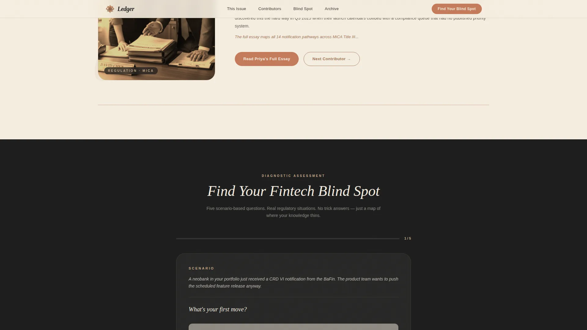
Creator Spotlight Sections
Three contributor profiles each open with a candid portrait, a one-line personal philosophy, and a mid-insight excerpt from their piece. The excerpt ends deliberately, pulling readers toward the full issue. A secondary call to action at the bottom of each spotlight leads to an email gate with the relevant issue pre-selected.
Five-Step Blind Spot Quiz
The primary call to action launches a five-question scenario diagnostic. Questions use real-world regulatory framing, such as a neobank receiving a CRD VI notification, so the quiz itself demonstrates editorial credibility. Upon completion, readers receive a personalized reading map of three back-issue articles matched to their weakest domain.
Email Gate with Role Selector
Both conversion paths, the quiz result and the contributor essay link, are gated behind a simple email capture form. Readers self-identify as operator, investor, regulator, or journalist. This role selector allows the journal to deliver a relevant, personalized reading map rather than a generic confirmation.
Back-Issue Archive Grid
Past issues are displayed in an asymmetric bento grid layout. The grid communicates volume and depth at a glance, reinforcing the journal's track record. Each cell can surface an issue number, headline topic, and contributor name.
Page sections overview
| Section | Purpose |
|---|---|
| Editorial Manifesto Hero | Opens the page with a full-viewport quote and duotone contributor byline |
| Anchor Navigation Hub | Central contents wheel linking all five page spokes |
| Contributor Spotlight One | Profiles the regulatory attorney covering MiCA's second-order effects |
| Contributor Spotlight Two | Profiles the data journalist behind the capital-flow diagrams |
| Contributor Spotlight Three | Profiles the former central banker writing the editorial |
| Blind Spot Quiz | Five-scenario diagnostic leading to a personalized reading map |
| Back-Issue Archive | Asymmetric bento grid of past issues with volume numbers |
| Page Footer | Minimal horizontal footer in Vercel-style layout |
Design & branding system
The visual identity follows a Warm Artisan theme. Every color choice refers to a physical, tactile object: kiln-fired clay, aged parchment, inkwell black. The result is a reading surface that feels earned rather than designed.
- Color palette: aged parchment (#F5EDE0) for backgrounds, inkwell black (#1E1E1E) for body text, kiln-fired clay (#A0785A) for section dividers and pull-quote borders, and muted terracotta (#C47B5A) reserved for buttons, active navigation markers, and hover states
- Typography: Fraunces serif for all display headings and pull quotes; DM Sans for body text and interface elements, giving editorial weight to titles while keeping body copy clean and readable
- Section dividers use clay rules to pace reading rhythm, while generous line-height on inkwell body text ensures long-form essays remain comfortable to read
Mobile & speed optimization
The template is designed desktop-first, reflecting the primary audience of compliance officers and analysts working at desks. Full mobile support is built in so the page remains readable and functional on any screen.
- Static page sections use server-side rendering patterns; interactive components such as the quiz and email gate modal are client-side only, keeping the initial page load lean
- Scroll-reveal animations and stagger transitions are set to medium intensity, ensuring motion enhances rather than distracts from the editorial content
- The anchor navigation adapts for smaller screens, keeping the hub-and-spoke structure navigable without losing the contents-wheel metaphor
How this template helps you convert
The page runs two parallel conversion paths that feel editorially native rather than promotional. Neither path asks for a commitment before delivering value.
- The blind-spot quiz earns the email address by first giving the reader a personalized result. The diagnostic itself acts as a content sample, demonstrating the journal's analytical depth before any gate appears.
- The contributor spotlight email gate pre-selects the relevant issue, reducing friction. Readers who reach the end of a spotlight excerpt are already engaged with a specific contributor's argument, making the ask feel like a natural next step rather than an interruption.
Other information about this template
This template is category-matched to Blog and Editorial, specifically the fintech newsletter and fintech monthly deep-dive niche. It was built under a Hub and Spoke anchor navigation structure with a Quiz and Assessment primary conversion direction.
- The header concept is classified as Quote and Manifesto, meaning the hero is designed around a single authoritative statement rather than a product screenshot or feature list
- The creative direction is Creator Spotlight, so the template structure prioritizes individual contributor identity as a trust signal over brand-level messaging
- The Warm Artisan theme and Warm Stone color system are designed to differentiate this journal visually from the blue-and-white SaaS aesthetic common in fintech marketing
- The intersection match score for this template's category, subcategory, and niche combination is 13, indicating a tightly aligned editorial fit across all three levels


Theme
Warm Artisan
Creative direction
Creator Spotlight
Color system
Warm Stone
Style
Hub & Spoke (Anchor Nav)
Direction
Quiz/Assessment
Page Sections
Full-viewport Manifesto Header
Hub-and-spoke Anchor Navigation
Creator Spotlight Sections
Five-step Blind Spot Quiz
Role-segmented Email Gate
Back-issue Archive Grid
Related questions
Who is the primary reader this landing page targets?
Can I customize the contributor profiles for my own journal team?
How does the blind-spot quiz conversion path work?
Does the back-issue archive section grow with my publication?
What makes this different from a standard newsletter sign-up page?


