Insurance News Landing Page Template | Masonry Editorial
Ledger is a warm, editorial insurance news landing page template built for independent agents who need industry clarity fast. Its masonry card grid organizes breaking regulatory news, opinion columns, and market data by urgency and weight. A floating Coverage IQ quiz and a footer email bar work together to turn casual readers into loyal, subscribed followers.
by Rocket studio
Quick summary
Ledger is a single-page insurance news landing page template designed for independent property and casualty agents, agency owners, and customer service representatives. It pairs a full-bleed editorial hero with a masonry article grid, a five-question Coverage IQ assessment, and a minimal email subscribe bar to turn passing visitors into regular readers.
Who this template is for
This template is built for people who live inside the insurance industry and need reliable, readable news without the noise. Whether you are running a solo agency or managing a growing book, Ledger speaks directly to your daily rhythm.
- Solo property and casualty producers who scan headlines between client appointments
- Agency owners tracking carrier mergers, acquisitions, and market appetite shifts
- Young customer service representatives building industry knowledge outside of exam prep textbooks
What problem this template solves
Most insurance news feels written for compliance officers, not working agents. Dense policy language, buried leads, and cluttered layouts make it hard to extract what actually matters before the next client call. Ledger solves that friction directly.
- Converts dense regulatory and carrier content into readable, skimmable editorial stories
- Organizes news by urgency so agents triage breaking news first and read long analysis later
- Replaces generic newsletter sign-up flows with a personalized quiz that calibrates content to each reader's actual knowledge gaps
What you get with this template
Ledger delivers a complete, single-page editorial layout that feels like a curated newsroom rather than a generic blog theme. Every section has a defined role and a clear visual weight.
- A full-bleed parallax hero section with an editorial headline and floating article cards
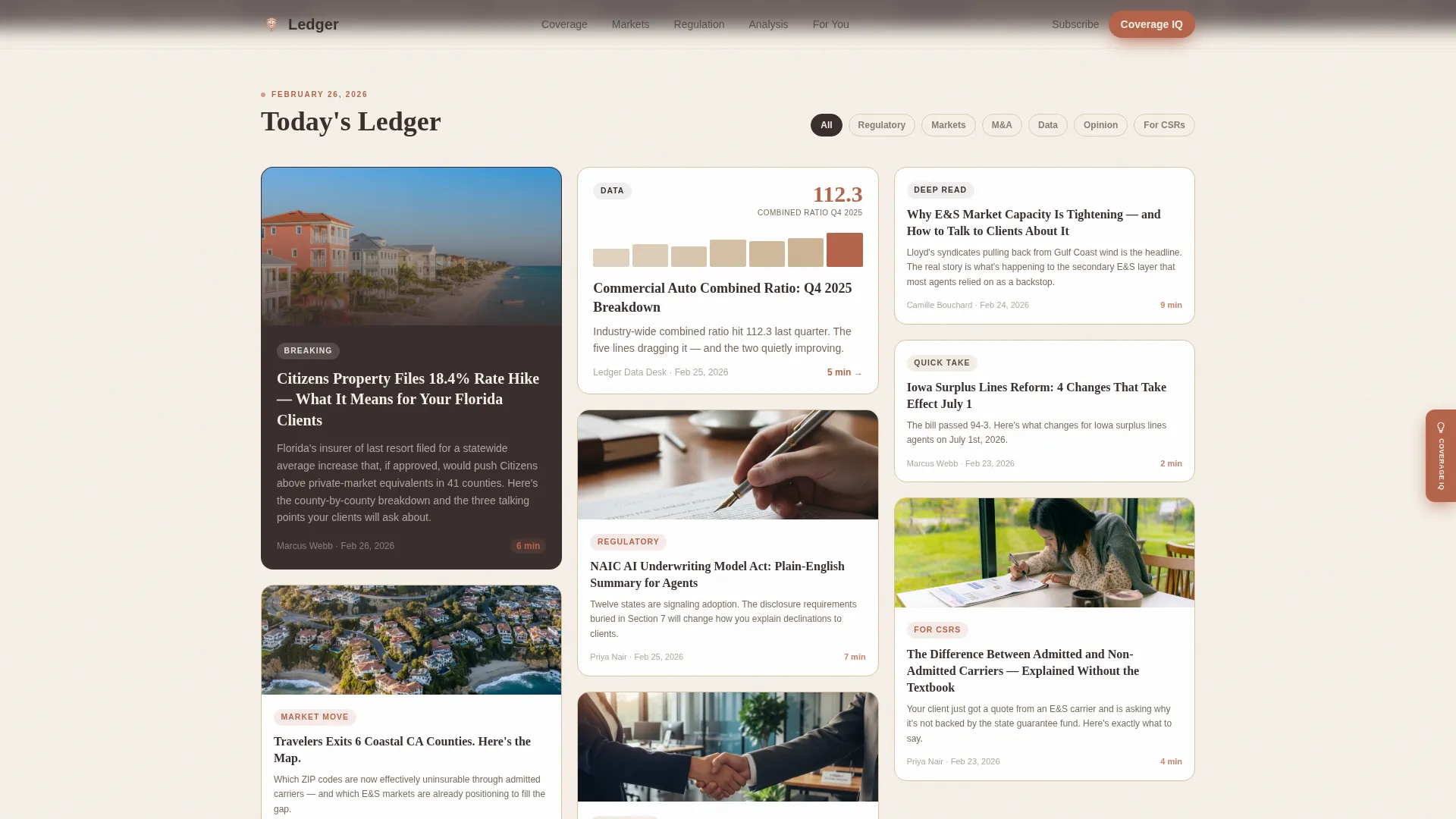
- A masonry article grid with varied tile heights for breaking news, opinion columns, and data pieces
- A floating Coverage IQ quiz tab, a testimonial scroll strip, an asymmetric audience profile section, and a footer email subscribe bar
Feature list
This template is built around five core capabilities that serve both the editorial experience and the conversion goal.
Masonry Article Grid with Story-Weighted Tiles
The masonry grid assigns visual weight by story type. Regulatory breaking news earns tall, dominant tiles. Opinion columns use slim, quote-forward cards. Market data pieces take wide panels. The staggered reveal animation reinforces the editorial hierarchy as visitors scroll.
Floating Coverage IQ Quiz Tab
A terracotta-colored floating tab appears on the right edge after the first scroll. It opens a five-question modal asking about coverage line specialty, years licensed, news consumption habits, biggest knowledge gap, and email address. Results serve a personalized reading list and a weekly digest calibrated to that reader's gaps.
Full-Bleed Parallax Hero
The hero section uses an overhead, warm-toned desk photograph as a full-width background. Natural window light, open trade journals, reading glasses, a markup-covered policy document, and a coffee mug compose a lived-in editorial scene. A walnut-brown headline fades in over the image on load.
Asymmetric Audience Profile Section
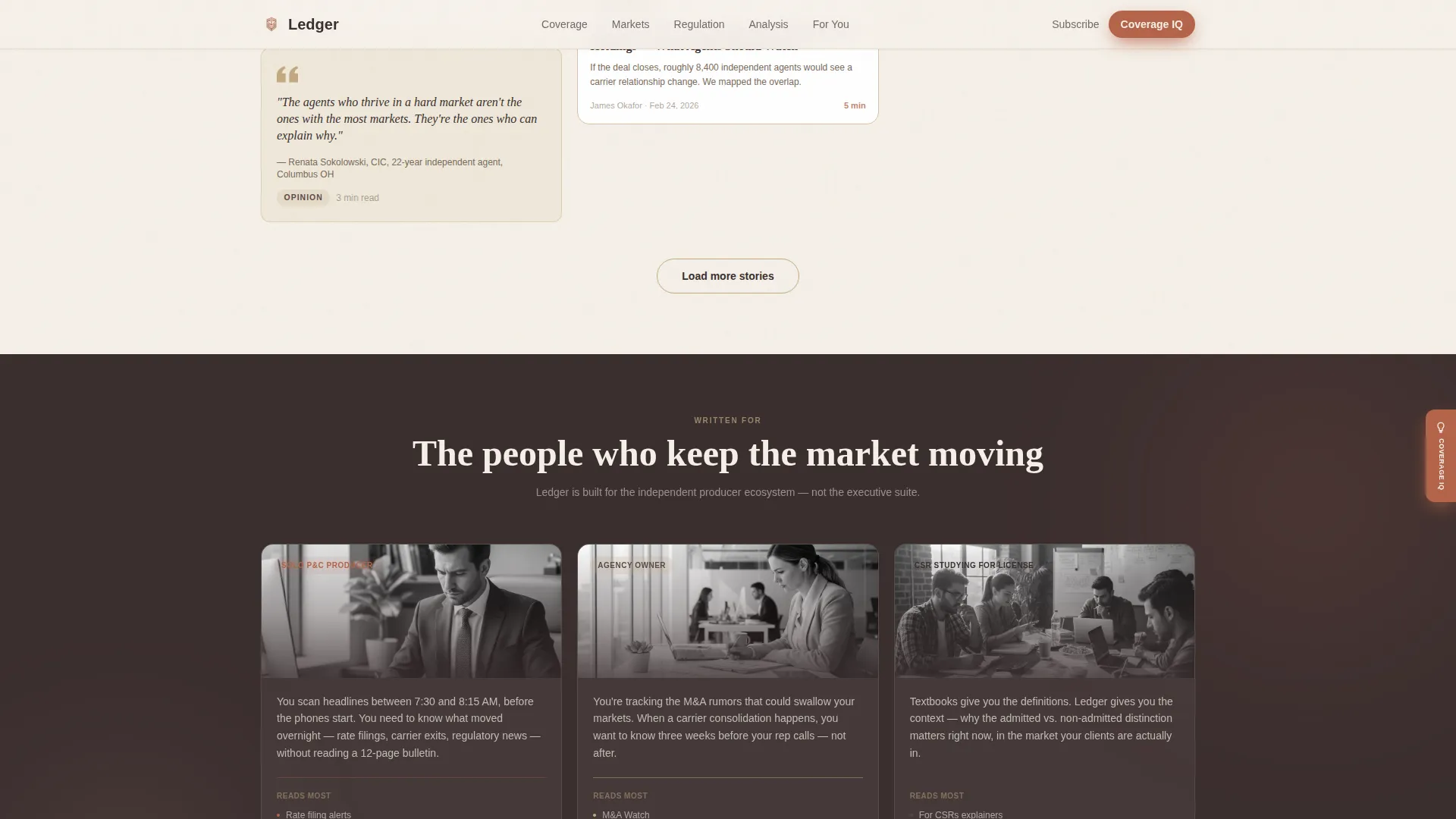
Three panels in an asymmetric layout each address one reader type directly: the solo producer, the agency owner, and the studying customer service representative. The copy in each panel speaks to that person's specific daily pressure rather than generic agent language.
Footer Email Subscribe Bar
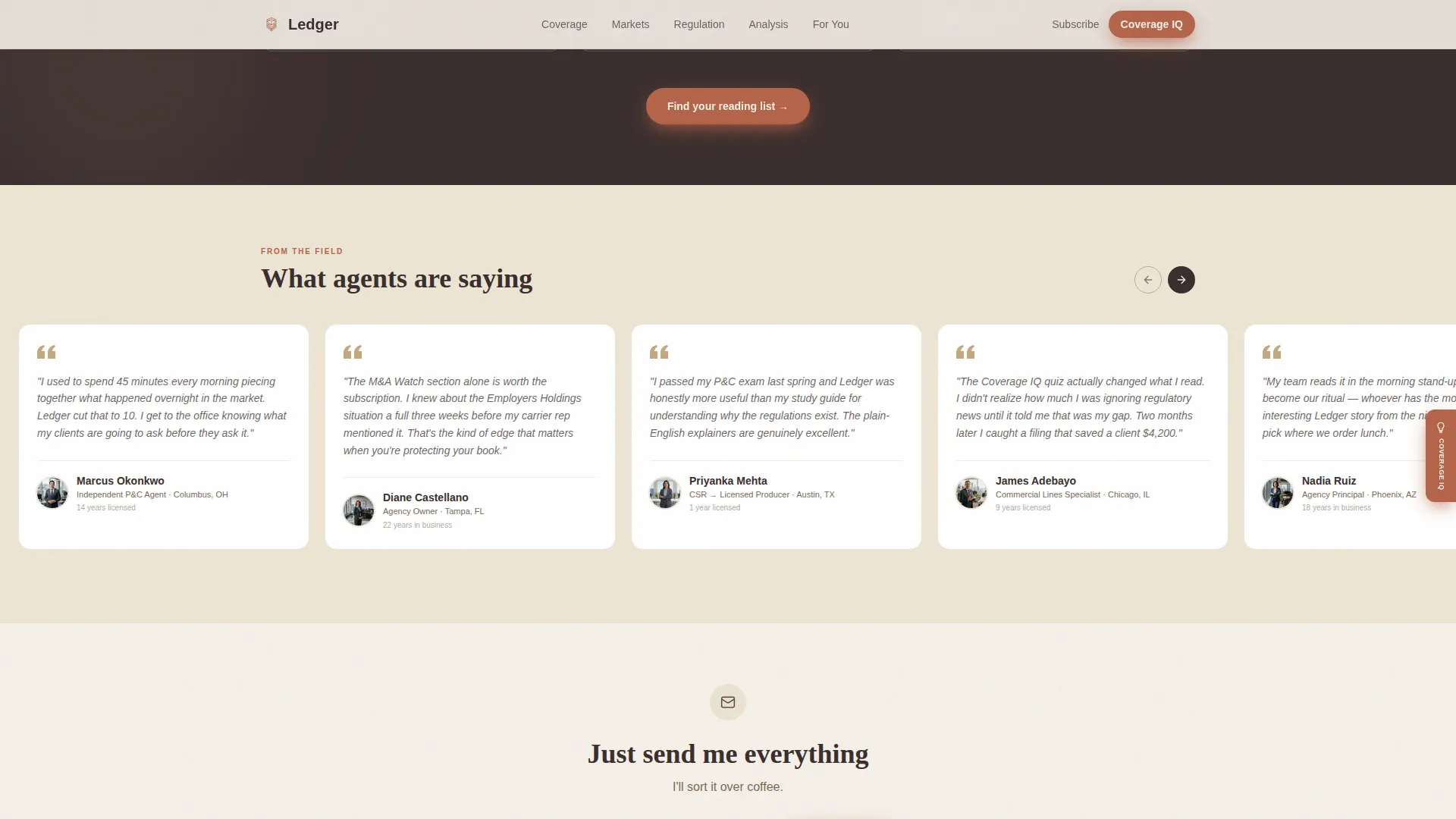
A minimal single-field email bar anchors the page footer. The prompt reads "Just send me everything, I'll sort it over coffee," matching the editorial tone without asking for more than an email address. It serves visitors who want a simpler path than the quiz.
Horizontal Testimonial Scroll
Agent quotes appear in a horizontally scrolling strip. Each testimonial card includes the agent's role and state, grounding social proof in recognizable professional context for other working agents.
Page sections overview
| Section | Purpose |
|---|---|
| Full-Bleed Hero | Establishes editorial tone and surfaces the primary headline |
| Floating Article Cards | Previews live content inside the hero to reduce bounce |
| Masonry Article Grid | Organizes stories by urgency, type, and reading depth |
| Audience Profile Panels | Confirms relevance for each of the three reader types |
| Coverage IQ Teaser | Drives quiz engagement with a terracotta call-to-action surface |
| Testimonial Scroll Strip | Builds trust through agent-specific social proof |
| Footer Subscribe Bar | Captures email from visitors who prefer a direct sign-up |
Design & branding system
The visual identity follows a Warm Artisan editorial direction built around a four-color Warm Stone system. Every color has an assigned role, and that discipline is what makes the palette feel intentional rather than decorative.
- Parchment cream (#F5F0E8) covers the page background; walnut brown (#3B2F2F) anchors all headlines and body text; sandstone (#C4A882) tints card borders and section dividers
- Terracotta (#B5654A) appears only on tags, hover states, and call-to-action surfaces so every flash of it earns attention
- Fraunces serif handles display headlines for editorial authority; DM Sans handles body copy and interface labels for clean readability
Mobile & speed optimization
The template is designed desktop-first to match how agents typically scan news between appointments on a laptop. It includes a strong mobile fallback so the reading experience holds on smaller screens.
- The article grid adapts from a multi-column masonry layout to a single-column stacked feed on mobile without losing story hierarchy
- The floating quiz tab and footer subscribe bar remain accessible and functional across screen sizes
- Server-side rendering powers the article grid for faster initial load; the quiz modal runs as a client component to keep interactivity smooth
How this template helps you convert
Ledger supports two distinct conversion paths so visitors can choose the level of commitment that suits them in the moment.
- The Coverage IQ floating tab captures high-intent visitors by offering a personalized reading list in exchange for five quick answers and an email address, producing a subscriber who already knows their content is relevant to them.
- The footer email bar catches visitors who are ready to subscribe without going through an assessment, reducing friction for readers who already trust the publication.
Other information about this template
Ledger is built for the United States market with date formatting set to MM/DD/YYYY and currency references in USD where applicable. The animation profile is set to medium-high, covering masonry stagger reveals, floating card entrance effects, a parallax hero, and a horizontal scroll strip. The page type is a single landing page, not a multi-page site. Template customization involves swapping the hero photograph, updating article card content, editing quiz questions and results logic, and adjusting brand colors within the established palette roles.
- Typography pairing: Fraunces for serif editorial headlines, DM Sans for body and user interface text
- Animation scope: masonry stagger reveal, parallax hero scroll, floating card entrance, horizontal testimonial scroll
- Footer layout follows a horizontal flow pattern designed to keep the subscribe bar prominent without cluttering the closing section

Theme
Warm Artisan
Creative direction
Gallery Walk
Color system
Warm Stone
Style
Masonry/Pinterest
Direction
Quiz/Assessment
Page Sections
Story-weighted Masonry Article Grid
Floating Coverage IQ Quiz Tab
Full-bleed Parallax Hero Section
Asymmetric Audience Profile Panels
Horizontal Testimonial Scroll Strip
Footer Single-field Email Subscribe Bar
Related questions
Who is this landing page template designed for?
What is the Coverage IQ quiz and how does it work?
Can visitors subscribe without taking the quiz?
What article card formats does the masonry grid include?
Is this template suited for a desktop-first audience?



