Private Equity Newsletter Landing Page Template
Ledger is a private equity daily digest landing page template built on an asymmetric 60/40 grid. It uses a Heritage and Story editorial aesthetic drawn from a Japanese Zen color system to position a curated morning briefing for managing directors, LP relations teams, and independent sponsors. The page earns subscriber trust through editorial restraint, named social proof, and a sample edition lightbox before asking for a single email address.
by Rocket studio
Quick summary
Ledger is a single-page template designed for a private equity morning digest. It opens with a serif manifesto header, moves through an asymmetric editorial layout that builds trust section by section, and closes with a low-friction email capture. The design philosophy is disciplined restraint: washi cream backgrounds, sumi ink text, and aged-gold accent lines signal authority before a single word is read.
Who this template is for
This template is built for publishers, editorial teams, and independent media operators running a premium private equity newsletter. It speaks to founders and operators who need their landing page to project the same editorial credibility their content delivers each morning.
- Managing directors and general partners (GPs) who need a page that respects their time and intelligence
- LP relations teams looking to validate the digest before recommending it internally
- Independent sponsors hunting for co-investment opportunities and needing proof of content quality before subscribing
What problem this template solves
Private equity professionals receive too much noise and too little signal. A generic newsletter landing page with stock photography and bullet-point benefit lists will not convert a skeptical managing director. The page needs to demonstrate editorial taste before it asks for anything in return.
- Deal intelligence is scattered across group chats, tabs, and forwarded emails with no single trusted morning source
- Most newsletter landing pages lead with features rather than demonstrating the actual reading experience
- Skeptical, time-pressed readers need to verify quality before committing their inbox to another subscription
What you get with this template
You get a fully structured, single-page editorial landing page that earns subscriber trust through progressive disclosure. Each scroll fold reveals a new layer of proof without repeating an argument already made above it.
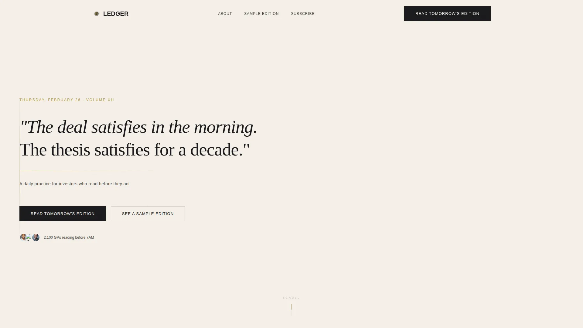
- A Quote/Manifesto hero section with a serif headline, aged-gold rule, and attribution line, followed immediately by the primary call to action
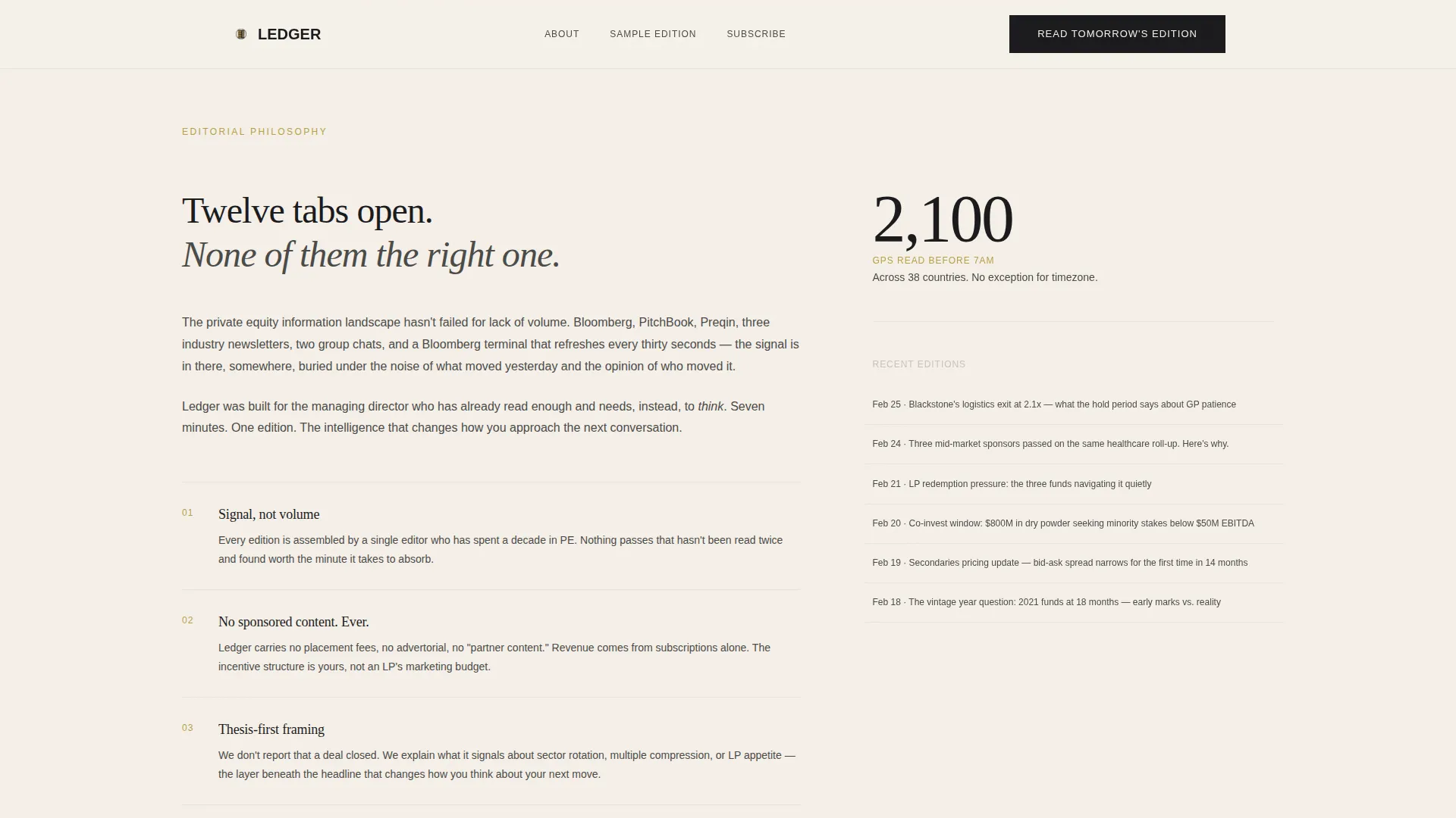
- A Vision and Mission narrative built into the 60-column side, paired with anchored pull statistics and a scrolling digest preview on the 40-column side
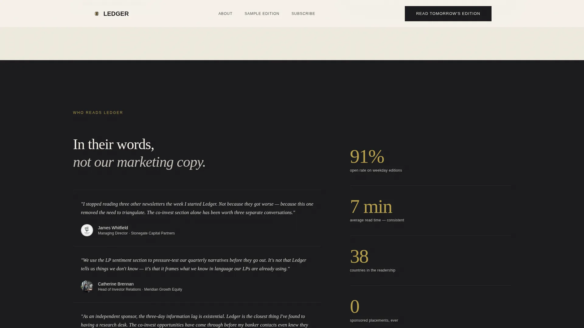
- Named PE professional testimonials, sample subject lines, an inline lightbox for a full past issue, and a minimal email capture modal routing to a single-field subscription page
Feature list
This template is built around the brief in every detail. The components below are present by design, not suggestion.
Asymmetric 60/40 Editorial Grid
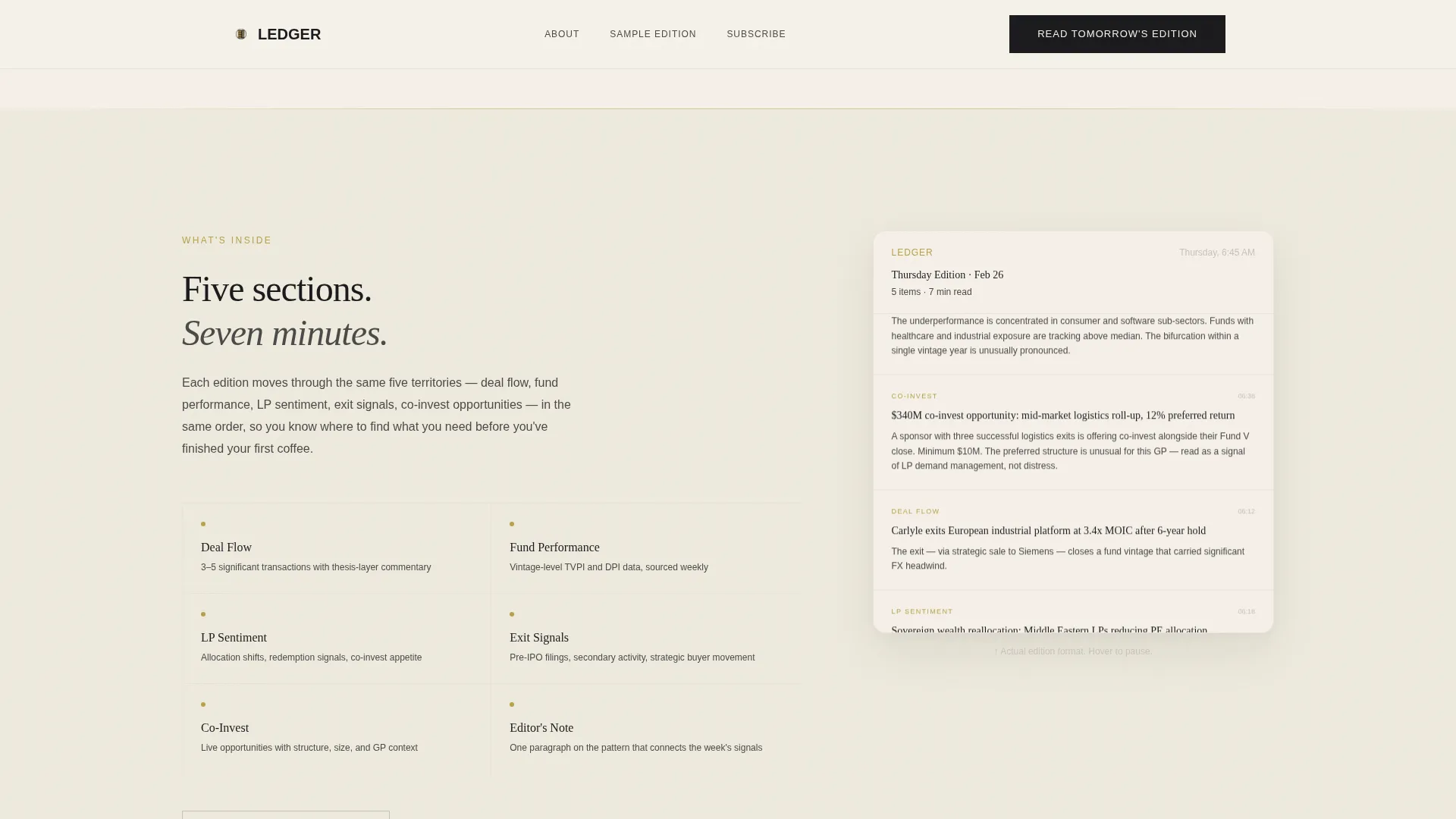
The page layout divides each scroll fold into a 60-column narrative column and a 40-column anchor column. The wide column carries the editorial story. The narrow column holds pull statistics, sample subject lines, and a scrolling digest preview that moves at half speed, letting visitors absorb the format without clicking away.
Quote/Manifesto Hero Section
The header opens with a massive serif quote set in generous leading against a washi cream background. A thin aged-gold rule runs beneath the text. A single attribution line follows. There is no image and no animation. The negative space around the words performs the role of authority.
Inline Lightbox Sample Edition
A secondary call-to-action labeled "See a Sample Edition" opens a full past issue inside an inline lightbox. Skeptical readers can verify editorial quality before committing. This path converts skeptics who are not yet ready to subscribe but want proof of what they will receive.
Scrolling Digest Preview
The 40-column anchor side includes a scroll-linked digest preview that moves at half the page scroll speed. Visitors can read actual edition content without navigating away. The component keeps readers engaged and demonstrates the format in context.
Named Social Proof Section
The "Who Reads It" section uses named PE professionals with titles, firm names, and specific quotes written in their own cadence rather than polished marketing copy. The supporting statistic anchors the proof with a concrete reader count delivered before a specific hour each morning.
Minimal Email Capture Modal
The primary call to action routes to a simple email capture page with one input field. Supporting subtext removes friction by stating that no payment card and no free trial period are required. The modal keeps the subscription path direct and uncluttered.
Page sections overview
| Section | Purpose |
|---|---|
| Hero Manifesto | Opens with the serif quote, gold rule, attribution, and primary call to action |
| Why Ledger | 60/40 asymmetric split carrying editorial philosophy and anchored pull statistics |
| What's Inside | Content scope display with sample subject lines from recent digest editions |
| Who Reads It | Named PE testimonials with titles and the social proof statistic |
| Sample Edition | Inline lightbox trigger and scrolling digest preview component |
| Footer | Minimal horizontal flow footer closing the page |
Design & branding system
The visual identity follows a Heritage and Story theme built on a Japanese Zen color system. Every color choice is deliberate. The palette creates the feeling of a leather editorial folio opened in a quiet room, where the design itself signals discipline before the content speaks.
- Washi paper cream (#F5F0E8) serves as the page base, sumi ink black (#1A1A1D) carries all body text, and stone garden gray (#4A4A48) handles secondary type and dividers
- Aged gold (#B8A04A) is reserved strictly for accent lines, pull quote rules, and hover states, keeping its visual weight high by using it sparingly
- Typography pairs Fraunces serif for all display headlines with DM Sans for body text and user interface elements, creating a clear hierarchy between editorial voice and functional copy
Mobile & speed optimization
The template is built desktop-first, reflecting the primary audience of managing directors scanning between calls on a desktop or tablet. Responsive behavior is included so the page remains readable and functional on smaller screens.
- Reveal-on-scroll animations are low to medium weight, keeping visual interest without creating layout jank on slower connections
- Server Components handle static sections to minimize the JavaScript footprint, with minimal scripting reserved for the scroll-linked preview and lightbox interactions
- The asymmetric grid reflows cleanly for tablet and mobile viewports, preserving the editorial hierarchy across screen sizes
How this template helps you convert
The page is structured as a Click-Through landing page. Every section deepens trust by one degree before the next call to action appears. Conversion happens because the page earns it, not because it demands it.
- The manifesto hero establishes editorial authority immediately. The primary call to action appears directly beneath it, catching readers who are already convinced before the first scroll.
- The scrolling digest preview and named testimonials remove doubt mid-page. A second pinned call to action in the 40-column gutter catches readers who needed the extra proof before deciding.
- The inline lightbox and single-field email capture eliminate the two most common friction points: uncertainty about content quality and fear of a complicated signup process.
Other information about this template
This template sits at the intersection of Blog and Editorial design and the Private Equity Newsletter niche. It is built for a specific kind of reader who treats their inbox with professional discipline and will not subscribe to anything that does not first demonstrate its own editorial standards.
- The template supports a B2B media and financial services publishing context, making it suitable for independent PE intelligence operators as well as established fund communications teams
- The Vision and Mission creative direction means every scroll fold advances the editorial argument rather than restating the same value proposition in different words
- The Japanese Zen color system was chosen specifically to avoid the aggressive color contrast common in fintech landing pages, signaling restraint and long-form editorial credibility instead
Theme
Heritage & Story
Creative direction
Vision & Mission
Color system
Japanese Zen
Style
Asymmetric Grid (60/40)
Direction
Click-Through
Page Sections
Asymmetric 60/40 Editorial Grid
Quote/manifesto Hero Section
Inline Lightbox Sample Edition
Scrolling Digest Preview
Named Social Proof Section
Minimal Email Capture Modal
Related questions
Who is this landing page template designed for?
What does the 60/40 asymmetric grid mean in practice?
How does the sample edition lightbox work?
Can I adjust the color palette and typography?
Is this template suitable for a desktop-first audience?



