Personal Finance Newsletter Landing Page Template
Ledger is a masonry-style landing page template built for a personal finance interview and profile newsletter. It features an editorial broadsheet masthead, a staggered interview card grid, an inline five-question money archetype quiz, and a mission statement section. The design follows a Luxe Minimal aesthetic with warm neutrals, ink-dark type, and gold used only as a precise accent.
by Rocket studio
Quick summary
Ledger is a single-page newsletter landing page template designed for personal finance storytelling. It pairs a newspaper-style masthead with a masonry interview grid, an inline archetype quiz, and a reader testimonials section. The visual identity is calm, editorial, and deliberate, built to earn trust through restraint rather than noise.
Who this template is for
This template is built for newsletter creators who treat personal finance as a narrative subject, not a listicle format. If you publish interviews, profiles, or decision-based money stories, this page gives your work the presentation it deserves.
- Independent newsletter writers covering personal finance interviews and real money decisions
- Founders, financial educators, or journalists launching a paid or free subscription publication
- Creators targeting mid-career professionals who are financially competent but looking for strategic clarity
What problem this template solves
Most newsletter landing pages look like every other signup form on the internet. They describe a topic without conveying a voice, and they ask for an email before giving any reason to care. For a publication built on real stories and specific decisions, that generic presentation is a credibility gap.
- Visitors can't quickly feel the editorial quality or tone of the newsletter from a standard template
- There is no clear path for skeptical readers who want proof before committing to a subscription
- The newsletter's core value, real human financial stories, stays invisible behind a generic hero section
What you get with this template
This template gives you a complete, section-led landing page that communicates editorial depth from the first scroll. Every section has a specific conversion role, and the layout is designed to move readers forward without pressure.
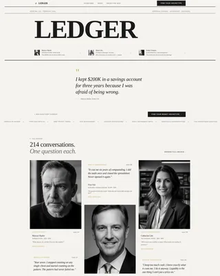
- A broadsheet masthead hero with oversized LEDGER typography, a table-of-contents portrait row, and a single pull quote from the latest interview
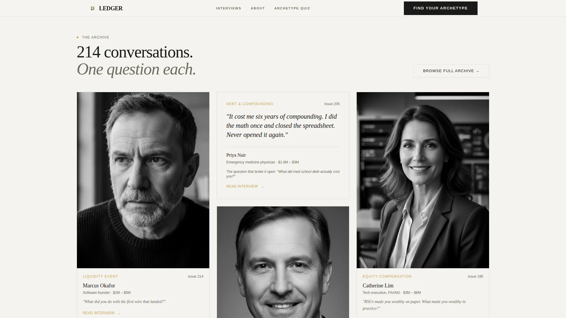
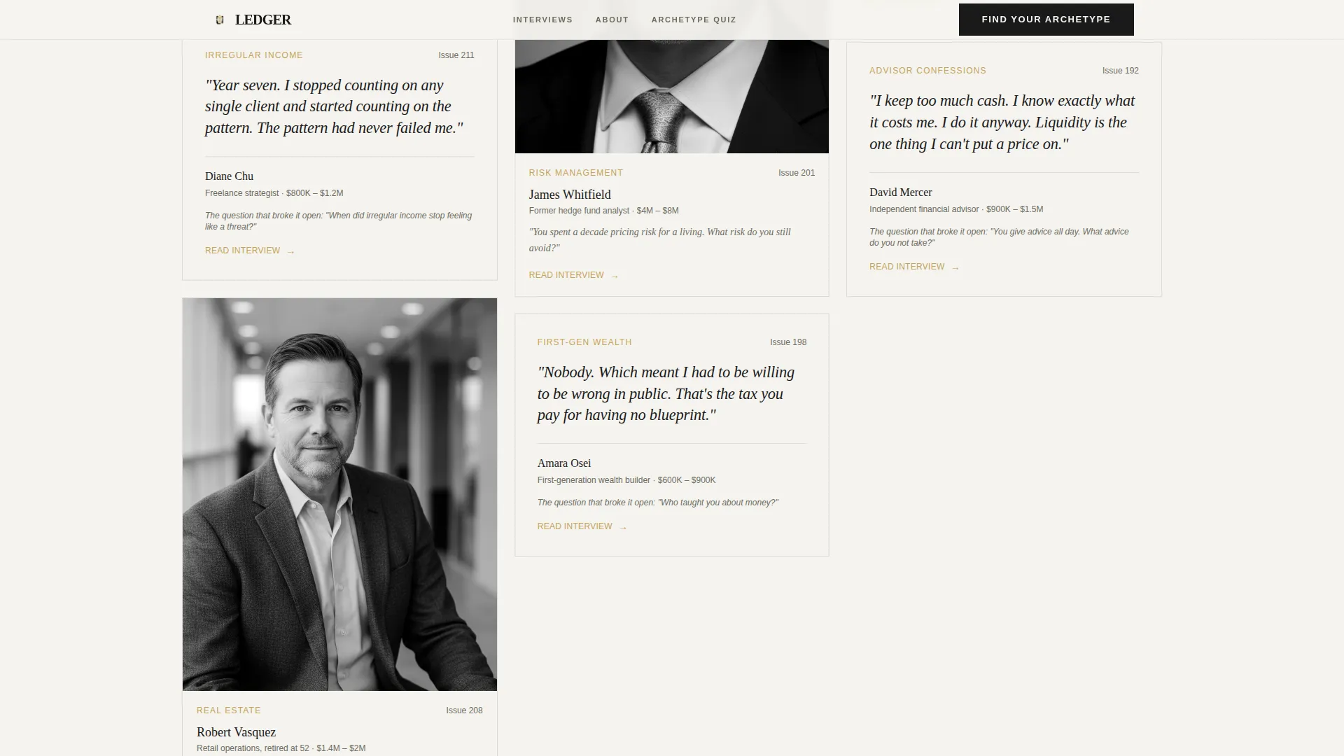
- A staggered masonry grid of interview cards showing subject names, net worth ranges, and the breakthrough question from each conversation
- An inline five-question money archetype quiz that identifies the reader's financial personality and delivers matched interview profiles via email
Feature list
This template is built around a small number of high-intention components. Each one is designed to do a specific job inside the reader's scroll journey.
Editorial Broadsheet Masthead
The hero section presents "LEDGER" at editorial scale using a high-contrast serif typeface. A dateline shows the current issue number, and three interview subject names appear as a table-of-contents row with desaturated black-and-white portrait thumbnails. Below the fold line, a single oversized italic pull quote anchors the opening without any hero image. Typography functions as the visual.
Staggered Masonry Interview Grid
Interview cards are arranged in a masonry layout at varying heights, styled like pinned magazine clippings. Each card displays the subject's name, their net worth range, and the one question that shifted the conversation. Some cards feature a stark portrait; others present a typographic excerpt. The layout communicates depth and volume at a glance.
Inline Money Archetype Quiz
A five-question diagnostic sits inline on the page. Questions appear one at a time against a full-screen stone white background with minimal interface elements. The quiz identifies the reader as one of four financial personalities: The Architect, The Improviser, The Sentinel, or The Compounder. Results and three matched interview profiles are delivered by email, converting quiz-takers into subscribers.
Mission Statement Section
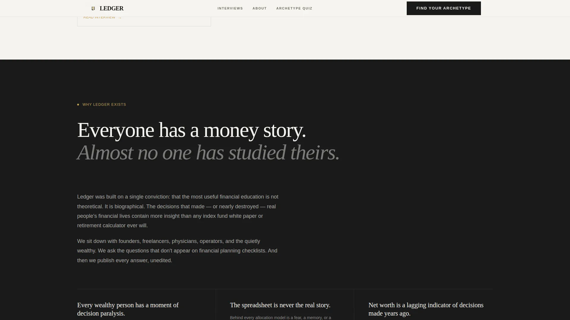
After the interview grid, a dedicated section explains why these stories are collected. It surfaces patterns observed across hundreds of interviews and shares what readers report changing after six months of reading. This section earns trust for visitors who want editorial intent before subscribing.
Reader Testimonials Section
Social proof is presented as specific reader outcome quotes rather than generic praise. A subscriber count and an interview count give the publication visible scale. This section addresses the "is this worth my time" question directly and concisely.
Dual Conversion Paths
The primary call to action leads visitors into the archetype quiz. A secondary path offers direct access to the current week's interview for readers who want to evaluate content before participating. Both paths lead toward subscription, but neither forces the same sequence.
Page sections overview
| Section | Purpose |
|---|---|
| Editorial Masthead Hero | Establishes publication voice and anchors the opening pull quote |
| Masonry Interview Grid | Shows editorial depth through staggered interview card previews |
| Mission Statement | Explains the publication's thesis and observed reader patterns |
| Money Archetype Quiz | Converts visitors into subscribers through a five-step diagnostic |
| Reader Testimonials | Builds trust with specific outcome quotes and publication scale |
| Linear Footer | Closes the page with a clean single-row navigation and legal row |
Design & branding system
The visual language is Luxe Minimal with a Japanese Zen color palette. Every design decision prioritizes breathing room and typographic authority over decoration. The result feels less like a marketing page and more like an editorial object.
- Color palette: stone white (#F5F3EF) as the dominant background, sumi ink (#1A1A1A) for all type, bamboo ash (#6B6B5E) for secondary text and card borders, and gold leaf (#C4A35A) reserved exclusively for interactive elements and pull-quote marks
- Typography: Fraunces (a high-contrast serif) handles all editorial headings; DM Sans handles body text and interface copy
- Portrait photography appears in desaturated black-and-white throughout the interview grid and masthead, keeping the palette undisturbed
Mobile & speed optimization
The template is built desktop-first to honor the editorial reading experience. Mobile responsiveness is included as a structured fallback that preserves the layout hierarchy without compromising the masonry grid or quiz flow.
- The masonry grid collapses to a single-column card stack on smaller screens while maintaining card-level formatting
- Quiz transitions and staggered scroll reveals are included at a medium animation intensity, keeping the experience fluid without sacrificing load performance
- Static-first architecture is applied to all non-quiz content using server components, keeping the page lightweight for the majority of visitors
How this template helps you convert
This landing page is structured to move readers toward subscription through two distinct paths, both backed by editorial credibility rather than urgency tactics.
- The archetype quiz engages visitors actively by asking decision-based questions rather than collecting an email upfront. The result delivery creates a natural and high-value reason to subscribe.
- The secondary "Read This Week's Interview" path gives skeptical visitors direct proof of content quality before asking for any commitment, reducing friction for readers who need to see before they sign up.
Other information about this template
This template is suited for newsletter creators working in the personal finance media space who want a publication-grade presentation from day one. It is particularly well-matched to editorial formats that prioritize depth, voice, and specific storytelling over generic financial advice.
- The template uses Fraunces and DM Sans, both available as open-license web fonts, making the typographic system accessible for independent publishers
- The footer follows a Pattern 1 linear single-row layout, keeping the bottom of the page clean and uncluttered
- The quiz component supports four named result types: The Architect, The Improviser, The Sentinel, and The Compounder
- The page is localized for a United States audience using USD formatting and MM/DD/YYYY date display
- Animation intensity is set at medium, with staggered scroll reveals, quiz step transitions, and parallax text layers included by default
Theme
Luxe Minimal
Creative direction
Vision & Mission
Color system
Japanese Zen
Style
Masonry/Pinterest
Direction
Quiz/Assessment
Page Sections
Editorial Broadsheet Masthead Hero
Staggered Masonry Interview Grid
Inline Money Archetype Quiz
Mission Statement Section
Reader Testimonials with Social Proof
Dual Subscription Conversion Paths
Related questions
Do I need to write my own interview content to use this template?
How does the money archetype quiz convert visitors into subscribers?
Is this template suitable for a newsletter that is just launching?
Can the four archetype names be customized?
Does this template support both free and paid newsletter models?



