Editorial Finance Newsletter Landing Page Template
Ledger is an editorial finance landing page template built for personal finance newsletter creators. It uses an asymmetric 60/40 grid, a Japanese Zen color palette, and a Day-in-the-Life narrative structure to guide visitors through a reader's financial week. The page drives click-through conversions to an external subscribe page with no on-page email form.
by Rocket studio
Quick summary
Ledger is a single-page editorial template for personal finance newsletter writers. It pairs a Chapter/Book header concept with a scroll-driven Day-in-the-Life narrative, moving visitors through Monday to Sunday as a financial story. Three full-length excerpt blocks prove the writing before visitors click through to subscribe.
Who this template is for
This template is built for independent writers and newsletter creators who publish personal finance content for real people living on real incomes. If your writing is honest, specific, and a little opinionated, this layout was designed for your voice.
- Personal finance newsletter writers targeting thirty-something renters and dual-income households
- Freelancers who write about money in plain, readable language for chaotic-finances readers
- Independent publishers sending weekly issues through platforms like Substack or Buttondown
What problem this template solves
Most newsletter landing pages look like software products. They list features, stack testimonials, and bury the actual writing. For an editorial newsletter, the writing itself is the product. This template solves the mismatch between what you sell and how you sell it.
- Visitors leave before reading because the page looks generic and untrustworthy
- The writing quality stays hidden behind a sign-up form, so readers never get proof before committing
- The page tone contradicts the newsletter tone, creating friction before the first click
What you get with this template
You get a complete, single-page landing page that feels like an editorial broadsheet. Every section is structured to show your writing, build recognition, and send visitors to your subscribe page with confidence.
- An asymmetric 60/40 grid layout with a Chapter/Book hero, a woodblock-style risograph illustration slot, and three excerpt blocks
- A Day-in-the-Life narrative structure covering Monday through Sunday, with alternating grid columns carrying the story and financial data
- Three strategically placed click-through call-to-action buttons with vermillion contrast and per-button issue teasers
Feature list
This section covers the core built-in capabilities that make Ledger work as a conversion-focused editorial landing page.
Asymmetric 60/40 Grid Layout
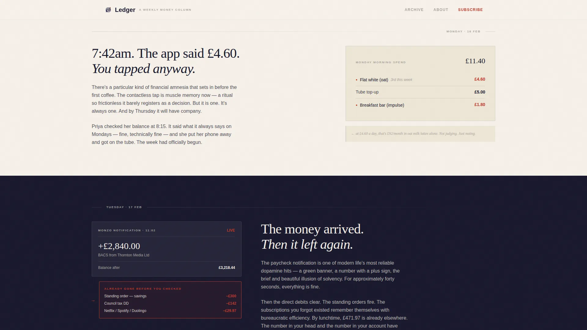
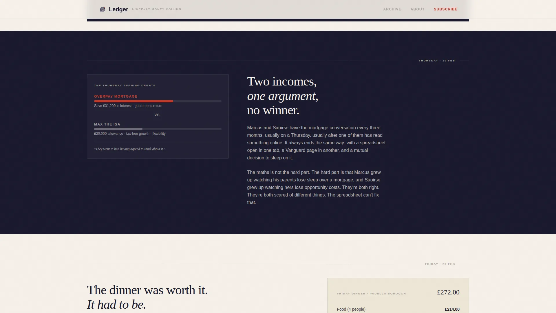
The 60-column carries long-form narrative content on warm washi cream. The 40-column holds ink-dark negative space, floating marginalia, and annotated data panels. The columns alternate which side carries the story as readers scroll through each day of the week.
Chapter/Book Hero Section
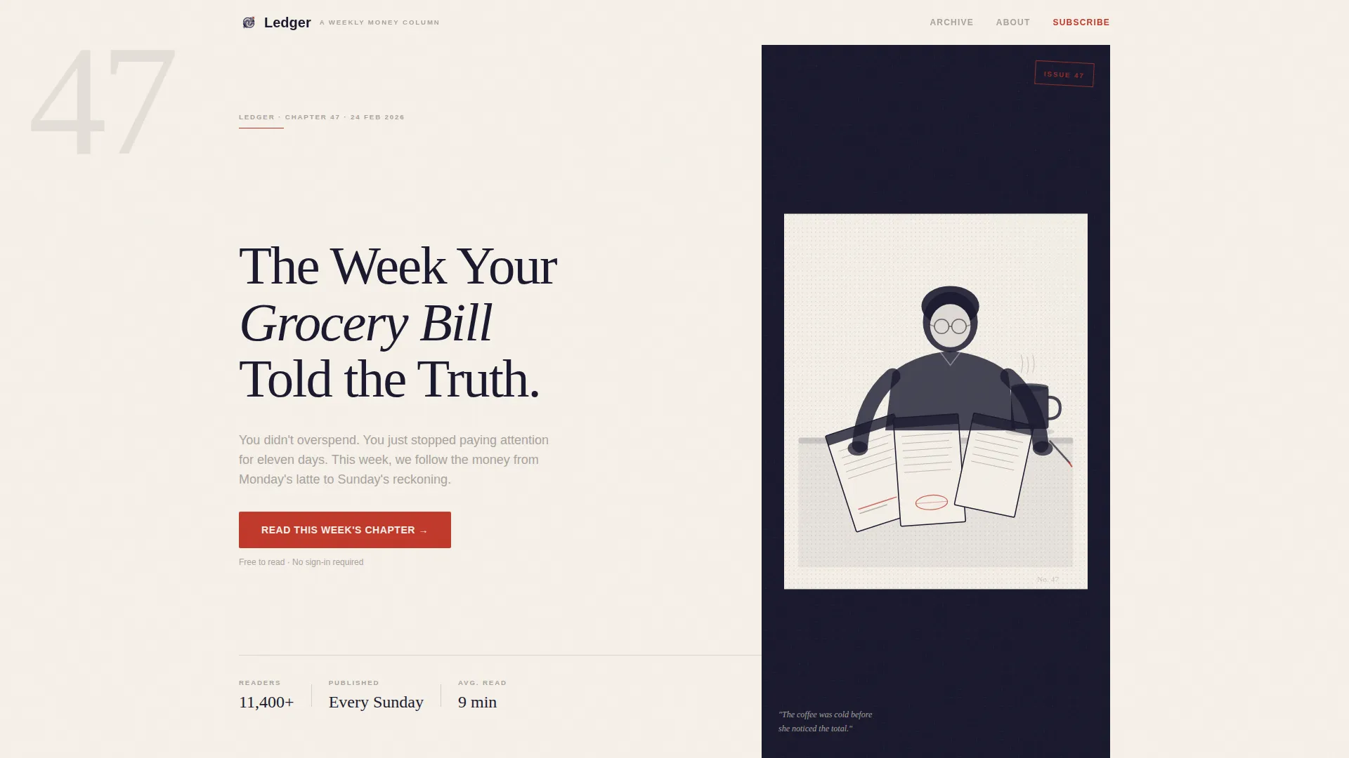
The header opens as a book-spread composition. The left 60% displays an oversized chapter number in thin serif type above an editorial headline. The right 40% holds a single risograph-textured, two-color woodblock-style illustration. There is no photography in this section.
Day-in-the-Life Scroll Narrative
Seven scroll sections walk visitors through a single reader's financial week, from Monday morning coffee to Sunday's budget audit. Each section combines narrative copy, a real expense breakdown, and a handwritten margin note. The pacing accelerates as the week moves forward.
Three Click-Through Call-to-Action Placements
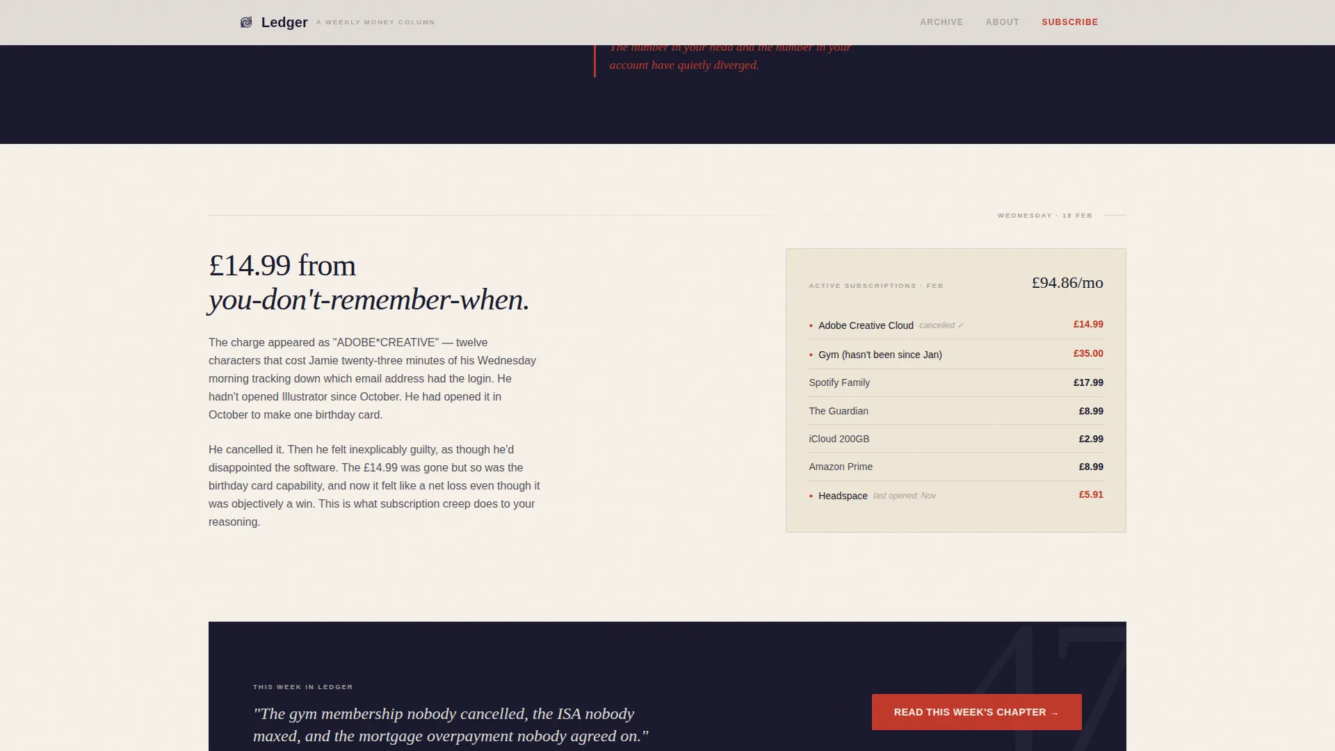
The primary call to action, "Read This Week's Chapter," appears beneath the hero, after Wednesday's section, and again at Sunday's close. Each instance carries a one-line teaser from the latest issue. There is no email capture form on the page.
Three Full-Length Excerpt Blocks
Three writing sample blocks let visitors read actual newsletter content before they decide to subscribe. This positions the writing quality as the primary trust signal, removing the need for conventional testimonials or star ratings.
Scroll-Linked Animation and Day Progress Indicator
Scroll-linked reveals, staggered entry animations, ink-draw SVG effects, and a day progress indicator give the page a deliberate, editorial rhythm. Subtle parallax adds depth to the ink-dark panels without distracting from the content.
Page sections overview
| Section | Purpose |
|---|---|
| Chapter Hero Spread | Opens the page as a book chapter with editorial headline and risograph illustration |
| Monday Morning Panel | Begins the Day-in-the-Life narrative with a morning expense moment |
| Tuesday/Wednesday Alternating Grid | Continues the financial week story with alternating 60/40 column rhythm |
| Mid-Week call to action Panel | Vermillion click-through button with a mid-issue teaser line |
| Thursday Accelerator Section | Tightens narrative pacing as the week's financial decisions stack up |
| Sunday Audit Close | Brings the week to a close with a budget review and recognition moment |
| Excerpt Blocks | Three full-length writing samples showing newsletter voice and depth |
| Page Footer | Horizontal flow footer pattern with supporting navigation |
Design & branding system
The visual identity follows a Japanese Zen editorial system. Every color, type choice, and spacing decision is intentional and restrained, designed to feel like a freshly printed broadsheet on a quiet morning.
- Color palette: deep sumi ink (#1A1A2E) for backgrounds and panels, warm washi cream (#F5F0E8) for content columns, stone garden gray (#A8A29E) for secondary text and marginalia, and torii vermillion (#C1392B) reserved exclusively for call-to-action buttons and pull quotes
- Typography: DM Serif Display for editorial headlines and chapter numbers, Manrope for body copy and annotated notes
- Illustration style: risograph-textured, two-color woodblock compositions with no photography, giving every visual element an intimate, hand-printed quality
Mobile & speed optimization
The template is designed desktop-first to protect the editorial magazine feel. The asymmetric grid and scroll narrative are optimized for wide-screen reading. Responsive adjustments ensure the layout remains clear and readable on smaller screens.
- Server components handle static sections to keep JavaScript usage minimal across the page
- Scroll-linked animations and parallax effects are scoped to avoid unnecessary repaints on lower-powered devices
- The 60/40 grid reflows cleanly for mobile viewports, keeping narrative and data panels legible without breaking the day-by-day story structure
How this template helps you convert
This template converts by earning trust through writing quality, not by pressuring visitors with forms or countdown timers. The entire page structure is built around a single click-through goal.
- Three full excerpt blocks let visitors read real newsletter content before committing, making the subscribe click feel like a natural next step rather than a blind leap of faith.
- Vermillion call-to-action buttons placed on ink-dark panels create strong visual contrast at three key scroll moments, each reinforced with a specific issue teaser line that makes clicking feel timely.
- The Day-in-the-Life narrative mirrors the reader's own financial week, building personal recognition and emotional alignment before the final Sunday call-to-action moment closes the story.
Other information about this template
This template is well-suited for newsletter creators publishing on platforms that use a separate subscribe page, since the click-through structure sends visitors offsite rather than capturing email addresses directly. The page supports both UK-leaning and US English content with GBP and USD references handled naturally in the copy slots.
- The footer uses a horizontal flow pattern consistent with Vercel-style layout conventions for clean, minimal navigation
- The template style is categorized under Blog and Editorial with a Personal Finance Newsletter subcategory, making it a strong fit for finance-focused creative writers
- Animation intensity is set to medium with scroll-linked reveals and stagger effects, giving editors control over pacing without requiring custom code
Theme
Editorial Magazine
Creative direction
Day-in-the-Life
Color system
Japanese Zen
Style
Asymmetric Grid (60/40)
Direction
Click-Through
Page Sections
Asymmetric 60/40 Editorial Grid
Chapter/book Hero with Risograph Illustration
Day-in-the-life Scroll Narrative
Three Strategic Click-through Ctas
Full-length Writing Excerpt Blocks
Scroll-linked Animation System
Related questions
Does this template include an email sign-up form?
Can I use my own writing in the excerpt blocks?
What illustration style does the template use?
Is this template suitable for a UK-based personal finance newsletter?
How many times does the call-to-action button appear on the page?



