Heritage Fintech Newsletter Landing Page Template
Ledger is a single-column landing page template built for fintech curated newsletter publishers. It uses a Heritage editorial aesthetic, vellum backgrounds, rust link states, and ink-dark serif type, to deliver a chapter-style scroll experience. The page is designed around click-through conversion, guiding serious readers toward a live issue rather than collecting email addresses.
by Rocket studio
Quick summary
Ledger is a single-column flow landing page for a fintech curated links newsletter. It opens like a leather-bound field journal, uses a Parchment and Rust color system, and drives readers toward the full issue rather than a sign-up form. Three placed calls to action and a secondary archive link do the conversion work through depth and editorial confidence.
Who this template is for
This template is built for serious newsletter publishers in the fintech space. It suits people who lead with editorial voice and want the product to sell itself through real content.
- Fintech newsletter writers targeting product managers, compliance leads, and investors
- Solo operators or small editorial teams who publish a curated weekly dispatch
- Creators building subscriber trust through demonstrated depth rather than headline promises
What problem this template solves
Most newsletter landing pages ask readers to commit before showing them anything worth reading. That approach fails with sophisticated professional audiences who want proof before they subscribe.
- Readers in fintech arrive skeptical and time-constrained; they need to see the signal before handing over attention
- Generic sign-up pages undercut editorial credibility by hiding the actual content
- This template flips the model: it shows a real sample issue, a sourcing methodology, and named reader testimonials before any commitment is requested
What you get with this template
You get a fully structured single-column landing page that proves the newsletter's value through its own content. Every section has a clear role in moving a reader from curious to convinced.
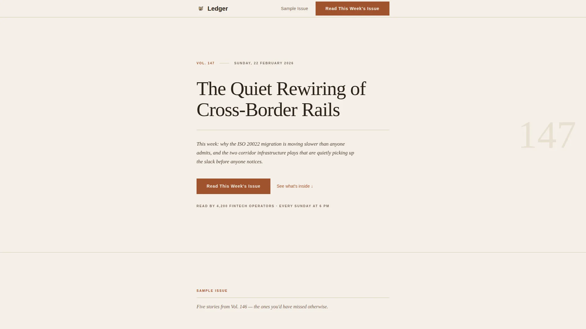
- A chapter-opening header with a volume number, small-caps date, editorial headline, and italic editor's note
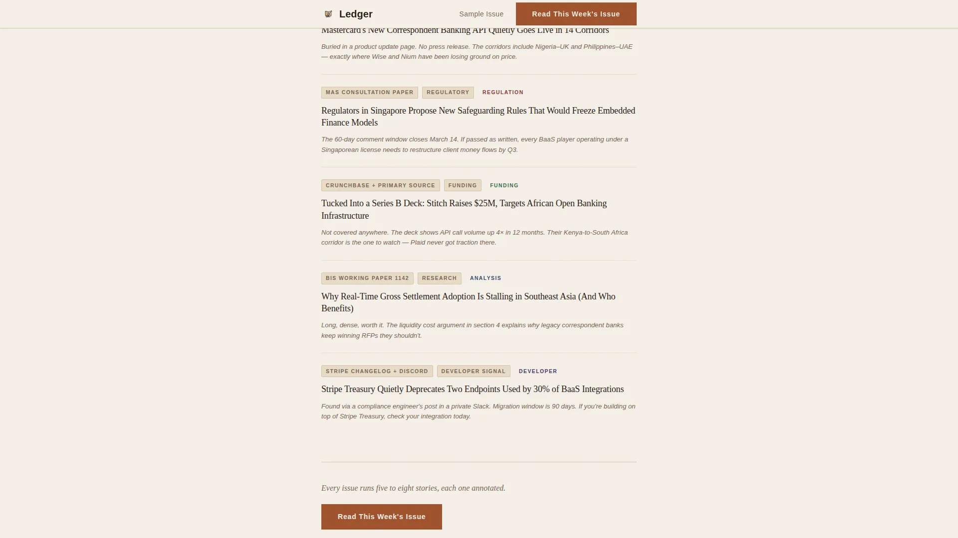
- A sample issue section with linked headlines, source tags, and one-line editorial annotations
- A methodology section, marginalia-style testimonials, three placed primary calls to action, and a secondary archive link
Feature list
This template includes the following built-in sections and design features.
Chapter-Style Header Opening
The header renders like a physical journal page. It shows a volume number ("Vol. 147"), a date set in small caps, a large serif editorial headline, and a two-line italic editor's note. No image, no animation, typography alone holds the viewport.
Sample Issue Section
A full sample of the newsletter is rendered as real content. It includes linked headlines, source-tag labels, and one-line editorial annotations. This gives prospective readers direct evidence of the curation quality before any action is requested.
Sourcing Methodology Section
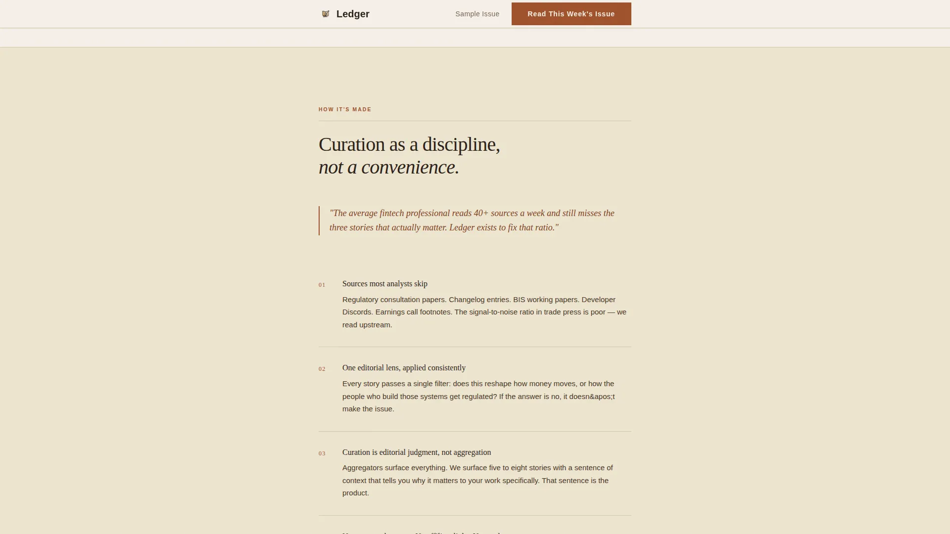
A dedicated section explains how stories are found, what gets cut, and why curation outperforms aggregation. It gives the editorial process credibility and builds trust with readers who value signal over noise.
Marginalia Testimonials
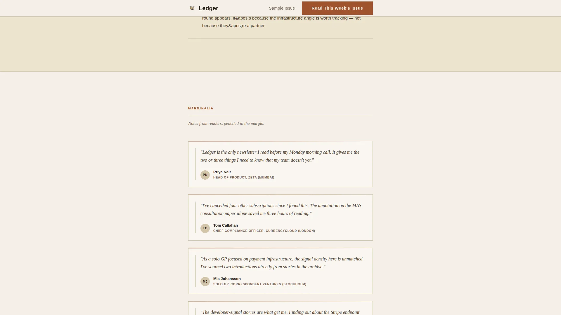
Social proof is styled as penciled margin notes. Named readers with their professional titles appear in a handwritten-note aesthetic, reinforcing the field-notebook identity and making the testimonials feel like annotations rather than ad copy.
Three-Touch Call to Action Placement
The primary call to action, "Read This Week's Issue," appears three times: below the header, after the sample content section, and at the page close. A secondary text link, "Browse the Archive," sits beneath the final call to action for readers who want to audit before committing.
Rust Hover States and Ink Typography System
All clickable elements carry an oxidized rust patina on hover. Body text runs in iron-gall ink brown. Section dividers use faded tan, echoing ruled lines on aged paper. The full palette works together to create a warm, analog reading environment.
Page sections overview
| Section | Purpose |
|---|---|
| Chapter Header | Opens with volume, date, editorial headline, and editor's note |
| Primary call to action One | First "Read This Week's Issue" button below header |
| Sample Issue | Displays real curated links, source tags, and annotations |
| Primary call to action Two | Second call to action after sample content |
| Methodology | Explains story sourcing and curation philosophy |
| Marginalia Testimonials | Named reader quotes styled as margin notes |
| Final call to action Block | Third primary button plus "Browse the Archive" text link |
| Minimal Footer | Single-row linear footer with essential links |
Design & branding system
The visual identity follows a Heritage and Story theme. Every design decision references the physical quality of a leather-bound ledger or a well-marked field notebook.
- Color palette: aged vellum (#F5F0E8) for backgrounds, iron-gall ink (#2B2118) for body text, foxed-page tan (#D4C5A9) for section dividers, and oxidized rust (#A0522D) for links, pull quotes, and hover states
- Typography: Fraunces serif for editorial headlines and section titles; DM Sans for body copy, labels, and interface elements
- Animation is intentionally minimal, with subtle reveal transitions on scroll and no distracting motion
Mobile & speed optimization
The template is built desktop-first to match the primary audience's Sunday evening research habit. It still functions clearly on smaller screens thanks to its single-column structure.
- The single-column layout scales cleanly from wide desktop to tablet without structural changes
- Minimal JavaScript and Server Components keep the page light and responsive across devices
- Low animation levels and a clean rendering approach support fast initial page loads
How this template helps you convert
This template converts through demonstrated value, not urgency tactics. The strategy is to prove the product by showing the product.
- The sample issue section places real editorial content in front of readers before asking anything of them, building trust and establishing the newsletter's quality on its own terms
- Three strategically placed calls to action catch readers at natural decision points, after the header, after the sample, and at the close, without repeating the same pressure
- The "Browse the Archive" secondary link gives hesitant readers a low-friction path to audit back issues, reducing the barrier to the first click
Other information about this template
This template is a strong fit for fintech media creators who publish on platforms like Substack or a hosted archive. It is designed to send readers directly to the live issue rather than collecting email addresses on-page.
- The page works as a standalone click-through bridge between discovery traffic and the full newsletter platform
- The Heritage editorial aesthetic is intentional for professional audiences who associate visual restraint with intellectual seriousness
- The footer uses a minimal Pattern 1 linear single-row layout, keeping the close of the page clean and uncluttered
- Desktop is the primary device target, though the single-column structure adapts naturally to other screen sizes
Theme
Heritage & Story
Creative direction
Industry Report
Color system
Parchment & Rust
Style
Single Column Flow
Direction
Click-Through
Page Sections
Chapter-style Header with Editorial Type
Real Sample Issue Display
Sourcing Methodology Section
Marginalia-style Testimonials
Three-touch Call to Action with Archive Link
Parchment and Rust Design System
Related questions
Does this template include an email sign-up form?
Can I update the volume number, headline, and editor's note myself?
How many calls to action does the template include?
What typography does this template use?
Is this template suitable for a newsletter outside fintech?



