Specialist Business & Finance Blog Blog & Content Website Template
Ledger is a personal finance blog landing page built around one writer's honest debt-payoff story. The masonry layout guides visitors through a reverse-chronological origin arc, from recent wins back to the first overdraft, before funneling them into a free flagship guide. The design is warm, journal-like, and built for late-night reading on a phone.
by Rocket studio
Quick summary
Ledger is a single-page, click-through landing page for a personal finance blog. It opens with a cinematic desk photograph and an emotionally direct headline, then walks visitors through a Pinterest-style masonry arc, recent wins first, early struggles last, before delivering a clear, pressure-free call to action pointing toward a free long-form guide.
Who this template is for
This template is built for independent writers and solo bloggers who cover personal finance from lived experience. If your credibility comes from showing your work rather than holding a credential, Ledger gives that story a professional home.
- Solo personal finance bloggers who document their own debt payoff or savings journey
- New creators launching a content-led blog without a product to sell upfront
- Freelancers and independent writers who want a click-through page that earns trust before asking for anything
What problem this template solves
Most blog landing pages lead with a pitch. Ledger leads with a story. The common problem for personal finance writers is that readers arrive skeptical, they have seen too many generic money tips. This template solves that skepticism by putting emotional narrative before the call to action.
- Visitors leave before connecting because the page feels impersonal or rushed
- The writer's origin story gets buried in a sidebar bio instead of anchoring the whole page
- There is no clear path from "I relate to this" to "I want to read more"
What you get with this template
You get a complete, single-page landing page ready to represent a personal finance blog. Every section is designed to do one specific job in the reader's journey, from first impression to first click.
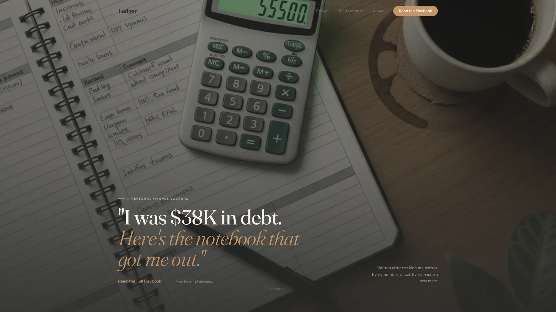
- A full-bleed hero section with a styled desk photograph and a headline typeset directly onto the planner visual
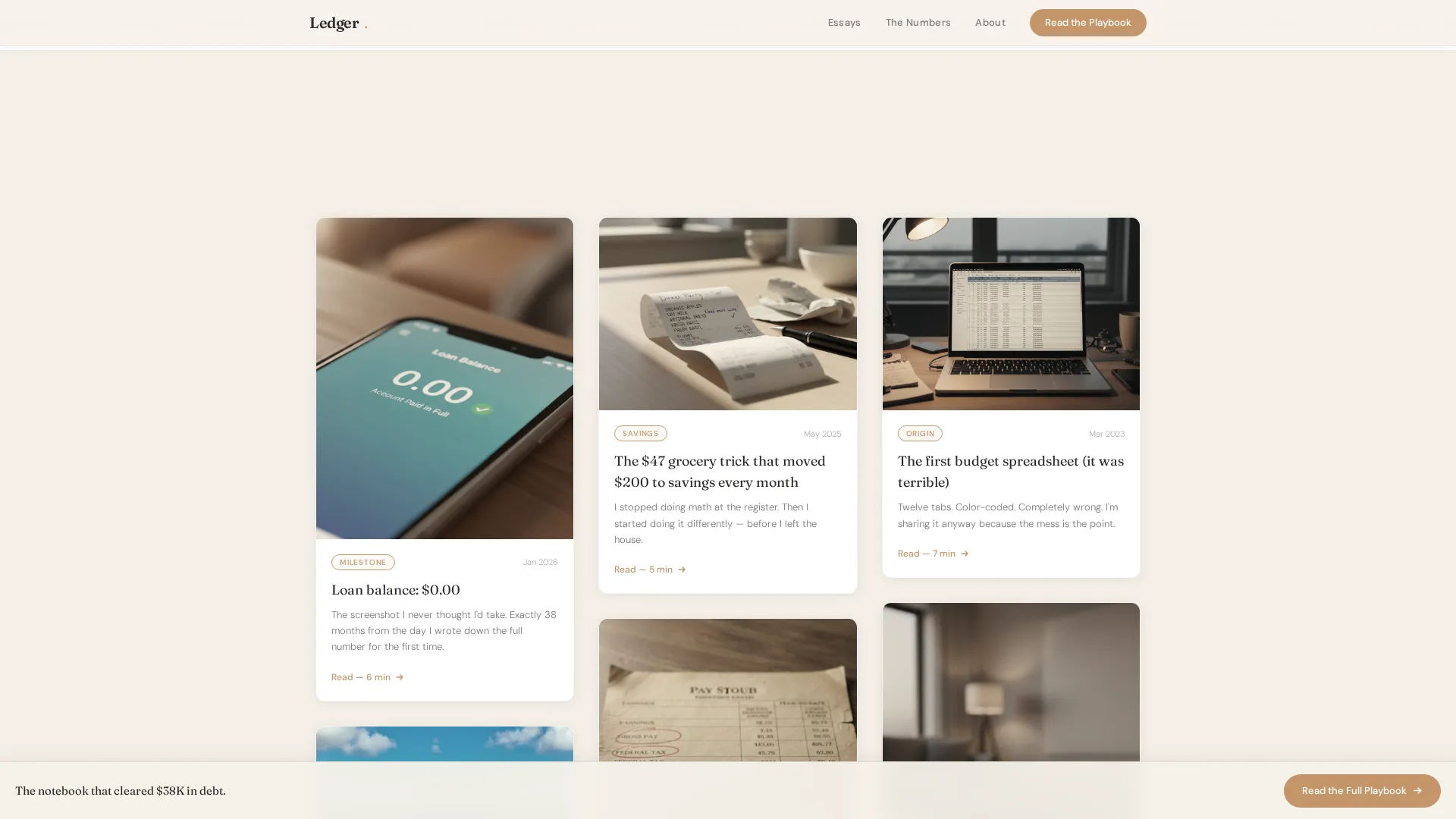
- A staggered masonry grid that presents blog post cards in a reverse-chronological narrative arc
- A fixed-bottom call-to-action button that fades in after the visitor scrolls through the origin arc, plus a final footer call-to-action section
Feature list
This template is built around a focused set of components that serve the content-first, click-through goal of a personal finance blog landing page.
Cinematic Full-Bleed Hero
The hero occupies the full viewport width with a real-desk overhead photograph. The headline appears typeset onto the open planner page in the image, making the story feel handwritten rather than designed. A soft text link below the headline provides the first, low-pressure path to the flagship guide.
Reverse-Chronological Masonry Grid
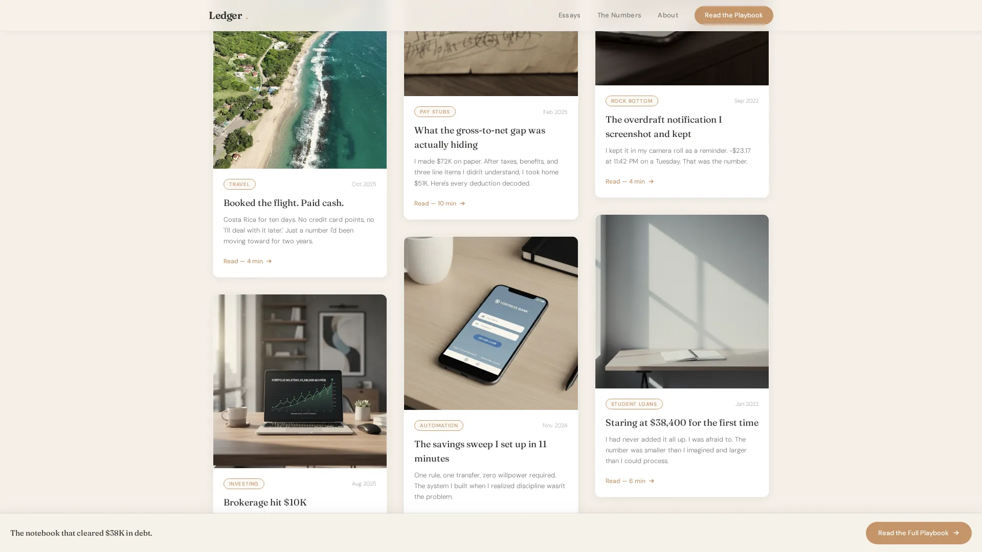
The origin arc grid uses a Pinterest-style staggered card layout. Cards open with recent financial wins and shift in color temperature as the visitor scrolls downward toward earlier, sparser moments. Each card is an entry point to a blog post, but together they tell a single coherent story.
Full-Width Pull Quote Break
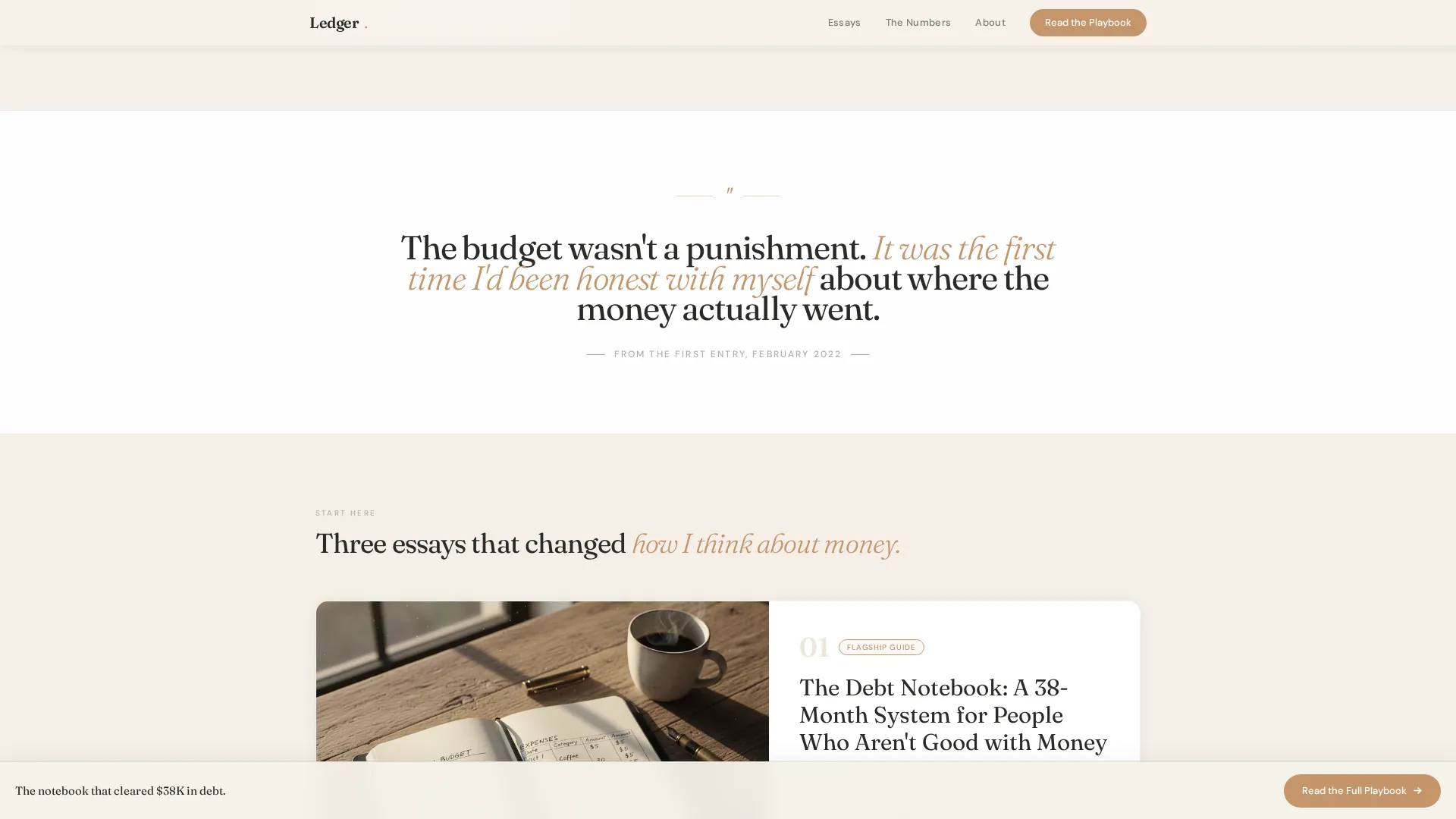
A handwritten-style pull quote interrupts the masonry grid at the midpoint. It resets the reading rhythm and gives the most emotionally resonant line in the story its own visual space, reinforcing trust before the proof section begins.
Featured Posts Proof Section
Three cornerstone articles receive full editorial treatment below the masonry arc. Each is presented with a thumbnail, a short description, and a clear link. This section gives new visitors a curated starting point beyond the origin arc.
Scroll-Triggered Fixed-Bottom Call to Action
After the visitor passes the origin arc, a fixed button fades in at the bottom of the screen. It stays visible as the reader moves through the proof section, providing a persistent but non-intrusive path to the free guide.
Warm Editorial Typography System
The template uses two weights of a humanist serif for the entire typographic hierarchy. Display headings carry weight and warmth; body text stays readable at small sizes. No decorative typefaces compete for attention.
Page sections overview
| Section | Purpose |
|---|---|
| Hero with Headline | Opens the story and sets emotional tone |
| Origin Arc Grid | Shows the financial journey through blog cards |
| Pull Quote Break | Resets rhythm and builds emotional trust |
| Featured Posts Proof | Highlights three cornerstone articles editorially |
| Fixed-Bottom Call to Action | Persists after scroll to invite guide clicks |
| Final Call-to-Action Footer | Closes the page with a direct next-step prompt |
Design & branding system
The visual identity follows a warm, editorial aesthetic that feels closer to a well-used notebook than a polished finance product. Every design decision reinforces the journal tone of the writing.
- Color palette: warm parchment (#F5F0E8) for backgrounds, soft graphite (#4A4A48) for body text, muted lavender-gray (#B8B0C4) for supporting elements, and dried-rose gold (#C4956A) reserved exclusively for links, buttons, and pull quotes
- Typography: a humanist serif used at two weights handles the entire hierarchy, keeping the page readable and editorially consistent without additional typeface layers
- Cards use barely-there shadows on white or parchment backgrounds, and the masonry grid shifts in color temperature from warm recent-win tones to cooler, sparser compositions as the visitor scrolls deeper
Mobile & speed optimization
The template is built with a mobile-first reading experience in mind. The audience reads late at night on a phone, so every layout decision prioritizes comfort at small screen sizes.
- Masonry grid reflows cleanly for single-column reading on mobile without losing the narrative arc order
- Animations use scroll reveals and staggered card entrances at a medium intensity, keeping motion purposeful rather than distracting
- Static content sections use server components to minimize JavaScript load, keeping the page responsive on lower-end mobile connections
How this template helps you convert
This template converts through emotional narrative, not urgency tactics. The visitor is never pressured; they are guided. Each section builds the case for clicking through to the free guide by answering the reader's unspoken question: "Can I trust this person?"
- The hero headline delivers an immediate, specific claim that earns attention in the first three seconds of the visit
- The masonry origin arc creates a "I'm somewhere on this timeline" moment that keeps the reader scrolling and identifying with the story
- The scroll-triggered fixed-bottom button surfaces only after the reader has moved through the narrative, so the call to action feels like a natural next step rather than an interruption
Other information about this template
This template is specifically designed for the personal finance blog niche, where reader trust is the primary currency. A few additional details are worth noting for anyone evaluating it.
- The page has no email gate or sign-up form; the opt-in lives inside the free guide itself, keeping the landing page frictionless
- The footer follows a horizontal flow pattern suited to single-page blog landing pages with minimal navigation needs
- Localization defaults are set for a United States audience, using USD currency formatting and MM/DD/YYYY date style throughout
- The template is category-matched to Blog and Editorial, subcategory Business and Finance Blog, making it a focused fit for content-led personal finance sites
Theme
Atelier Studio
Creative direction
Origin Story
Color system
Cloud Canvas
Style
Masonry/Pinterest
Direction
Click-Through
Page Sections
Cinematic Full-bleed Hero Section
Reverse-chronological Masonry Grid
Full-width Pull Quote Break
Featured Posts Proof Section
Scroll-triggered Fixed-bottom Button
Warm Two-weight Typography System
Related questions
Is there an email opt-in form on this landing page?
Can I use this template if I am just starting my personal finance blog?
How does the masonry grid tell a story rather than just list posts?
What call-to-action options does this template include?
Is this template suited for readers browsing on a phone?



