Fintech Startup Professional Website Template
Ledger is a bento grid landing page template built for pre-seed fintech startups. It presents burn rate, runway, cap table, and revenue metrics in a single real-time dashboard view. Designed with a void-black and iridescent color system, the template combines an industry-report layout with a comparison engine to move technical founders from pain to proof in one scroll.
by Rocket studio
Quick summary
Ledger is a bento grid landing page template for pre-seed fintech startups. It shows a real-time financial dashboard covering burn rate, runway, cap table, and revenue in one view. The void-black palette with iridescent teal and holographic violet accents gives it a clinical-yet-alive feel. It is built to convert technically minded founders and operators fast.
Who this template is for
This template is built for early-stage fintech teams who need to communicate complex financial clarity without a lengthy pitch deck. It speaks directly to operators who live inside spreadsheets and want something sharper.
- Technical co-founders in the first three months after incorporation
- Solo CFOs managing multiple portfolio companies at once
- Accelerator operations leads who want one shareable dashboard link instead of many scattered tabs
What problem this template solves
Pre-seed financial ops are chaotic. Founders stitch together exports from multiple tools at odd hours, cap table discrepancies take days to resolve, and no single view shows burn, runway, and revenue together. This template positions Ledger as the answer to that fragmentation.
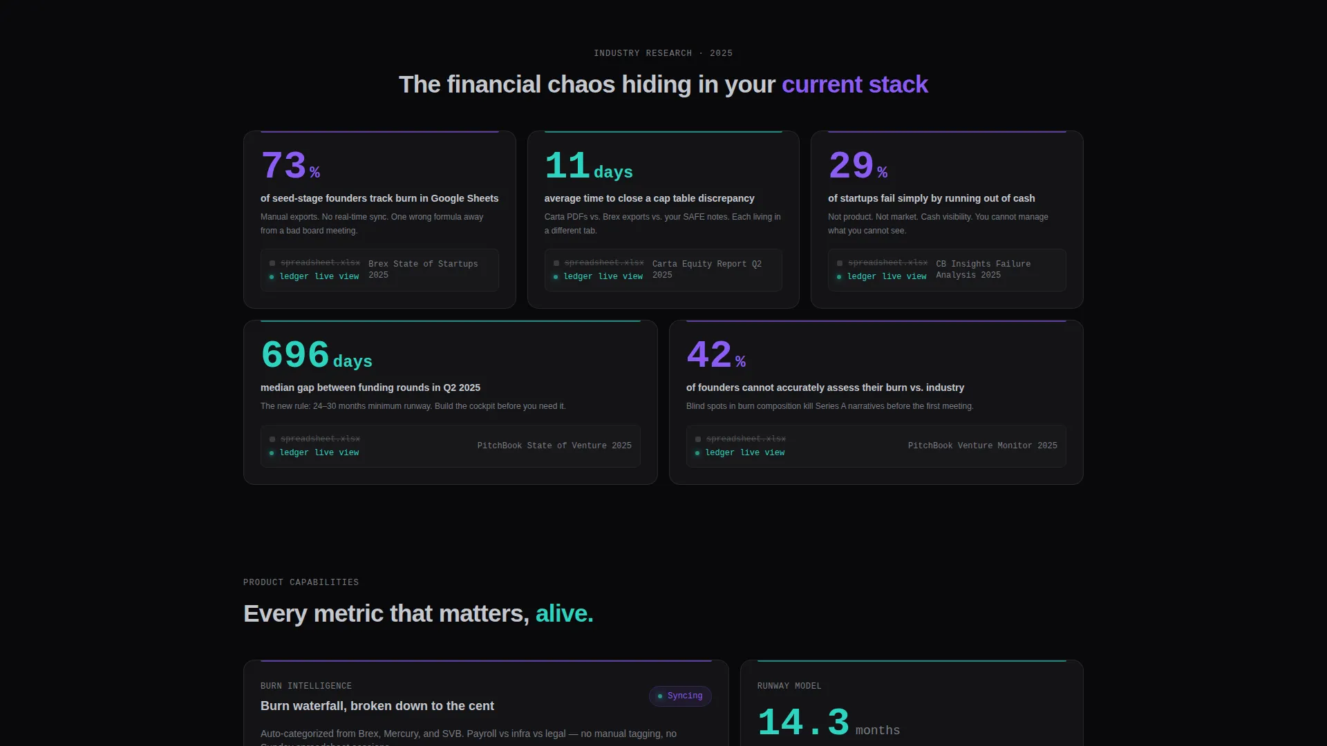
- 73% of seed-stage founders track burn in spreadsheets, a stat the template surfaces as a bento card stat paired with a micro-animation
- Cap table discrepancies take an average of 11 days to close, a pain point the template visualizes being solved in seconds
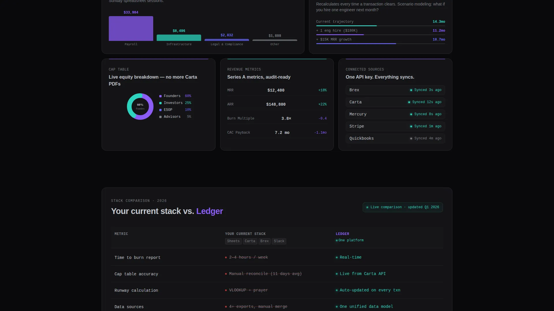
- The comparison table makes the cost of the current stack undeniable before the call-to-action even appears
What you get with this template
You get a fully designed, section-led landing page that blends industry research framing with embedded product proof. Every component is grounded in the source brief and ready to adapt to your real product details.
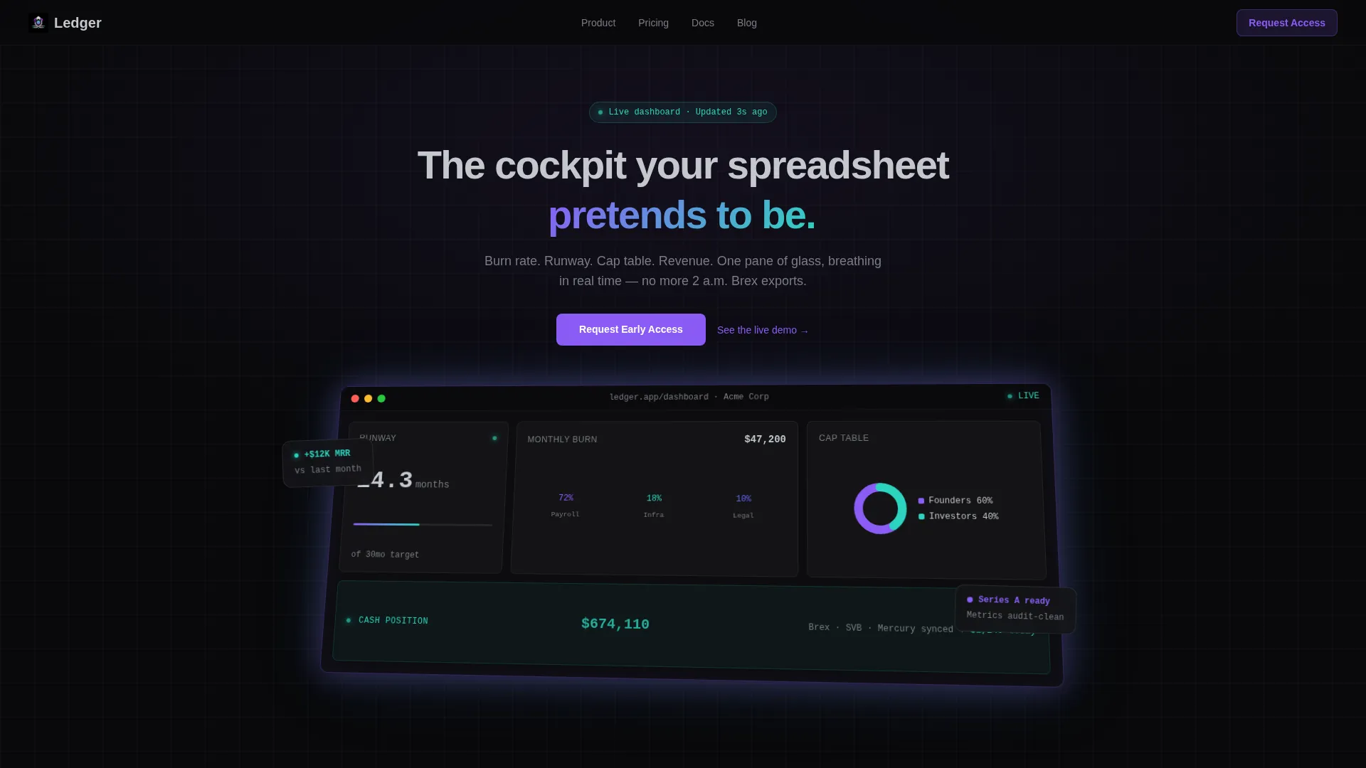
- A full-width product screenshot header with isometric tilt and holographic glow effect
- A bento grid of industry-report stat cards paired with dashboard micro-animations
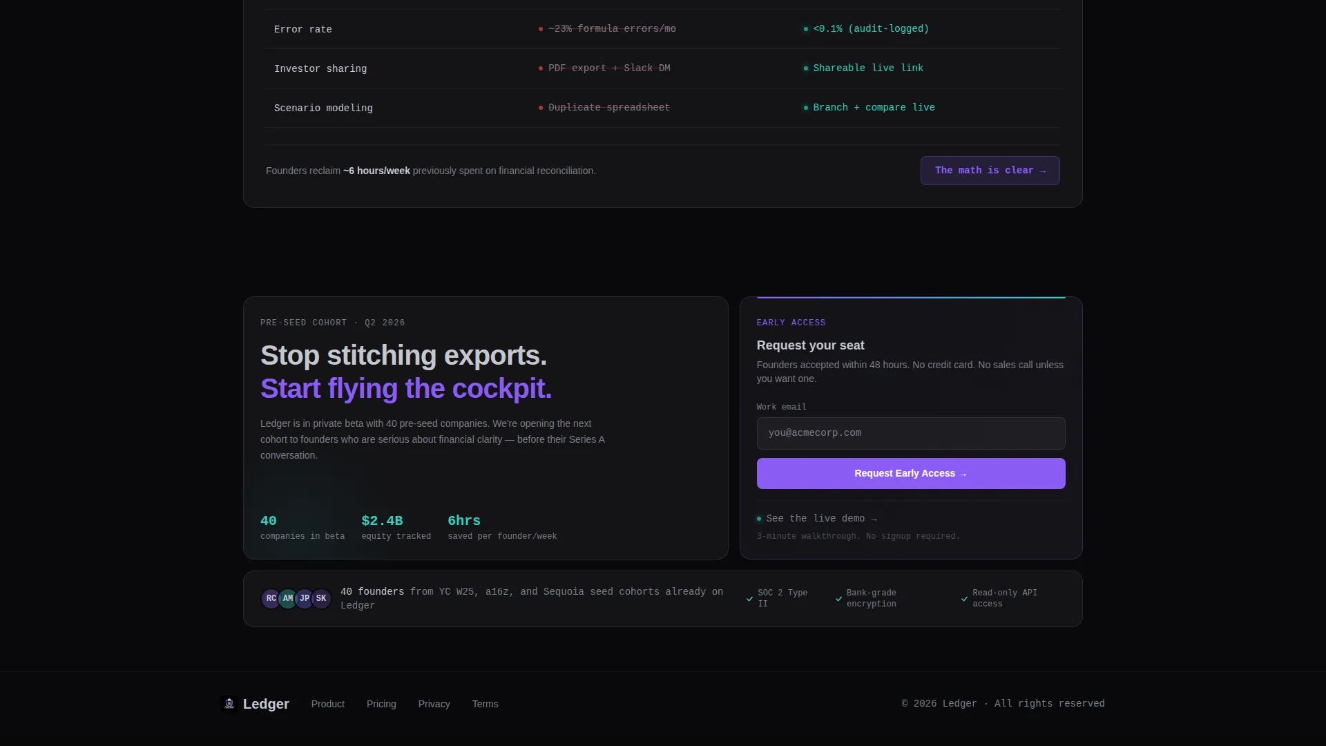
- An interactive two-column comparison table and a bottom-right call-to-action tile with email input and a Loom demo modal link
Feature list
This template is built around six core design and layout capabilities drawn directly from the brief.
Bento Grid Layout System
The page is structured as a bento grid where each tile serves a distinct purpose. Stat cards, product proof panels, and the comparison block sit in a modular grid that escalates from pain to proof as the visitor scrolls.
Real-Time Dashboard Header
The header features a pixel-perfect product screenshot shown mid-session. It includes a runway countdown, a burn waterfall chart broken out by payroll, infrastructure, and legal, a cap table donut chart, and a live cash position ticker. The screenshot sits on a subtle isometric tilt with a soft holographic glow at its edges.
Industry Report Stat Cards
Each bento tile in the mid-page section presents a hard statistic about pre-seed financial chaos. Every stat is paired with a micro-animation showing the dashboard solving that exact problem, making the page read like a research brief with a product embedded in every finding.
Comparison Table Engine
A persistent mid-page bento card renders a two-column interactive table. The left column shows the current tool stack and the right column shows the single-platform alternative, with each row comparing time cost, error rate, and integration count side by side.
Call-to-Action Tile
The bottom-right bento tile anchors the primary conversion point. It contains a single-field email input labeled "Request Early Access" and a secondary text link that opens a Loom embed in a modal, catching visitors at the exact moment the comparison math becomes clear.
AI Iridescent Color Signal System
Iridescent teal is reserved strictly for live-data accents and hover states, teaching the eye that color equals signal. Holographic violet marks emphasis. Void black and liquid silver anchor all backgrounds and body text, keeping the interface clinical until interaction makes it alive.
Page sections overview
| Section | Purpose |
|---|---|
| Full-Width Header | Showcases the dashboard screenshot with isometric tilt and the headline "The cockpit your spreadsheet pretends to be" |
| Stat Card Grid | Presents industry-report statistics about pre-seed financial fragmentation, each paired with a dashboard micro-animation |
| Comparison Table | Renders the two-column interactive stack comparison covering time cost, error rate, and integration count |
| call to action Bento Tile | Captures early access email submissions and surfaces the Loom demo modal via a secondary text link |
Design & branding system
The visual identity follows a Dashboard Pro theme built on the AI Iridescent color system. The palette feels clinical at rest and spectrally alive on interaction, using color as a deliberate signal rather than decoration.
- Void black (#09090B) for all backgrounds, liquid silver (#C4C7CE) for body typography, holographic violet (#8B5CF6) for emphasis text and highlights
- Iridescent teal (#2DD4BF) reserved only for live-data accents, hover states, and the real-time cash ticker, so color always means something is active
- Bento card surfaces lift to #131316 against the void-black background, creating a subtle layered depth without breaking the dark-field aesthetic
Mobile & speed optimization
The bento grid is designed to reflow cleanly across screen sizes, keeping the stat cards and comparison table readable on smaller viewports. The layout prioritizes visual hierarchy so key data points land before the fold on any device.
- Modular bento tiles allow the grid to stack vertically without losing the escalating pain-to-proof narrative
- The isometric header screenshot and glow effects are contained within the card boundaries, preventing layout overflow on narrow screens
- The single-field call-to-action tile remains prominent and fully functional regardless of grid reflow order
How this template helps you convert
The template is structured as a persuasion sequence, not just a product showcase. Every scroll step reduces friction and builds proof before the ask arrives.
- The header headline and dashboard screenshot create immediate product credibility, showing a live session rather than a mockup, so the visitor understands the product before reading a word of body copy.
- The industry-report stat cards move the visitor from passive reading to active recognition, each statistic naming a pain they already feel and each micro-animation showing it resolved.
- The comparison table does the final persuasion work, quantifying the cost of the current stack row by row, so the call-to-action email field appears at the exact moment the math is undeniable.
Other information about this template
This template is part of the Startup and Launch category with a Fintech Pre-Seed Startup niche focus. It carries a high intersection match score, reflecting strong alignment between the template style, creative direction, and target audience. A few practical notes for builders using this template:
- The template style is Bento Grid and the theme is Dashboard Pro, making it well suited for data-heavy product launches where visual density needs to feel ordered rather than overwhelming
- The creative direction is Industry Report, meaning the copy structure and card layout are designed to cite real statistics and pair them with product proof rather than rely on marketing language alone
- The header concept is Product Screenshot and the landing page direction is Comparison/Versus, a combination that works especially well for pre-seed products competing against fragmented tool stacks
- The color system is labeled AI Iridescent and the teal accent rule, color equals signal, is a deliberate design decision baked into the layout logic, not just a style choice
Theme
Dashboard Pro
Creative direction
Industry Report
Color system
AI Iridescent
Style
Bento Grid
Direction
Comparison/Versus
Page Sections
Bento Grid Layout System
Real-time Dashboard Header
Industry Report Stat Cards
Interactive Comparison Table
Early Access Call to Action Tile
AI Iridescent Color Signal System
Related questions
Who is this landing page template designed for?
Can I adapt the stat cards to my own data?
What is included in the comparison table section?
Does the call-to-action tile support a video demo?
What makes this template different from a standard SaaS landing page?



