Specialist Business & Finance Blog Portfolio & Case Study Website Template
Ledger is a hub and spoke investing blog landing page built for writers who think in decades, not quarters. It pairs a warm artisan visual identity with a five-spoke anchor navigation, a personal author letter, featured essay cards, a portfolio framework section, a curated reading list, and a weekly newsletter signup that converts curious visitors into loyal Saturday morning readers.
by Rocket studio
Quick summary
Ledger is a single-page investing blog template built around a five-spoke anchor navigation. It opens with a cinematic hero, moves through a personal author philosophy letter, featured essays, a portfolio framework, and a curated reading list, then closes with a full newsletter signup section. The warm artisan design feels like a linen-bound journal left open on a wooden desk.
Who this template is for
This template suits thoughtful writers who publish long-form investing content and want readers to stay, explore, and subscribe. It is built for a content-first audience that values depth over hype.
- Independent investing bloggers publishing a weekly newsletter
- Personal finance writers building an audience around compounding and long-term thinking
- Early-stage content creators who need a professional hub without complex tooling
What problem this template solves
Most blog templates treat every post equally. They offer no clear intellectual architecture and no reason for a first-time visitor to trust the writer before reading a single word. Ledger solves that.
- Visitors land without context and leave before they understand what the blog stands for
- There is no clear conversion path from casual reader to committed subscriber
- Generic layouts undercut the credibility that a serious investing writer has earned
What you get with this template
You get a complete, single-page layout with six content sections and a footer. Every section has a distinct job, and together they guide a first-time visitor from curiosity to subscription.
- A hero section, philosophy letter, essay cards, portfolio framework section, reading list, and newsletter signup
- A fixed anchor navigation with five labeled spokes that let returning readers jump to any chapter instantly
- Two conversion touchpoints: an amber call-to-action button after the opening letter and a sticky newsletter bar that appears after the visitor passes the third spoke
Feature list
This template is built around the content and conversion needs of a serious investing blog. Each feature below is drawn directly from the template brief.
Five-Spoke Anchor Navigation
The anchor navigation fixes to the top of the page after the visitor begins scrolling. Five labeled links, Philosophy, Latest Essays, Portfolio Frameworks, Reading List, and Newsletter, let any returning reader skip directly to the section they want. Amber highlight styling marks the active spoke so orientation is always clear.
Personal Author Philosophy Letter
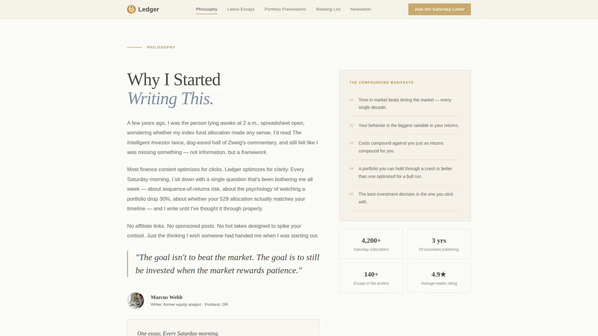
The Philosophy section opens with a personal letter from the author explaining why the blog exists. This letter establishes voice and trust before any essay or product mention appears. A warm amber call-to-action button for the newsletter signup sits at the bottom of the letter, catching readers while their interest is highest.
Featured Essay Cards with Reading-Time Badges
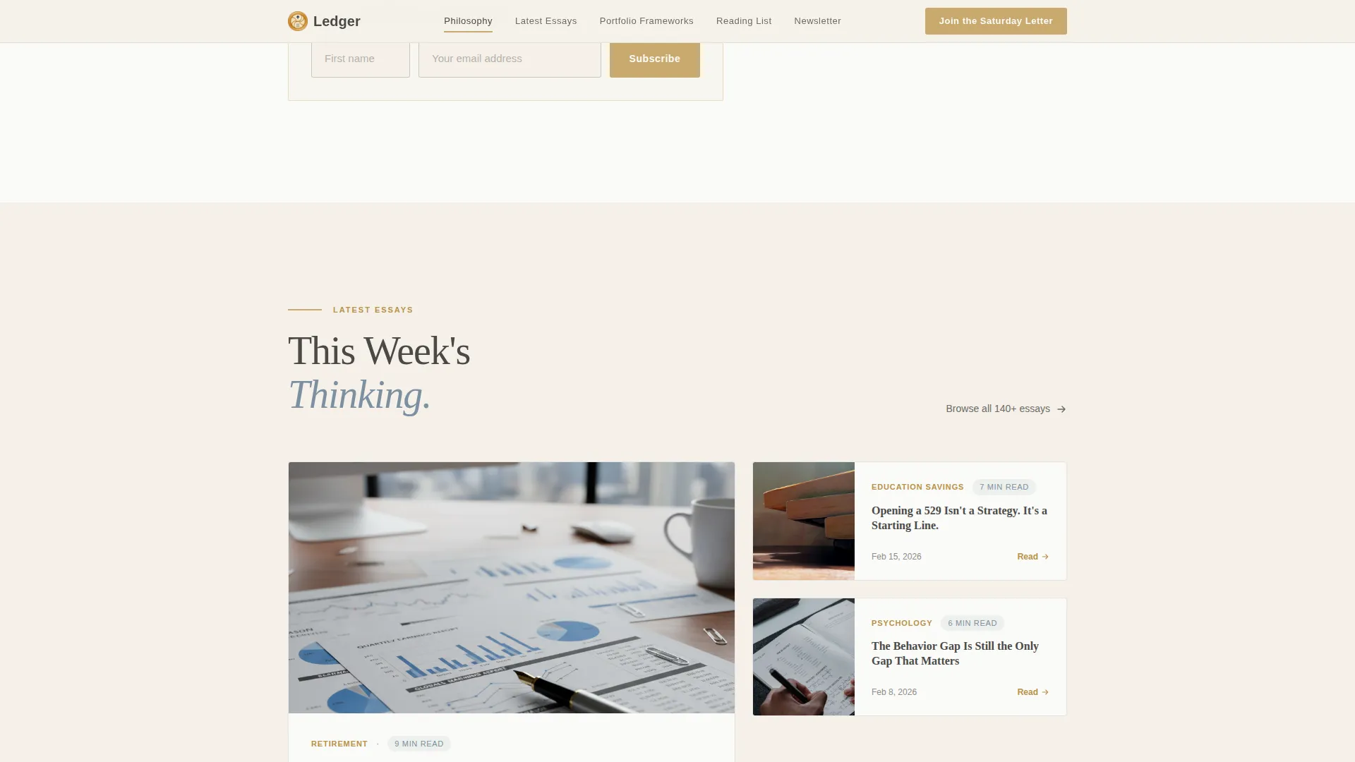
The Latest Essays section displays three featured essay cards. Each card carries a reading-time badge so visitors can decide at a glance whether to click now or save for later. This section gives new readers an immediate sample of the blog's depth and editorial voice.
Visual Portfolio Framework Section
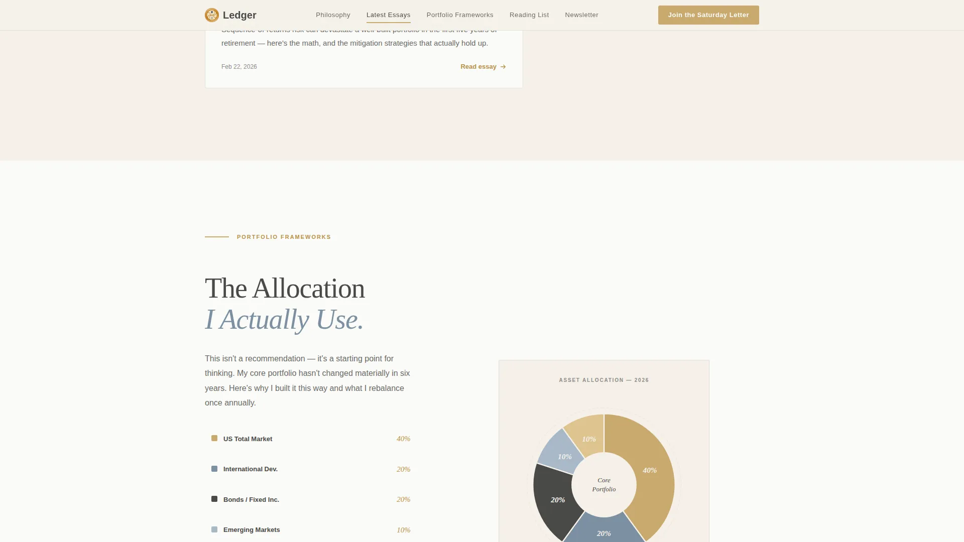
The Portfolio Frameworks section presents the blog's asset allocation philosophy as a hand-drawn style pie chart. A secondary call-to-action here offers a free downloadable PDF, "The 10-Year Portfolio Checklist," gated behind the same email field used for the newsletter. This gives hesitant visitors a concrete, tangible reason to subscribe.
Curated Reading List with Annotations
The Reading List section displays a curated selection of investing books, each paired with a one-line annotation. The annotations act as proof of intellectual depth and editorial taste, building credibility through curation rather than self-promotion.
Sticky Newsletter Bottom Bar
After the visitor scrolls past the third spoke, a sticky bottom bar appears with a compact newsletter signup form. The form asks only for a first name and an email address. A single reassurance line reads: "One essay every Saturday morning. No spam. No affiliate links. Unsubscribe anytime."
Page sections overview
| Section | Purpose |
|---|---|
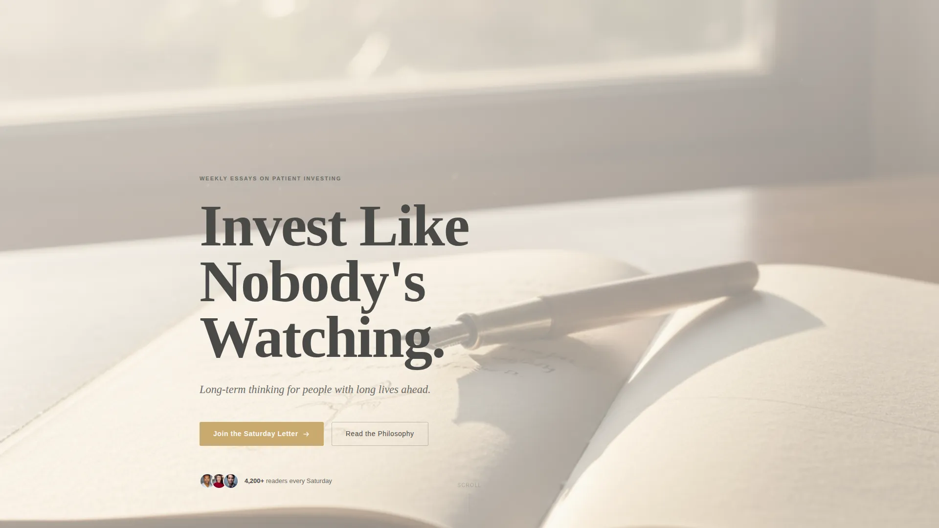
| Hero Image Header | Sets tone; displays serif headline and subline over morning-light photograph |
| Fixed Anchor Navigation | Lets visitors jump to any spoke; highlights active section in amber |
| Philosophy Letter | Author opens with personal context; first newsletter call-to-action appears here |
| Latest Essays | Three essay cards with reading-time badges sample the blog's editorial voice |
| Portfolio Frameworks | Hand-drawn pie chart and PDF checklist download drive secondary conversion |
| Reading List | Annotated book curation builds credibility and intellectual trust |
| Newsletter Signup | Full signup section with social proof and subscriber count |
| Sticky Bottom Bar | Compact form appears after third spoke for returning or hesitant visitors |
| Footer | Horizontal flow footer with navigation and closing context |
Design & branding system
The visual identity follows a Warm Artisan theme built on the Soft Mist color system. Every color decision is deliberate and restrained, the way a good margin note is more meaningful than a highlighter dragged across every line.
- Parchment cream (#F5F0E8) and warm white (#FAFAF7) alternate as section backgrounds, keeping the page easy to read for long sessions
- Pencil graphite (#4A4A48) carries all body text with generous line height built for slow, intentional reading
- Muted amber (#C9A96E) appears sparingly on anchor navigation highlights, pull-quote borders, and call-to-action buttons, acting like a ribbon bookmark that marks only what matters most
- Faded ink blue (#7B8FA1) adds quiet depth in supporting typographic elements
- Fraunces serves all display headlines; DM Sans handles body copy and interface text for a pairing that feels both scholarly and approachable
Mobile & speed optimization
The template is built desktop-first, reflecting the reality that investing readers typically sit down with a laptop in the evening. Full mobile support is included so the experience holds across all screen sizes.
- GSAP scroll reveals use blur and stagger animations at a medium intensity, adding life without slowing the page or distracting from the content
- Server components handle all static content sections, keeping JavaScript minimal and page load lean
- The sticky newsletter bar and fixed anchor navigation are designed to work cleanly on both desktop and mobile viewports
How this template helps you convert
The conversion architecture in Ledger is layered and patient, matching the unhurried tone of the content itself. There is no pressure, only well-placed invitations.
- The first newsletter call-to-action appears as an amber button at the close of the Philosophy letter, catching readers at the moment they feel most connected to the author's voice and purpose.
- A secondary conversion path offers the free "10-Year Portfolio Checklist" PDF inside the Portfolio Frameworks section, giving visitors who need a tangible reason to subscribe something concrete to reach for before they have built full trust with the writing.
- The sticky bottom bar activates after the third spoke and stays visible for the remainder of the scroll, ensuring that a motivated visitor never has to hunt for the signup form.
Other information about this template
Ledger is a strong fit for anyone building an investing blog or personal finance newsletter with a long-term audience strategy. A few additional details worth noting before you get started:
- The template style is Hub and Spoke with anchor navigation, a layout pattern well suited to content-rich single-page publishing hubs
- The header concept is Type Over Image, a full-width cinematic photograph of an open notebook with morning light, overlaid with a large serif headline reading "Invest Like Nobody's Watching"
- The creative direction is Vision and Mission, meaning the scroll tells a purposeful story: personal letter, manifesto, proof, and invitation
- Social proof elements include a subscriber count display, a testimonial pull-quote with amber border styling, and curated book annotations that signal editorial seriousness
- The FAQ accordion component is included as an interactive element on the page, providing a low-friction way to answer common reader questions without adding visual clutter
- This template is designed for English-language publishing with United States date formatting and USD context where relevant
Theme
Warm Artisan
Creative direction
Vision & Mission
Color system
Soft Mist
Style
Hub & Spoke (Anchor Nav)
Direction
Lead Generation
Page Sections
Five-spoke Fixed Anchor Navigation
Personal Author Philosophy Letter
Essay Cards with Reading-time Badges
Portfolio Framework and PDF Download
Annotated Curated Reading List
Sticky Newsletter Bottom Bar
Related questions
Can I connect the newsletter form to my email provider?
Is the 10-Year Portfolio Checklist PDF included?
Does the anchor navigation work on mobile devices?
Can I use this template for a newsletter topic outside of investing?
Can I add more than three essay cards to the Latest Essays section?



