Financial Services Review Blog Landing Page Template
Ledger is a broadsheet-inspired financial services review landing page built on an asymmetric 60/40 grid. It combines a newspaper front-page header, a manifesto-driven editorial scroll, a progressive six-question assessment, and a sidebar newsletter subscription card. The result is a trust-building editorial platform designed for readers who demand honest, fee-by-fee financial product analysis.
by Rocket studio
Quick summary
Ledger is a single-page editorial landing page template for financial services review blogs. It pairs broadsheet newspaper aesthetics with high-interactivity features: a manifesto section, a featured reviews bento grid, a progressive quiz, and a letters-to-the-editor social proof section. The design system uses aged parchment, dried ink, and rust-red to build instant editorial credibility.
Who this template is for
This template is built for publishers, independent journalists, and content teams who run financial review blogs. It suits anyone whose value proposition is honest, unsponsored product analysis delivered with editorial authority.
- Financial services bloggers and newsletter writers who review products like mortgages, robo-advisors, and credit cards
- Content media founders building trust with readers burned by hidden banking fees
- Small-scale editorial teams targeting mid-career professionals and first-generation investors
What problem this template solves
Financial content online often looks generic. Readers who need genuine product comparisons arrive on pages that feel like affiliate listicles, not credible editorial work. That trust gap is the central problem this template addresses.
- Generic blog layouts fail to signal editorial rigor, causing skeptical readers to bounce quickly
- Standard landing pages offer no interactive path to help visitors find the review most relevant to their situation
- Most finance templates lack the visual language needed to communicate neutrality, depth, and journalistic conviction
What you get with this template
You get a fully structured, single-page editorial landing page laid out in a broadsheet-faithful asymmetric grid. Every section is purpose-built to move a skeptical reader from first impression to personal engagement.
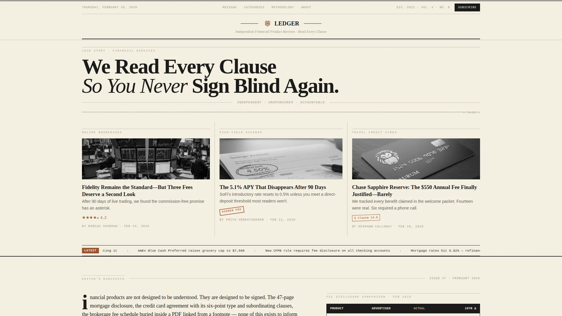
- A newspaper front-page hero with masthead, publication date in small caps, a lead headline, and a three-column review teaser layout
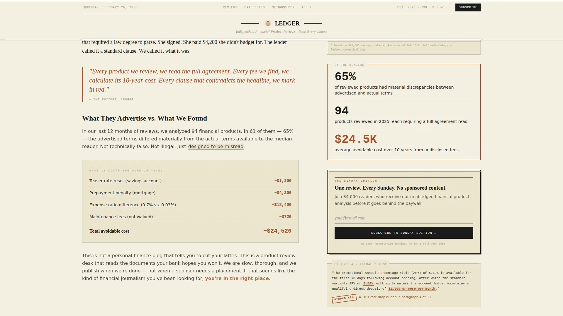
- A 60/40 manifesto section that pairs long-form editorial argument with supporting data: comparison tables, fee breakdowns, and annotated term callouts
- A progressive six-question assessment, a bento-style featured reviews grid, letters-to-the-editor testimonials, and a persistent sidebar subscription card
Feature list
A brief paragraph on what makes this feature set distinctive: every component in Ledger is designed around editorial trust signals rather than generic conversion patterns. Each feature earns its place by serving a skeptical, well-informed reader.
Newspaper Front-Page Hero
The header reproduces a broadsheet front page with fidelity. It includes a hand-set serif masthead, a date typeset in small caps, a bold lead headline, and a three-column teaser row showing miniature review cards complete with star ratings, a rust-red hidden fee stamp, and editorial annotation circles.
60/40 Asymmetric Manifesto Section
The page scrolls through a manifesto structured in a 60-column editorial argument paired with a 40-column evidence panel. The evidence side surfaces comparison tables, fee breakdowns, and annotated screenshots of buried contract terms. Each sub-section escalates from advertised claims to actual costs discovered over time.
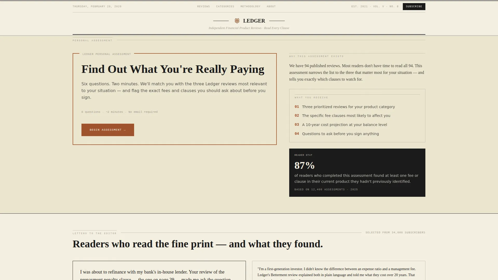
Progressive Six-Question Assessment
The primary call to action, "Find Out What You're Really Paying," opens a low-friction progressive quiz. The first question asks which financial product the visitor is comparing. Five follow-up questions cover current provider, monthly spend, biggest frustration, risk comfort, and switching timeline. Answers dynamically narrow the visitor toward a personalized review shortlist.
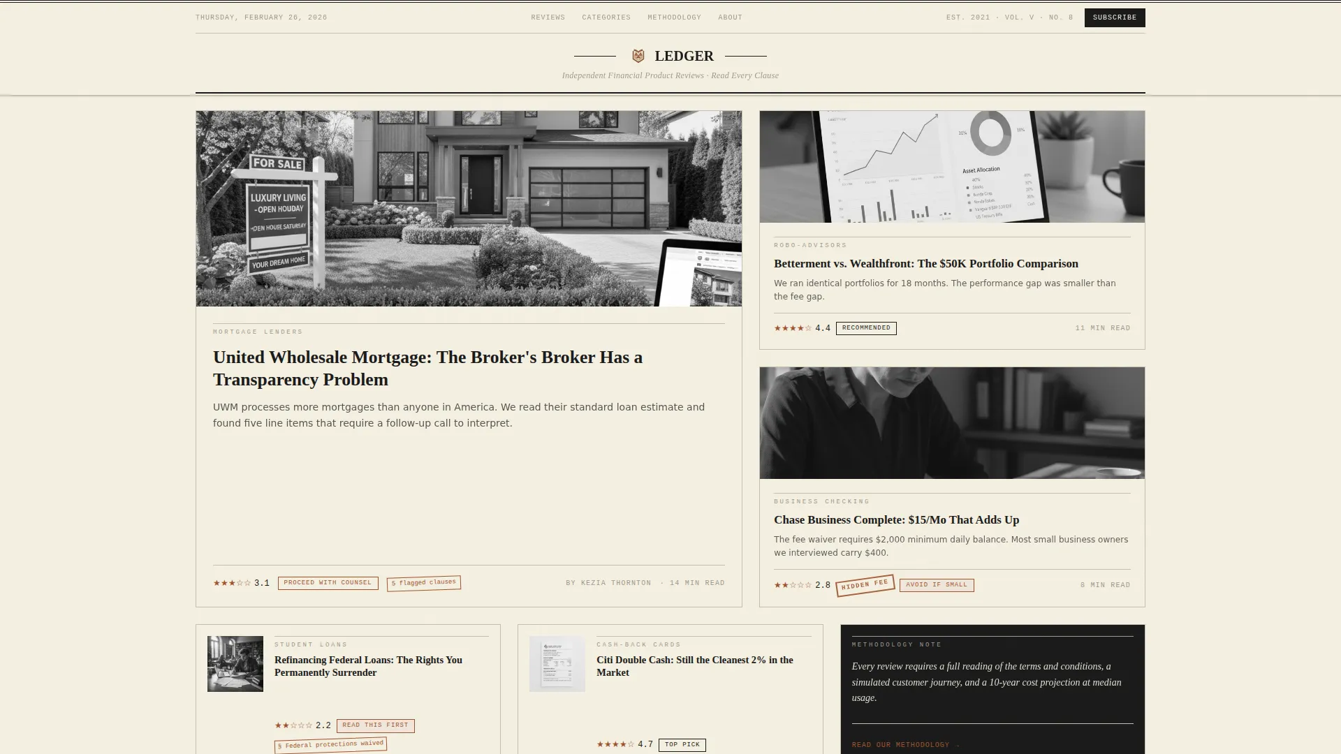
Featured Reviews Bento Grid
An asymmetric bento-style grid surfaces top-rated and flagged product reviews. Cards include star ratings, rust-red annotation stamps for warnings like hidden fees, and editorial-style callouts that mirror the visual language of the hero section.
Letters-to-the-Editor Social Proof
Reader testimonials are presented in a letters-to-the-editor format rather than standard review cards. This matches the broadsheet identity and reinforces editorial credibility with a subscriber count display alongside reader voices.
Persistent Sidebar Subscription Card
The 40-column sidebar carries a secondary conversion path throughout the page scroll. A simple email field styled like a newspaper subscription card invites readers to subscribe to the Sunday Edition, capturing visitors who are not yet ready to take the assessment.
Page sections overview
| Section | Purpose |
|---|---|
| Newspaper Hero Masthead | Establishes editorial identity and surfaces three miniature review teasers |
| Manifesto Editorial Split | Presents the blog's thesis with supporting fee evidence in a 60/40 layout |
| Featured Reviews Bento | Showcases top-rated and flagged financial product reviews in an asymmetric grid |
| Quiz Assessment call to action | Guides visitors through six questions toward a personalized review shortlist |
| Social Proof Letters | Builds reader trust through letters-to-the-editor format testimonials |
| Masthead-Styled Footer | Closes the page with broadsheet-faithful branding and navigation flow |
Design & branding system
The design language is rooted in the physical experience of reading a leather-bound accounting journal or a Sunday broadsheet. Every color, typeface, and spacing decision reinforces editorial authority and financial seriousness.
- Color palette: aged parchment cream (#F5F0E1) for backgrounds, dried ink black (#1A1A1A) for body text, rust-red (#A0522D) for pull quotes, star ratings, and interactive highlights, and faded ledger-line gray (#C4BFB3) for grid lines, dividers, and secondary type
- Typography: Fraunces serif for headlines to evoke hand-set editorial type, DM Sans for readable body columns, and JetBrains Mono for numerical data and fee figures
- Visual details: scroll-reveal animations, ink-draw underline effects, and a parallax broadsheet texture layer reinforce the ink-and-paper theme throughout the scroll
Mobile & speed optimization
The template is designed desktop-first to honor the broadsheet metaphor, with a graceful mobile fallback that preserves editorial readability on smaller screens.
- The asymmetric 60/40 grid collapses cleanly for mobile viewports, keeping the manifesto argument and evidence panel readable in a single-column stacked layout
- The progressive assessment is lazy-loaded to keep the initial page experience fast, with scroll-reveal animations triggered only as sections enter the viewport
- The persistent sidebar subscription card adapts to a sticky bottom bar or inline section on mobile, maintaining the secondary conversion path without obstructing content
How this template helps you convert
The conversion architecture follows the emotional arc of the manifesto itself: build conviction first, then offer the exact answer the reader now craves.
- The newspaper hero and three-column teaser immediately signal editorial depth, earning enough trust for a skeptical reader to keep scrolling rather than bouncing
- The manifesto section escalates emotional stakes across its sub-sections, so by the time the "Find Out What You're Really Paying" assessment appears two-thirds down the page, the reader actively wants a personal answer
- The sidebar subscription card operates as a parallel low-commitment path, converting readers who are engaged but not yet ready to assess, turning them into newsletter subscribers for ongoing retention
Other information about this template
This template is a strong fit for financial services content publishers who want their editorial platform to look and feel as credible as the analysis they produce. A few additional details worth noting before you start customizing.
- The footer follows a horizontal flow pattern with masthead-style branding, keeping the broadsheet identity consistent from hero to close
- Localization defaults are set for English, United States Dollar formatting, and MM/DD/YYYY date display
- The template supports medium-intensity animation: scroll reveals, ink-draw underlines on hover, and a subtle parallax effect on the parchment background texture
- All typographic and color tokens are clearly named in the design system, making it straightforward to adapt the palette or swap typefaces if your brand requires it
Theme
Ink & Paper
Creative direction
Manifesto
Color system
Parchment & Rust
Style
Asymmetric Grid (60/40)
Direction
Quiz/Assessment
Page Sections
Newspaper Front-page Hero
60/40 Manifesto Section
Progressive Assessment Quiz
Featured Reviews Bento Grid
Letters-to-the-editor Testimonials
Persistent Sidebar Subscription Card
Related questions
What kind of financial content works best with this template?
Can I adjust the six assessment questions to match my review categories?
Do I need a developer to set up the sidebar subscription card?
Is this template suitable for a solo blogger or does it need a full editorial team?
How does the broadsheet layout hold up on mobile screens?



