Horology & Watch Collecting Landing Page Template
Mainspring is a coming-soon landing page for a curated watch collecting and horology Instagram account. Built on an asymmetric 60/40 grid with an Ink and Paper visual identity, it guides obsessive collectors through a day-in-the-life narrative, then captures their email through a waitlist form that opens with one perfectly chosen question.
by Rocket studio
Quick summary
Mainspring is a single-page waitlist template for a horology-focused Instagram account. It uses a 60/40 asymmetric grid, a warm parchment and walnut color system, and a scroll-driven day-in-the-life narrative to draw in watch collectors. The page closes with a minimal email form that asks one optional question to self-select real enthusiasts from the crowd.
Who this template is for
This template is built for creators who want to launch a curated watch collecting or horology content brand with intention. It suits anyone who needs to grow an audience before going live, and who wants their landing page to feel as considered as the content it previews.
- Watch collectors and dial photographers building an Instagram presence
- Apprentice watchmakers and horology enthusiasts establishing a community
- Content creators in niche editorial spaces who need a polished coming-soon page
What problem this template solves
Most coming-soon pages feel anonymous. They offer a countdown, a vague tagline, and a generic email field. That approach fails niche communities, where trust and shared obsession are the real currency. This template solves the cold-start problem for a content brand by turning the wait into an experience.
- Visitors feel the editorial voice of the account before a single post goes live
- The waitlist form filters casual sign-ups from genuine collectors through one self-selecting question
- The narrative structure gives the brand a story to tell before it has a back catalogue
What you get with this template
You get a fully structured, single-page landing page with five distinct content sections, a scroll-driven narrative layout, and a waitlist conversion form. Every section is built from the source brief, so the visual and editorial logic is already in place when you open the file.
- Full-bleed hero section with a delayed account name reveal and a single launch line
- Three narrative sections covering the winding ritual, the hunt, and the community
- A dual-placement waitlist form with an email field and one optional collector question
Feature list
A brief note on what makes this template distinct: every feature below is described exactly as it appears in the source brief, so you know what is genuinely included before you build.
Asymmetric 60/40 Grid Layout
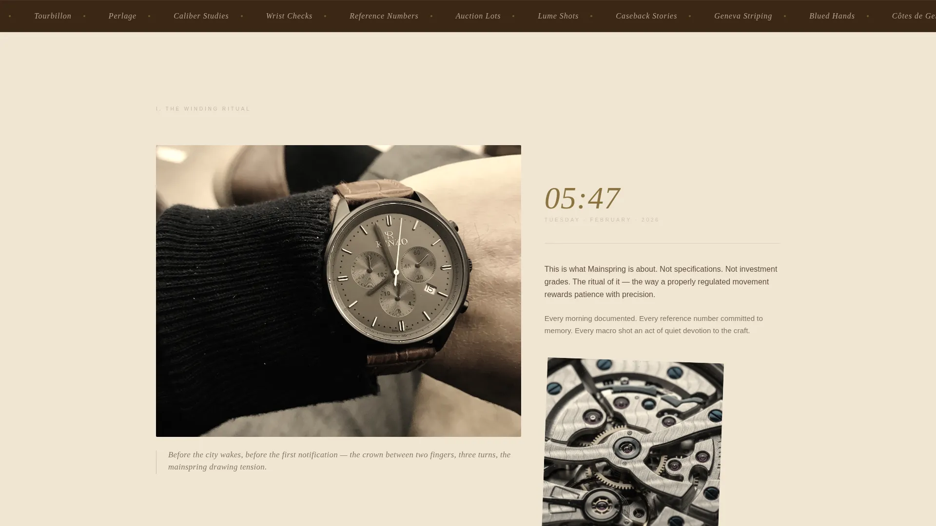
Each narrative section splits the viewport into a dominant 60-column image area and a 40-column text column. This creates visual rhythm without symmetry, keeping the page feeling editorial rather than templated.
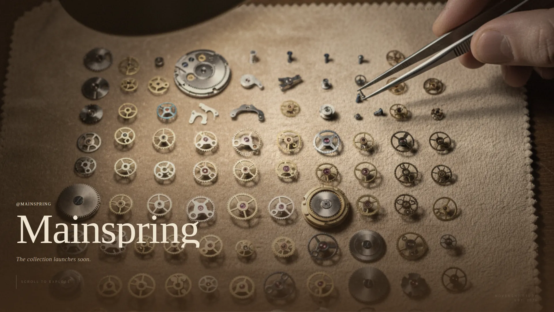
Full-Bleed Overhead Hero
The opening section fills the entire viewport with a close-up overhead desk photograph. The account name appears after a deliberate pause in a thin engraved-style serif, followed by a single line: "The collection launches soon."
Day-in-the-Life Scroll Narrative
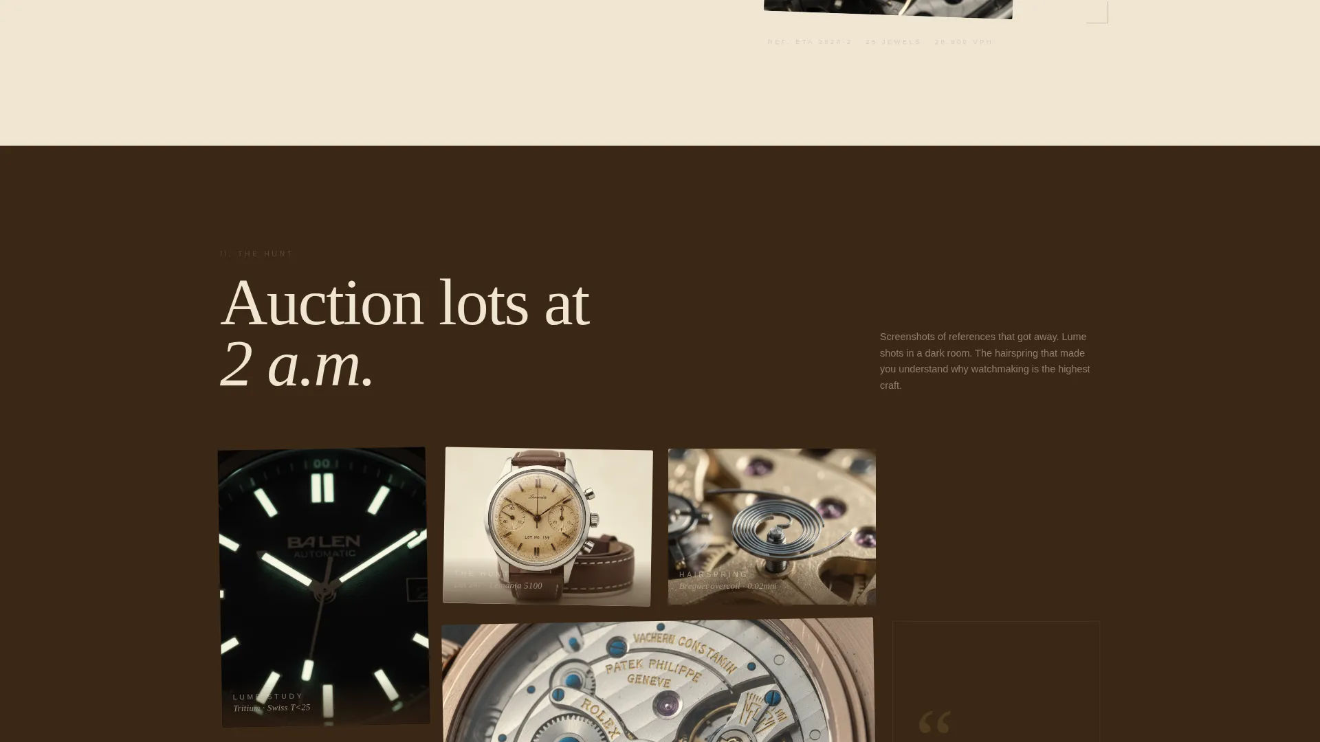
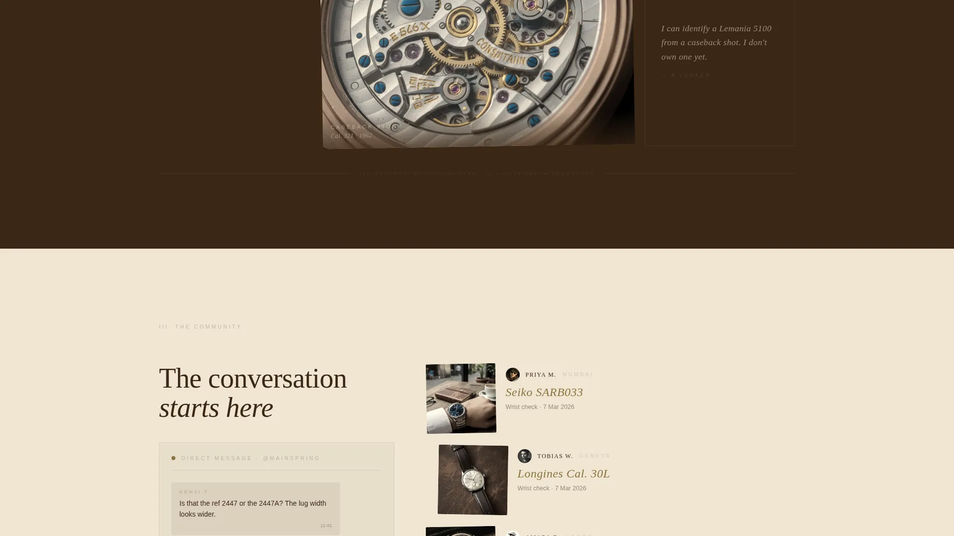
Three scroll sections follow the arc of a horologist's day. The winding ritual uses morning wrist shots and a handwritten-style timestamp. The hunt section brings in macro and lume photography. The community section reflects DM culture, wrist checks, and poll results.
Dual-Placement Waitlist Form
The conversion form appears twice: once after the midpoint narrative and once anchored at the bottom. It asks for an email address and one optional field, "What's on your wrist right now?", which opens a conversation and filters for real collectors.
High-Interaction Animation System
The template includes reveal-text slide-up animations, parallax mouse tracking, scroll-triggered fades, a noise texture overlay, a magnetic brass button effect, image grayscale-to-color hover transitions, and a custom cursor on card elements.
Ink and Paper Typography Pairing
Headlines use Fraunces, a variable serif with optical-size control that reads like hand-engraving at display sizes. Body copy uses DM Sans for clean legibility against the warm parchment backgrounds.
Page sections overview
| Section | Purpose |
|---|---|
| Full-Bleed Hero | Reveal account name and launch line |
| The Winding Ritual | Morning wrist-shot narrative, 60/40 split |
| The Hunt | Macro and lume photography storytelling |
| The Community | DM culture, wrist checks, poll results |
| Waitlist Form | Email capture with collector question |
| Minimal Footer | Horizontal flow with exclusivity tagline |
Design & branding system
The visual identity draws from the Ink and Paper theme using a Warm Stone color palette. Every color choice references physical materials: aged parchment, walnut ink, sandstone, and oxidized brass. Backgrounds alternate between deep walnut and parchment tones, so text always reads against its contrasting base.
- Aged parchment (#F0E6D3), walnut ink (#3B2716), sandstone (#B8A48E), and oxidized brass (#8B7400) reserved for hover states and the waitlist button
- Fraunces serif for all display headlines, DM Sans for body copy and form labels
- Noise texture overlay applied across sections to simulate the fibrous feel of paper stock
Mobile & speed optimization
The template is designed desktop-first, reflecting the browsing habits of the collector audience. Mobile adaptation is built in with care, ensuring the asymmetric grid and animation system reflow correctly on smaller screens without losing the editorial atmosphere.
- Desktop-first layout with deliberate mobile reflow for the 60/40 grid columns
- Server Components handle static content delivery; Client Components manage animations and interactions
- Scroll-triggered animations and parallax effects are scoped to Client Components for clean performance separation
How this template helps you convert
The conversion logic is embedded in the editorial experience. Visitors do not encounter a hard sell. They encounter a world they want to belong to, and the form is the door.
- The day-in-the-life narrative builds desire and belonging before any call to action appears, so the email ask arrives with earned trust rather than cold friction.
- The optional "What's on your wrist right now?" field turns sign-up into a conversation opener, which raises form completion intent among the collectors this page was built to attract.
- The tagline beneath the button, "No algorithms. No ads. Just movements.", frames the list as exclusive and intentional, reinforcing the reason to join before the visitor scrolls away.
Other information about this template
This template sits at the intersection of editorial design and community-building strategy. A few additional details are worth knowing before you decide.
- The template is built for a horology Instagram account in the Blog and Editorial category, under the Watch Collecting and Horology Content subcategory
- The footer uses a Vercel Horizontal Flow minimal pattern, keeping the page close cleanly without visual noise
- The brass accent color (#8B7340) appears sparingly across the page, used only for hover states and the waitlist button, to preserve its impact
- The page is English-language and commerce-free, suited to a global collector community with no pricing or storefront elements
Theme
Ink & Paper
Creative direction
Day-in-the-Life
Color system
Warm Stone
Style
Asymmetric Grid (60/40)
Direction
Waitlist/Coming Soon
Page Sections
Asymmetric 60/40 Grid Layout
Full-bleed Overhead Hero
Day-in-the-life Scroll Narrative
Dual-placement Waitlist Form
High-interaction Animation System
Ink and Paper Typography Pairing
Related questions
Can I replace the placeholder photography with my own watch images?
Does the waitlist form connect to an email marketing service?
Is this template suitable for a watch brand or shop, or only for content accounts?
Can I adjust the two-column grid ratio away from 60/40?
Can the dual waitlist form placement be reduced to one?



