Metric - Powerful Pipeline Landing Page Template
Metric is a single-page comparison table landing page built for B2B SaaS growth teams. It pairs a full-viewport dashboard header with oversized statistics, a head-to-head comparison table, and a click-through flow that leads visitors straight into a live demo. The design uses a dark Data Command palette and escalating cost-of-inaction copy to make clicking feel inevitable.
by Rocket studio
Quick summary
Metric is a comparison table landing page template designed for B2B SaaS startups. It opens with a live dashboard preview, anchors every scroll-stop to a single oversized statistic, and builds toward a head-to-head comparison table. The entire page drives one click: "See Your Pipeline Live." No forms, no friction.
Who this template is for
This template is built for growth-focused teams at early-stage B2B SaaS companies who need to communicate pipeline clarity fast. It speaks directly to decision-makers who are tired of explaining complexity with slides and spreadsheets.
- Series A founders who need a sharper story for investor and buyer conversations
- Revenue Operations leads managing fragmented tool stacks and manual reporting workflows
- VP of Sales who need a single, confident number before every board or leadership meeting
What problem this template solves
Most SaaS pipeline tools lose potential customers at the explanation stage. The product is powerful, but the page asks visitors to read their way into understanding it. Metric flips that sequence. It leads with the cost of the problem, proves it with data, and only then names the solution.
- Visitors leave before reaching the comparison table because early sections are too feature-focused
- The value gap between the current messy stack and a clean command center is never made visceral
- call to action buttons appear before trust is earned, so clicks feel like a risk rather than a logical next step
What you get with this template
You get a complete single-page layout ready to communicate one focused message: your pipeline has a pulse, and Metric reads it. Every section is purposefully sequenced to escalate urgency without resorting to hype.
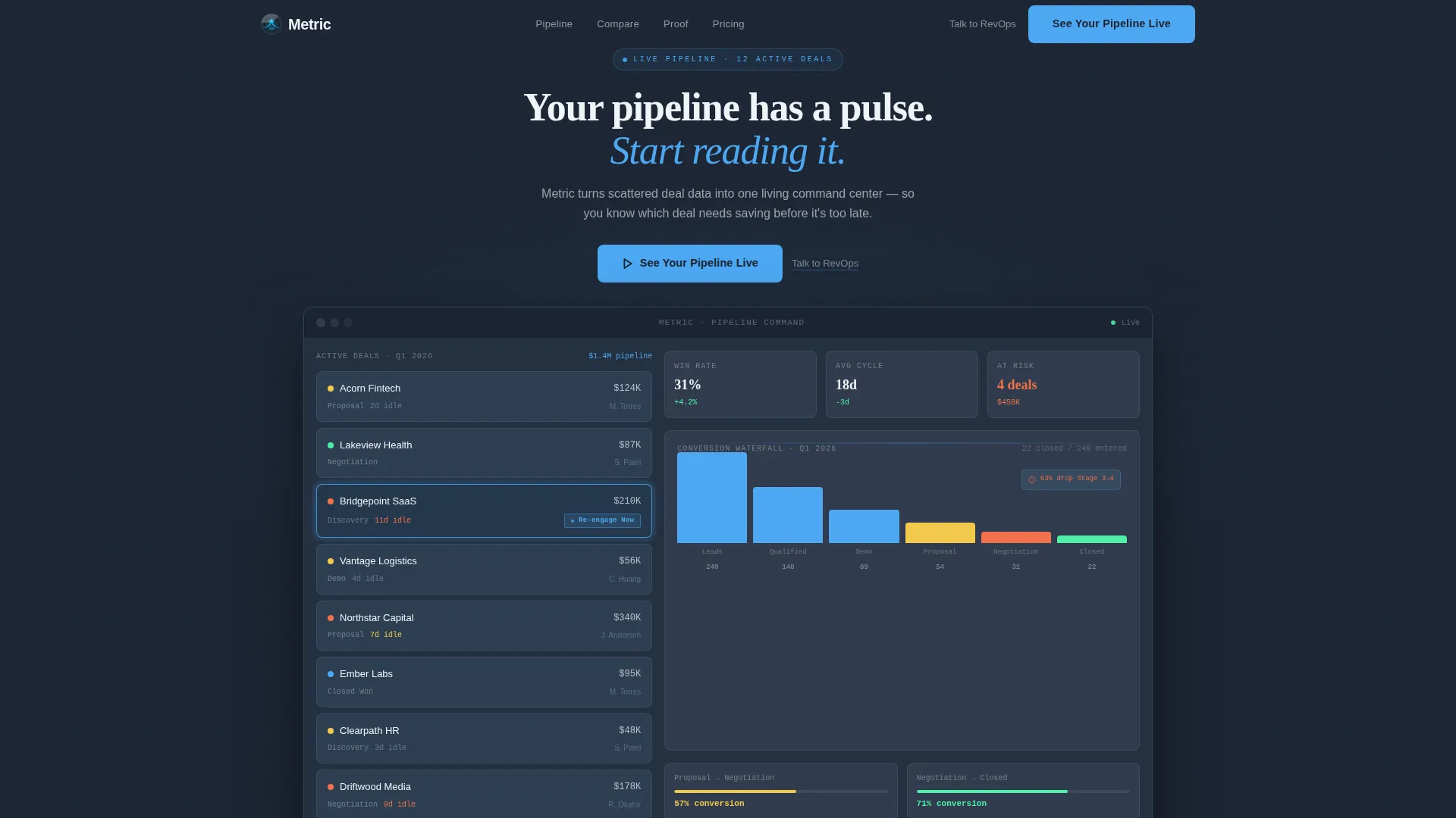
- A full-viewport dashboard header with a pulsing deal card and a fading headline overlay
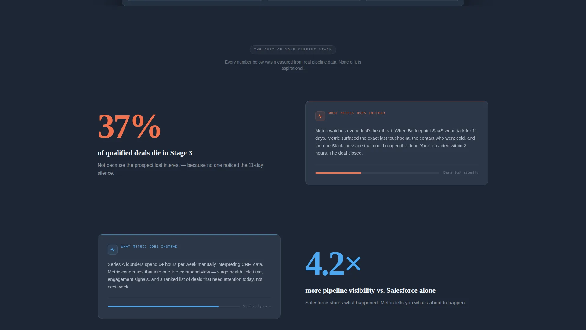
- An oversized-statistics scroll rhythm that surfaces the human cost of pipeline blind spots
- A structured comparison table contrasting a unified pipeline tool against a fragmented manual stack
- Repeated primary and secondary calls to action placed at three high-intent moments on the page
Feature list
This template includes components and layout decisions grounded in the source brief. Each one serves the click-through goal.
Full-Viewport Dashboard Header
The header renders a pixel-perfect product screenshot at full page width. It shows twelve deals across pipeline stages, a conversion waterfall chart mid-cascade, and one deal card pulsing sky-blue with a "Re-engage Now" prompt. The primary call-to-action button appears here first, above the fold.
Stats-First Scroll Rhythm
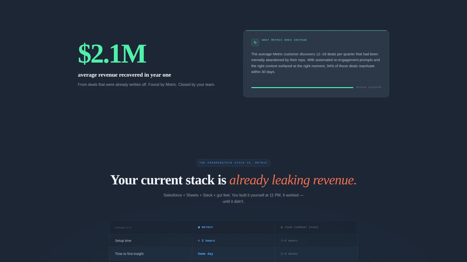
Each major section opens with a single oversized statistic set in 72-pixel type before any explanation appears. The approach creates a pattern of recognition before justification, so visitors absorb the problem on an emotional level before the solution is introduced.
Head-to-Head Comparison Table
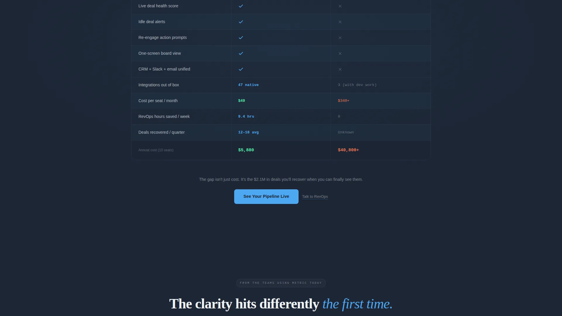
The centerpiece of the page is a structured table comparing the template product row by row against a common fragmented stack. Rows cover setup time, time-to-insight, number of integrations, and cost per seat. Sky-blue checkmarks mark each advantage clearly.
Escalating Cost-of-Inaction Copy
Section by section, the copy builds a quiet sense of urgency. Rather than listing features, each block surfaces what a visitor is already losing with their current workflow. The framing makes the product feel like a correction, not a pitch.
Triple call to action Placement
The primary call-to-action, "See Your Pipeline Live," appears three times: inside the dashboard header, after the comparison table, and at the page close. A secondary text link, "Talk to RevOps," sits beneath each button for visitors who prefer a human conversation before committing.
No-Form Click-Through Flow
There is no lead capture form on this page. The primary button carries the visitor directly into a pre-built interactive demo environment seeded with sample pipeline data. This reduces friction at the moment of highest intent.
Page sections overview
| Section | Purpose |
|---|---|
| Dashboard Header | Opens with a full-viewport pipeline screenshot and the first primary call-to-action |
| Stats Impact Block | Delivers the first oversized statistic before any product explanation |
| Problem Escalation | Frames pipeline blind spots as active, measurable revenue leakage |
| Comparison Table | Contrasts the unified tool against a manual multi-tool stack row by row |
| Post-Table call to action | Repeats the primary and secondary calls to action at peak conviction |
| Page Close call to action | Final call-to-action block that closes the persuasion arc |
Design & branding system
The visual system follows a Data Command theme. Every color and layout decision reinforces the feeling of a focused, high-stakes operating environment rather than a generic SaaS marketing page.
- Background uses deep operations slate (#1B2433), with mid-tone gunmetal (#3A4557) applied to card surfaces and table rows
- Sky-signal blue (#4DA8F2) activates on every interactive element, live data point, and checkmark in the comparison table
- Altitude white (#F0F4F8) handles all body text and negative space, keeping readability high against the dark palette
Mobile & speed optimization
The template is structured for responsive viewing across device sizes. The dark palette and focused layout reduce visual load without sacrificing the cockpit-at-altitude atmosphere.
- The full-viewport dashboard header scales to maintain the pipeline screenshot's readability on smaller screens
- The comparison table is built to reflow cleanly, keeping row contrast and sky-blue checkmarks legible on mobile
How this template helps you convert
This template is engineered around a single conversion goal: one click into a live demo. Every structural and copy decision supports that outcome.
- The page earns trust before making an ask. Oversized statistics prove the problem exists before the product is ever named, so the call-to-action button feels like a logical conclusion rather than a sales prompt.
- Friction is removed at the moment of highest intent. No form stands between the visitor and the demo. The button click is the conversion, and it leads somewhere immediately useful.
- Two buyer modes are served at once. The "See Your Pipeline Live" button captures self-serve, high-confidence buyers. The "Talk to RevOps" text link captures buyers who need a human conversation first, without cluttering the primary flow.
Other information about this template
This template sits within the Startup and Launch category, specifically the Startup Homepage subcategory, and is matched to the B2B SaaS startup niche. It carries an intersection match score of 13, reflecting strong alignment across theme, creative direction, color system, template style, and landing-page direction.
- Template style: Comparison Table
- Theme: Data Command
- Color system: Slate and Sky
- Creative direction: Stats-First Impact
- Header concept: Dashboard Preview
- Landing-page direction: Click-Through
Theme
Data Command
Creative direction
Stats-First Impact
Color system
Slate & Sky
Style
Comparison Table
Direction
Click-Through
Page Sections
Full-viewport Dashboard Header
Stats-first Scroll Sections
Head-to-head Comparison Table
Cost-of-inaction Copy Framework
Triple Call-to-action Placement
No-form Click-through Flow
Related questions
Who is this landing page template designed for?
Does this template include a lead capture form?
Can I customize the statistics and comparison table rows?
What pages does this template include?



